Properties Window
The properties window will allow the user to change the form properties or any property of the control in the form. The property change is reflected in the form in real time so that the user has a correct assessment on the changes he is making. Each control has its own properties, some of the properties are common for all the controls. The Property window has different sections for grouping the properties like General, Attached label, Data Source, Style, Rules, Validation and Reports. These sections will be displayed based on the type of the control.
Right Panel consists of three section
- Properties
- Forms Explorer
- Templates
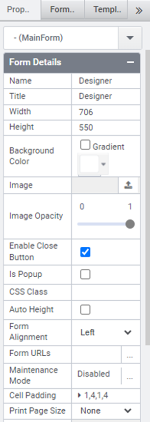
Properties:
By Default, Property Panel consists of Property of form as shown in the image below.
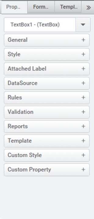
If a control is selected, then the property of control will displayed in Property Panel as shown below.
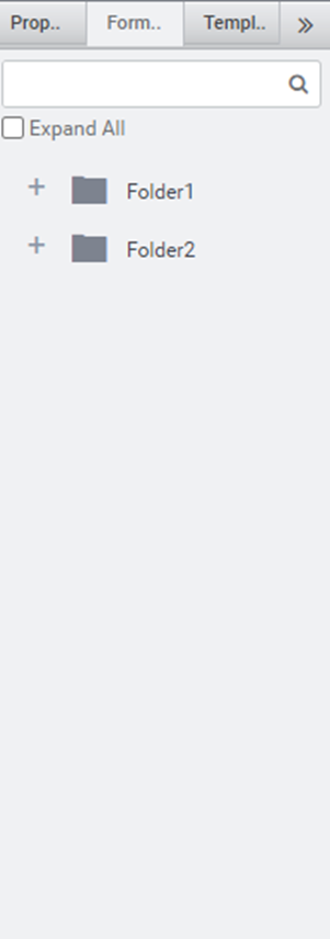
Forms Explorer:
Forms Explorer has the list of folders in the current tenant. Folders can be expanded by clicking + button or Expand All checkbox. The forms can be searched by typing the form in search bar. The form section image is displayed below
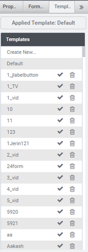
Templates:
In this section, Templates can be created and already created templates using template builder are also listed as shown in the image below. Templates can be deleted by clicking the delete icon corresponding to the template.