CheckBox
A checkbox control is a user interface element that allows users to select or deselect one or more independent options.
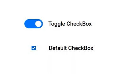
It typically appears as a small square box that can be checked or unchecked to represent a binary choice, and it can also be displayed as a toggle option using template options.
Control Name: Checkbox
Group: Standard
| General | |||
| S.no | Property name | Data type | Description |
| 1 | Text | String | If a user enters a value inside the Text property, the entered value will be displayed in the preview. |
| 2 | Tooltip | String | The texts that need to be displayed when the user hover the mouse pointer over the control, without clicking it. |
| 3 | Tab Index | Integer | Sets the Tab order for the control within its container. |
| 4 | Default Value | Boolean | If this property is checked in the Designer will display the checkbox that is checked in the Preview. |
| 5 | Remarks | String | To make a comment or observation about the control for reference. |
| Attached Label | |||
| S.no | Property name | Data type | Description |
| 6 | Show Label | Boolean | To display the attached label along with the control. |
| 7 | Label Text | String | Sets the text content of the label attached to the control. |
| 8 | Label Position | String | To place the label attached in various positions around the control. |
| 9 | Label Width | String | Sets the suggested width or thickness of the label attached to the control. |
| 10 | Label Height | String | Sets the suggested height of the label attached to the control. |
| 11 | Text Alignment | String | To align the texts inside the label attached to different positions within the control. |
| 12 | Margin | String | Sets the edge or outer margin to the control. |
| 13 | Font | String | Sets the font face\style. |
| 14 | Font Size | String | Sets the size of the text in the attached label. |
| 15 | Bold | Boolean | To make the attached label text Bold |
| 16 | Italic | Boolean | Italicize the attached label text. |
| 17 | Underline | Boolean | Underline the attached label text. |
| 18 | Font Color | String | Sets a brush that describes the Font color in the attached label. |
| 19 | Background Color | String | Sets a brush that describes the Background color to the attached label. |
| Style | |||
| S.no | Property name | Data type | Description |
| 20 | Width | String | Sets the suggested width or thickness of the control. |
| 21 | Margin | String | Sets the edge or outer margin to the control. |
| 22 | Font | String | Sets the font face\style. |
| 23 | Font Size | String | Set the font size. |
| 24 | Font Color | String | Sets a brush that describes the Text color of the control. |
| 25 | Background Color | String | Sets a brush that describes the Background color of the control. |
| 26 | Visible | Boolean | Sets the visibility of the control while rendering. |
| 27 | Enable | Boolean | Sets the accessibility of the control during rendering. |
| 28 | Bold | Boolean | To make the control text Bold. |
| 29 | Italic | Boolean | Italicize the control text. |
| 30 | Template | String | To set a different template(toggle) design for the checkbox control |
| Rules | |||
| S.no | Property name | Data type | Description |
| 31 | Rules | After selecting the control, If the user clicks the Rules tab it will be expanded and displays a Rules property. Create Rule can be selected from a drop down list. On clicking the Create Rule link button will navigate the user to the Rules Engine. The same control will be added as a trigger by default to execute the Rule. |
| Validation | |||
| S.no | Property name | Data type | Description |
| 32 | Is Required | Boolean | Helps to check whether the user has to give input in the control or not. If this property is enabled, this will not allow the user to save a form without giving the input. |
| 33 | Required Message | String | If the Is Required property was enabled and input was given in this property, the validation message will be displayed to the next right of the control when the user is trying to save a form without entering a value in the control. |
| Reports | |||
| S.no | Property name | Data type | Description |
| 34 | Control Report | Control Report will redirect to the Reports tab that will display all the configurations, rules and datasources details associated with the selected control. |