Bar Chart
A bar chart is a visual tool used to represent data with rectangular bars. It is commonly used to display categorical or discrete information, with each bar representing a different category or group. The height or length of each bar reflects the value or quantity associated with that category.
Types of Charts:
There are three different types of Bar charts.
- Vertical Chart
- Horizontal Chart
- Stacked Chart
Let’s take a closer look at the different types of bar charts and walk through the detailed steps to configure each one.
1. Vertical Chart
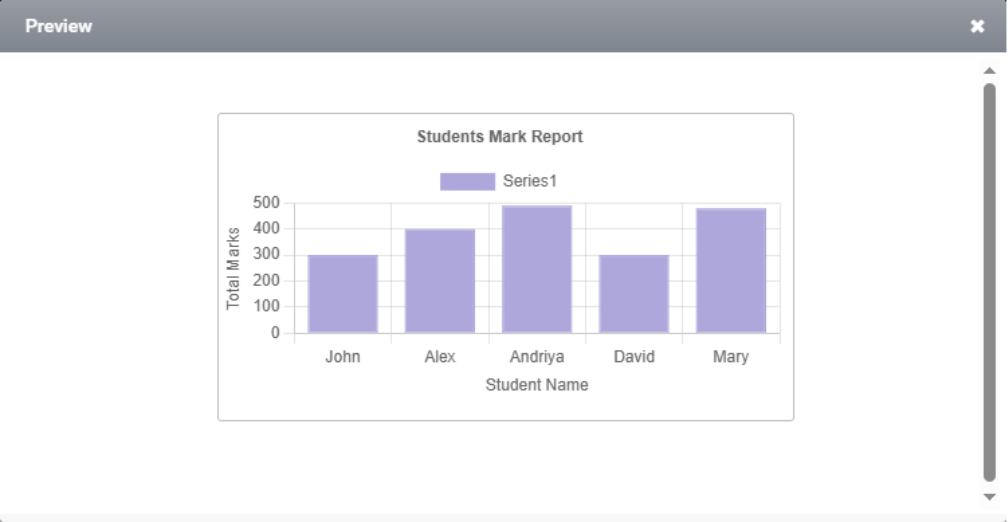
A vertical chart is a form of bar chart where data is represented by vertical rectangular bars, and the height of each bar reflects the value it represents. They are widely used in business, education, and research to visualize survey results, sales figures, population data, and more.
Steps to configure Vertical Chart:
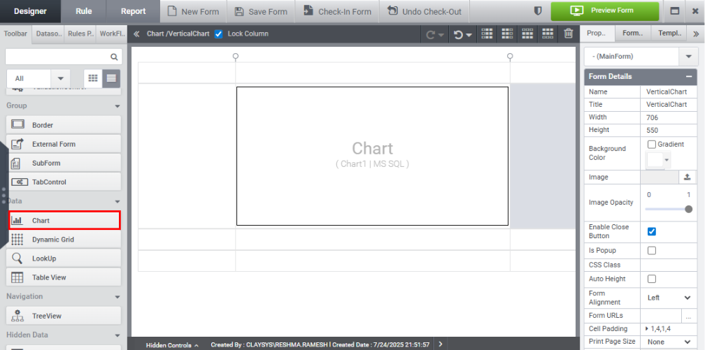
Step 1: Drag and drop the chart control from the toolbar onto the form, as illustrated in the image below.
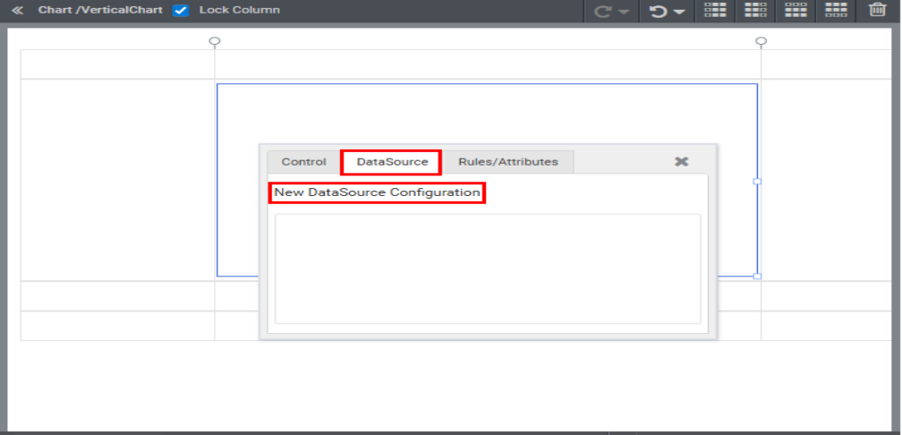
Step 2: Click the New Datasource Configuration link under the Datasource tab in the Quick Menu.
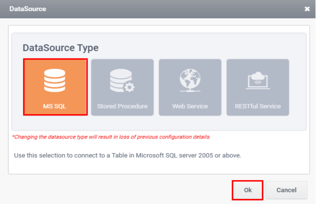
Step 3: Select SQL as the datasource type in the Datasource Wizard and click OK.
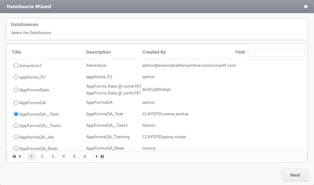
Step 4: Select your preferred datasource from the available options and click Next, as demonstrated in the image below.
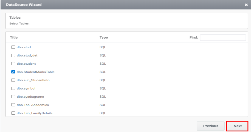
Step 5: Choose the necessary table from the Tables list and click Next.
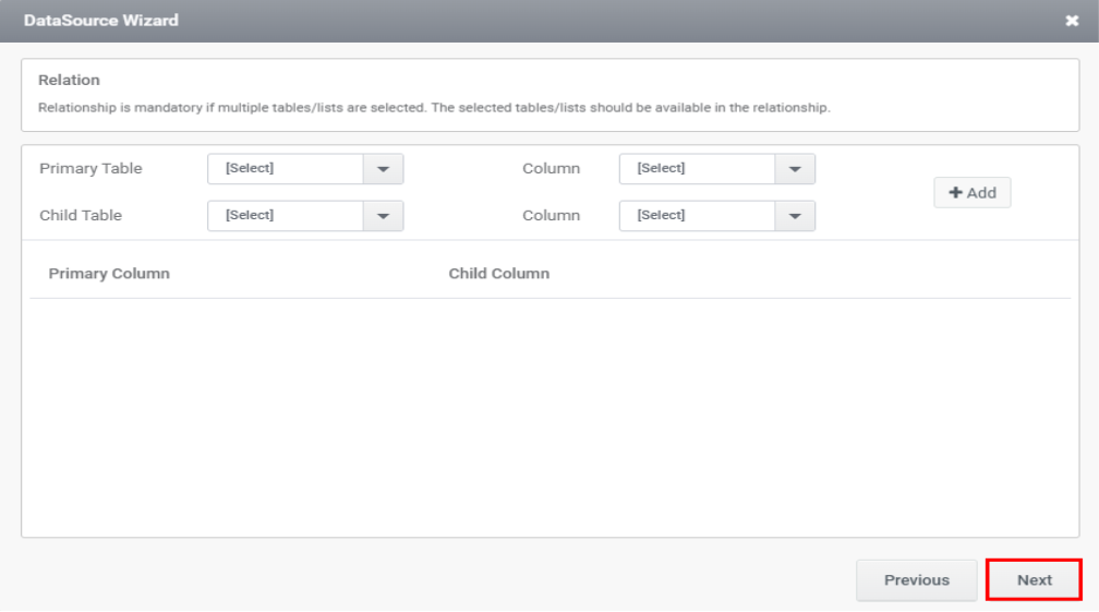
Step 6: You can join the tables in this wizard, if necessary, then click Next.
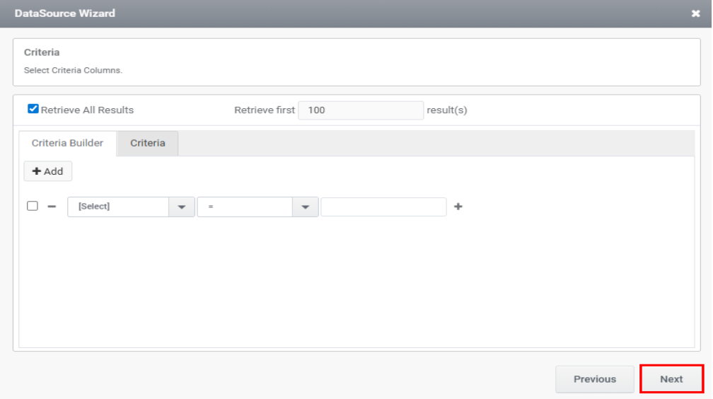
Step 7: Criteria can be configured using the wizard displayed in the image below. Afterward, click Next.
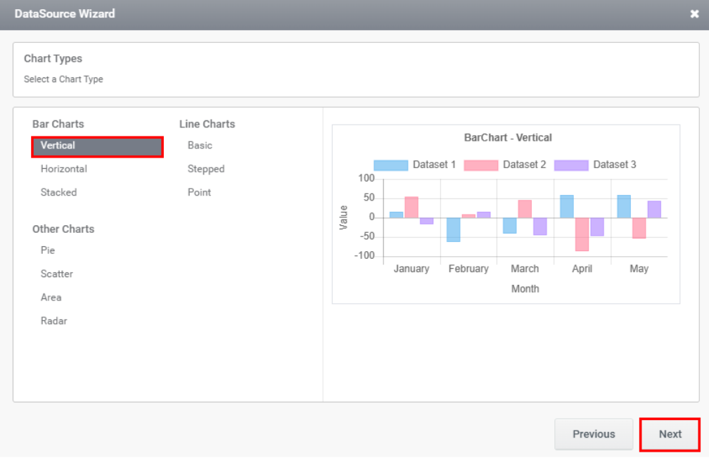
Step 8: Select the Vertical chart type as illustrated in the image below, then click Next.
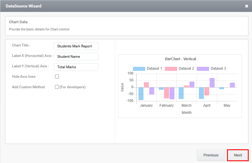
Step 9: The next wizard has following fields such as,
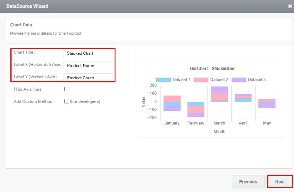
Chart Title: This field is used to enter the chart title, which appears at the top of the chart. It provides viewers with a quick understanding of the chart’s purpose or context. The title often emphasizes the main message or key insights the chart is intended to convey.
Label X (Horizontal Axis): This field is used to enter the label for the X-axis. The horizontal axis represents the categories or groups being compared or analyzed in the chart. It is positioned at the bottom of the chart and extends from left to right.
Label Y (Vertical Axis): The label to be shown in Y axis can be given in this field. The vertical axis that represents the numerical values
Hide Axis Line: Hiding axis lines means removing or concealing the lines that define the axes in a chart.
Add Custom Method: When this checkbox is enabled, a Method Name field appears where you can enter the method name. The Add Custom Method option is intended for developers. When selected, it prompts you to provide a method name. This method (a JavaScript function) is called during the execution of the chart’s FillData rule, and the chart data is passed to it as a parameter. After entering the required field, click the Next button.
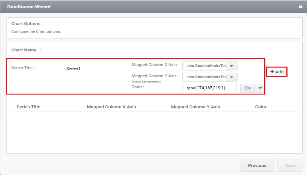
Step 10: The next wizard has following fields such as,
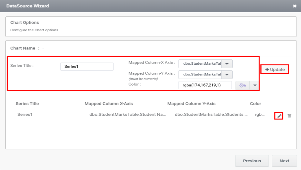
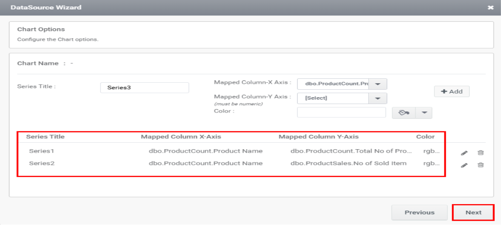
Series Title: By default, Series Title will be Series 1.
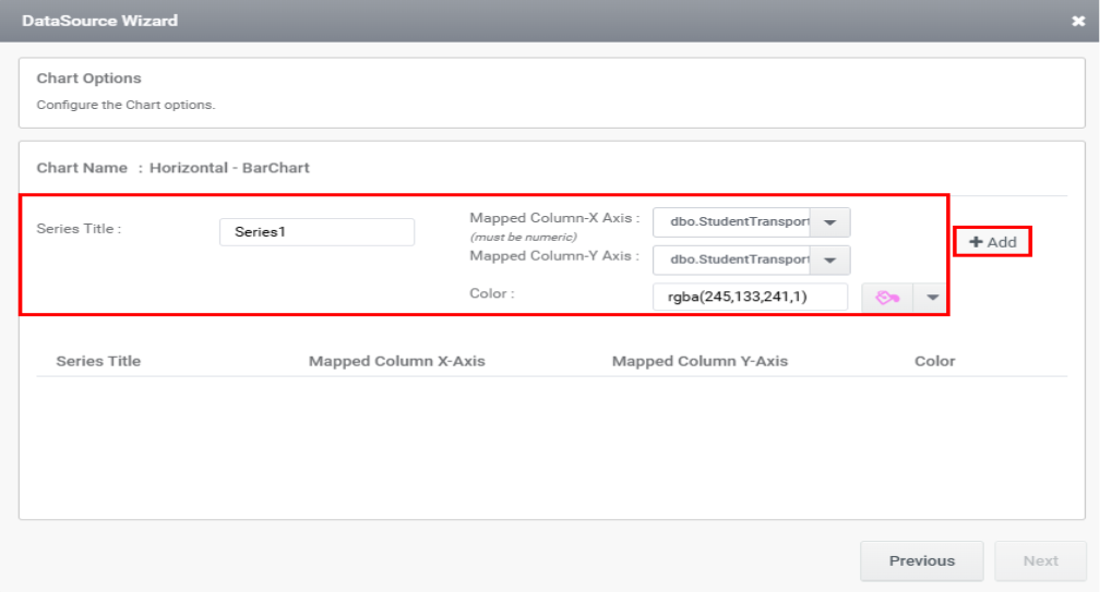
Mapped Column X Axis: The X axis can be mapped with the required column in the table.
Mapped Column Y Axis: The Y axis can be mapped with the required column in the table.
Color: The required color can be added manually or by using a color picker.
After entering the required field click the Add button as shown in the image below.
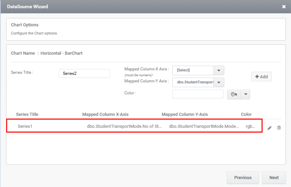
Clicking the Add button will insert the chart details into the section below, as demonstrated in the image.
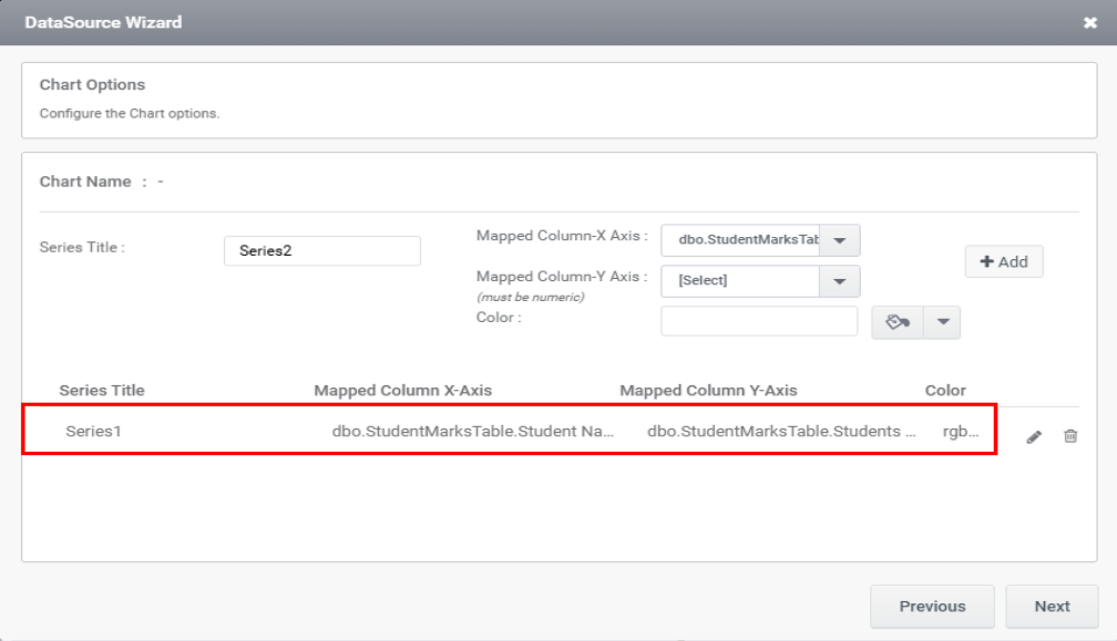
The chart details you’ve entered can be edited by clicking the Edit icon, as shown in the image below. When you click the icon, the data will populate the fields in the top section, where you can make the necessary changes and then click the Update button, as illustrated.
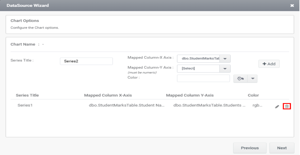
The added series can be removed by clicking the Delete icon.
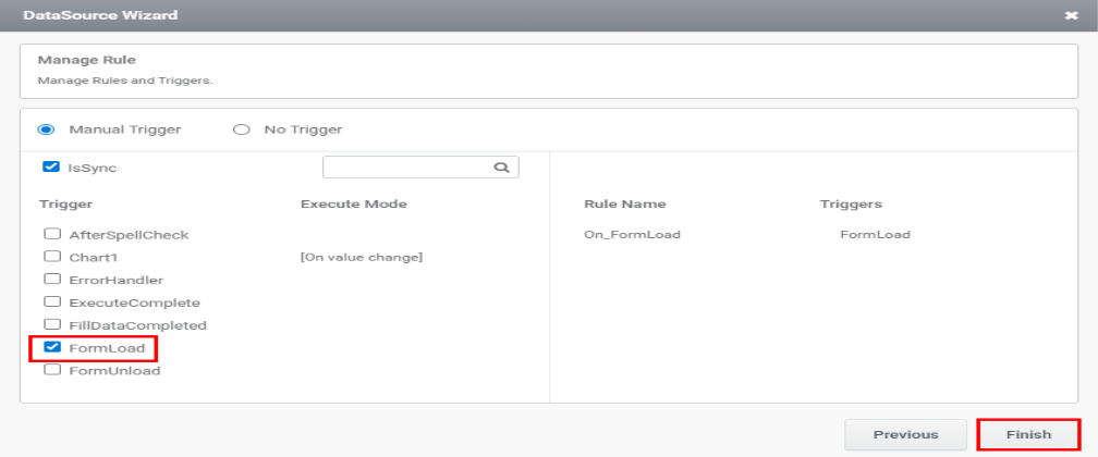
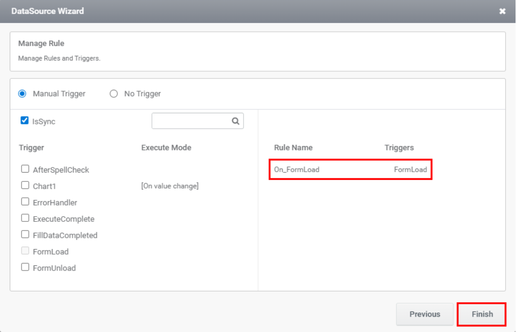
Step 11: Once a series is added, click the Next button. The wizard to add trigger section appears as shown in the image below. Select the trigger and click the Finish button.

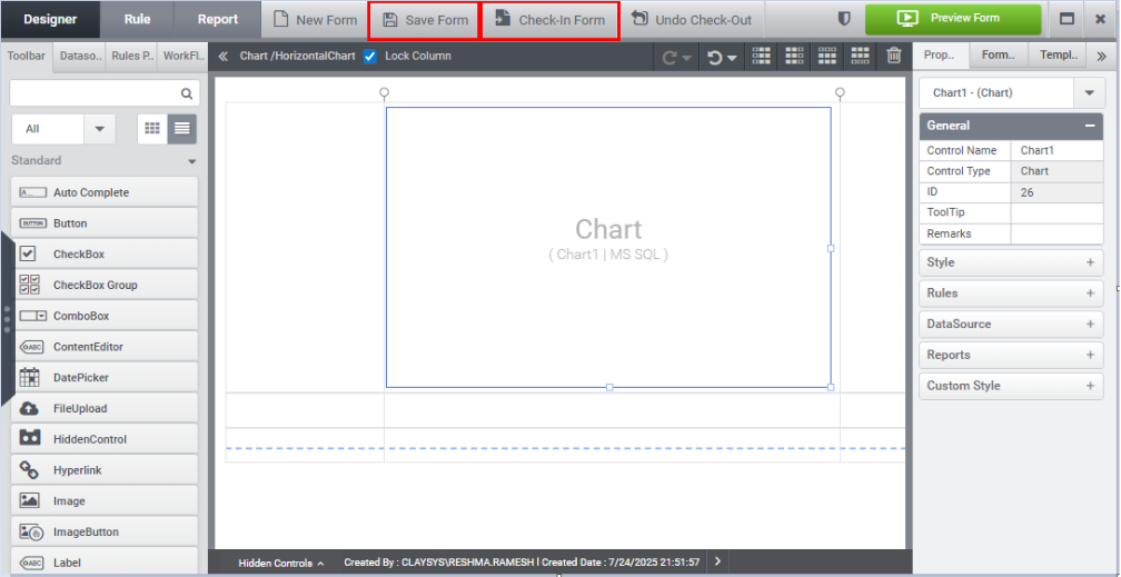
Step 12: Select the Save Form and Check-In Form options, as demonstrated in the image below.
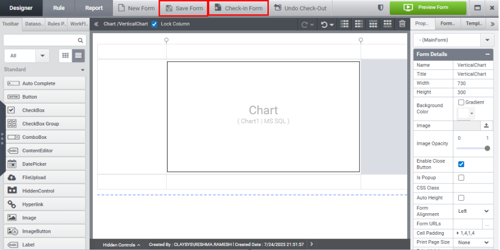
The form will be checked in.
Step 13: Click Preview to view the chart upon form loading.
2. Horizontal Chart
A horizontal bar chart is a visual representation of data using rectangular bars oriented horizontally. In this type of chart, the length of each bar reflects the value it represents. The horizontal axis usually displays the categories or groups being compared, while the vertical axis shows the corresponding numerical values.
Steps to configure Horizontal Bar Chart:
Step 1: Drag and drop Chart Control.
Step 2: Click the New Datasource Configuration link under the Datasource tab in the Quick Menu.
Step 3: Datasource Wizard appears, select the datasource type as SQL and click Ok.
Step 4: Choose the desired datasource from the list of available datasources, and click Next.
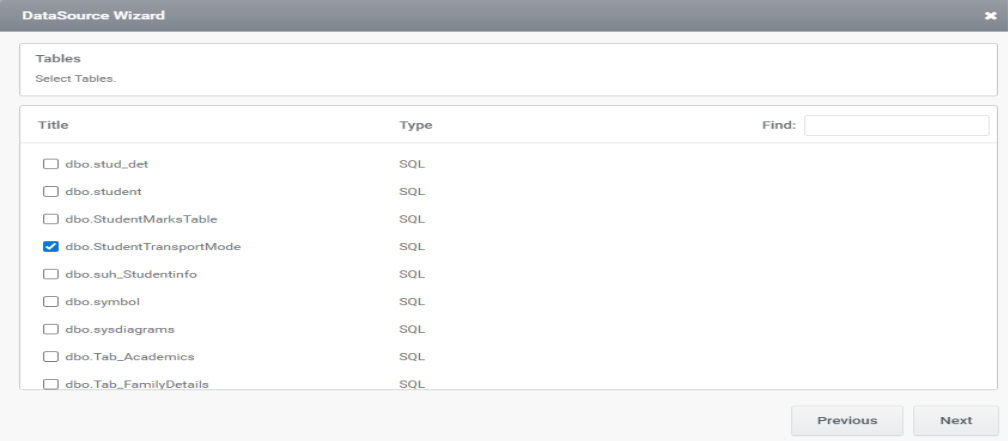
Step 5: Select the required table from the list of Tables and click Next as shown in the image below.
Step 6: The joining of tables can be done in the Relation wizard and click Next.
Step 7: Criteria can be managed in the criteria wizard and click Next.
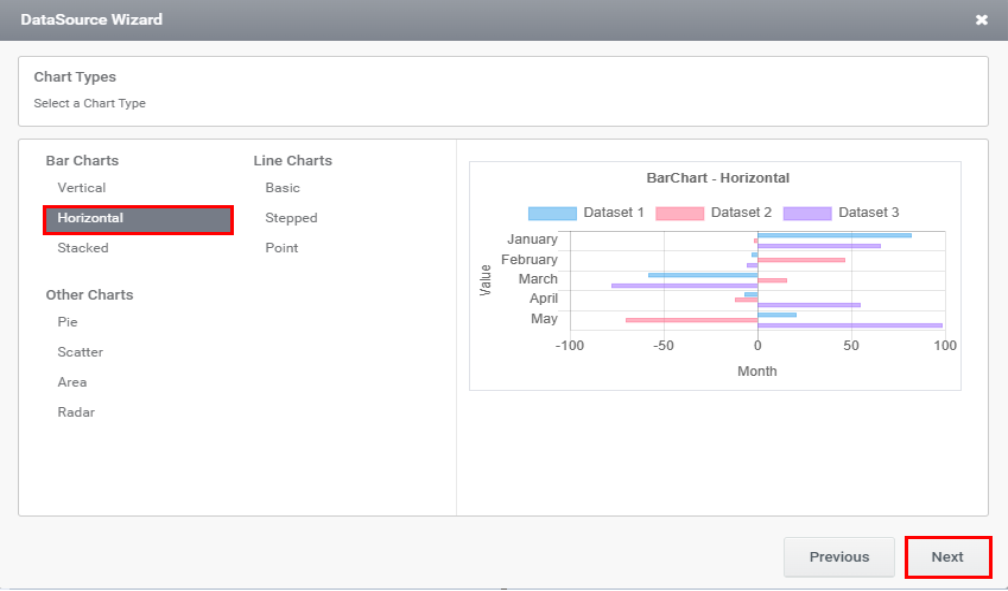
Step 8: Select the chart type as Horizontal as shown in the image below and click Next.
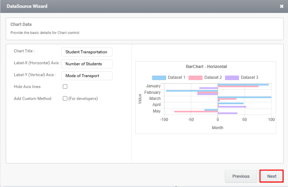
Step 9: Enter the basic details of the chart and click Next button.
Step 10: Select the X-Axis, Y-Axis field, color and click Add button as demonstrated in the image below.
Step 11: When the Add button is clicked, the series will be added to the section below.
The added series can be modified or removed using the Edit and Delete icons.
Step 12: Select the trigger as shown in the image below and the rule will be automatically created and click Finish.
Step 13: Click Save Form and Check In form button.
Step 14: Click Preview to display the horizontal bar chart.
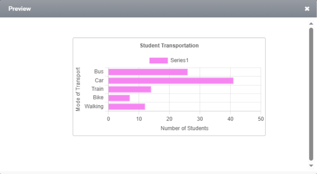
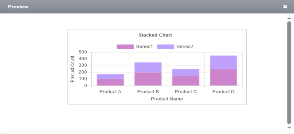
3. Stacked Chart
A stacked bar chart is a visual tool that uses rectangular bars to represent data, with each bar showing the total value of a category. These bars are divided into segments, each representing a different subcategory or component of the overall total, allowing for easy comparison of both the whole and its individual parts.
Steps to configure stacked Bar Chart:
Step 1: Drag the Chart Control from the toolbar and drop it onto the form.
Step 2: Click the New Datasource Configuration link located under the Datasource tab in the Quick Menu.
Step 3: When the Datasource Wizard appears, select SQL as the datasource type and click OK.
Step 4: Select the desired datasource from the available list and click Next.
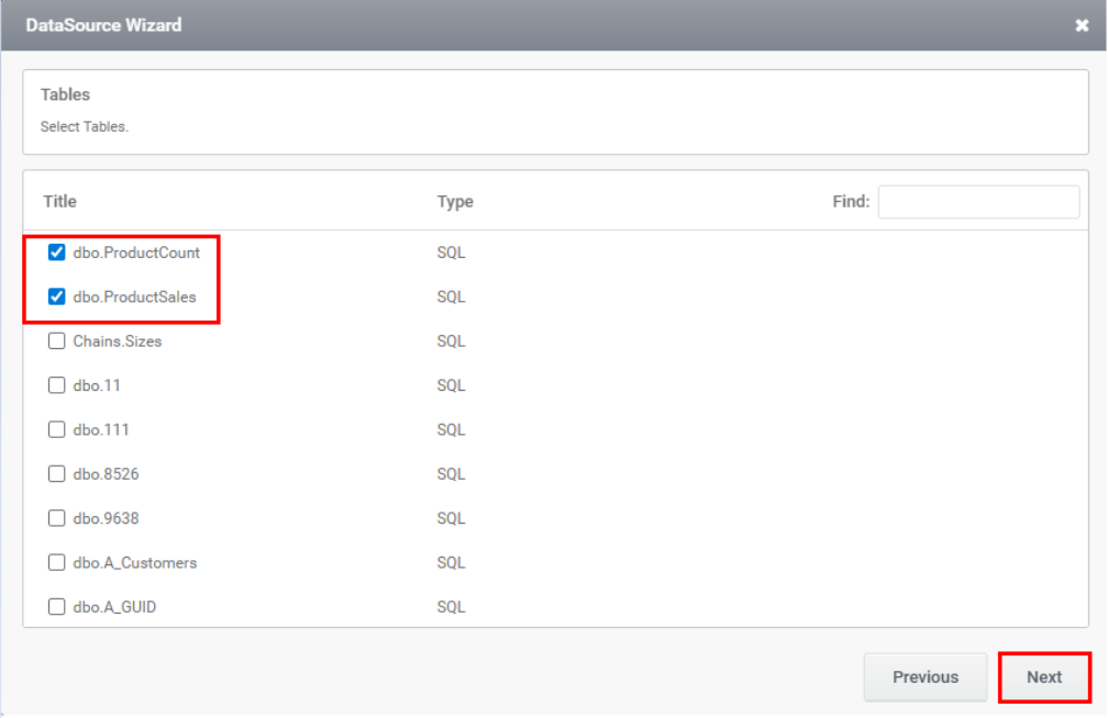
Step 5: From the list of Tables, select the required tables and then click Next, as illustrated in the image below.
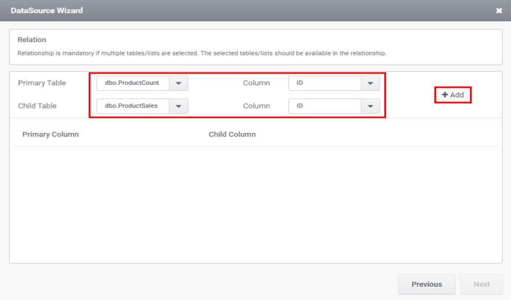
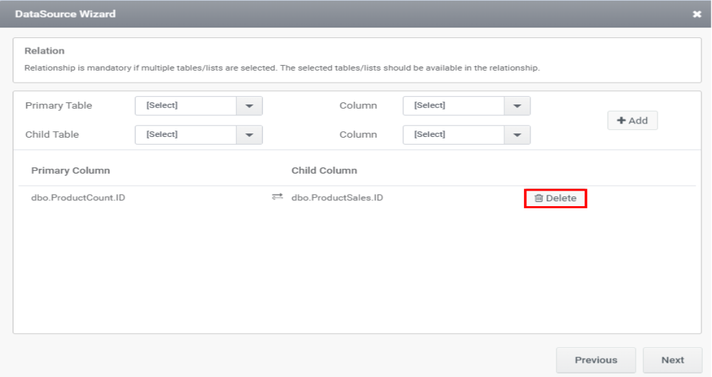
Step 6: The next page shows the relationships between tables; select the desired relation and click the Add button, as illustrated in the image below.
Step 7: The relation will be displayed in the Primary and Child column sections as demonstrated in the image.
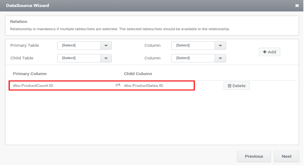
The relation can be deleted by clicking the Delete button.
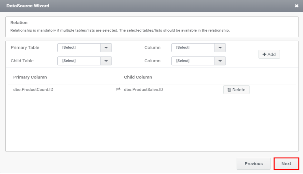
Step 8: Once the relation is added, click the Next button.
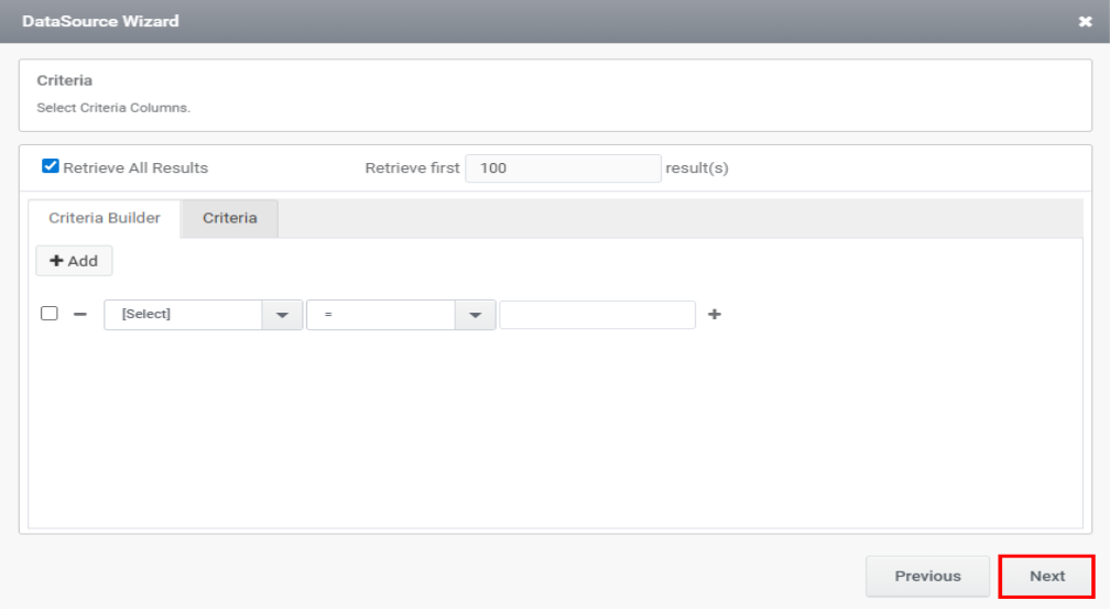
Step 9: The following page presents the criteria section—add your criteria and then click Next.
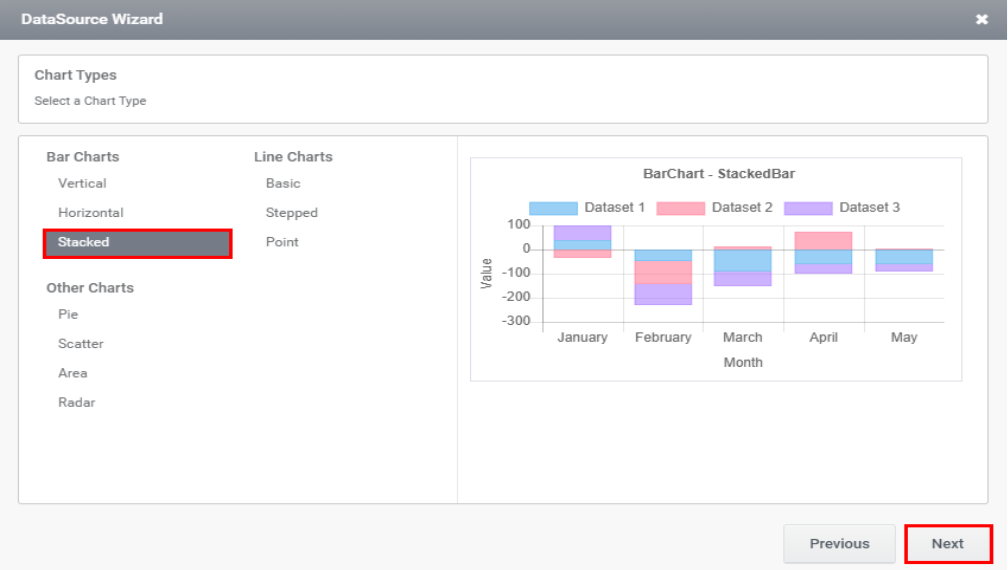
Step 10: Choose Stacked as the chart type and click the Next button.
Step 11: Enter the details in the next wizard as shown in the image below and click Next.
Step 12: The upcoming wizard will show the series selection. Select the series and click Add. The added series will appear as illustrated in the image below. Then, click Next.
Step 13: Configure the trigger and click Finish.
Step 14: Click Save Form and Check-In Form to save and check in the form. Next, click Preview to view the stacked chart, as illustrated in the image below.