Create a Basic Form
Let’s explore the process of creating a basic form within the Claysys AppForms platform.
1.Navigate to Form Explorer
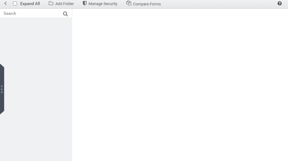
Go to the site URL and log in with valid credentials. After logging in, you’ll find a Designer tab in the top-right corner of the screen. Please note, the Designer tab is only accessible to users who have designer/administrator permissions.

This action will open the Form Explorer as shown in the image below.
2. Create a New Folder
Initiate the process by creating a new folder within the Claysys AppForms environment. Click the “Add Folder” option to create a new folder, as illustrated in the image below.

A new folder will be created, as shown below.
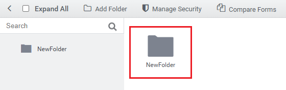
By default, the folder will be named “NewFolder”. The user can rename it by entering the desired name in the textbox, as shown in the image below.
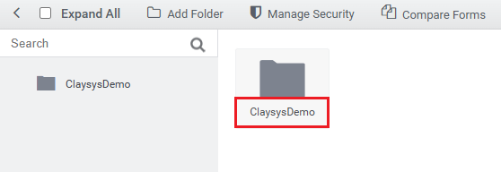
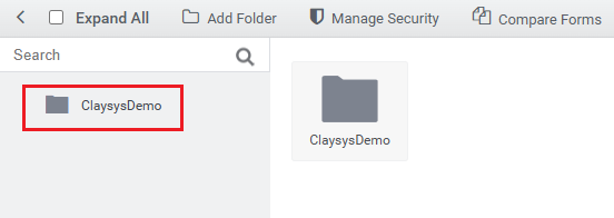
The updated name will appear in the left panel only after the renaming is finalized, as illustrated in the image below.
3. Editing the Folder Name
Let’s look at how to update the folder name.
Right-click on the folder you wish to rename and select the “Rename Folder” option.
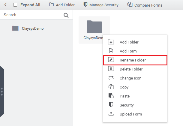
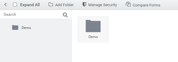
Enter the desired name, and it will be updated in the left panel, as shown in the image below.
4. Creating a Form
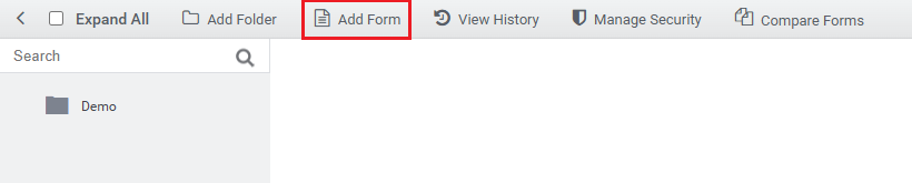
Double-click the folder, then click the “Add Form” button located on the top toolbar, as shown in the image below.
The following dialog box appears, as shown in the image.
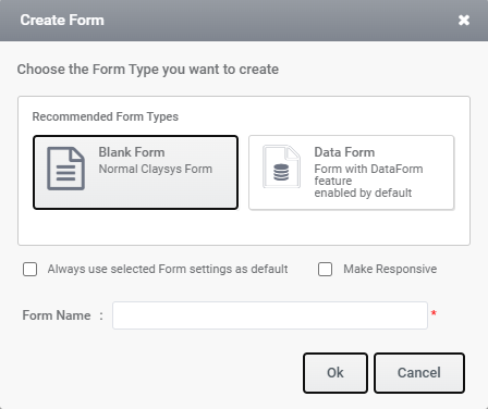
When creating a new form in ClaySys AppForms, two form types are available:
- Blank Form – A standard ClaySys form with basic configuration.
- DataForm – A form with DataForm-specific features enabled by default. (This type will be available only if the feature is activated during installation and the corresponding tenant setting is enabled)
Additionally, two checkbox options are provided:
- Always use selected Form settings as default – When selected, the chosen form settings will automatically be applied as the default for future form creations.
- Make Responsive – When selected, the form will be created with responsive design features enabled.
Enter the desired name in the Form Name field and click the OK button. The newly created form will then open in the designer, as shown in the image below.
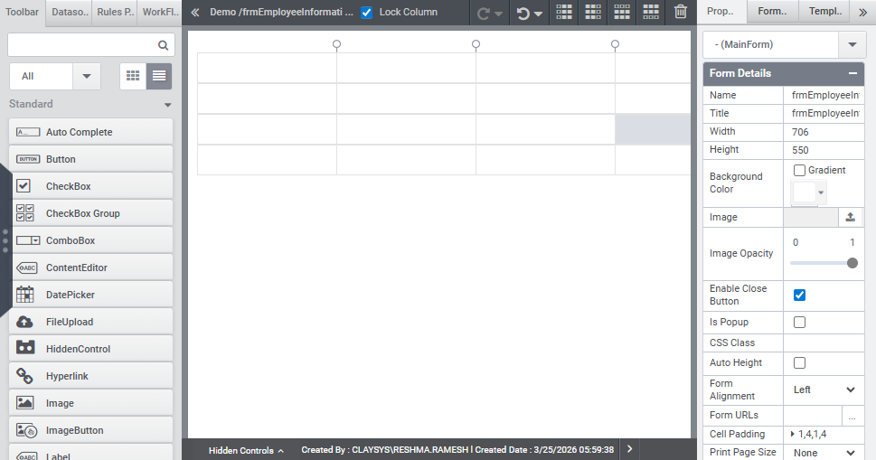
In the designer interface, the left panel displays the Toolbar, Data Source, Rules Panel, and Workflow sections. The Properties window is located on the right side, while the central area is dedicated to the Designer workspace where the form layout is managed.
Toolbar: The Toolbar provides access to all the tools that can be used within the form.
DataSource Panel: This panel allows users to create, configure, and manage the form’s data sources.
Rules Panel: The Rules Panel is used to define, edit, and manage business rules that control the form’s behavior.
Workflow Panel: This section enables users to design and manage workflows associated with the form.
Designer Area: Located at the center, the Designer area is where the form’s user interface is visually constructed.
Properties Panel: Positioned on the right side, the Properties Panel allows users to view and modify the properties of the selected form or control.
5. Example of Designing an Employee Details Form
Let’s explore how to design an employee information form to manage Employees informations.
Drag and drop a Label control onto the form layout, as illustrated in the image below.
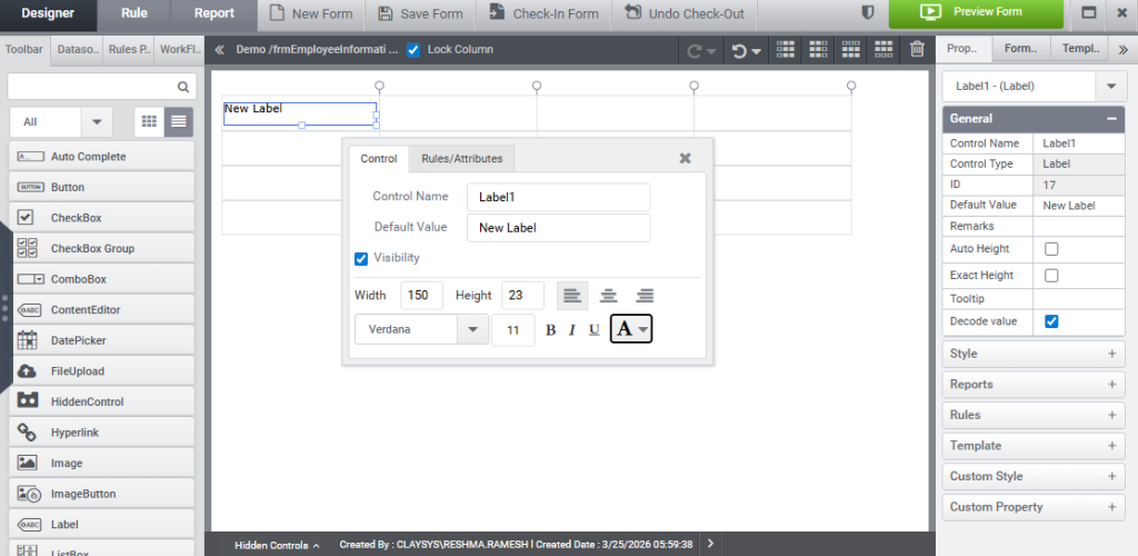
To span across multiple columns, input the required number of columns into the Column Span field, as demonstrated in the image below.
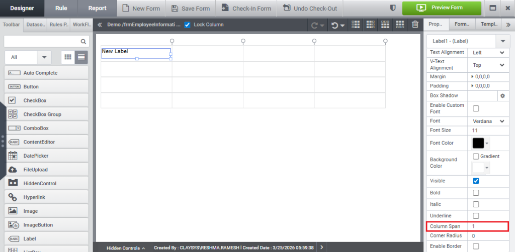
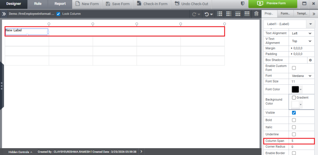
Specifying 5 will span across 5 columns as shown in the image below.
Lock Column property – when disabled, cells within a column can have varying widths. When enabled, all cells in the column maintain a uniform width. Control widths can be adjusted independently, regardless of whether this property is enabled or disabled.
When the label is clicked, a quick menu appears, as shown in the image below.
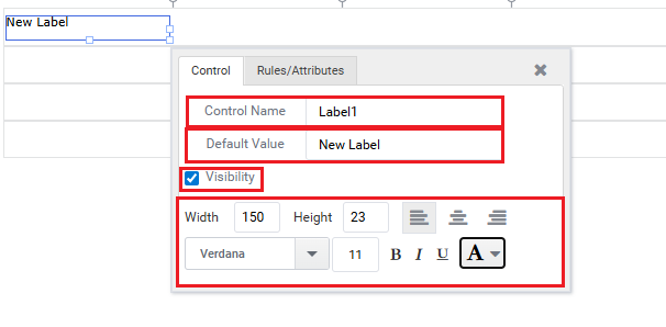
- Control Name: Displays the default name assigned to the control.
- Default Value: Specifies the initial value that appears in the control.
- Visibility: When enabled, the control will be visible during rendering; otherwise, it will be hidden. This option is enabled by default.
- Basic formatting options—such as width, height, alignment etc.—can be adjusted in the section located below the Visibility setting.
The label has been set as required, as shown in the image below.
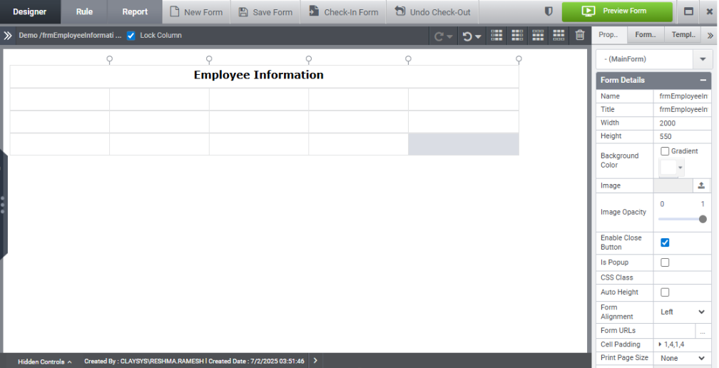
Place four Label controls onto the Subform and rename each one as needed, as illustrated in the image below.
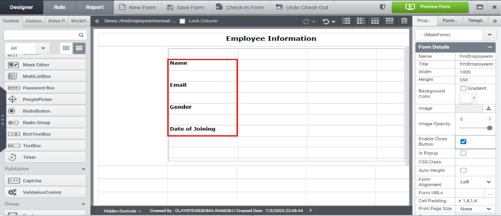
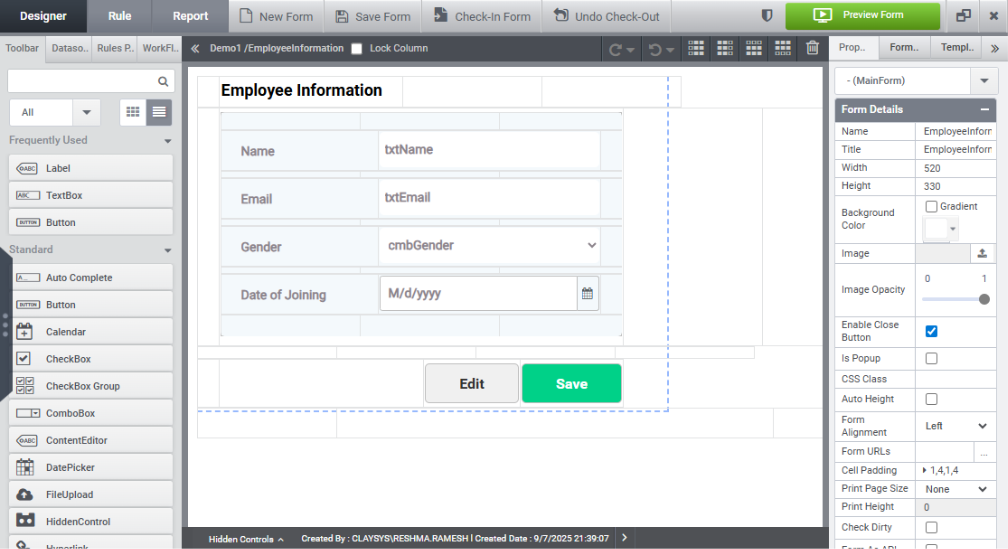
Create a form layout with the following components:
6.Data Source Configuration
Let’s explore how to configure a data source to insert, update data into and retrieve data (Select) from a SQL table.
a) Insert Command:
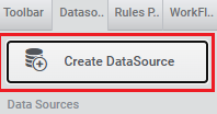
Step 1: Click on the “Create Datasource” option in the Datasource panel located on the left side, as illustrated in the image below.
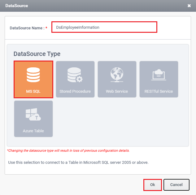
Step 2: A prompt for the Datasource Wizard will appear. Enter the desired datasource name, select MS SQL as the datasource type, and click OK, as shown in the image below.
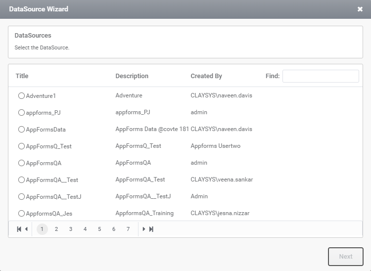
Step 3: The next page displays a list of datasources which are configured in the datasource settings. Select the required datasource, as illustrated in the image below.
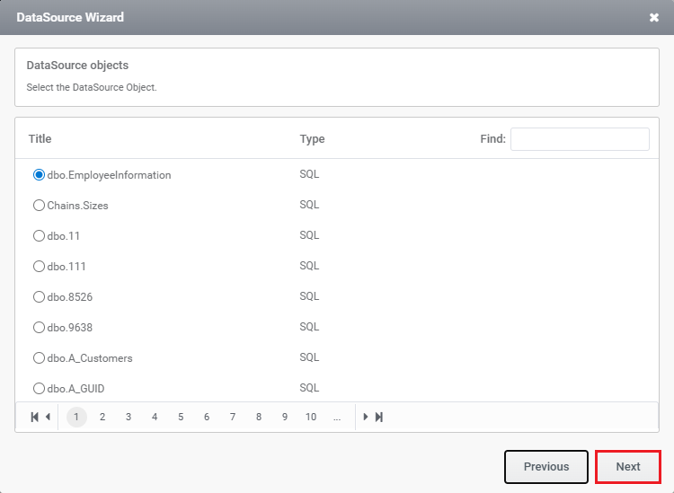
Step 4: Select the table where the data should be inserted, and click the Next button, as demonstrated in the image below.
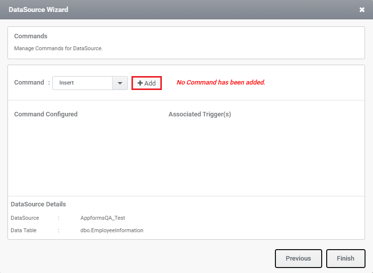
Step 5: To insert data into the table, select the Insert command and click the Add button, as illustrated in the image below.
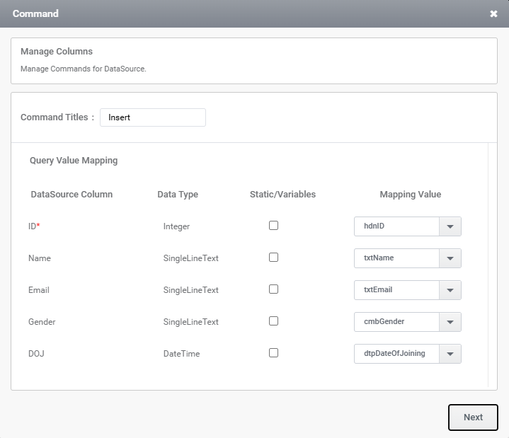
Step 6: The Manage Column Wizard displays a mapping between the columns in data source and the corresponding controls in the form.
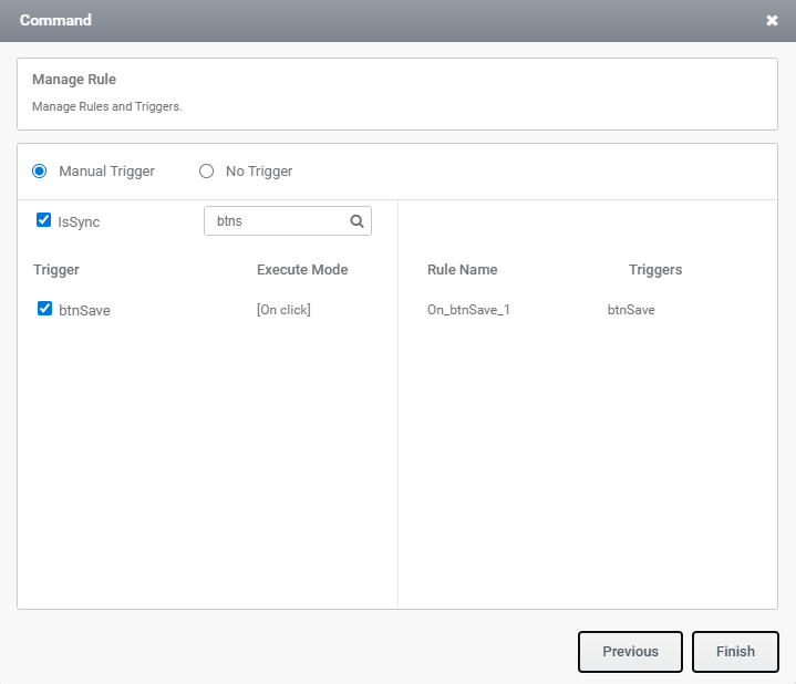
Step 7: In the next window, select the trigger as shown in the image below; the rules will be generated automatically.
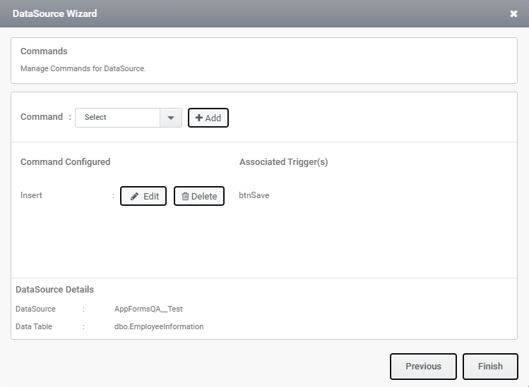
Step 8: Trigger has been created as shown in the image below
b) Update Command:
Step 1: To configure the update command, select ‘Update’ from the combo box and click the ‘Add’ button, as shown in the image below.
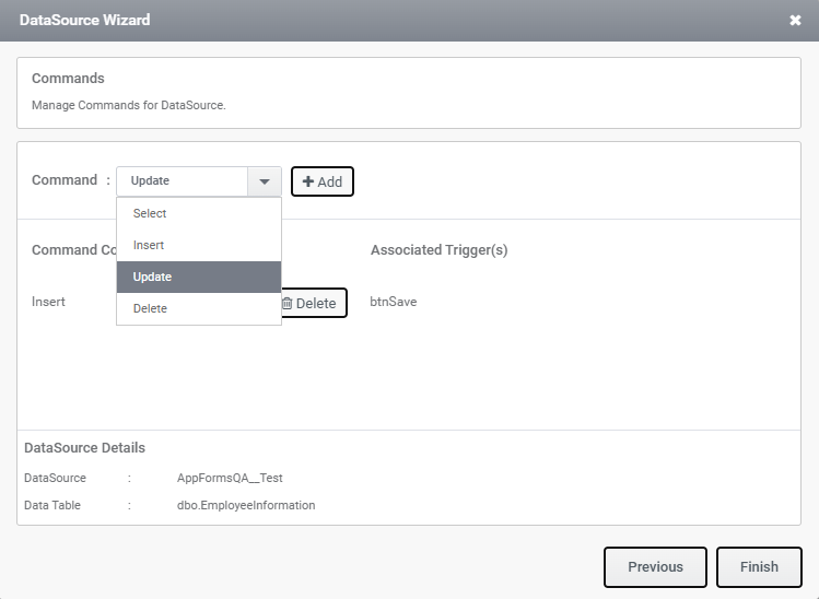
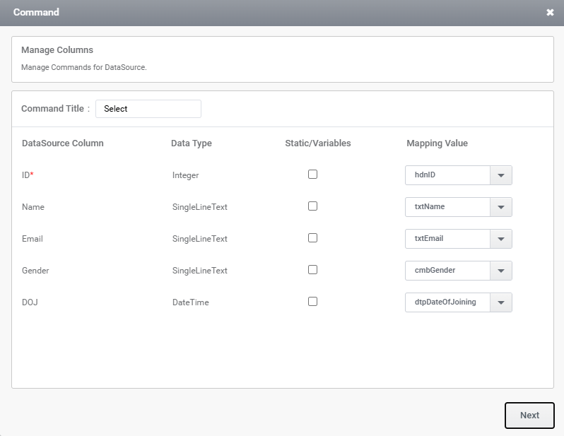
Step 2: Map the datasource columns to the relevant form controls as illustrated in the image.
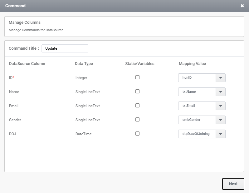
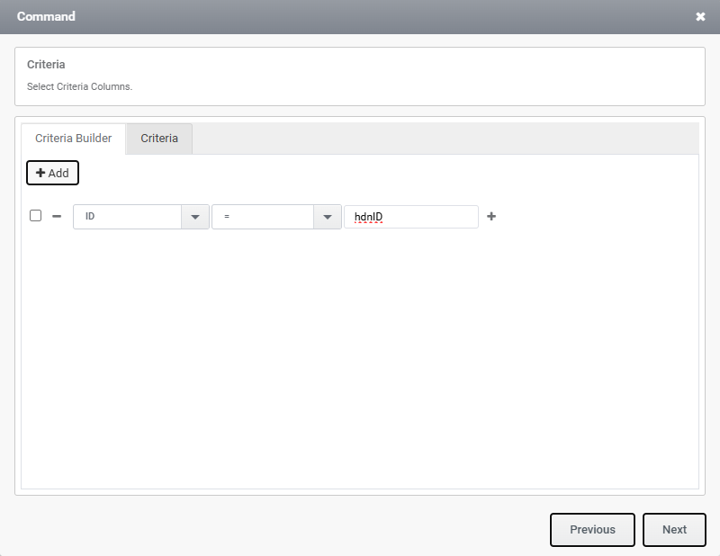
Step 3: Enter the criteria. In this case, set ‘ID’ equal to ‘hdnID’; the corresponding value will be populated in the field. Then, click ‘Next’.
Step 4: Select the trigger for the Update command, as shown in the image below. Once the trigger is selected, the rules for the Update command will be generated automatically.
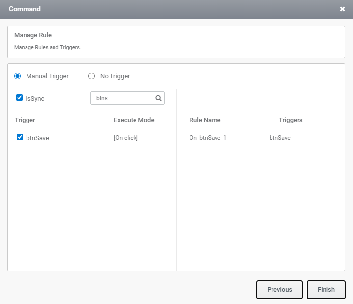
Step 5: Trigger has been created.
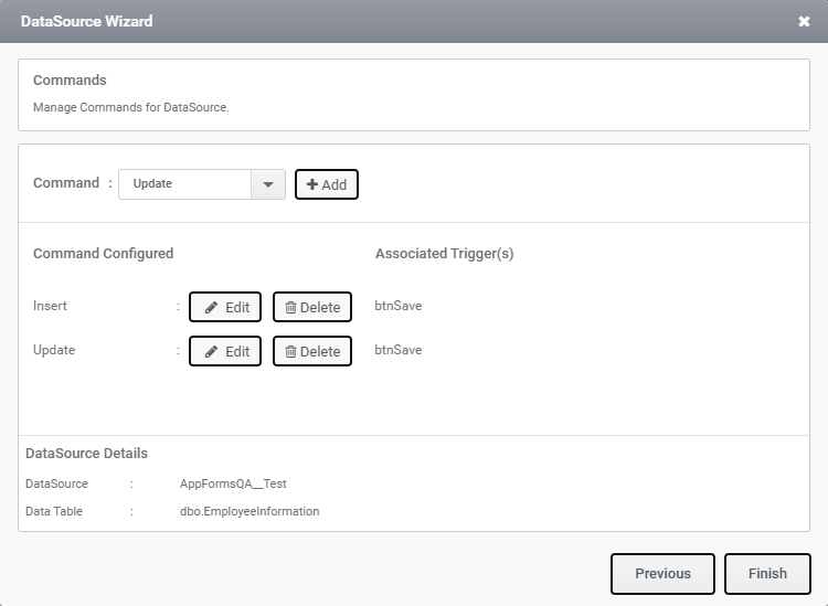
Note: Since the Insert and Update commands share the same trigger, they can be handled using rules.
c)Select Command:
Step 1: Click on Select operation as shown in the image below.
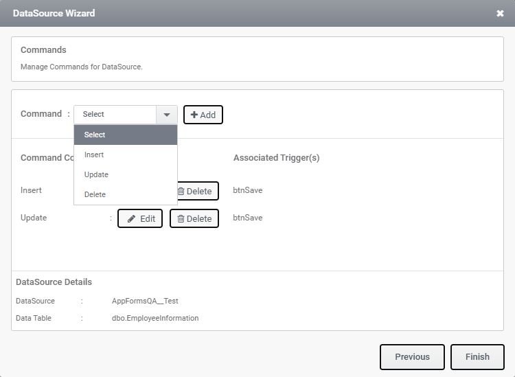
Step 2: Map the field to the relevant form controls.
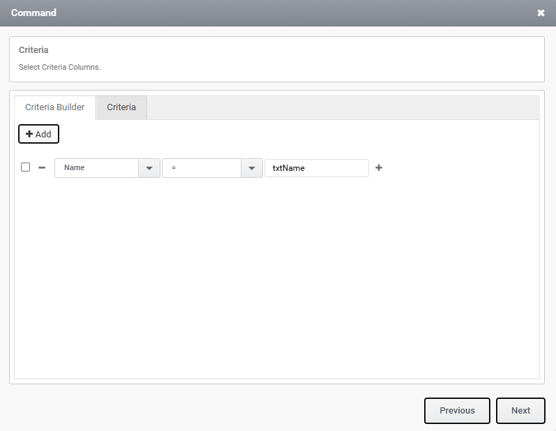
Step 3: Enter the criteria. In this case, set ‘Name’ equal to ‘txtName’; the corresponding value will be populated in the field. Then, click ‘Next’.
Step 4: Select the trigger for the Select command, as shown in the image below. Once the trigger is selected, the rules for the Select command will be generated automatically.
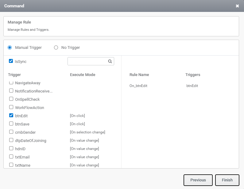
Step 5: Trigger has been created.
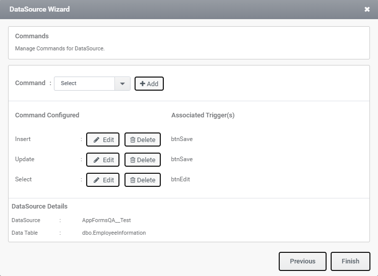
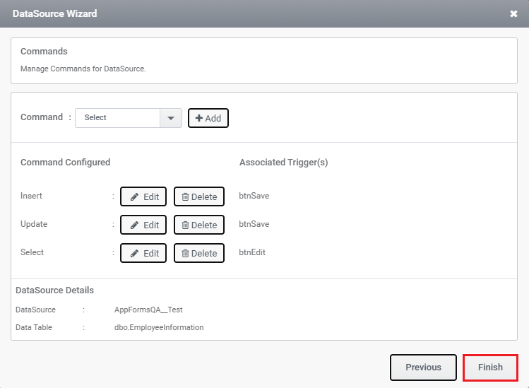
Step 6: Once all commands have been configured, click the Finish button as shown in the image below.
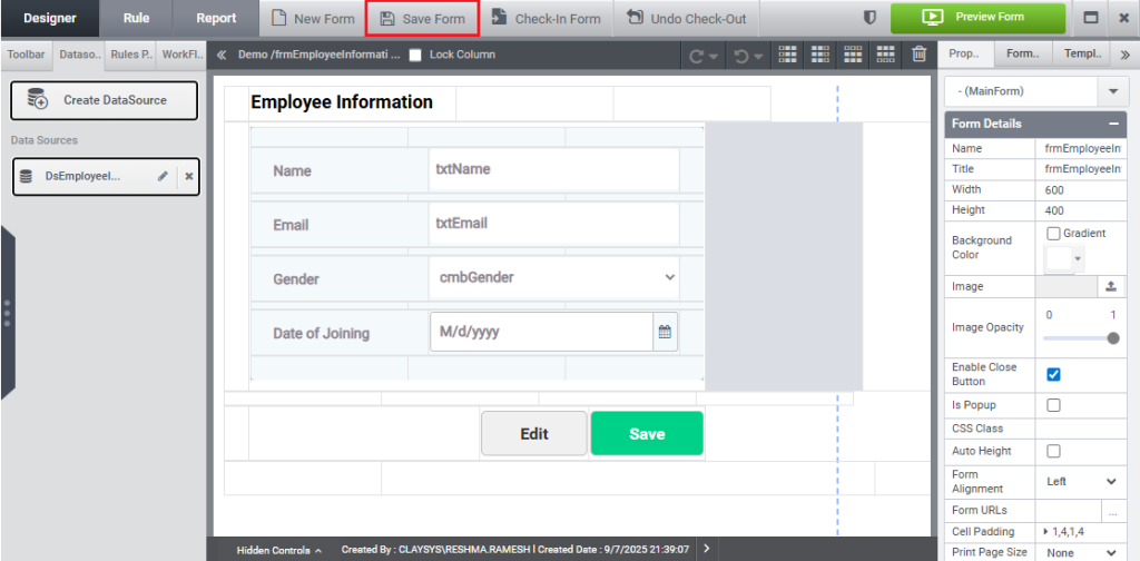
Press the “Save Form” button, as depicted in the image below.
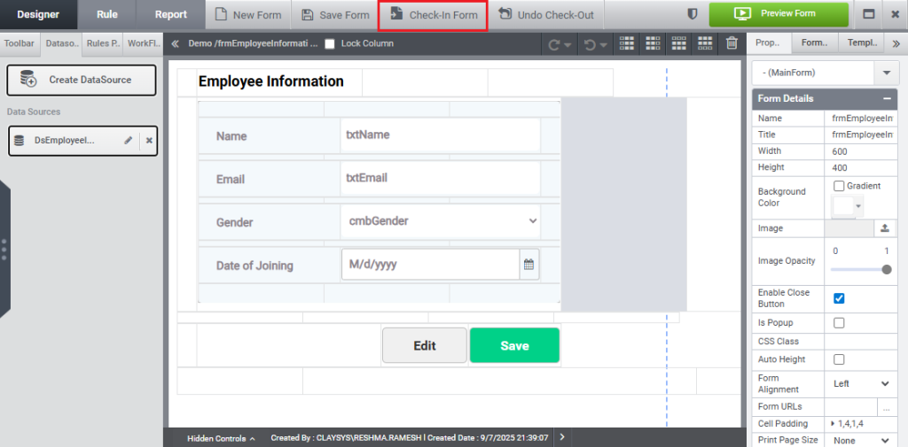
Press the “Check-In Form” button, as depicted in the image below.
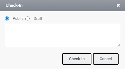
As illustrated in the image below, a dialog box will appear. Then, click the “Check-In” button.
The form check-in will be completed, as demonstrated in the image below.
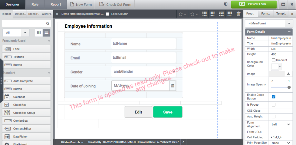
Click Preview button.
As illustrated in the image below, a pop-up window will appear.
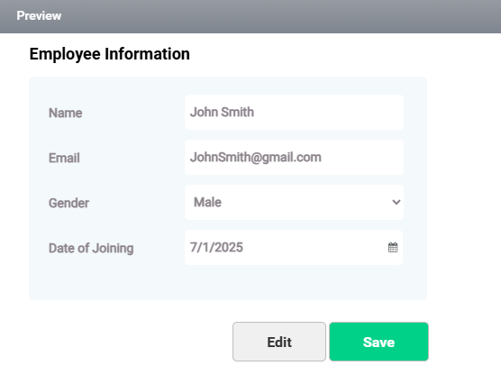
Please enter the details of employee and click Save button.
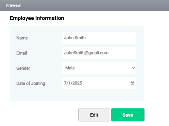
The value will be added to the table, as illustrated in the image below.

Add the form to the web part, enter the employee details, and then click the Save button, as illustrated in the image.
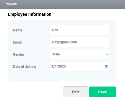
The employee details you entered have been added to the table, as shown in the image below.

Select the employee using the Name provided in the txtName textbox and click Edit button as shown in the image below.
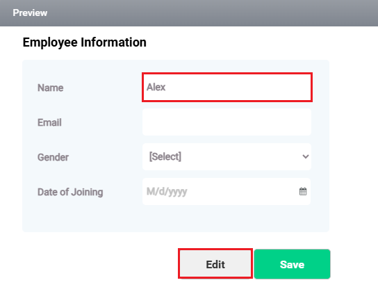
Enter the updated details as shown in the image below as Date of Joining has been changed and then click the “Save” button.
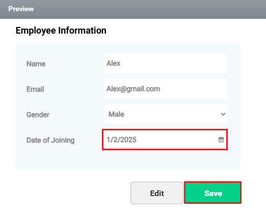
The information will be reflected in the table, as shown in the image below.

Shortcut to expand the designer view
For maximized workspace and improved focus in Designer, press Ctrl+Q to expand the interface to full screen, as shown in the image below.
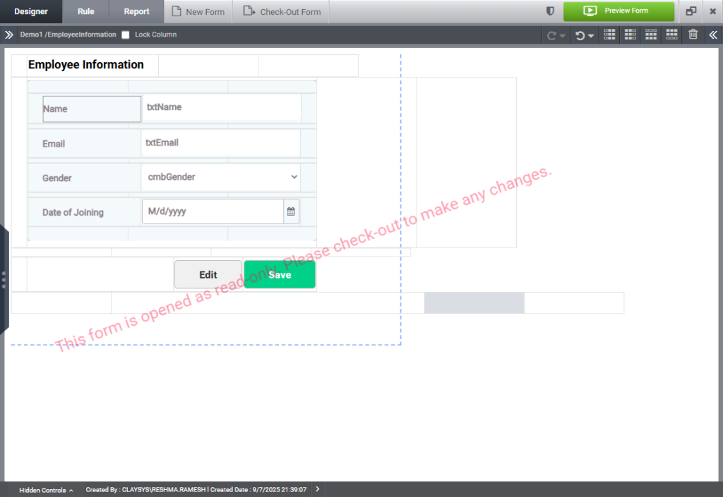
Press Ctrl+Q or the Esc key on your keyboard to return to the normal view.
Click the double left arrow icon in the top-left corner to expand the controls panel, as shown in the image below.
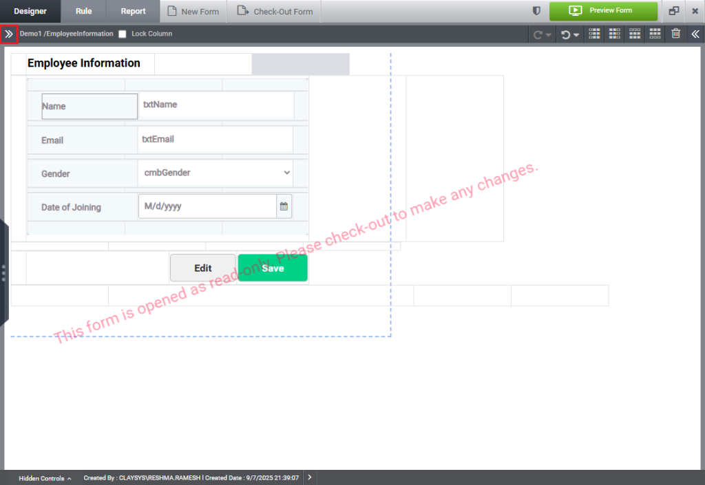
The control panel expands as shown in the image below.
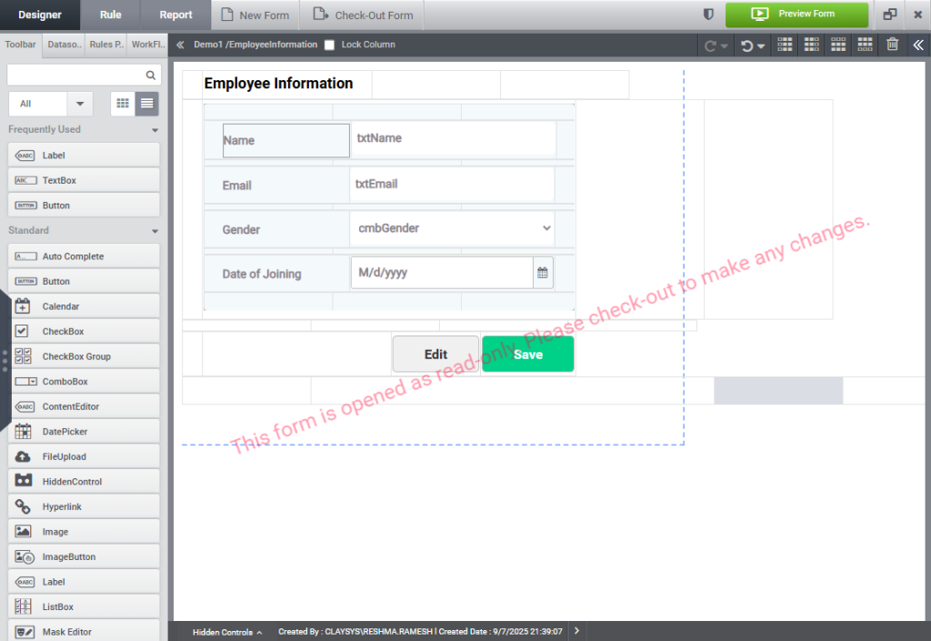
Click the double right arrow icon in the top-right corner to display the property panel, as shown in the image below.
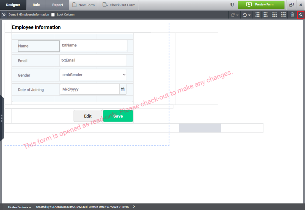
The Property Panel expands, as illustrated in the image below.
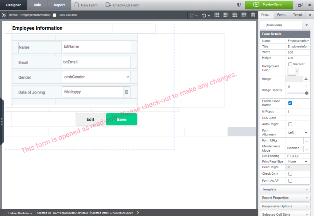
Frequently Used Controls:
We have an option to see the frequently used controls when a control is used two or more times. The frequently used section is available on the left side of the toolbar as shown in the image below.
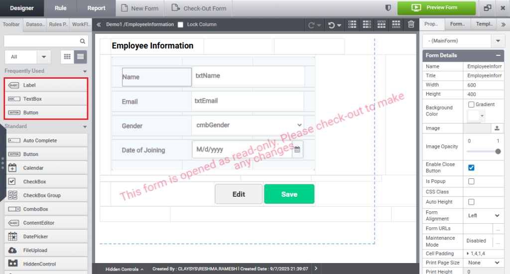
User can access the control by dragging dropping the control from the frequently used section to the designer.
+ icon in designer:
This feature in AppForms allows easy access to controls in the designer using the + icon.
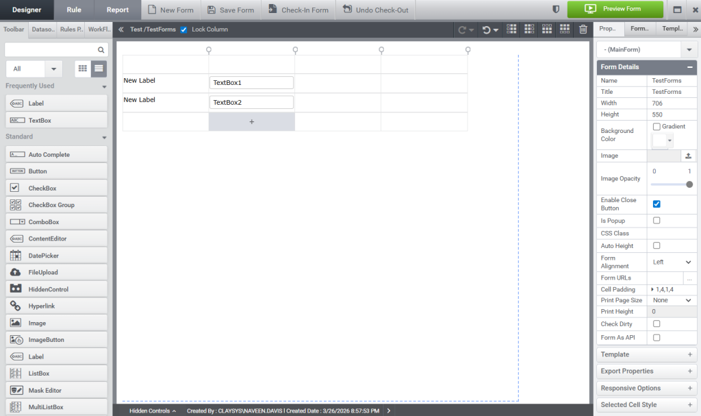
When you click on a blank cell in the form, a + symbol appears, as shown in the image below.
Clicking on + symbol, a drop down appears with list of all controls in toolbar and frequently used controls from the designer as shown in the image below.
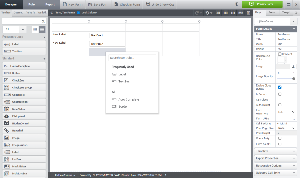
Clicking on a control from the drop down will automatically add it to the designer. Alternatively, you can search for a specific control by typing its name into the Search textbox.