Navigation Settings
Navigation Settings are used to customize the application’s landing page and navigation experience for end users. Using Navigation Settings, users can configure sites, startup forms, top and left menu navigation, and workflows within the application.
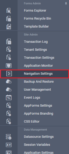
The Navigation Settings option is available in the left navigation panel, as shown in the image below.
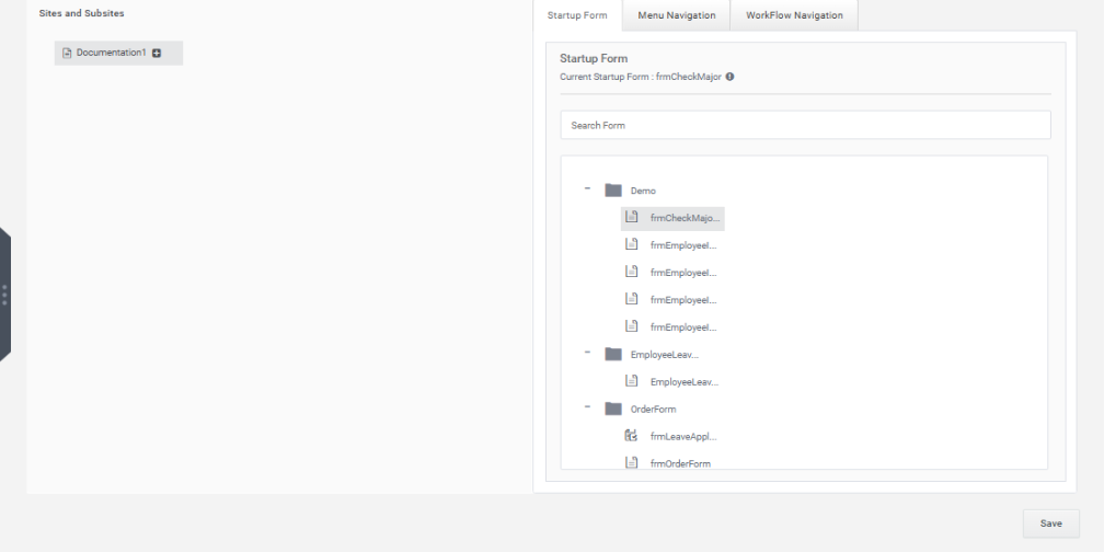
On clicking the Navigation Settings link, the Navigation Settings page opens, as illustrated below.
The Sites and Subsites section allows users to create and manage subsites under the main site.
To create a new subsite:
- Click the + icon next to the site.
- A new subsite will be created under the selected site, as shown in the image below.
Users can create any number of subsites. The URL for the selected site is displayed on the right side as the Selected Site URL. This URL can be used to access forms hosted within that subsite.
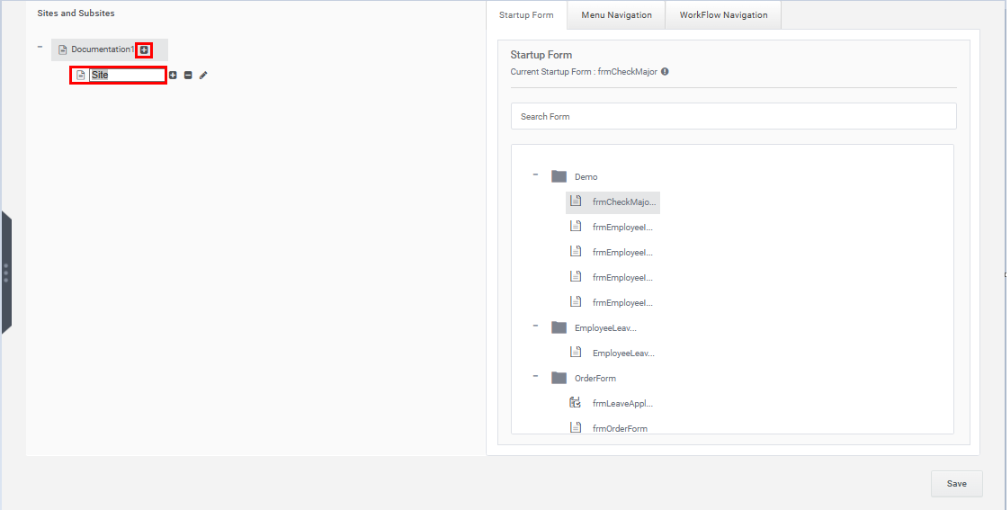
The site name can be edited directly in the textbox.
Each newly created site displays the following icons:
- Plus (+) Icon – Adds a subsite under the selected site.
- Minus (-) Icon – Deletes the selected site.
- Edit Icon – Allows editing the site name.
On the right side of the Navigation Settings page, the following tabs are available:
- StartUp Form
- Menu Navigation
- Workflow Navigation
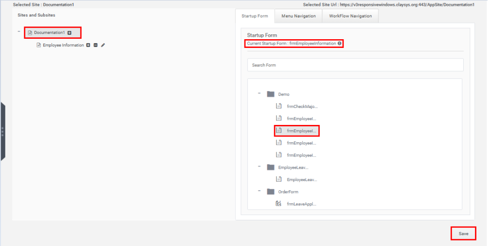
1. StartUp Form Tab
The form displayed when a site URL is accessed is called the Startup Form.
The StartUp Form tab displays all forms available within the current tenant, as shown below.
To configure a startup form:
- Select the required site from the left panel.
- Select the desired form from the forms list on the right.
- The selected form appears under Current StartUp Form.
Click the Save button to set the selected form as the startup form.
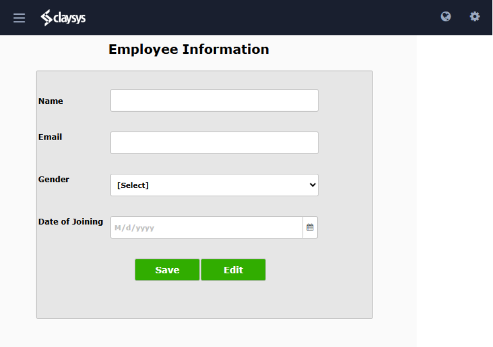
Once configured, opening the site’s home page automatically displays the selected startup form, as shown below.
2. Menu Navigation
The Menu Navigation tab allows users to configure forms that appear in the top and left navigation menus on the application’s home page.
The Menu Navigation tab contains the following sections:
- Top Navigation
- Left Navigation
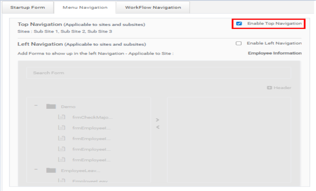
2.1 Top Navigation
By default, Top Navigation is disabled.
To enable Top Navigation:
- Check the Enable Top Navigation checkbox.
- Click the Save button.
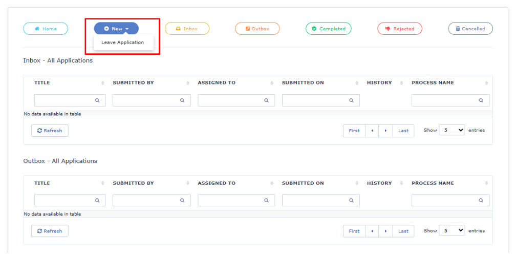
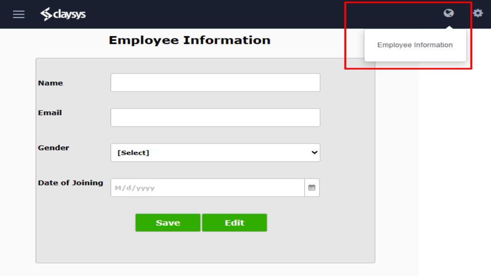
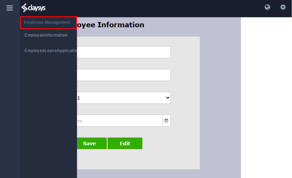
After enabling, the configured top navigation sites appear on the home page, as shown below. Clicking a site redirects the user to the configured form of that site.
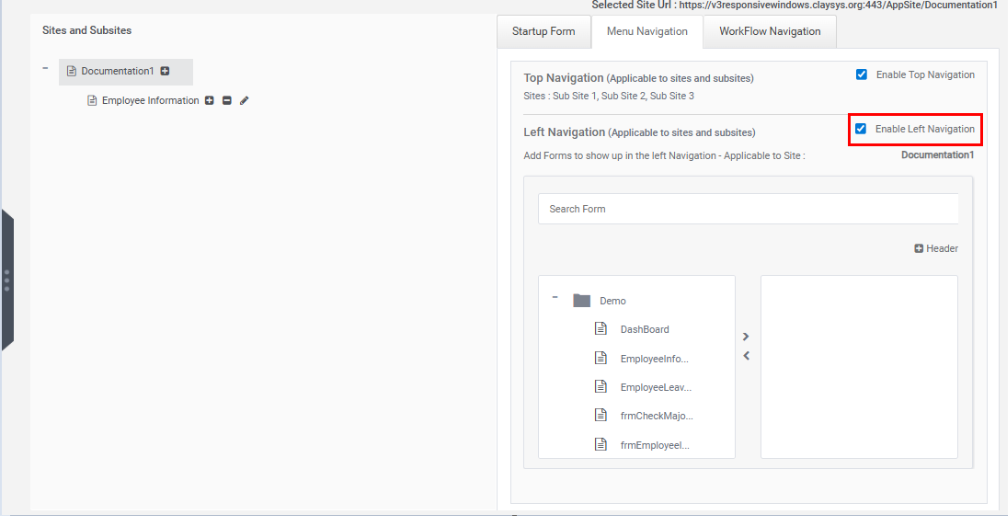
2.2 Left Navigation
Left Navigation allows users to add forms to the left-side navigation menu of the site.
By default, Left Navigation is disabled.
To enable Left Navigation:
- Check the Enable Left Navigation checkbox.
- Click the Save button.
Adding Forms to Left Navigation
To add forms to the left navigation menu:
- Select the required form from the left-side list.
- Click the Right Arrow button to move it to the selected forms list on the right.
To remove a form:
- Select the form from the right-side list.
- Click the Left Arrow button.
Users can add multiple forms to the navigation menu. A search box is also provided to quickly locate specific forms.
After configuring the forms, click the Save button.
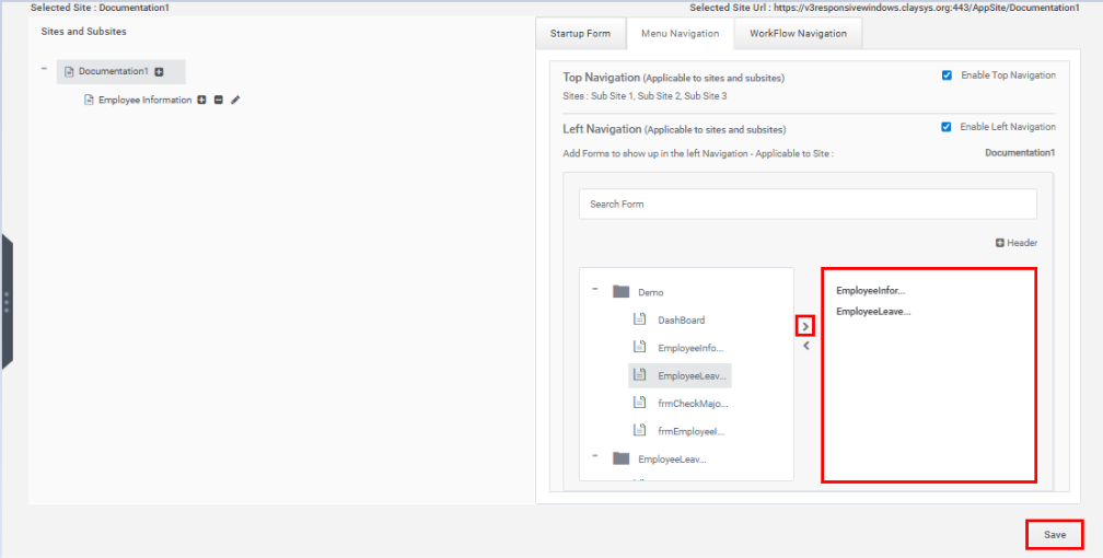
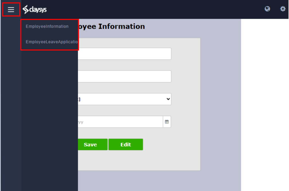
The configured left navigation appears as shown below.
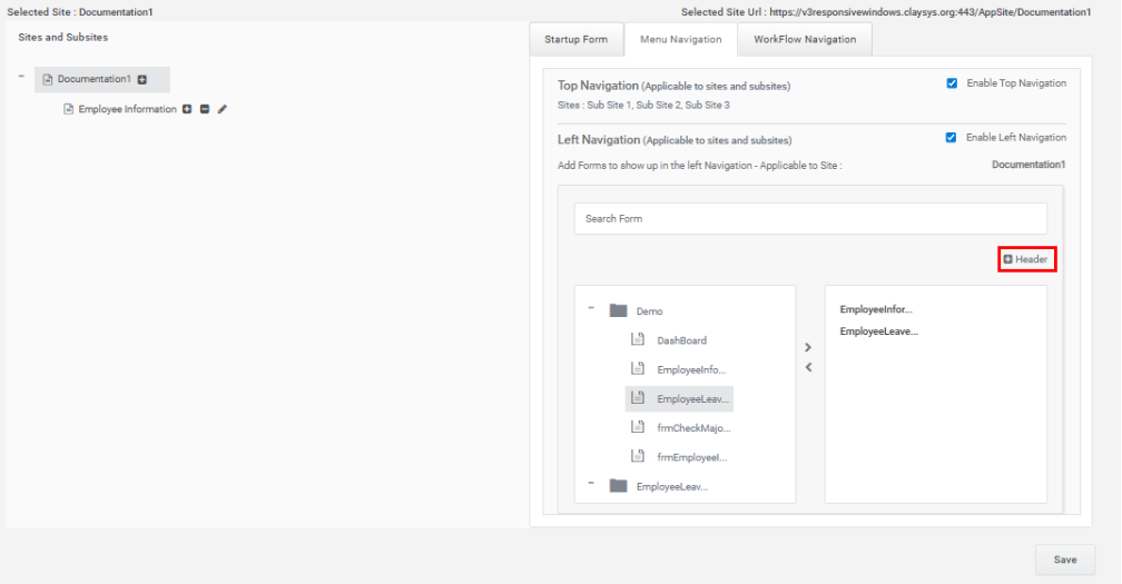
Header Configuration in Left Navigation
The Left Navigation section also supports adding headers to organize navigation items.
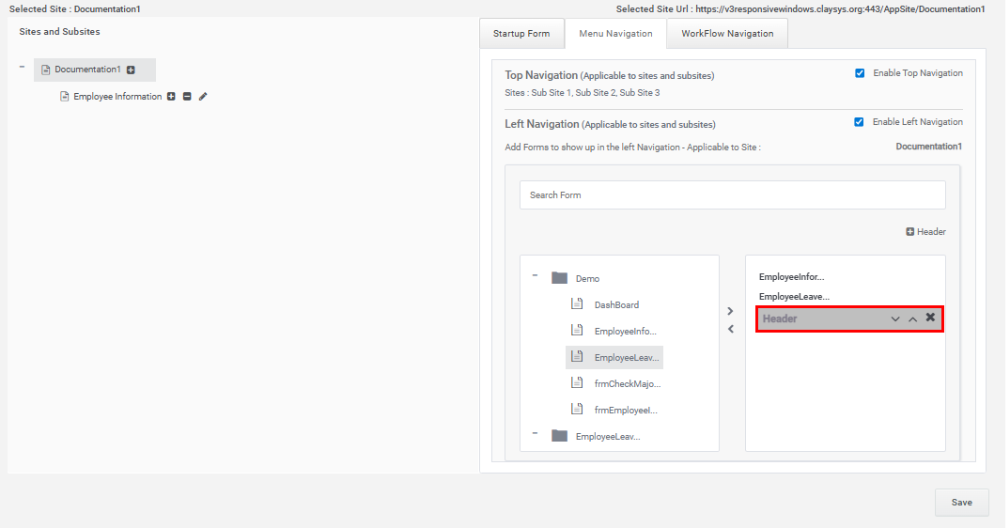
Adding a Header
- Click the Header option.
- The header item appears in the right-side list.
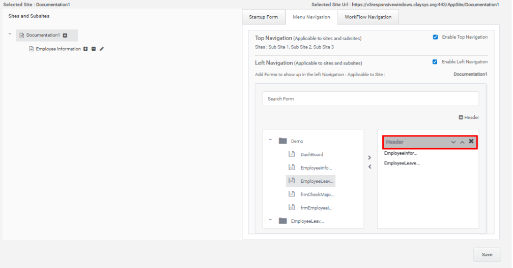
The header can be:
- Moved up or down using the arrow buttons.
- Deleted using the cross icon.
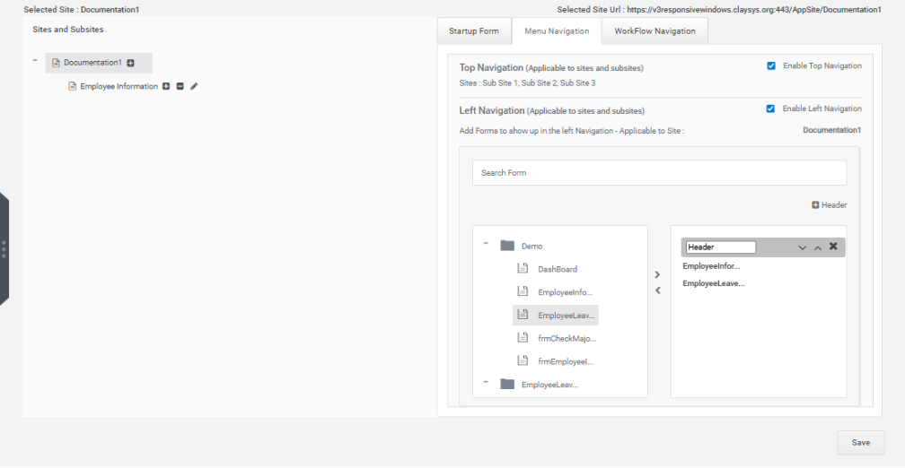
Editing a Header
To edit a header:
- Double-click the header item.
- The header text becomes editable.
- Enter the required header name.
- Click the Save button.
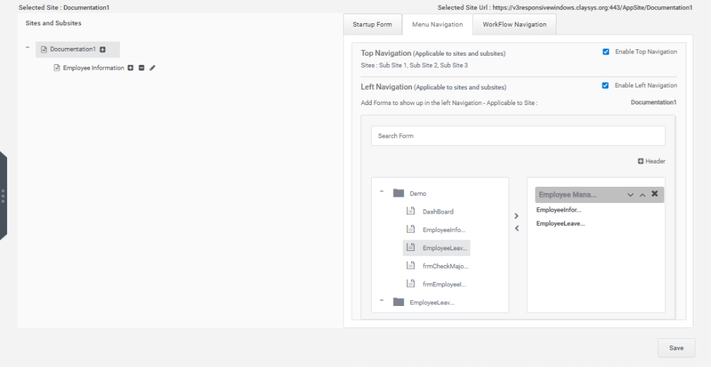
The configured header is displayed in the left navigation menu, as illustrated below.
3. Workflow Navigation
The Workflow Navigation tab displays all workflows available within the tenant.
To configure workflow navigation:
- Select the required workflow.
- Click the Save button.
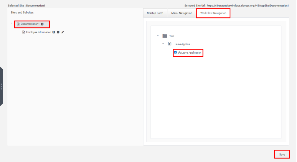
The selected workflow is then added to the web part, as shown below.