Dynamic Grid
The Dynamic Grid control enables users to display a data-entry grid where each column can host different types of controls (eg: TextBox, ComboBox). It supports standard data operations such as insertion, selection, update, and deletion using a configured SQL data source.
Dynamic Grid Operations
1. Insertion
- Configure a dynamic grid with the required types of controls as shown in the image with SQL data source.
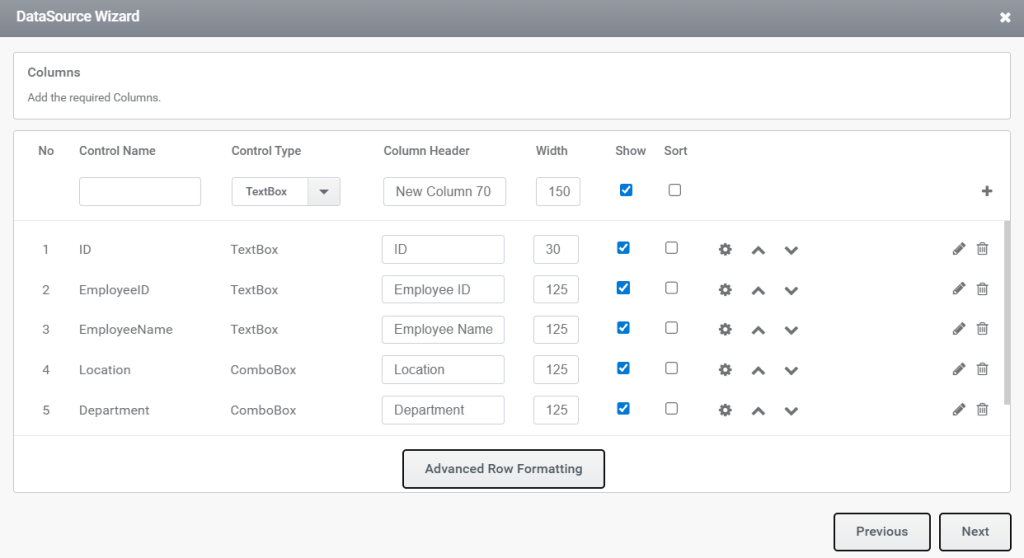
Figure 1.1 Insertion control configuration
- An example of the insert command configuration is provided below.
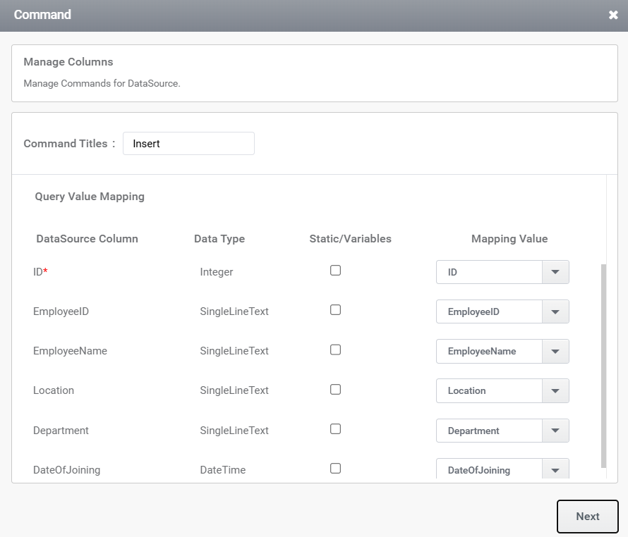
Figure 1.2 Insertion control mapping with data source
- Assign the trigger to this Insert Command using the ‘btnSelectDetails’ button, as shown in the image.
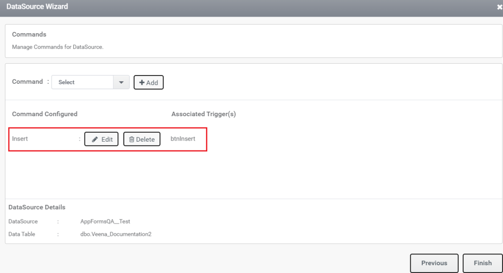
Figure 1.3 Insertion trigger
- The rule to insert details into the SQL table will look like the image below.
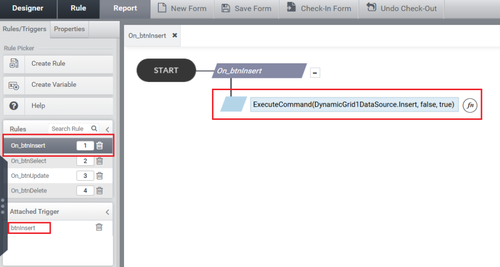
Figure 1.4 Insertion rule
- Take the preview , and insert some values into the DG and click the insert button as shown in the image.
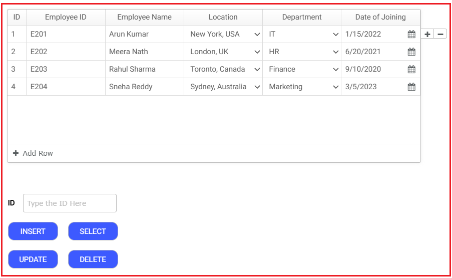
Figure 1.5 Insertion preview
- Notice that the values are inserted into the SQL data source which you have configured.
2. Selection
- In the same dynamic grid, configure a Select command. The control configuration will appear as shown in the image below. Here, the ID field is used in the criteria to fetch all values that are not equal to “0”.
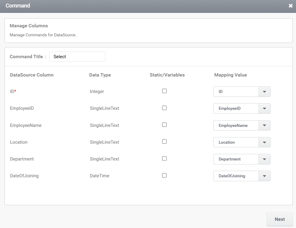
Figure 2.1 Selection control mapping
- Assign this rule to a button trigger named “btnSelectDetails”. The command configuration is shown in the image below.
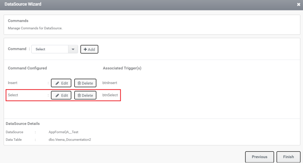
Figure 2.2 Selection trigger
- The corresponding rule for selecting values is shown below.
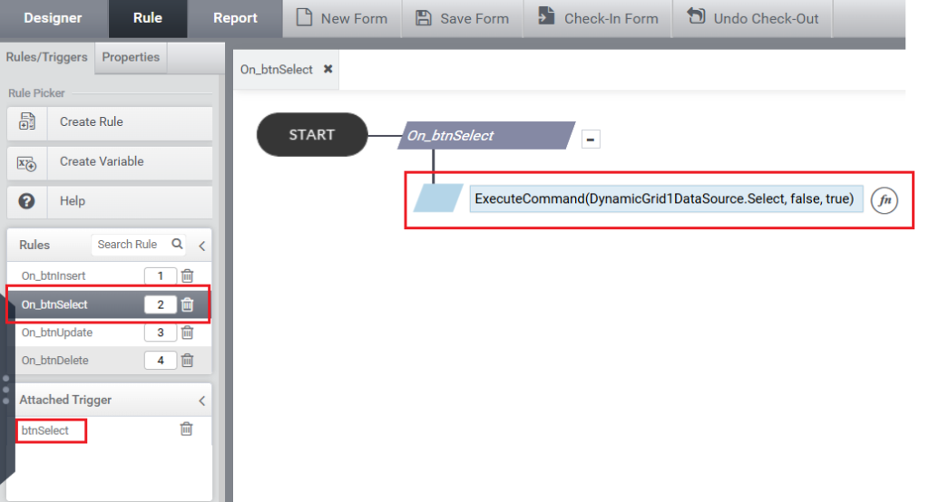
Figure 2.3 Selection rule
- Take the preview and click the button ‘Select Details’. Notice that the values are populated to the dynamic grid from the SQL data source.
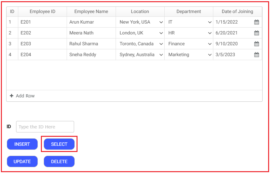
Figure 2.4 Selection Preview
3. Update
- The dynamic grid will update whenever there is a change in row values. The control configuration for this is shown below, where a field in the grid is used as the criteria for the update.
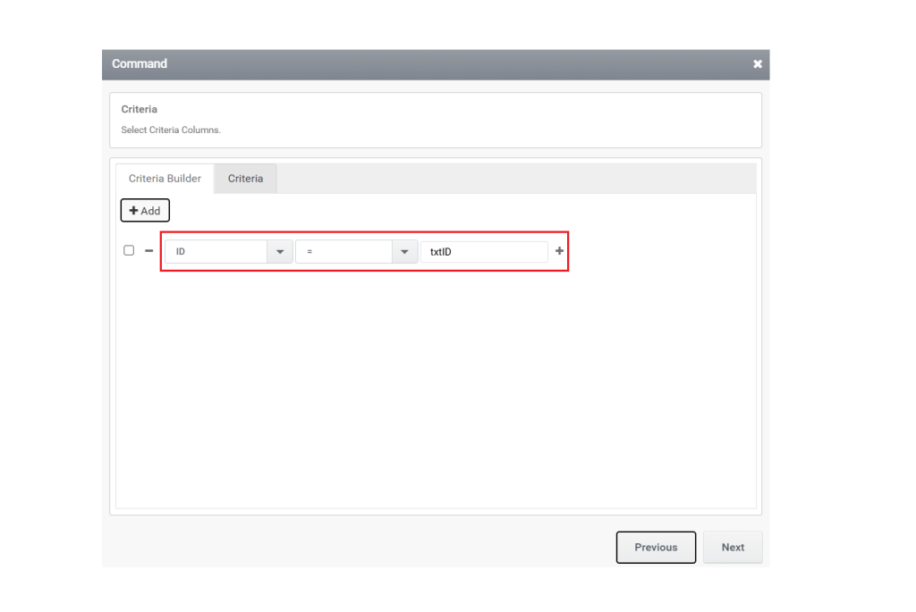
Figure 3.1 Update Control Mapping
- Associate this rule with the ‘btnUpdateDetails’ button, as illustrated below.
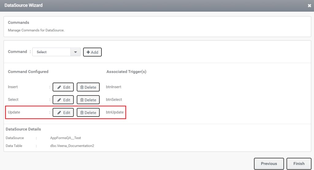
Figure 3.2 Updation trigger
- Below is the rule used to update values in the dynamic grid.
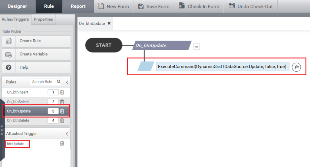
Figure 3.3 Updation Rule
- Now take the preview and edit some values in the rows of the dynamic grid and click the ‘Update Details’ button to update the values to the SQL data source as below. Here, the highlighted fields in the dynamic grid are edited. On clicking, the update button notices that the values are updated to the SQL data source.
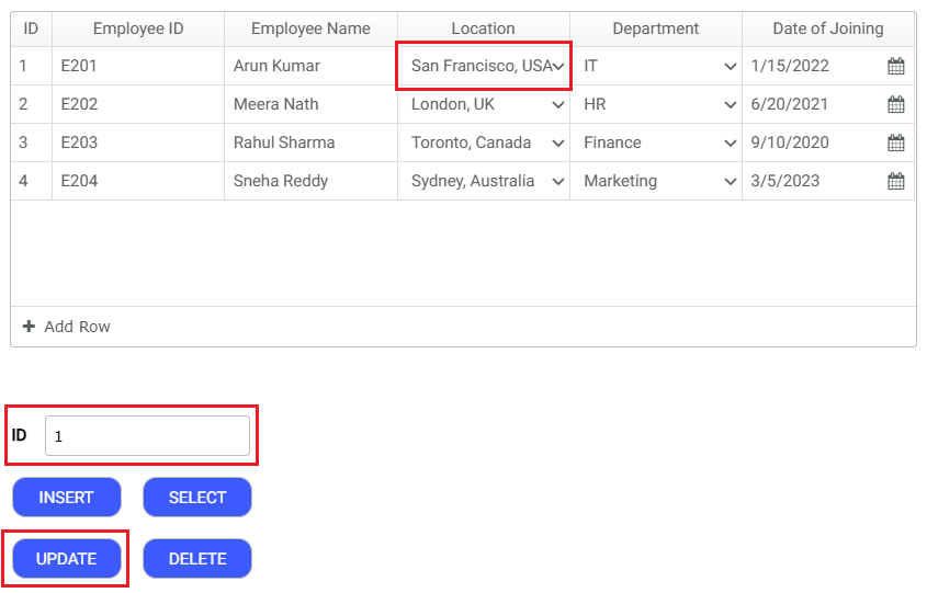
Figure 3.4 Updation Preview
4. Delete
Records in the Dynamic Grid can be removed by configuring a Delete Command and adding it to the button trigger.
- The ID field in the Dynamic Grid is used as the key to identify and delete the corresponding record from the SQL data source.
- Add a button (eg: btnDelete) and configure it as the trigger for the delete operation.
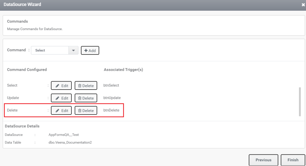
Figure 4.1 Delete trigger
- Define the delete query and map it appropriately to the data source.
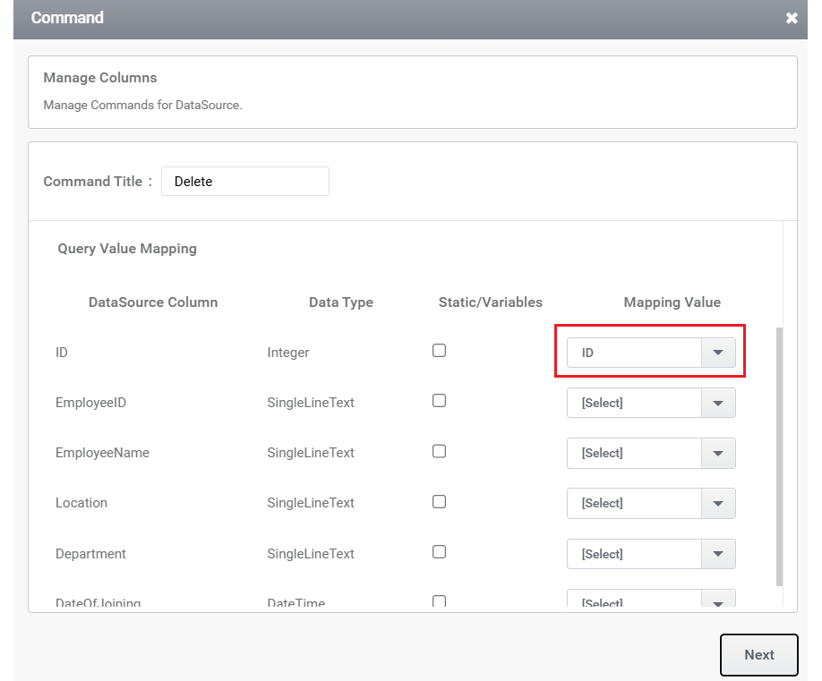
Figure 4.2 Delete Query
- Create a rule that executes the delete command when the button is clicked.
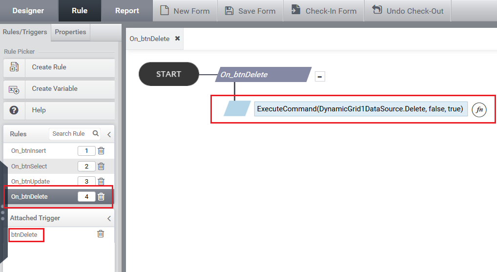
Figure 4.3 Delete Rule
- Preview the application, select the desired row(s) using the Delete (minus) icon in the Dynamic Grid quick action buttons, and then click the Delete button (btnDelete) to confirm the deletion.
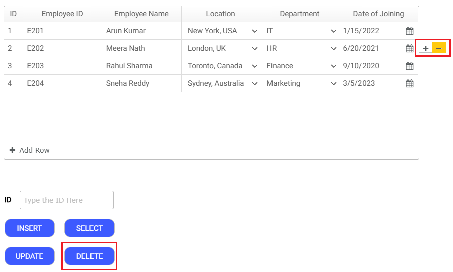
Figure 4.4 Quick Action Button – Delete
- The IDs of the rows removed using the Delete Quick Action icon are stored internally, and when the Delete button is clicked, the removed rows from the Dynamic Grid are deleted from the SQL data source.
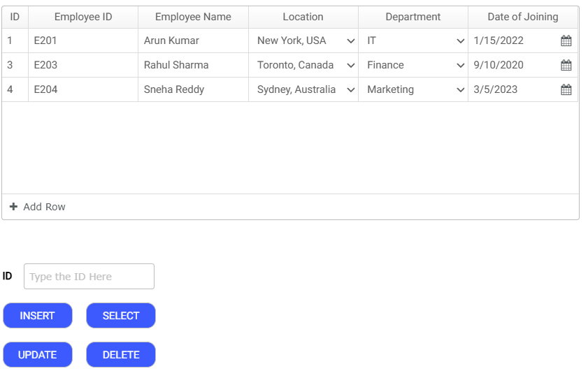
Figure 4.5 After Delete Operation
Composite Column in Dynamic Grid
A Composite Column in a Dynamic Grid is a configurable column that dynamically transforms into an interactive control (such as a TextBox, ComboBox etc) based on conditions defined in the configuration.
Use Cases:
- When Column B needs to behave as a control depending on the value selected in Column A.
- To implement a cascading dropdown, where the ComboBox in Column B populates its values based on the selection in Column A.
Steps to Configure:
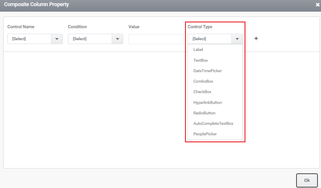
- Set the column’s data type to Composite Column.
- Open the Control Properties settings for the column.
- In the Composite Column Property popup, define the required condition.
- Based on the specified condition, the column can render as any control available under Control Type.
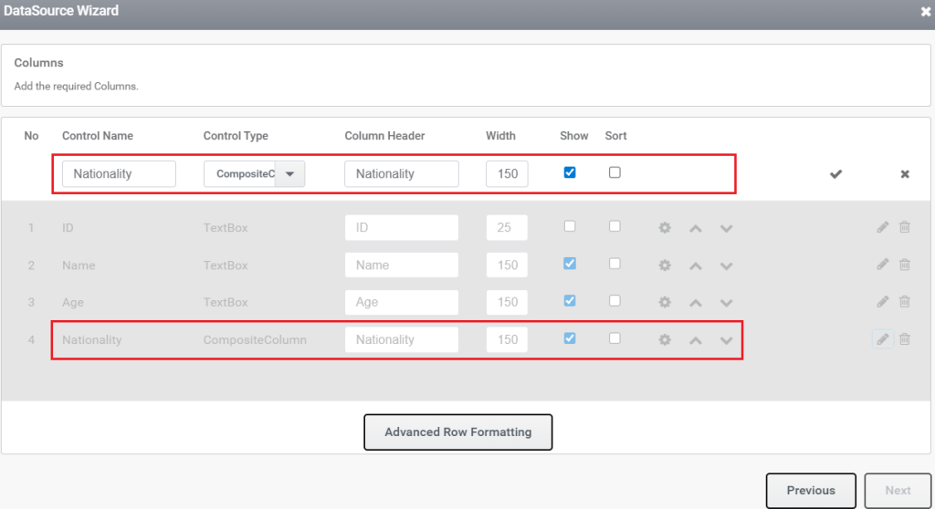
The “Control Name” shown in the snippet below lists the DG column controls. “Condition” refers to operators such as equal to, less than, and so on, while “Value” should be specified according to the selected condition. The available control types that can be used within a composite column are illustrated under “Control Type” in the snippet below.
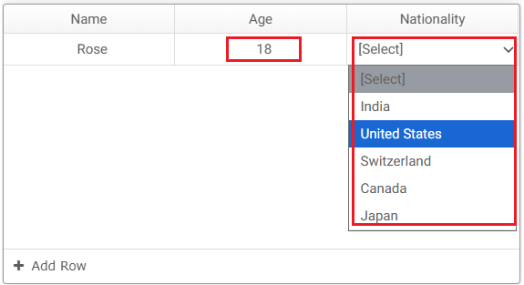
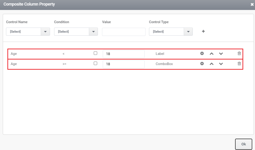
The condition in the snippet below indicates that when the value in the DG column “Age” is less than 18, the composite column is rendered as a Label control. When the value is greater than or equal to 18, the composite column is rendered as a ComboBox.
If the control used in the condition is a ComboBox, and the composite column also switches to a ComboBox with its values populated based on the selection made in the first ComboBox, this behavior is referred to as a cascading dropdown.
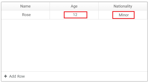
The snippet below shows that the value provided on rendering is 12 to control “Age”, which is less than 18. Therefore, the control is rendered as a Label. The default value specified in the Label control’s properties is displayed during rendering.
The snippet below shows that the value provided is 18. Therefore, the control is rendered as a ComboBox. If the control is a collection control, such as an Autocomplete Textbox or ComboBox, its data source must be configured through the Datasource settings.