Border Control
Border
Border Control is used to group a set of controls or to give an outer border to the entire form to make the form more presentable. User can set several properties like border color, theme, and thickness to the Border control to give a professional and modern look to the form.
Working with a Border Control
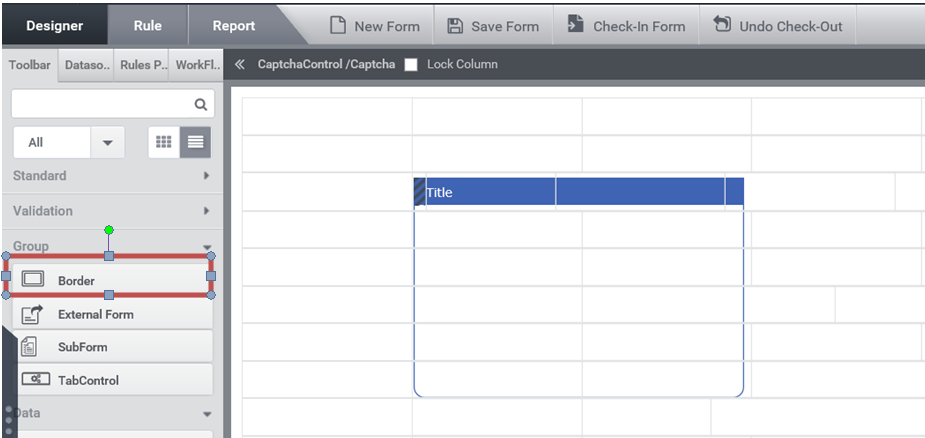
Step 1:– Create a form having ‘Border Control‘, as shown below:-
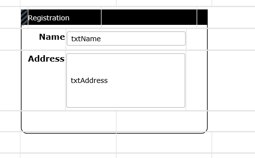
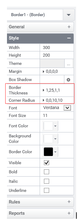
Step 2:– Drag the controls inside the Border, the form designed will look like Figure 2. In Properties Tab, User can set width, height, theme, thickness, border color etc (Figure 3).
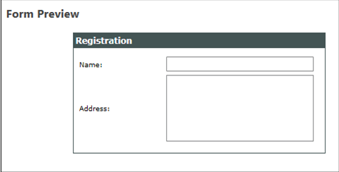
A preview of a form having Border control is shown in Figure 4,
Control Name: Border
Group: Grouping Control
| General | |||
| S.no | Property Name | Data Type | Description |
| 1 | Text | String | Sets the text associated with the control. |
| Style | |||
| S.no | Property Name | Data Type | Description |
| 2 | Width | String | Sets the suggested width to the control. |
| 3 | Height | String | Sets the suggested height to the control. |
| 4 | Theme | Sets the theme to the Border control. | |
| 5 | Margin | String | Sets the edge or outer margin to the control. |
| 6 | Border Thickness | String | Sets the suggested thickness to the Border control. |
| 7 | Corner Radius | String | Sets the radius to the Border control. |
| 8 | Font | String | Sets the font Style to the Title of Border Control. |
| 9 | Font Size | String | Sets the font size to the Title of Border Control. |
| 10 | Font Color | String | Sets a brush that describes the Text color of the Title of control. |
| 11 | Background Color | String | Sets a brush that describes the Background color. |
| 12 | Border Color | String | Sets a brush that describes the Background color to the Border. |
| 13 | Visible | Boolean | Sets the visibility of the control while rendering. |
| 14 | Bold | Boolean | To make the title of control Bold. |
| 15 | Italic | Boolean | Italicize the title of control. |
| 16 | Underline | Boolean | Underline the title of control. |
| 17 | Column Span | String | To merge the number of column specified. |
| Rules | |||
| S.no | Property Name | Data Type | Description |
| 18 | Rules | After selecting the control, If user clicks Rules tab it will be expanded and displays a Rules property. Create Rule can be selected from a drop down list. On clicking the Create Rule link button will navigate the user to the Rules Engine. The same control will be added as a trigger by default to execute the Rule. |
| Reports | |||
| S.no | Property Name | Data Type | Description |
| 19 | Control Report | Control Report will redirect to Reports tab that will display all the configurations, rules and data sources details associated to the selected control. |