Table View
The TableView control is used to display data in a tabular format within the form. It supports connecting to data sources like SQL tables or views and allows features like pagination for navigating large datasets. This control helps present data in a structured, interactive way, with options to dynamically set page size and move between pages.
Properties
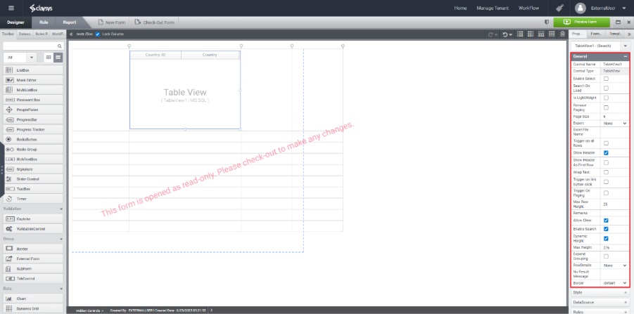
General Properties:
You can access the General Properties of TableView control through the panel located on the right side of the screen.
- Control Name – Specifies the identifier for the control, which will be used during its configuration.
- Control Type– Identify the type of control.
- Enable Select – Allows users to select individual rows within the TableView control.
- Search On Load– Enable this option to fill the TableView control on load.
- Is LightWeight– The “Lightweight” property typically refers to a mode of operation that optimizes performance by reducing the amount of data loaded and rendered at once. When the Lightweight property is enabled, the TableView may load only a subset of data, which can enhance the speed and responsiveness of the application, especially when dealing with large datasets.
- Remove Paging – Use this property to disable the paging functionality.
- Page Size– Sets the number of records to display on a page in a TableView control.
- Export – Defines the file format for exporting the data.
- Excel File Name – Specifies the name to be used for the exported Excel file.
- Export Mode- If the export format is set to .xlsx, an additional option called Export Mode will appear. Selecting Formatted in Export Mode will retain the header styles in the exported Excel file.
- Trigger on All Rows – Enables trigger execution for each row in the Table View control.
- Show Header – Enables the display of the header section in the Table View control.
- Show Header As First Row – Treats the first row of the Table View control as the header.
- Wrap Text – Enables text wrapping within the control to ensure content is fully visible.
- Trigger on Link Button Click – Executes the configured rule when the link button is clicked.
- Trigger on Paging – Executes the configured rule whenever a paging action occurs.
- Max Row Height – Specifies the maximum height allowed for each row in the TableView control.
- Remarks – Provide any additional comments or notes in this field.
- Allow Clear – Enables the functionality to clear or remove all rows from the control.
- Enable Search – Allows the FillData function to populate the control with data.
- Dynamic Height – Automatically adjusts the height of the control during rendering based on its content.
- Expand Grouping – Enable this option to automatically expand grouped rows or sections when the control is rendered.
- Row Details – Choose the mode in which detailed information for each row should be displayed.
- Include Blank Row – Enable this option to include a blank row in row details.
- No Result Message – Specify the custom message to display when the TableView control has no data to show.
- Border– Sets border style.
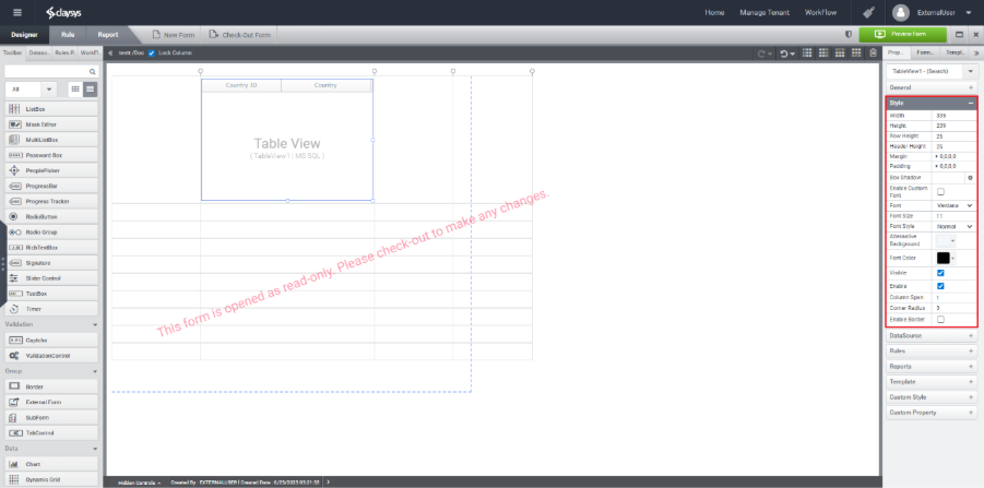
Style Properties:
You can access the Style Properties from the panel on the right side.
- Width – Defines the recommended width for the control.
- Height – Defines the recommended height for the control.
- Row Height – Sets the height for each row in the TableView.
- Header Height – Sets the height of the header section of the control.
- Margin – Specifies the outer spacing around the control.
- Padding – Sets the internal spacing (left, top, right, bottom) within the control.
- Box Shadow – Applies a shadow effect with configurable horizontal/vertical offset, blur radius, and color.
- Enable Custom Font – Enables the use of a custom font family.
- Font – Specifies the font family to be used for the control.
- Font Size – Sets the size of the text.
- Font Style – Defines the text style (e.g., bold, italic) of the control.
- Alternative Background – Sets an alternate background color for the control.
- Font Color – Specifies the color of the text.
- Visible – Toggles the visibility of the control (Show/Hide).
- Enable – Toggles whether the control is active or disabled.
- Column Span – Merges a specified number of columns into a single cell.
- Column Radius – Sets the corner radius to round the edges of the
- Enable Border – Use this option to add a border around the control.
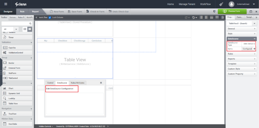
DS Configuration
MS SQL
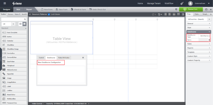
Step 1: Open the Toolbar, go to the Data section, and drag the TableView control into the designer workspace.
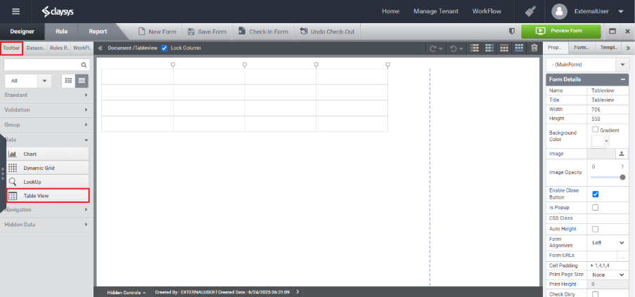
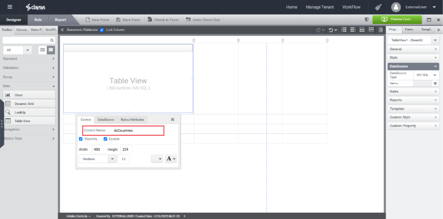
Step 2: Assign a name to the TableView control, such as tblCountries.
Step 3:
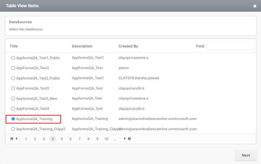
Select an available Data Source from the right-side Property Panel or click the DataSource tab in the Quick Menu of the TableView control.
Step 4:
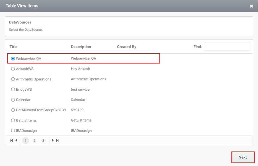
Configure the TableView control to use MS SQL as the data source by selecting the appropriate database name from the list available in the DataSource tab.
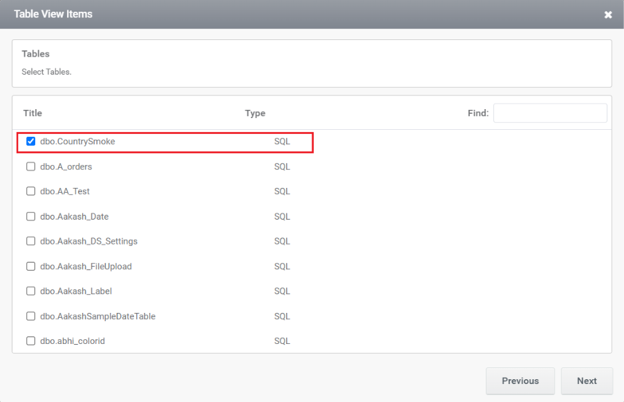
Step 5: After selecting the database, choose the required table’s name from the list provided.
Step 6:
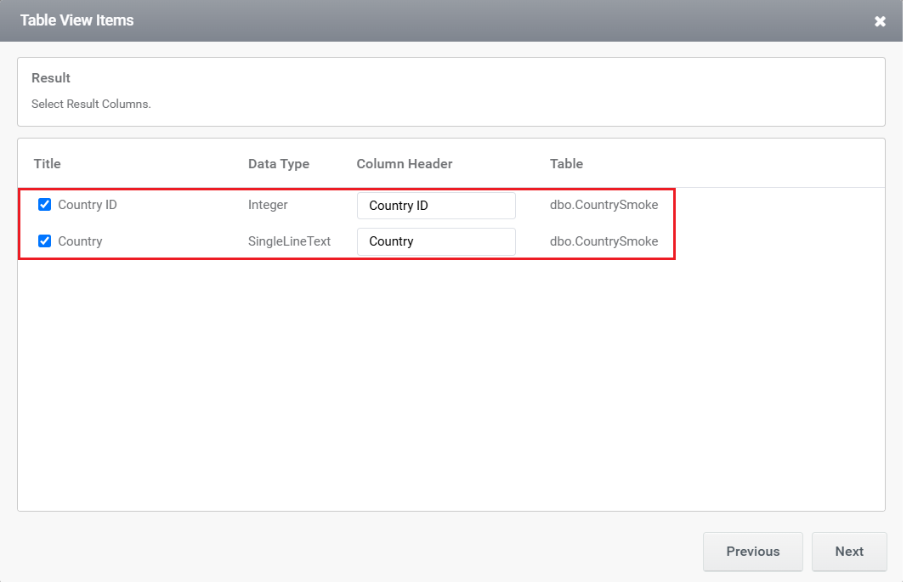
Select the required field names from the chosen table to display in the TableView. You can choose multiple fields based on the data you want to present.
Step 7:
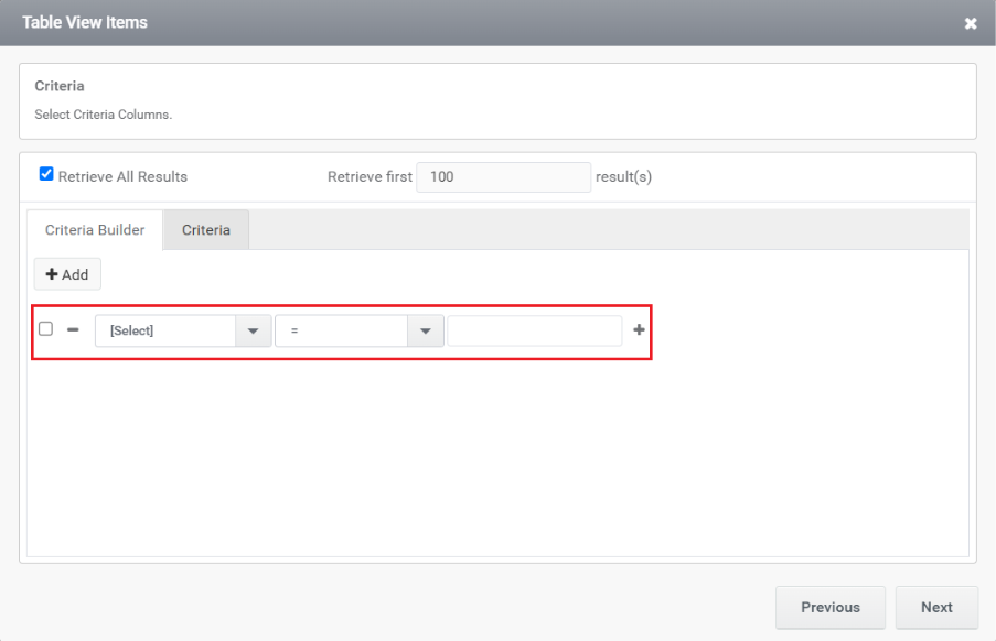
Add any necessary filter criteria to limit the data displayed in the TableView. This helps in showing only the relevant records based on specific conditions.
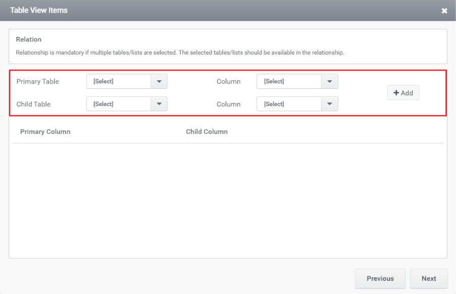
Step 8:
If more than one table is selected, define the relationship between the tables using appropriate join conditions. This ensures accurate data mapping and retrieval across related tables.
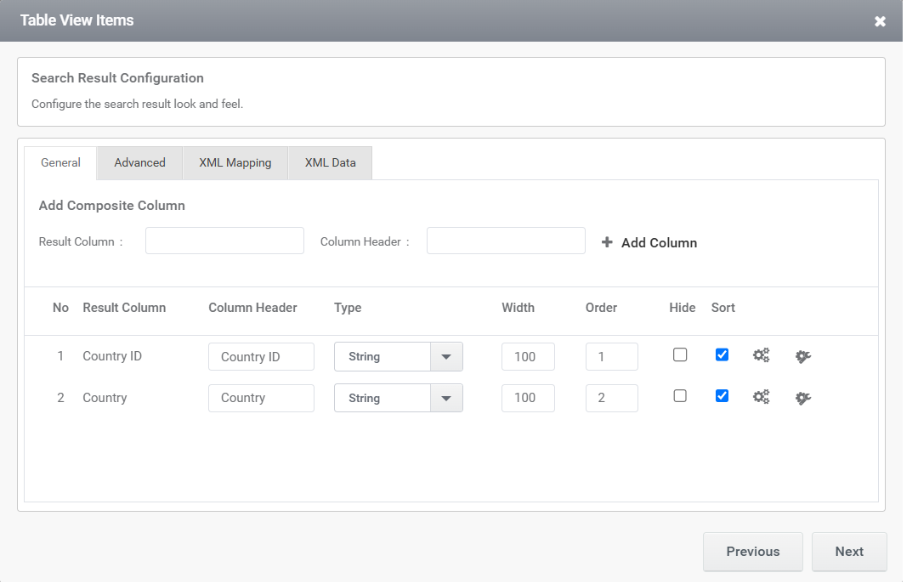
Step 9:
The list of selected columns and any additional settings for the TableView will be displayed in the next page. You can customize column properties such as visibility, header text, alignment, and formatting as needed.
Step 10:
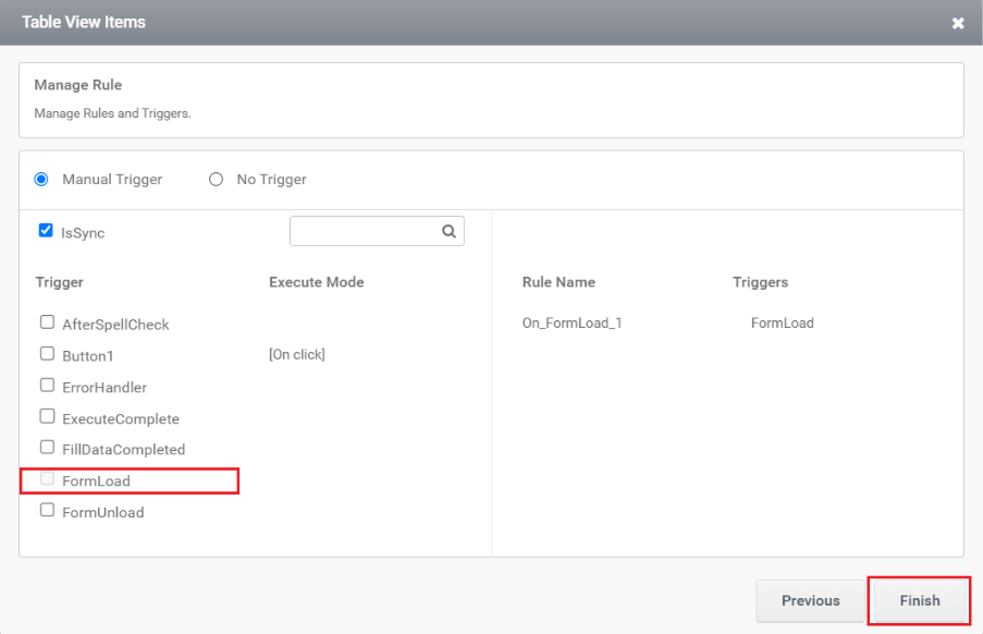
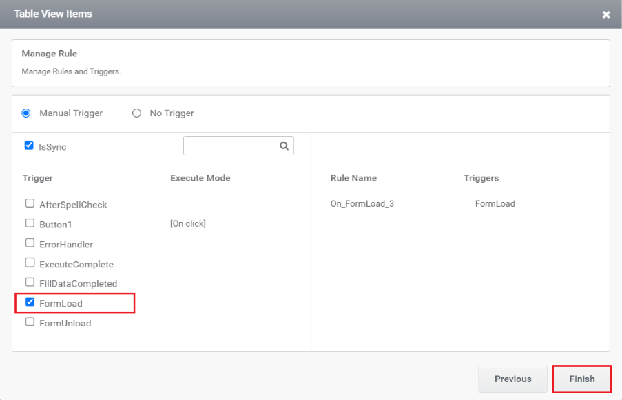
You need to add a trigger in the next window. You can choose either a Manual trigger or No trigger and select whether it should run Synchronously (Sync) or Asynchronously (Async).
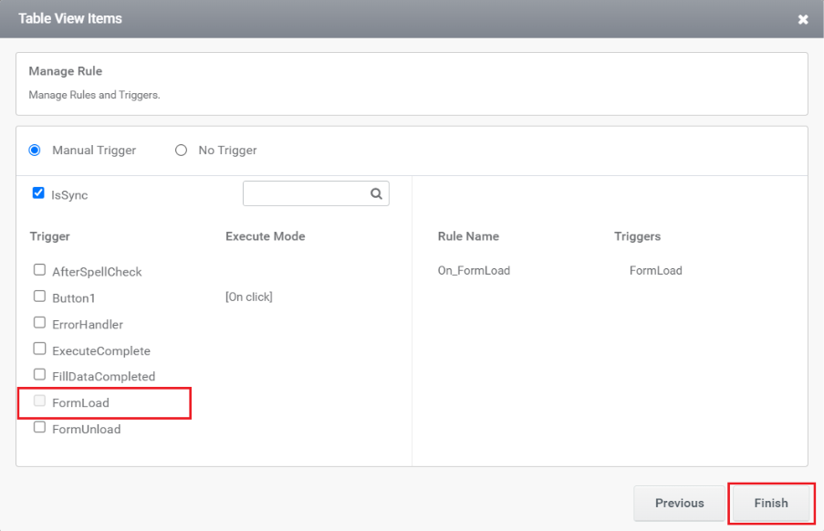
After clicking the Finish button, the configuration is completed.
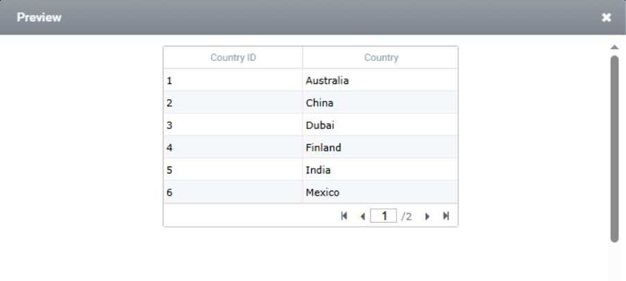
Step 11:
The image below shows the preview of TableView.
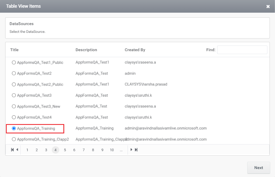
Stored Procedure
Step 1:
Choose the DataSource as Stored procedure and click the gear icon in the items tab.

Step 2:
Configure the TableView with Stored Procedure as the data source. Select the appropriate database name from the list in the DataSource tab.
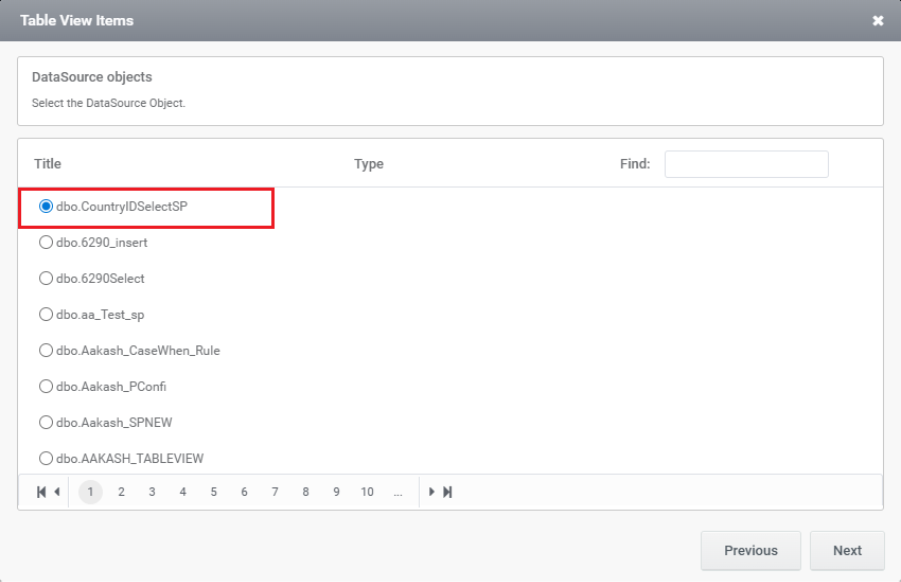
Step 3:
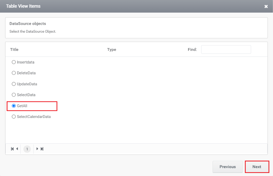
Select the stored procedure required from the available list.
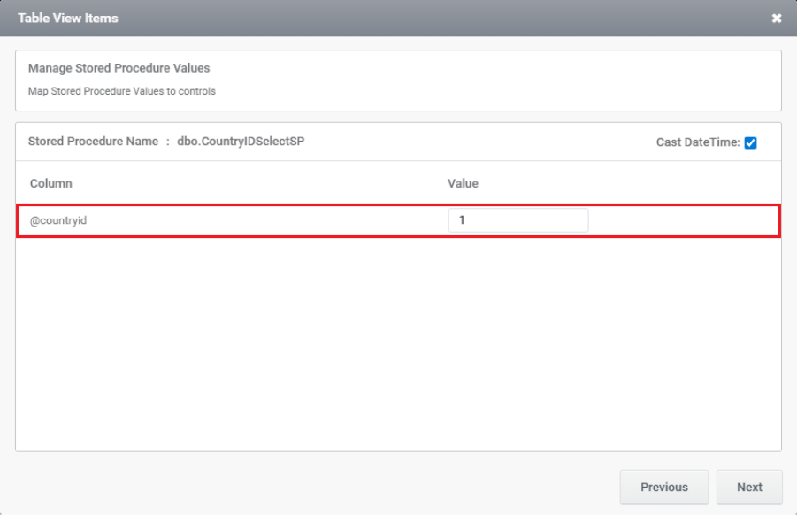
Step 4:
If you need to map stored procedure values to controls, they will be listed in the next window.
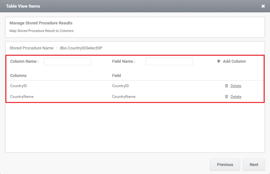
Step 5:
This section creates columns for Map Stored Procedure Result to Columns. This section will be blank by default—you need to manually add the required columns.
Step 6:
In the next window, you can see the columns that have been added and additional settings.
Step 7:
You need to add a trigger here. You can choose either a Manual trigger or No trigger and select whether it should run Synchronously (Sync) or Asynchronously (Async).
Step 8:
The image below shows the preview of TableView.
RESTful
Step 1:
Choose the DataSource as RESTful and Click the gear icon in the items tab.
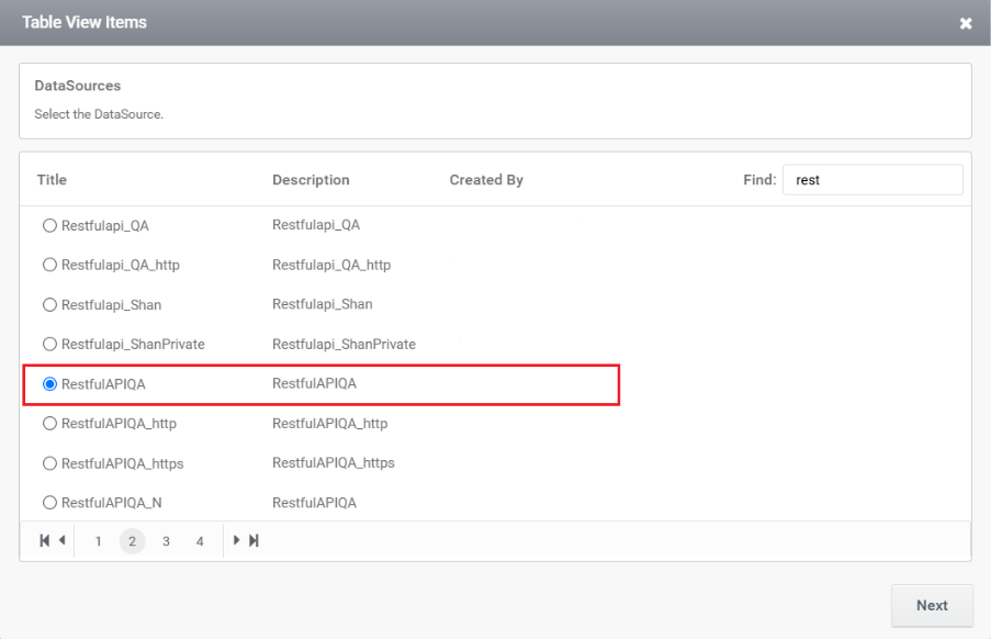
Step 2:
Choose the DataSource that is needed.
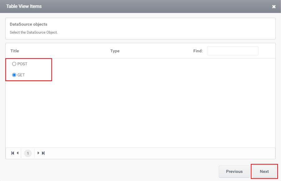
Step 3:
Choose the method which is needed.
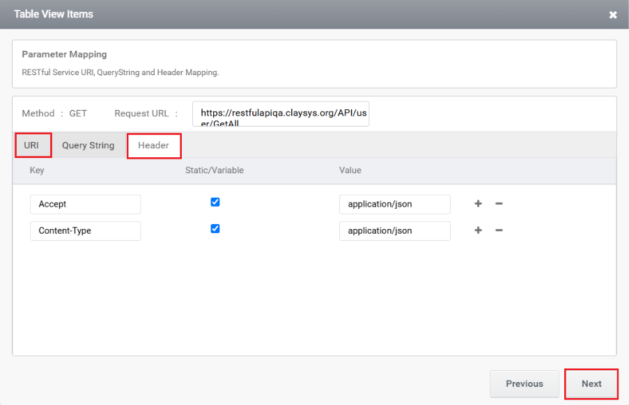
Step 4:
This section is used to add headers and the URI.
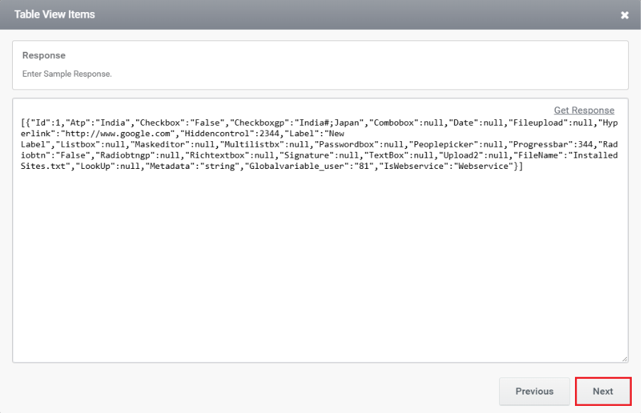
Step 5:
The next window is used to add the response body.
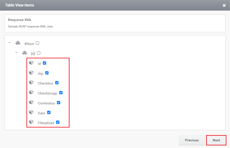
Step 6:
Choose the columns that need to be displayed from this window.
Step 7:
In this section, you can view the added columns along with their additional settings.

Step 8:
You need to add a trigger in the next window. You can choose either a Manual trigger or No trigger and also select whether it should run Synchronously (Sync) or Asynchronously (Async).
Web Service
Step 1:
Select Web Service from the right-side property panel or click the DataSource tab in the quick menu that appears when you select the TableView control.
Step 2:
Choose the DataSource that is needed.
Step 3:
Select the required method.
Step 4:
By default, this section displays the request body.
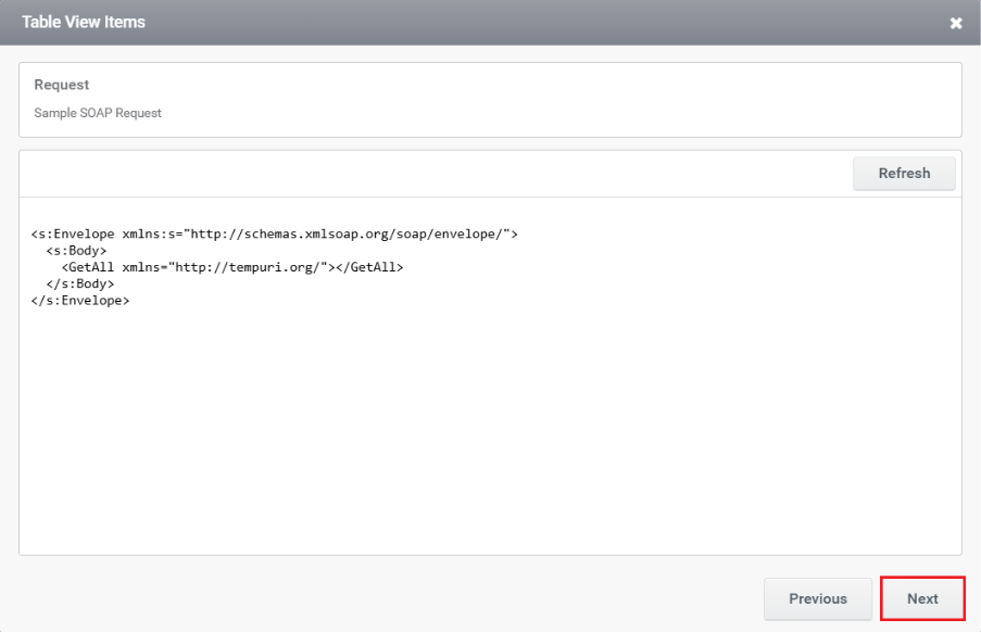
Step 5:
This window is used to configure the SOAP request XML for a TableView that retrieves data from a web service.

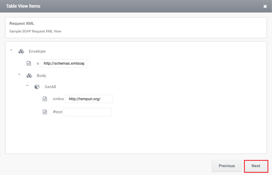
Step 6:
The next window displays the sample SOAP response XML structure returned by the web service.
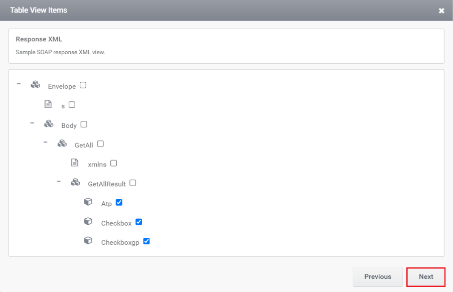
Step 7:
This window is used to select the response fields from the SOAP web service that you want to display in the TableView.
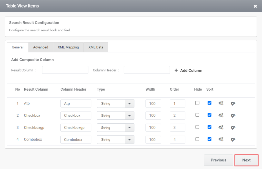
Step 8:
In the next section you can see the columns that are added and additional settings.
Step 9:
You need to add a trigger here. You can choose either a Manual trigger or No trigger and also select whether it should run Synchronously (Sync) or Asynchronously (Async).

Other features inside the configuration wizards
In the configuration wizards of the Table View control, several features can be utilized to enhance the functionality and appearance of the control. Here are some key features you can find:
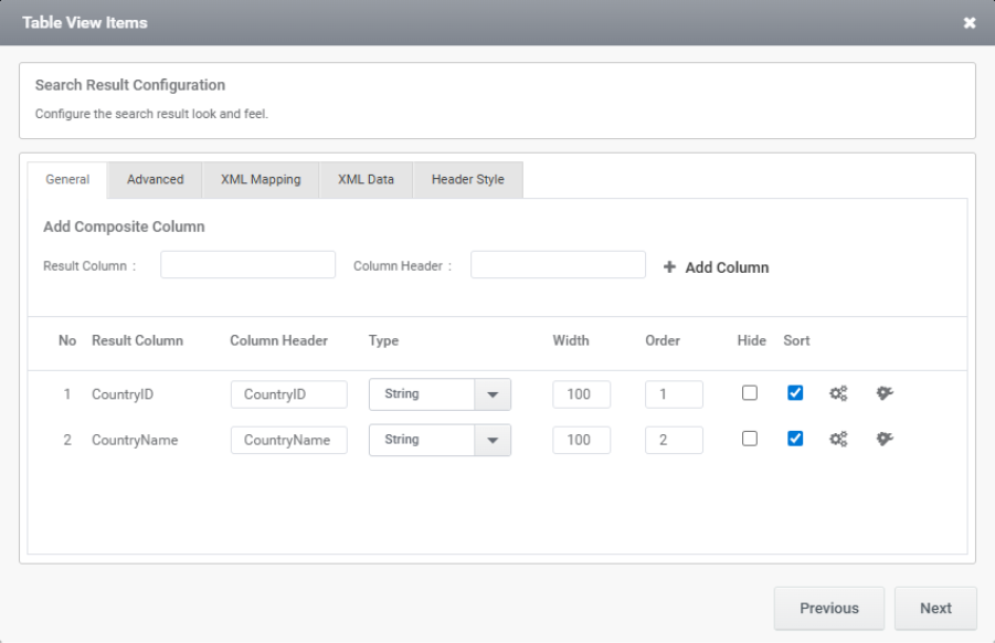
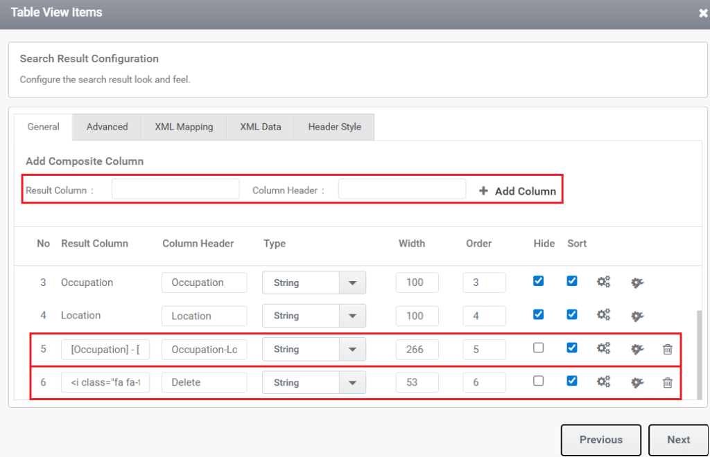
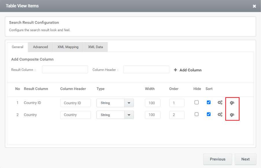
- Composite Column
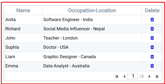
A Composite Column is a custom column in the TableView that allows you to combine values from existing columns or display additional elements such as action icons (e.g., Edit/Delete).
Steps to Configure:
- Specify the Result Column and Column Header.
- Click Add Column to include it in the TableView.
Examples:
- To display combined data from two columns as shown in the above snippet
(e.g., Occupation and Location), enter the value in the Result Column using square brackets as [Occupation] – [Location].
Then provide an appropriate title in the Column Header.
- To display an icon (such as a Delete icon) across the entire column, enter the following in the Result Column:
<i class=”fa fa-trash”></i>
Then provide a suitable Column Header.
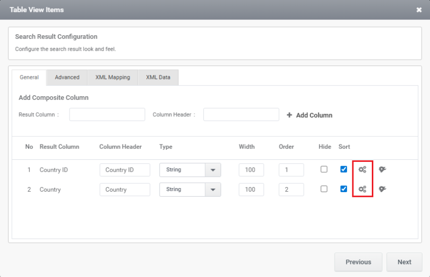
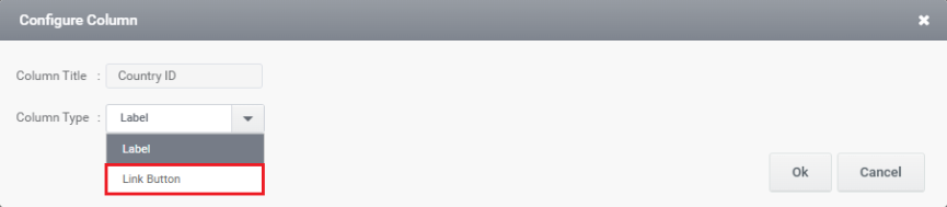
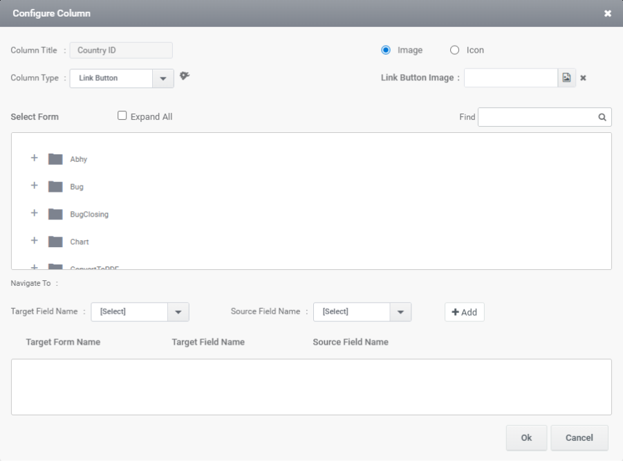
- Configure column: This window lets you set the column type for a field in the TableView. You can choose options like Label or Link Button depending on how you want the data to appear.
In this window, you can configure value mappings by selecting the Form, Target Field Name, and Source Field Name to pass data from the TableView control to other controls.
3. Operators: It allows you to customize how a column appears and behaves in the TableView. You can set footer calculations, text alignment, data format, tooltips, and enable features like find-and-replace or export wrapping. It helps enhance the readability and functionality of individual columns.
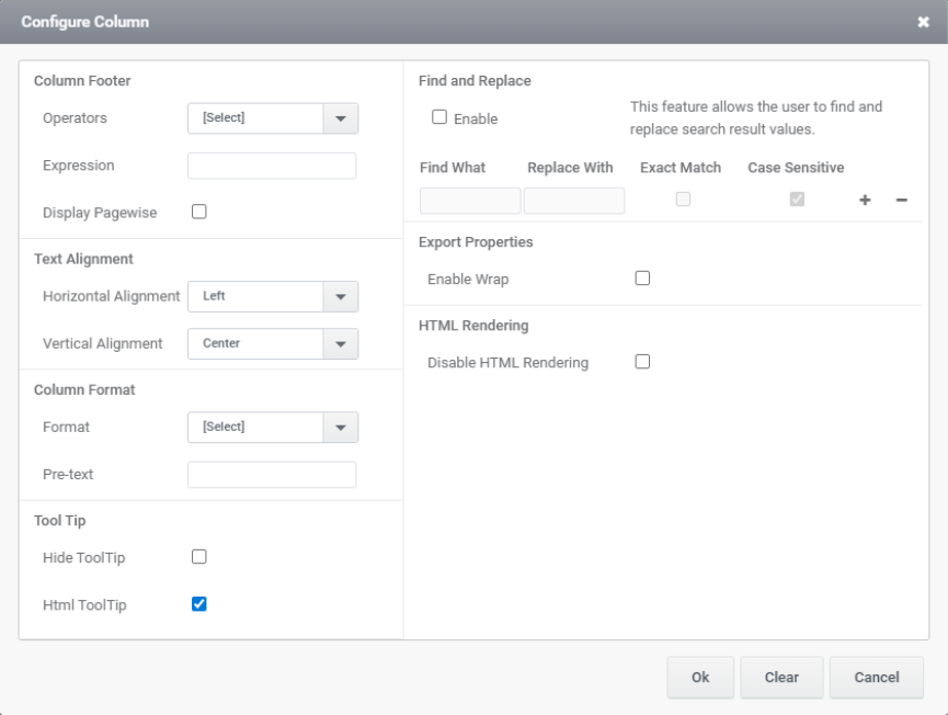
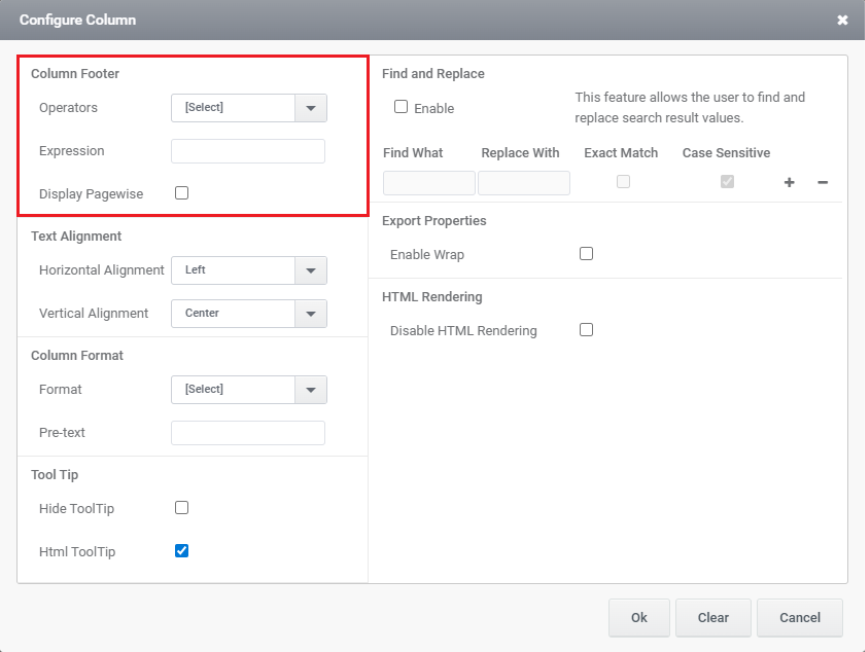
4. Column Footer : The Column Footer section allows you to apply aggregate functions like Total, Max, Min, or Avg to a column. You can also use the Expression field to define custom calculations. Enabling Display Pagewise shows the footer values per page instead of across the entire dataset.
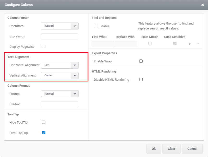
5. Text Alignment: The Text Alignment section allows you to control the positioning of content within a column. You can set the Horizontal Alignment (e.g., Left, Center, Right) and Vertical Alignment (e.g., Top, Center, Bottom) to adjust how text appears in each cell.
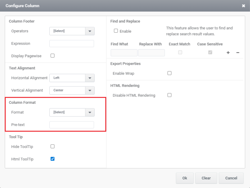
6. Column Format: This section allows you to customize how data is displayed in a table column. The Format dropdown lets you choose a display type (e.g., text, number, date), and the Pre-text field adds a prefix before the column value (e.g., “$” before currency).
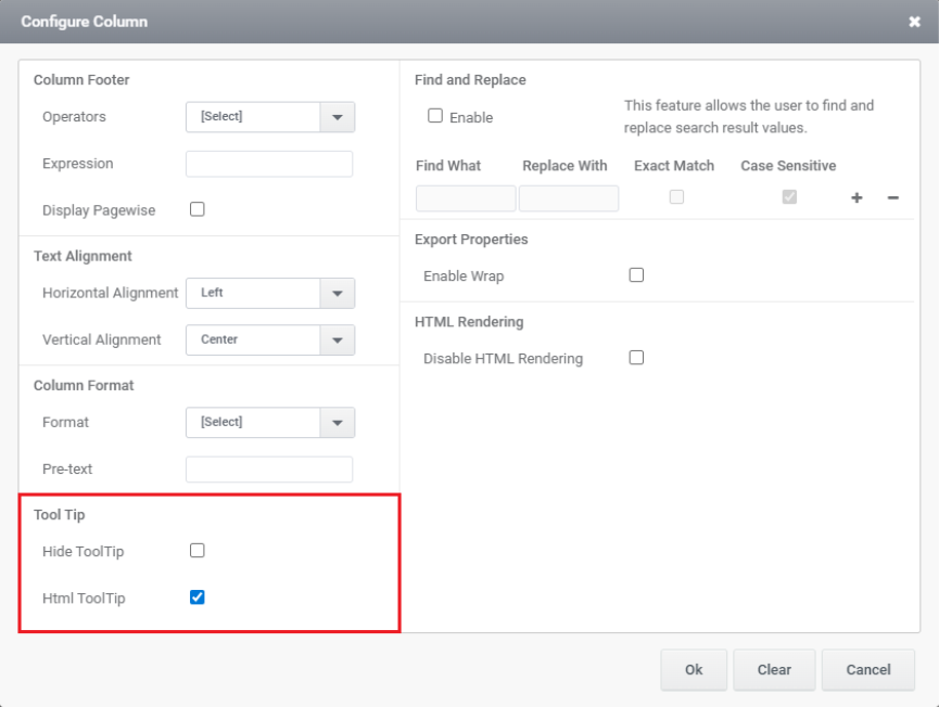
7. Tool Tip: This section controls the display of tooltips for a column. Checking Hide ToolTip disables the tooltip, while Html ToolTip allows you to use HTML formatting within the tooltip content for richer display.
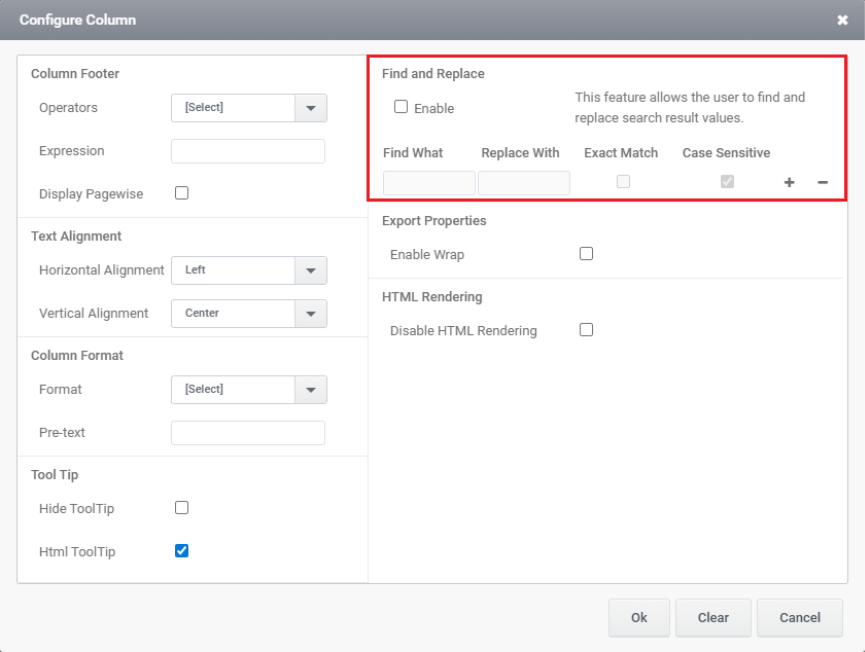
8. Find and Replace: This section lets users search for specific text in results and replace it with new text. When enabled, you can specify what to find, what to replace it with, and apply Exact Match or Case Sensitive conditions for more precise control.
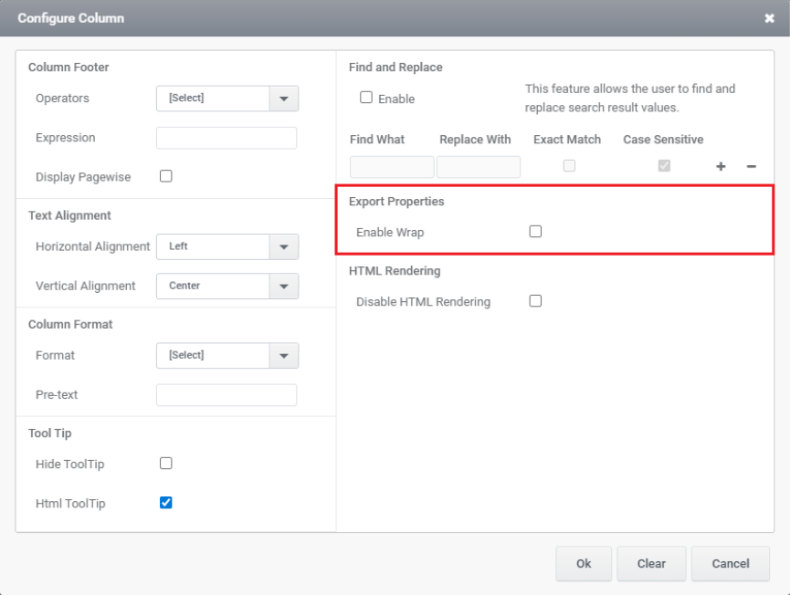
9.Export Properties: This section controls how data appears when exported. Enabling Wrap allows long text values to wrap onto multiple lines instead of being truncated or cut off in the export.
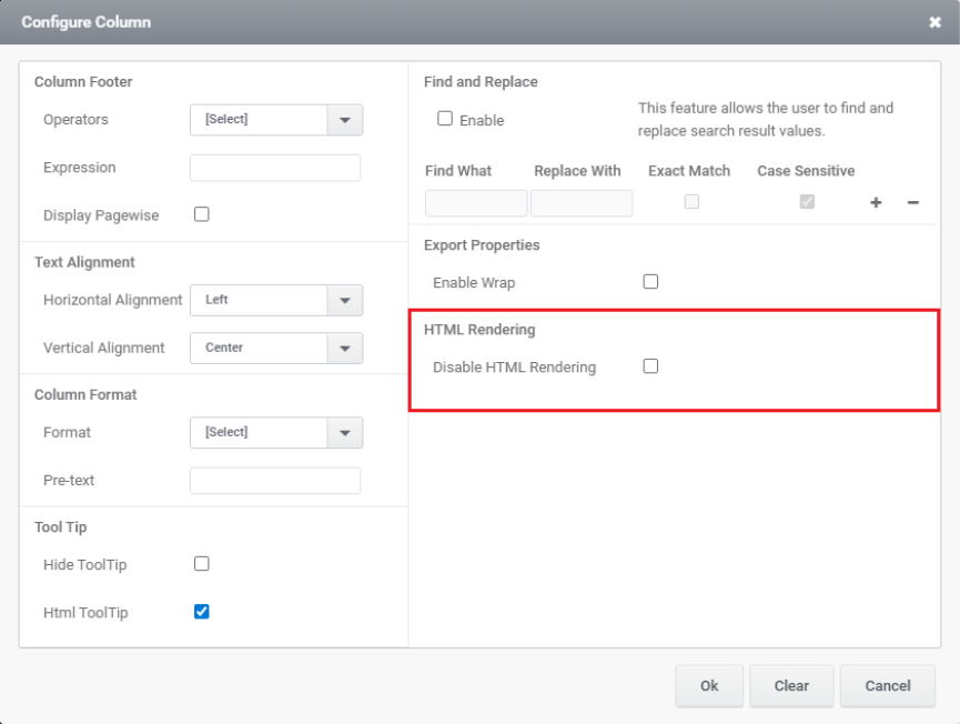
10. HTML Rendering: Check the option to disable HTML rendering. This will ensure that the content in the TableView is displayed as plain text rather than rendered HTML.
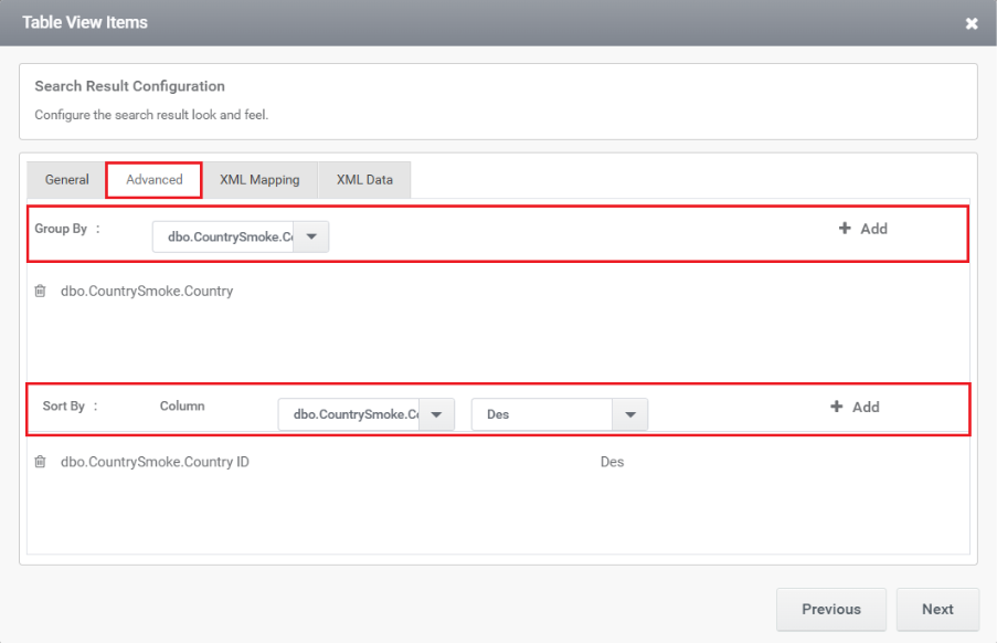
11. Group By and Sort By: This section allows you to define how TableView results are grouped and sorted in the table view. You can group results by a selected column (e.g., Country) and sort them by another column (e.g., Country ID) in ascending or descending (Des) order for better data organization.
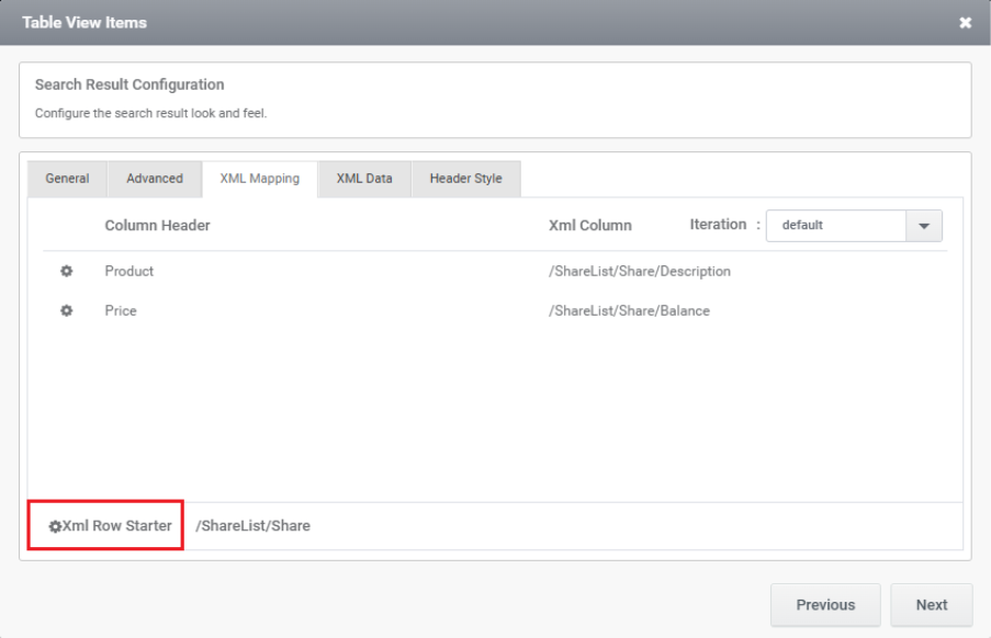
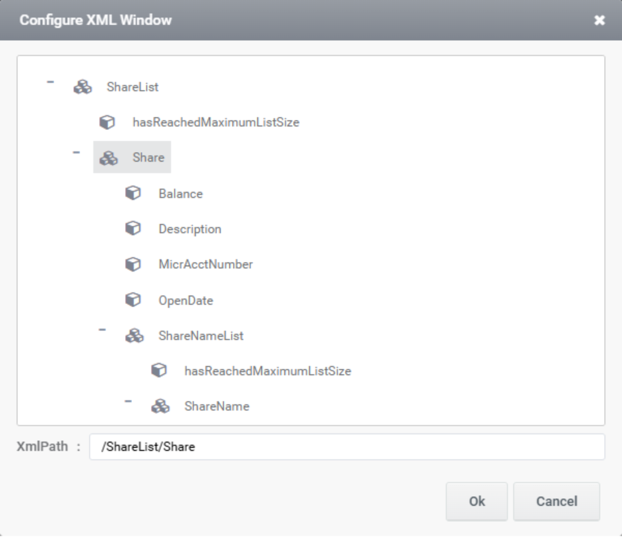
12. XML Mapping: This window is used to map XML data to table columns. It defines which XML elements should appear as columns in the result table.
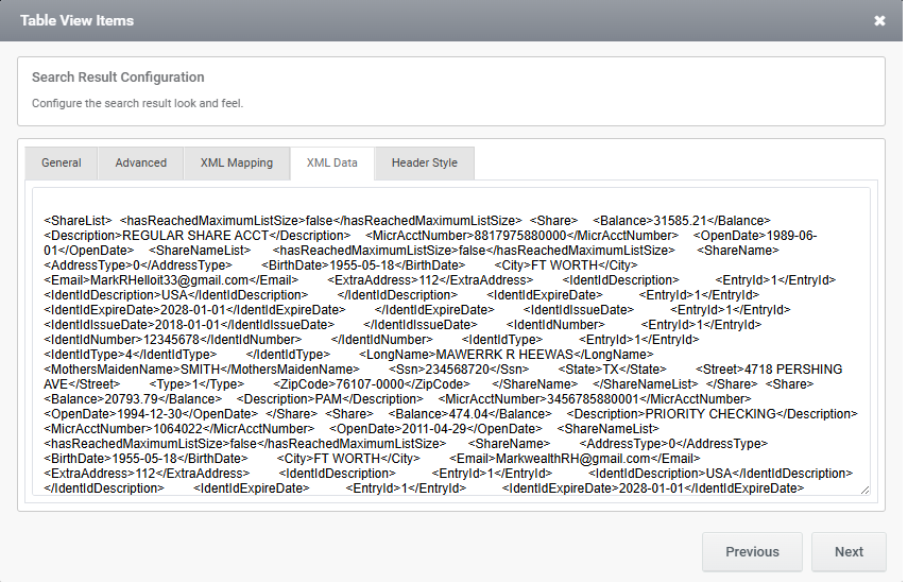
13. XML Data: This window displays the raw XML data that will be used in the table view. It shows the XML structure and content, which can be mapped to table columns using the XML Data tab for display in the search result.
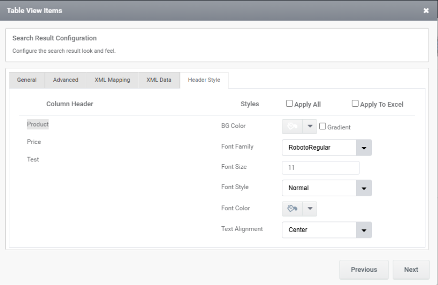
14. Header Style: The Header Style tab is used to customize the appearance of each column header in the TableView. It allows setting styles like font, size, color, alignment, and background for individual columns. This helps enhance readability and maintain consistent formatting across the table and exported files.
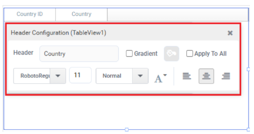
The same configurations are available in the Designer as well. To access them, click on the TableView header, which opens the header styling window with similar styling options.
Rules Associated with Tableview
- TableView1.XMLValue: You can use TableView1.XMLValue to get the current data in XML format, which can be useful for processing or sending the data to a web service.
- TableView1.PageSize: The TableView1.PageSize property controls how many records are shown per page in a Table View. You can set a default value (like 6) in the control’s properties. To change it dynamically, create a rule like TableView1.PageSize = 2 and add a trigger (e.g., FormLoad) so it runs when the form loads.
- TableView1.AllowClear : The TableView1.AllowClear property controls whether users can clear the rows in a Table View. When enabled, users can remove the displayed data; when disabled, the data stays visible and cannot be cleared. You can toggle this setting in the Table View control’s properties.
- TableView1.EnableSearch :This function is used to allow the FillData function to populate the control with data.
- TableView1.RowIndex : The TableView1.RowIndex function returns the index of the currently selected row in the Table View. It’s useful when you want to perform actions based on user selection, like retrieving data from that row. For example:
Textbox1.Value = GridGetValue(TableView1, TableView1.RowIndex, ColumnIndex).
Here, RowIndex helps you access data from the selected row dynamically. - TableView1.GridRowDetailDisplay : The TableView1.GridRowDetailDisplay property controls how row details are shown—options include On Select, Always, or Collapse. This determines whether the detail section appears when a row is selected, always stays visible, or remains collapsed. You can also manage this behaviour through the RowDetails property in the control settings
- TableView1.TotalRowCount : The TableView1.TotalRowCount property returns the total number of rows in the TableView1 control. You can use it in rules to show the record count or for pagination logic. For example, set Label1.Value = TableView1.TotalRowCount to display the count in a label.
- FillDataAsync : Fills a specific control (e.g., TableView, AutoComplete) asynchronously without blocking UI. For example, FillDataAsync(TableView1).
- FillData: This function is used to populate data from the data source into collection controls such as a TableView. It also determines whether the operation must be completed before executing the next set of rules.
Syntax: FillData(ControlName, PageNo) - FillDataSync: Similar to the FillData function, this function is also used to populate data from the data source into list controls. However, unlike FillData, it performs the data fill operation synchronously.
Syntax: FillDataSync(ControlName)