Changing properties of form and control using properties window
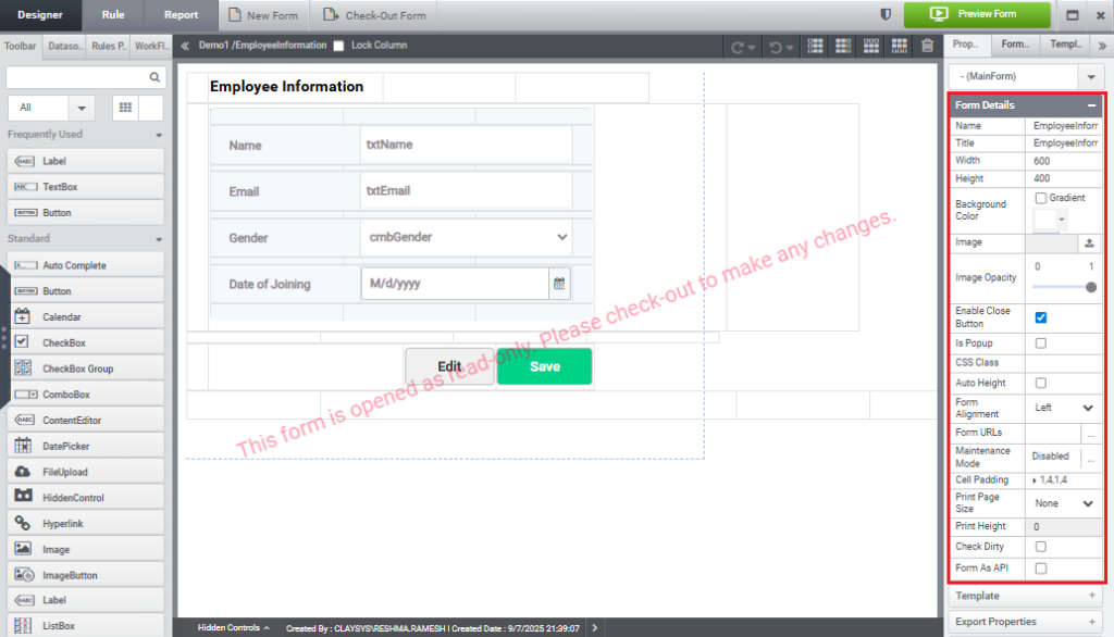
Let’s explore how to modify form properties using the Properties window. The Form Property panel is displayed in the image below.
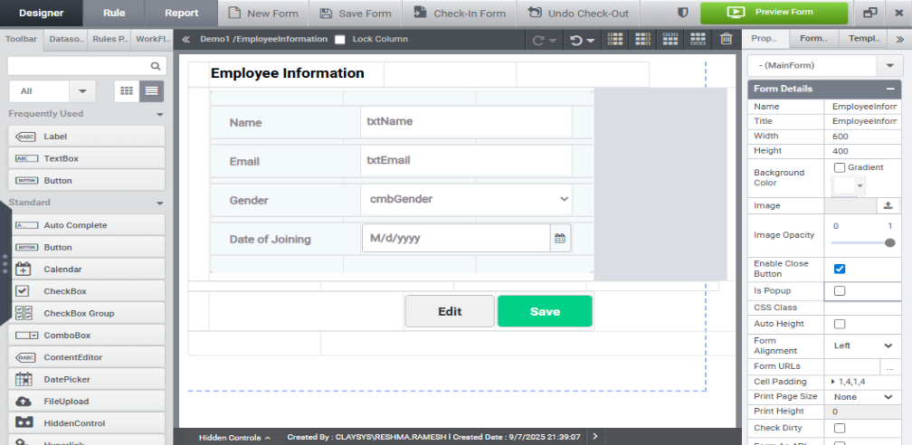
Set the height to 400 and the width to 600, then observe the current size of the form as shown in the image below.
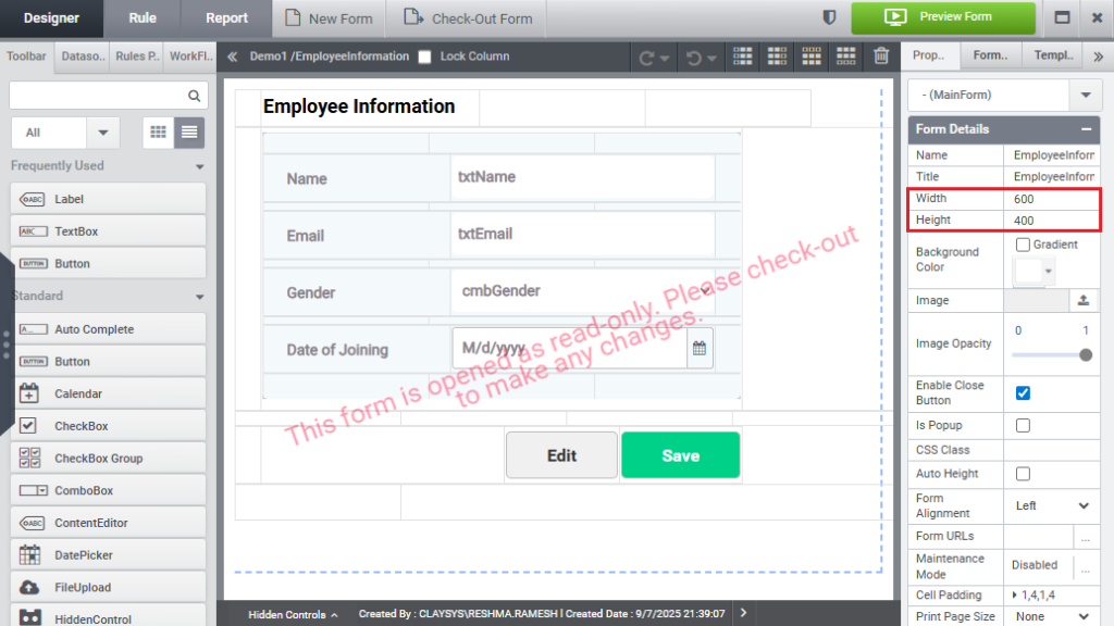
The form’s height and width are outlined by the dotted line in the designer.
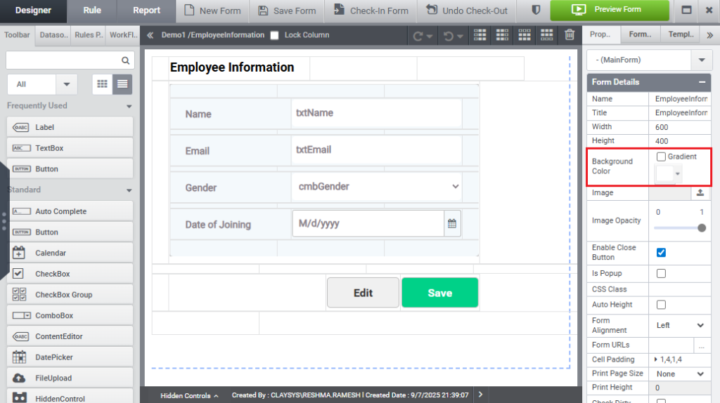
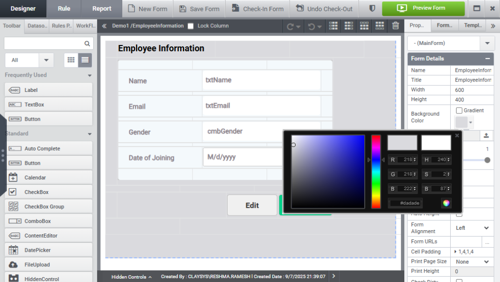
Select the preferred color using the Background Color option available in the Form Properties panel, as shown in the image below.
You can pick a background color from the color palette, where the dot indicates the currently selected color. The form’s background color will update immediately to reflect your selection, as illustrated below.
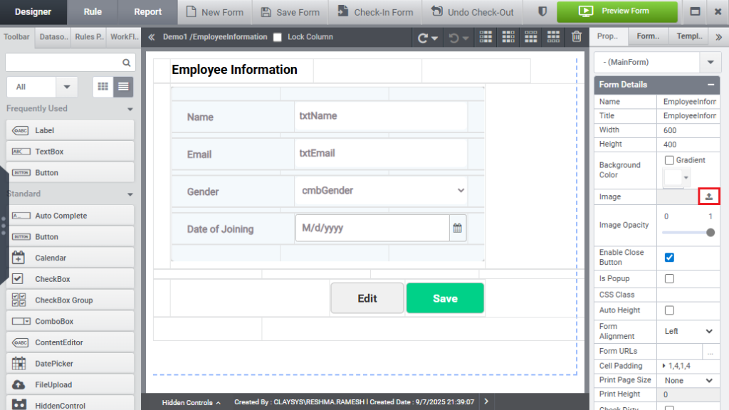
To add a background image, click the Upload Image icon under the Image option, as shown in the image below.
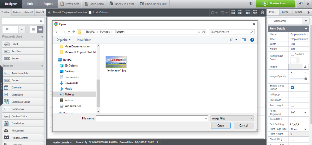
You can then select an image from the popup window to set as the background.
Once an image is selected, it will be set as the background, as illustrated in the image below.
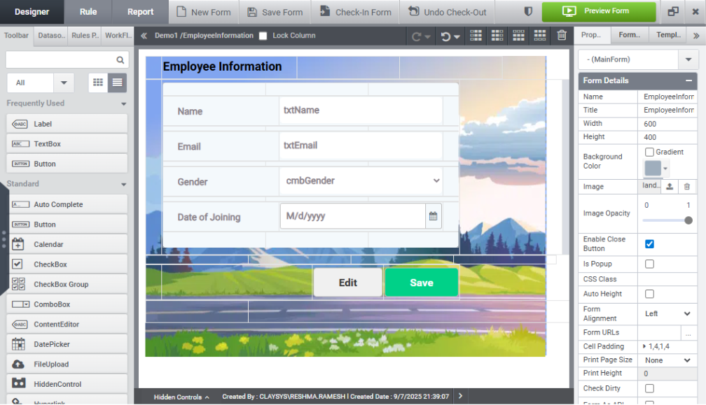
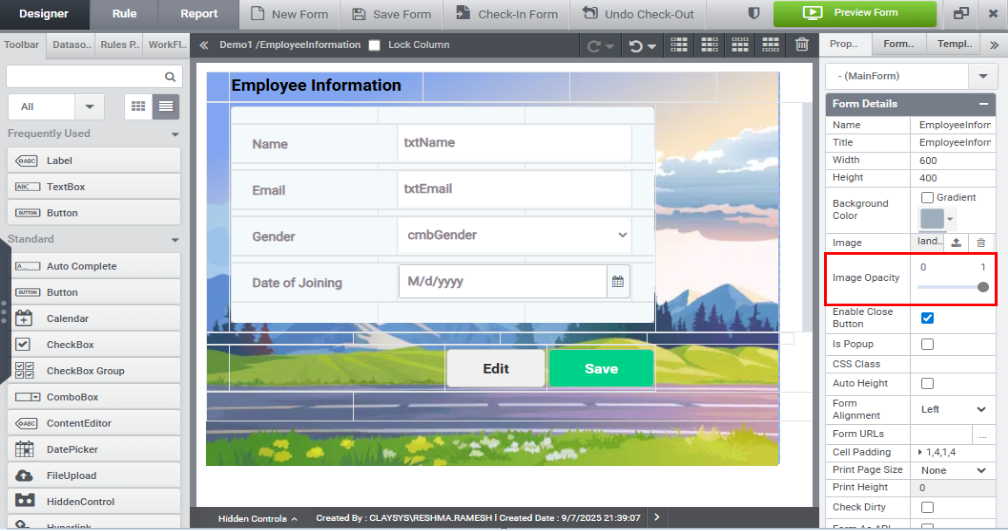
As shown in the image below, you can adjust the background image opacity using the Image Opacity option.
To remove the background image, click the Delete icon within the Background Image section.
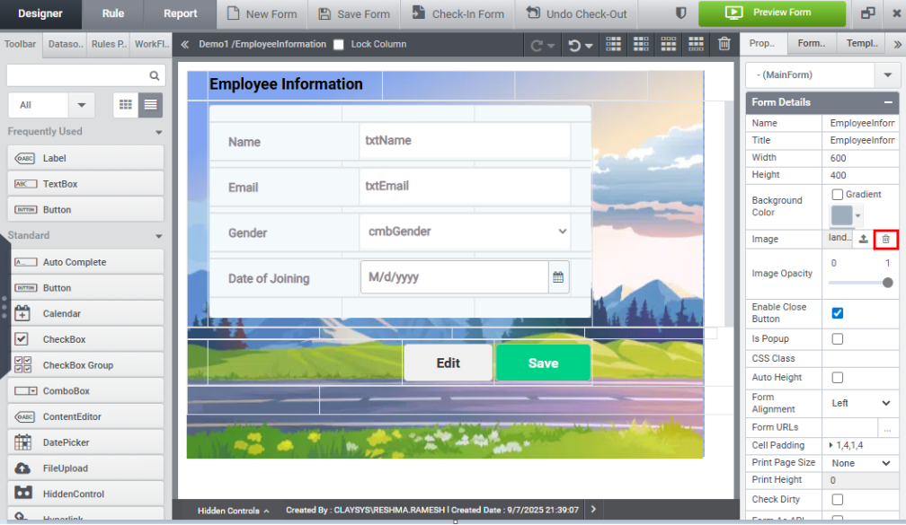
This action will immediately delete the background image, as demonstrated in the image below.
Changing the properties of the controls using properties window:
Let’s look at how to modify the control’s property.
Click on the Label control to view its properties in the right-side panel, as shown in the image below.
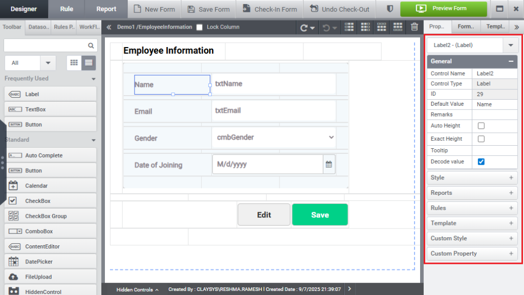
This panel displays a categorized list of configurable properties specific to the selected control. The properties are organized into seven distinct sections, making it easier to locate and configure specific settings for the control.
1.General
The General Properties section consists of nine configurable settings, as illustrated in the image below.
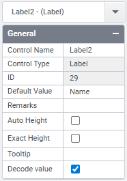
- Control Name: Displays the name assigned to the control.
- Control Type: Shows the type of control.
- ID: Displays the unique identifier of the control.
- Default Value: Shows the default value assigned to the control.
- Remarks: Allows you to add remarks or notes related to the control.
- Auto Height: When enabled, automatically adjusts the label control height.
- Exact Height: When enabled, set a fixed height for the label control.
- Tooltip: Lets you set a tooltip for the control.
- Decode Value: When enabled, decodes the value displayed by the label control.
2.Style
The style properties are grouped under this section as shown in the image below.
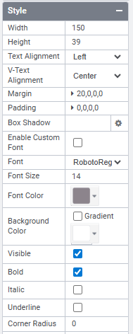
- Width: Adjusts the width of the label control.
- Height: Adjusts the height of the label control.
- Text Alignment: Sets the horizontal alignment of the text to left, right, or center.
- V-Text Alignment: Sets the vertical alignment of the text to top, bottom, or center.
- Margin: Adjusts the outer spacing (margin) around the label control.
- Padding: Adjusts the inner spacing (padding) within the label control.
- Box Shadow: Allows you to set a shadow effect around the label.
- Enable Custom Font: Enables the use of a custom font for the label text.
- Font: Lets you select the desired font style.
- Font Size: Adjusts the size of the label text.
- Font Color: Sets the color of the label text.
- Background Color: Sets the background color of the label.
- Visible: Controls the visibility of the label.
- Bold: Enables bold styling for the label text.
- Italic: Enables italic styling for the label text.
- Underline: Enables underlining of the label text.
- Corner Radius: Sets the curvature of the label’s corners.
- Enable Border: When enabled, reveals additional options to configure border thickness, style, and color.
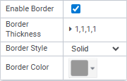
- Border Thickness: Allows you to set the thickness for the left, right, top, and bottom borders individually.
- Border Style: Lets you choose from various border styles.
- Border color: Sets the color of the border.
3.Reports
The reports section displays as shown below.
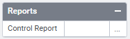
This property will show the report in which the control is used.
4.Rules
The Rules section is displayed in the image below.
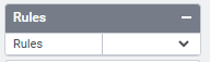
When you click the down arrow, the Create Rule option appears. Selecting this option creates a new rule with the label control as the trigger.
5.Template
The Template section is displayed in the image below.
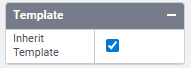
Enabling this option inherit control style from applied template.
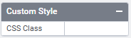
6.Custom Style
The css class name can be provided in this section as shown in the image below.
7.Custom Property
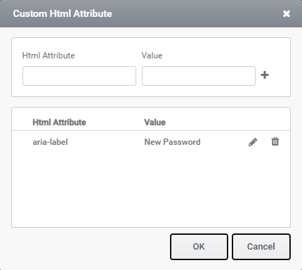
Custom Property has HTML Attribute property as shown in the image below.
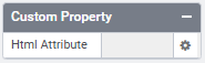
Clicking on the settings icon opens the Custom HTML Attribute window, as shown in the image below, where you can add HTML attributes and their corresponding values.