FileUpload
FileUpload control is a combination of a text box and a browse button that enable users to select a file to upload to the server.
Control Name: File Upload
Group: Standard
| General | |||
| S.no | Property name | Data type | Description |
| 1 | Tooltip | String | The texts that needs to be displayed when the user hover the mouse pointer over the control, without clicking it. |
| 2 | Tab Index | Integer | Sets the Tab order for the control within its container. |
| 3 | Allow Multiple File | Boolean | To allow multiple file uploads simultaneously. |
| 4 | Remarks | String | To make a comment or observation about the control for reference. |
| Attached Label | |||
| S.no | Property name | Data type | Description |
| 5 | Show Label | Boolean | To display the attached label along with the control. |
| 6 | Label Text | String | Sets the text content of the label attached to the control. |
| 7 | Label Position | String | To place the label attached in various positions around the control. |
| 8 | Label Width | String | Sets the suggested width or thickness of the label attached to the control. |
| 9 | Label Height | String | Sets the suggested height of the label attached to the control. |
| 10 | Text Alignment | String | To align the texts inside the label attached to different positions within the control. |
| 11 | Margin | String | Sets the edge or outer margin to the control. |
| 12 | Font | String | Sets the font face\style. |
| 13 | Font Size | String | Sets the size of the text in attached label. |
| 14 | Bold | Boolean | To make the attached label text Bold |
| 15 | Italic | Boolean | Italicize the attached label text. |
| 16 | Underline | Boolean | Underline the attached label text. |
| 17 | Font Color | String | Sets a brush that describes the Font color in attached label. |
| 18 | Background Color | String | Sets a brush that describes the Background color to the attached label. |
| 19 | Keep the file stream | Boolean | The file stream will be kept even after saving. Can be used with multiple data sources. |
| 20 | Download file stream | Boolean | When a file is selected from Share Point DataSource, only the path URL will be downloaded. If the file content need to be manipulated this property can be used. |
| Style | |||
| S.no | Property name | Data type | Description |
| 21 | Width | String | Sets the suggested width or thickness of the control. |
| 22 | Height | String | Sets the suggested height of the control. |
| 23 | Margin | String | Sets the edge or outer margin to the control. |
| 24 | Font | String | Sets the font face\style. |
| 25 | Font Size | String | Sets the font size. |
| 26 | Font Color | String | Sets a brush that describes the Text color of the control. |
| 27 | Background Color | String | Sets a brush that describes the Background color of the control. |
| 28 | Visible | Boolean | Sets the visibility of the control while rendering. |
| 29 | Enable | Boolean | Sets the accessibility of the control during rendering. |
| 30 | Column Span | String | To merge the number of column specified. |
| Rules | |||
| S.no | Property name | Data type | Description |
| 31 | Rules | After selecting the control, If user clicks Rules tab it will be expanded and displays a Rules property. Create Rule can be selected from a drop down list. On clicking the Create Rule link button will navigate the user to the Rules Engine. The same control will be added as a trigger by default to execute the Rule. |
| Validation | |||
| S.no | Property name | Data type | Description |
| 32 | Is Required | Boolean | Helps to check whether user has to give input in the control or not. If this property is enabled, this will not allow the user to save a form without giving the input. |
| 33 | Required Message | String | If Is Required property was enabled and input was given in this property, the validation message will be displayed to the next right of the control when the user trying to save a form without entering a value in the control. |
| Reports | |||
| S.no | Property name | Data type | Description |
| 34 | Control Report | Control Report will redirect to Reports tab that will display all the configurations, rules and datasources details associated to the selected control. |
File Upload Template
In responsive forms, the FileUpload control offers an option to use the FileUpload template, which provides an improved user interface, offering a more intuitive and user-friendly experience.
When the Responsive option is enabled for a form, the Template option appears under the Style properties of the FileUpload control, as shown in the image below.

After clicking the Template option, the File Upload Control Templates Wizard opens. From templates, select Material Design and click the Finish button, as shown in the image below.
The configuration for the selected template can be set in the Template Configuration section.
Template Name– The template name will be displayed in the Template Name field, and it will be either Default or Material Design, depending on the selection.
Icon HTML – The icon to be displayed in the FileUpload control can be specified in this field using HTML format.
Label – The label to be displayed below the FileUpload icon can be specified in this field.
Helper Text – A helper text can be configured to guide users on the allowed file type, size, and related details.
Show Progress – Enabling this checkbox will display the progress of the file upload.
When the Show Progress checkbox is enabled, additional fields will appear on the right side of the Template Configuration section, as shown below.
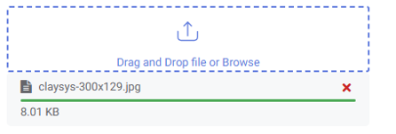
Display Orientation- The orientation of the FileUpload control’s progress can be selected in this field. When Display Orientation is set to Vertical, the progress bar will be displayed vertically, with the progress field positioned at the bottom of the FileUpload control, as shown in the image below.
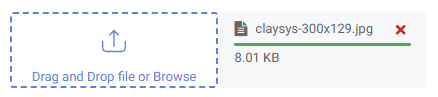
When Display Orientation is set to Horizontal, the progress bar of the FileUpload control will be displayed horizontally, with the progress bar appearing on the right side of the FileUpload control, as shown in the image below.
Show Progress Value: Enable this option to display the upload progress as a percentage.
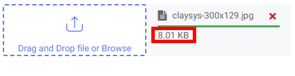
Show upload File size: Enable this option to display the file size, as shown in the image below.
Progress Bar Height: The height of the progress bar can be defined in this field.
Progress Bar Width: The widthof the progress bar can be defined in this field.
Enable Auto Height: When this field is enabled, the height of the progress bar will be set automatically.
Finish: After filling in the required fields, click the Finish button to apply the changes.
Clear: All fields in the Template Configuration section will be cleared, except for the Template Name field..