People Picker
The People Picker control is used to select users and groups. Basically, People Picker control contains a text box and two buttons, ‘Check Name’ and ‘Browse’ button. The Check Names button is used to validate the user’s entry, and the Browse button gives an interface to do a more advanced search on the whole directory.
Working with a People Picker control
- Create a form as shown in Figure 1, by dragging a ‘People Picker’ control.
Figure 1
- In the properties tab, there are several features like allow multiple and exclude group. User can select email, name, title, department, mobile number from Selected Value to display (Figure 2).
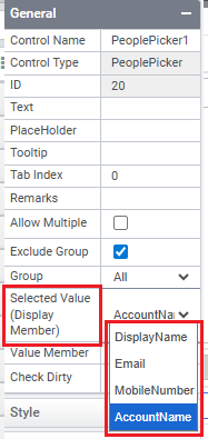
Figure 2
- Preview of a form containing People Picker control is shown in Figure 3,
Figure 3
- On clicking ‘Browse’ Button will opens a tab where the user can search and select people (Figure 4).
Figure 4
Control Name: People Picker
Group: Data Control
| General | |||
| S.no | Property name | Data type | Description |
| 1 | Text | String | Set the value to be displayed in preview. |
| 2 | Tooltip | String | The texts that needs to be displayed when the user hover the mouse pointer over the control, without clicking it. |
| 3 | Placeholder | String | The text that needs to be displayed as a place holder over the control. |
| 4 | Tab Index | Integer | Sets the Tab order for the control within its container. |
| 5 | Check Dirty | Boolean | Notifies the user to check the dependent control values are changed. |
| 6 | Remarks | String | To make a comment or observation about the control for reference. |
| 7 | Allow Multiple | Boolean | To allow multiple values in the people picker control simultaneously. |
| 8 | Exclude Group | Boolean | To exclude all or a particular group. |
| 9 | Selected Value | Sets the value that is to be displayed in the people picker control like Email, Display Name etc. |
| Attached Label | |||
| S.no | Property name | Data type | Description |
| 10 | Show Label | Boolean | To display the attached label along with the control. |
| 11 | Label Text | String | Sets the text content of the label attached to the control. |
| 12 | Label Position | String | To place the label attached in various positions around the control. |
| 13 | Label Width | String | Sets the suggested width or thickness of the label attached to the control. |
| 14 | Label Height | String | Sets the suggested height of the label attached to the control. |
| 15 | Text Alignment | String | To align the texts inside the label attached to different positions within the control. |
| 16 | Margin | String | Sets the edge or outer margin to the control. |
| 17 | Font | String | Sets the font face\style. |
| 18 | Font Size | String | Sets the size of the text in attached label. |
| 19 | Bold | Boolean | To make the attached label text Bold |
| 20 | Italic | Boolean | Italicize the attached label text. |
| 21 | Underline | Boolean | Underline the attached label text. |
| 22 | Font Color | String | Sets a brush that describes the Font color in attached label. |
| 23 | Background Color | String | Sets a brush that describes the Background color to the attached label. |
| Style | |||
| S.no | Property name | Data type | Description |
| 24 | Width | String | Sets the suggested width or thickness of the control. |
| 25 | Height | String | Sets the suggested height of the control. |
| 26 | Margin | String | Sets the edge or outer margin to the control. |
| 27 | Font | String | Sets the font face\style. |
| 28 | Font Size | String | Sets the font size. |
| 29 | Font Color | String | Sets a brush that describes the Text color of the control. |
| 30 | Background Color | String | Sets a brush that describes the Background color of the control. |
| 31 | Visible | Boolean | Sets the visibility of the control while rendering. |
| 32 | Enable | Boolean | Sets the accessibility of the control during rendering. |
| 33 | Bold | Boolean | To make the control text Bold. |
| 34 | Italic | Boolean | Italicize the control text. |
| 35 | Column Span | String | To merge the number of column specified. |
| Rules | |||
| S.no | Property name | Data type | Description |
| 36 | Rules | After selecting the control, If user clicks Rules tab it will be expanded and displays a Rules property. Create Rule can be selected from a drop down list. On clicking the Create Rule link button will navigate the user to the Rules Engine. The same control will be added as a trigger by default to execute the Rule. |
| Validation | |||
| S.no | Property name | Data type | Description |
| 37 | Is Required | Boolean | Helps to check whether user has to give input in the control or not. If this property is enabled, this will not allow the user to save a form without giving the input. |
| 38 | Required Message | String | If Is Required property was enabled and input was given in this property, the validation message will be displayed to the next right of the control when the user trying to save a form without entering a value in the control. |
| Reports | |||
| S.no | Property name | Data type | Description |
| 39 | Control Report | Control Report will redirect to Reports tab that will display all the configurations, rules and datasources details associated to the selected control. |