SubForm Control
By using Subform control, user can have a complete form within the Mainform having all the properties of Mainform. Whenever there is a different section in a form, we can show them up in a Subform control where user can fit more controls without making the form illegible.
Working with a Subform Control
Step 1:– Create a form having ‘Subform control’, as shown below: –
Figure 1
Step 2:– Place the controls inside the ‘Subform Control’. In properties Tab, users can set style, border, visibility, margin etc depending upon the application without affecting the MainForm. Whenever an application requires a different section, one can use subform control and drag all the required controls and set the visibility of Subform to True,whenever it wants to display.
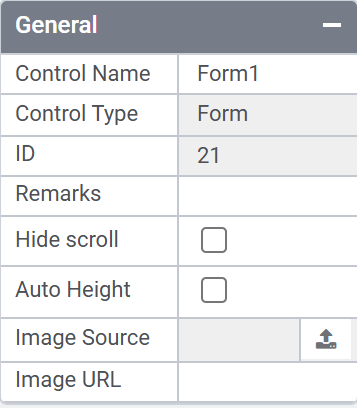
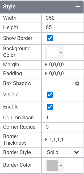
Figure 2
SubForm Rule Trigger
In Responsive forms, we have an option to enable triggers for Subform control, as illustrated in the image below.
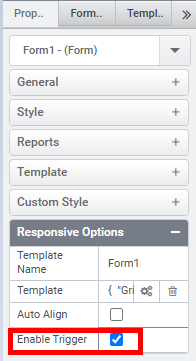
When the Enable Trigger option is enabled, the Subform control appears in the Trigger section, as shown below. Clicking the up arrow adds the Subform control to the Added Triggers list for the specified rule.
During rendering, clicking anywhere inside the subform will trigger the associated rule.
Control Name: Subform
Group: Grouping Control
| General | |||
| S.no | Property Name | Data Type | Description |
| 1 | Remarks | String | To make a comment or observation about the control for reference. |
| 2 | Hide Scroll | Boolean | To hide scroll of the Subform. |
| 3 | Auto Height | Boolean | To set the AutoHeight of the Subform |
| 4 | Image Source | Varbinary | To browse and upload an image from your local system(Available for Responsive forms) |
| 5 | Image URL | String | To paste a link to an image hosted on the web(Available for Responsive forms) |
| Attached Label | |||
| S.no | Property Name | Data Type | Description |
| 6 | Show Label | Boolean | To display the attached label along with the control. |
| 7 | Label Text | String | Set the text contents of the label attached to the control. |
| 8 | Label Position | String | To place the label attached in various positions around the control. |
| 9 | Label Width | String | Sets the suggested width or thickness to the label attached to the control. |
| 10 | Label Height | String | Sets the suggested height to the label attached to the control. |
| 11 | Text Alignment | String | Specifies whether the text to be left-aligned, Center –aligned or right-aligned. |
| 12 | Margin | String | Sets the edge or outer margin to the control. |
| 13 | Font | String | Sets the font Style. |
| 14 | Font Size | String | Sets the font size. |
| 15 | Font Color | String | Sets a brush that describes the Text color of the control. |
| 16 | Background Color | String | Sets a brush that describes the Background color to the attached label. |
| Style | |||
| S.no | Property Name | Data Type | Description |
| 17 | Width | String | Sets the suggested width or thickness to the control. |
| 18 | Height | String | Sets the suggested height to the control. |
| 19 | Show Border | Boolean | To set the border for the control. |
| 20 | Margin | String | Sets the edge or outer margin to the control. |
| 21 | Background Color | String | Sets a brush that describes the Background color of the control. |
| 22 | Visible | Boolean | Sets the visibility of the control while rendering. |
| 23 | Enable | Boolean | Sets the accessibility of the control during rendering. |
| 24 | Column Span | String | To merge the number of column specified. |
| Reports | |||
| S.no | Property Name | Data Type | Description |
| 25 | Control Report | Control Report will redirect to Reports tab that will display all the configurations, rules and data sources details associated to the selected control. |
Custom Style
| S.no | Property Name | Data Type | Description |
| 26 | CSS Style | String | Allows users to add CSS class to control to change the default formatting for any of the themes. |
Custom Attribute
| S.no | Property Name | Data Type | Description |
| 26 | HTML Attribute | String | Allows users to add HTML tags. |