Calendar
A calendar serves as a method for organizing time units to track duration over extended periods. This involves assigning names to time intervals, usually days, weeks, months, and years. A date represents a particular day within this framework. Additionally, a calendar can refer to a schedule of scheduled events.
Working
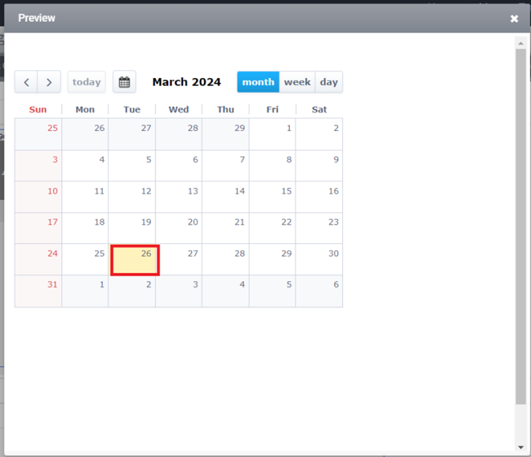
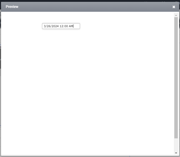
The calendar control enables users to view and select dates. Users can switch between different views such as month, week, and day. Additionally, the selected date can be displayed on other controls within the form, such as Textbox or Label. Activation of the calendar control can occur either by selecting a date directly on the control or by setting a value through a rule.
Properties
Here is the list of properties that are available.
| S.no | Property name | Data type | Description |
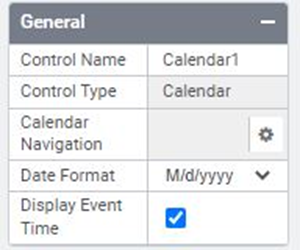
| General | |||
| 1 | Date Format | String | Allows a user to select the different date formats. |
| 2 | Display Event Time | Displays event time. | |
| 3 | Calendar Navigation | String | Sets the value to the control in the navigated form. |
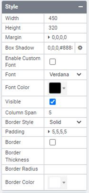
| Style | |||
| 4 | Width | String | Sets the suggested width or thickness of the control. |
| 5 | Height | String | Sets the suggested height of the control. |
| 6 | Margin | String | Sets the edge or outer margin to the control. |
| 7 | Font | String | Sets the font face\style. |
| 8 | Custom Font | Enables custom font. | |
| 9 | Font Color | String | Sets the Text color of the control. |
| 10 | Background Color | String | Sets the Background color of the control. |
| 11 | Visible | Boolean | Sets the visibility of the control while rendering. |
| 12 | Border Style | Boolean | Sets the border style. |
| 13 | Border | Boolean | Sets the border. |
| 14 | Padding | Boolean | Sets the padding for the calendar. |
| 15 | Column Span | String | To merge the number of columns specified. |
| Rules | |||
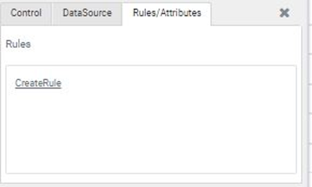
| 16 | Rules | After selecting the control, if the user clicks on the Rules tab, it will expand and display a Rules property. The “Create Rule” option can be selected from a drop-down list. Clicking on the “Create Rule” link button will navigate the user to the Rules Engine. The same control will be added as a trigger by default to execute the Rule. | |
| DataSource | |||
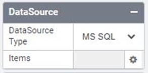
| 17 | Items | Clicking the Browse button for the items will open a data source window. | |
| Reports | |||
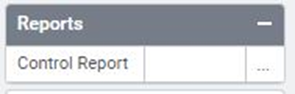
| 18 | Control Report | Selecting the Control Report option will redirect to the Reports tab, which will display all configurations, rules, and data source details associated with the selected control. | |
| Template | |||
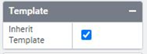
| 19 | Inherit Template | To set templates with styles, users can select one template at a time. | |
| Custom Style | ||||
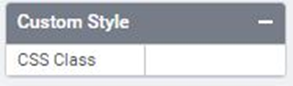
| 20 | CSS Class | Users can apply CSS classes. | ||
Quick Action Menu
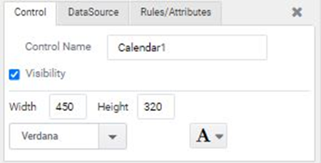
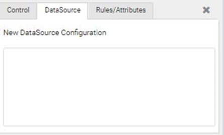
The Calendar control will include three Quick Action menus: Control, DataSource, and Rules/Attributes.
Rules
Here is the fundamental list of properties that can be utilized from rules.
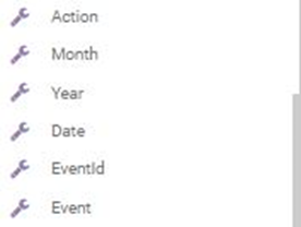
Action – This displays the last action performed on the calendar trigger.
For instance: “MessageBox(Calendar1.Action)”
Month – To display the month of the selected date.
For instance: “MessageBox(Calendar1.Month)”
Year – To displays the year of the selected date
For instance: “MessageBox(Calendar1.Year)”
Date – To displays the date selected in the calendar control
For instance: “MessageBox(Calendar1.Date)”
Event Id – To displays the event id of the selected event in the calendar control
For instance: “MessageBox(Calendar1.EventId)”
Event – To displays the event selected in the calendar control
For instance: “MessageBox(Calendar1.Event)”
DataSource
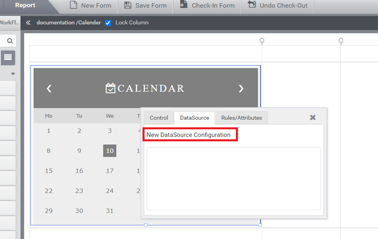
Step:1 – To configure the data source on the calendar, follow these steps:
1. Click on the calendar control.
2. Select ‘New DataSource Configuration’.
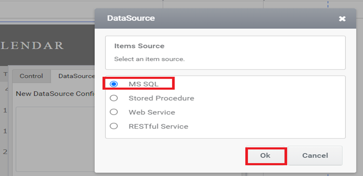
Step:2 – Choose any data source type. In this case, I am selecting the item source as ‘MS SQL’.
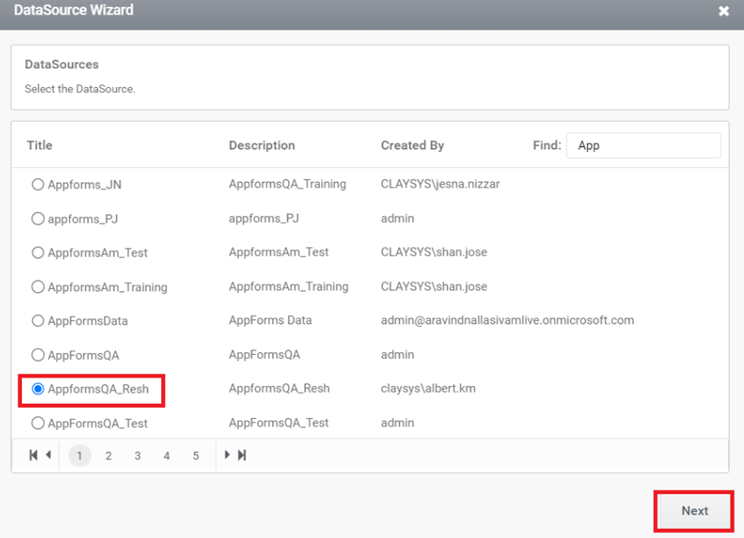
Step:3 – Select the DataSource. For instance, here ‘AppformsQA_Resh’ is selected, then click the Next button.
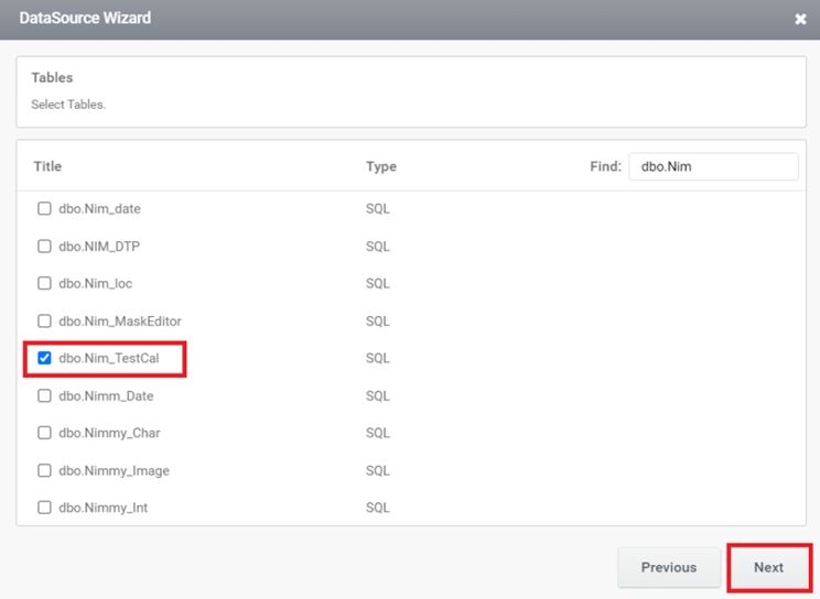
Step:4 – After clicking ‘Next,’ a list of all tables available in the selected database will be displayed. Select the table or tables from the list, then click ‘Next’.
Step:5 – If multiple tables are selected, establishing relationships is mandatory. The selected tables must be available for relationship configuration. Then, click the ‘Next’ button.
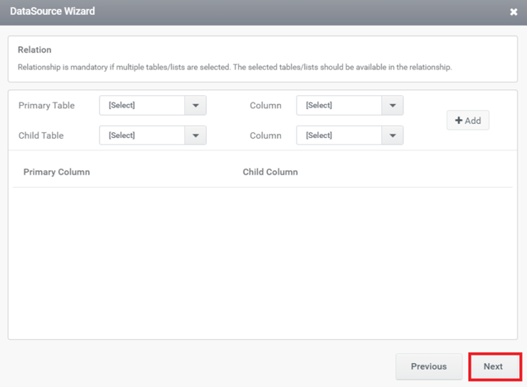
Step:6 – Choose the columns to be displayed from the selected tables, and then click ‘Next’.
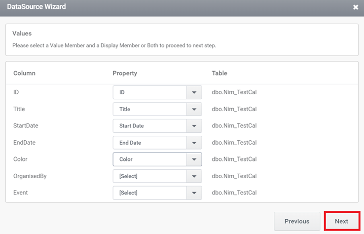
Step:7 – If necessary, you can set the criteria for populating the search by clicking ‘Add.’ The first dropdown will contain all the column names from the selected list, the second dropdown will contain a list of applicable operators for criteria satisfaction, and the third autocomplete field will display the control name from which the list value is to be obtained. Click on the ‘+’ icon to add more criteria. After setting the criteria, click on the ‘Next’ button.
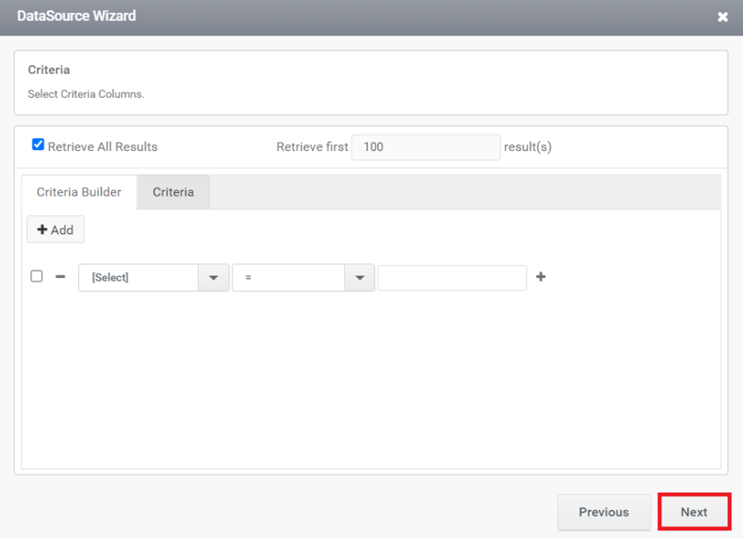
Step:8 – If required, you can sort the results (ascending/descending) by selecting the column. After sorting, click the ‘Next’ button.
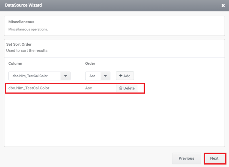
Step:9 – Click on ‘Add Trigger’ to automatically create a rule for initiating the fill of the calendar control based on the provided criteria. Select a trigger and click on ‘Create Rule’ to generate a rule with a specific trigger.
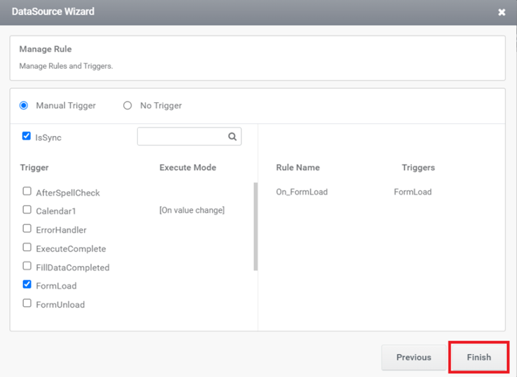
Step:10 – Click on ‘Finish’ to complete the calendar configuration. The created rule can be viewed from the ‘Rule’ tab, along with the provided trigger.
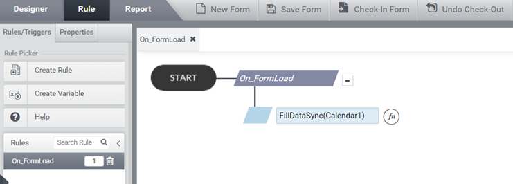
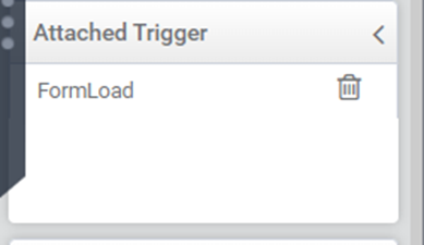
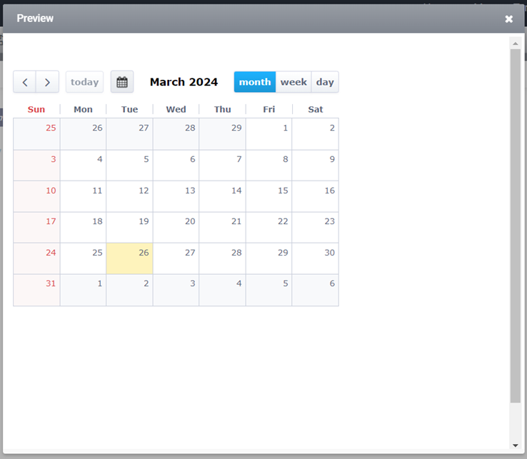
Step:11 – Go to form preview.
Calendar Navigation
Step:1 – Navigate to the ‘Property’ section; here, you can observe calendar navigation options.
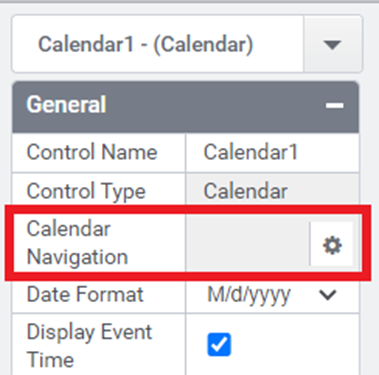
Step:2 – Click on the settings icon; this will display the calendar navigation form.
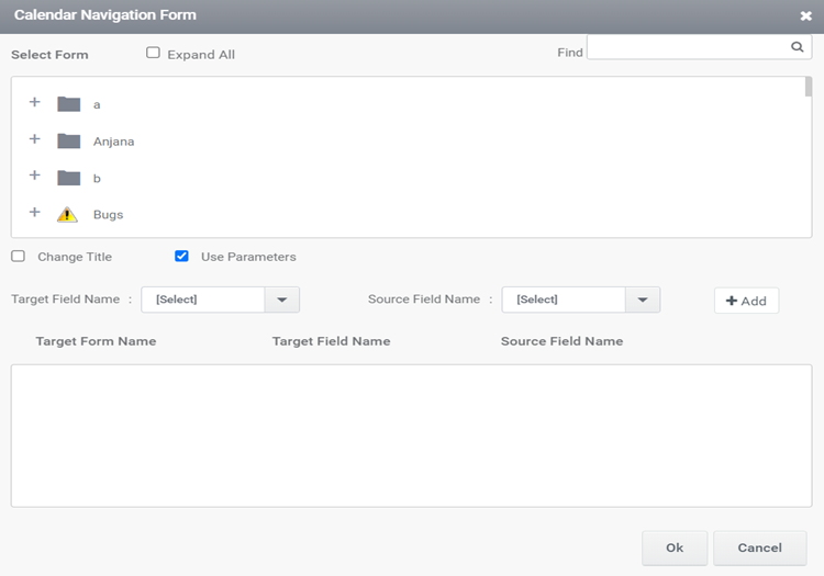
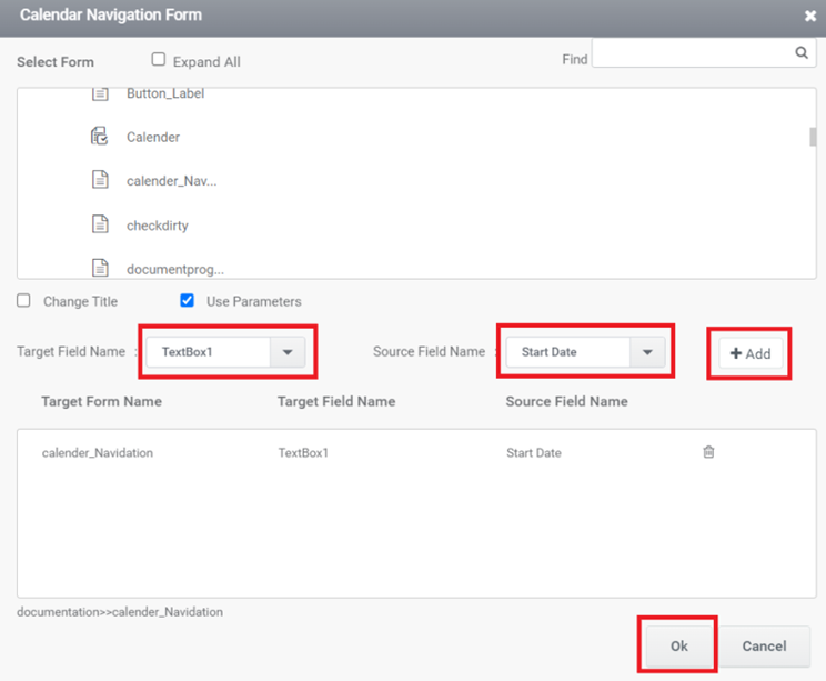
Step:3 – In the Calendar Navigation form:
1. Choose any form.
2. Select the Target Field Name and Source Field Name.
3. After selecting the Target Field Name and Source Field Name, click the ‘Add’ button to include multiple Target Field Names and Source Field Names.
4. After adding them, click the ‘OK’ button to preview.
Step:4– In the preview, if any value is selected in the calendar, that value can be seen in the target field of the selected form for navigation.