Configure Responsive forms
The new responsive feature allows designers to easily create forms in a responsive layout, eliminating the need to configure the form separately for different devices. With this feature, designers can configure the controls for different views simply by enabling the “Is Responsive” option in the form’s property panel. This exclusive feature in the latest build streamlines the process, making it easier to create responsive forms without the need for manual adjustments for each device view.
Simple Steps to Create a Responsive Form
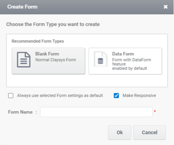
- Create a Form with the Responsive Option Enabled:
Begin by creating a form and ensuring that the ‘Is Responsive’ option is enabled.
Users can now create a responsive form by enabling the ‘Make Responsive’ checkbox while creating a new form.
- Use Subforms for Creating the UI:
The form’s UI should be designed in a tabular structure to ensure responsiveness. In the responsive view, subforms serve as containers, aligning according to the specified configuration. The controls placed within these containers will also adjust their alignment based on the applied settings.
- Configure the Main Form with Subform Containers for Different Views:
Once the subforms are added, configure the template to define how the subform should render across different views (e.g., mobile, tablet, desktop).
- Place the Required Controls Inside the Subform:
Inside the subform, add the necessary controls (such as text boxes, buttons, or other form elements). Controls placed outside the subform in the main form can be moved into a subform container by selecting the desired controls, right-clicking, and choosing the Add to Container option.
- Configure the Controls in the Subforms to Be Responsive:
Select the subform and navigate to the Responsive option in the Property Panel.
Configure the controls under the responsive template to adjust according to different screen sizes, ensuring they display correctly across various devices.
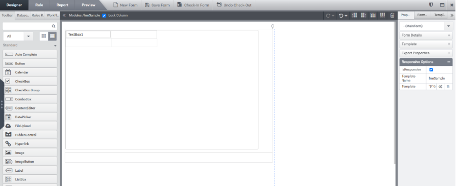
Designer
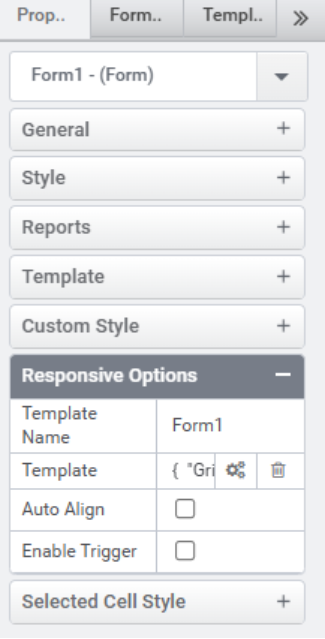
In the main form properties, there is a Responsive Options section that enables form responsiveness. To make the form responsive, the user can enable the Is Responsive option. Additionally, there is a Template Name field to identify the responsive template. These configuration options are available for both the main form and subform controls.
Main Form Responsive option
To create a responsive form, enable the “Is Responsive” option in the property panel of the main form.
- Template Name: The name of the control’s template.
- Template: Configure the responsive UI for the control.
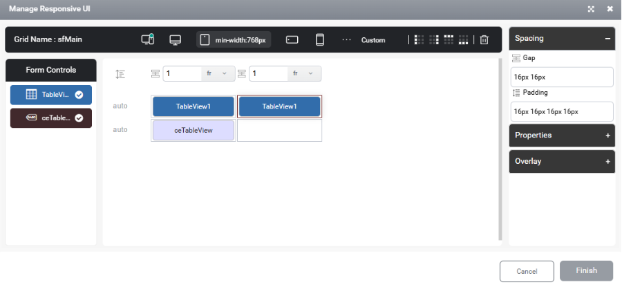
Drag and drop a subform, then configure the responsive UI of the subform by clicking the Template Feature Settings of the main form.
The wizard provides 4 default views:
- Default View: Controls will automatically align as one item per row by default. This behavior will apply to all views unless a different configuration is specified.
- Desktop View
- Tablet View
- Portrait View (Mobile)
- Landscape View (Mobile)

The user can add additional views by clicking the three dots in the header. This will display the available and configured breakpoints.
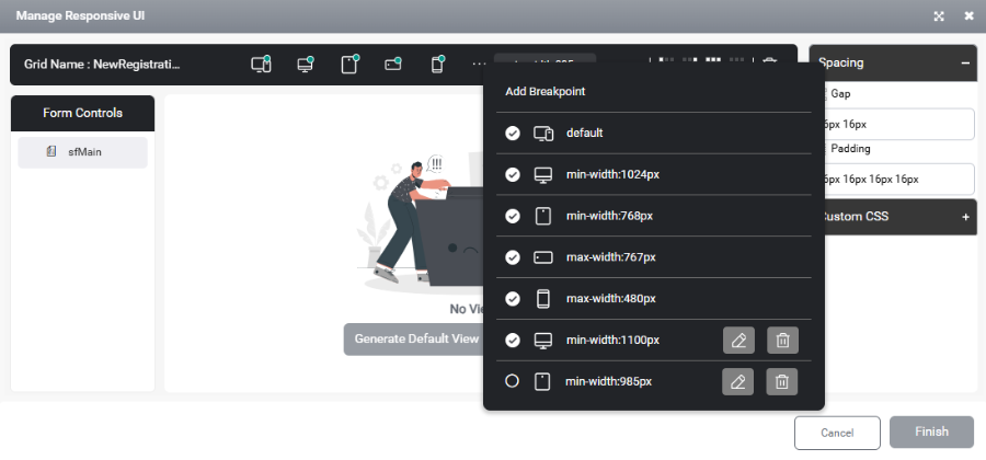
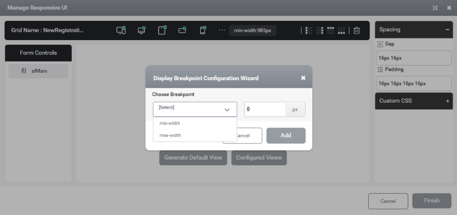
By clicking Add Breakpoint, the user can add new breakpoints. Existing breakpoints cannot be modified. In the Display Breakpoint Configuration Wizard, the user can specify either a min-width or max-width to configure additional views.
The user can adjust the column width by modifying the width property located at the top of each column.
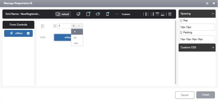
There are 3 measuring units in responsive design – fr, px and rem.
px – Pixel
- Used when a fixed size is required, especially for images, icons, or borders at specific breakpoints.
- Example: An image set to 50px will always render as 50 pixels in the configured breakpoint.
fr – Fraction
- Used in containers where layout areas are defined proportionally.
- Example: 3fr for a label and 1fr for a button means the label will occupy 75% of the space, and the button will occupy 25%.
rem – Root em
- Relative to the root font size.
- Useful when the site has font size management enabled.
- Recommended for containers with controls where scalability is important.
- Example: For a button with the text “Submit” and left/right padding of 5px, increasing the font size may break the UI. In such cases, using rem or fr helps maintain proportional spacing and responsive design.
When right-clicking on a template in the Designer, several options are available, such as Insert Column, Insert Row, Copy Template, Paste Template, Delete Template, Delete Column, Delete Row, and Clear View. The Clear View option is used to remove the configured layout from the selected view.
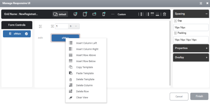
Insert Column Left: Inserts a new column to the left of the currently selected cell.
Insert Column Right: Inserts a new column to the right of the currently selected cell.
Insert Row Above: Inserts a new row above to the currently selected cell.
Insert Row Below: Inserts a new row below to the currently selected cell.
Copy Template: Used to copy the selected template for reuse elsewhere.
Paste Template: Used to paste the copied template.
Delete Template: Used to delete the selected template
Delete Column: Used to delete the selected column
Delete Row: Used to delete the selected column
Clear View: Used to remove the configured layout from the selected view.
To delete multiple rows, columns, or templates in the Responsive Wizard, hold down the Ctrl key and click each item to select them, then proceed with the delete action.
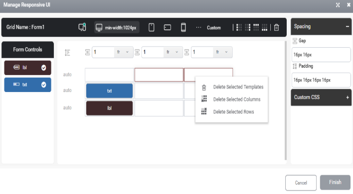
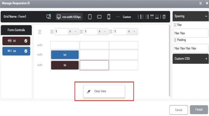
A context menu appears when the user right-clicks outside the grid area, offering an option to clear the displayed view.
By clicking on a template, its properties will be displayed on the right side of the Manage Responsive configuration window.
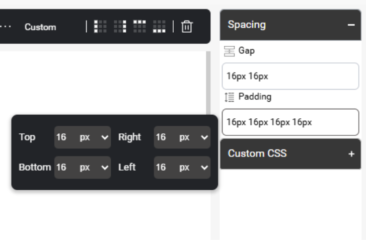
Spacing:
The user can adjust the spacing between items using the available spacing property.
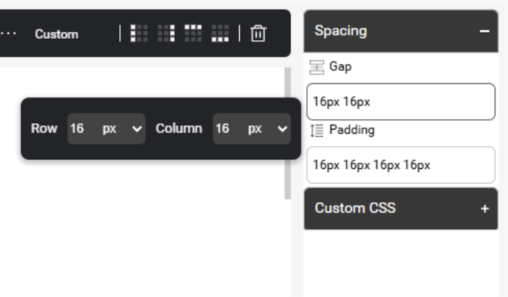
The user can add top, bottom, right, and left padding by configuring the Padding option.
Properties:
The property option is available for all templates by clicking on the template within the responsive configuration window.
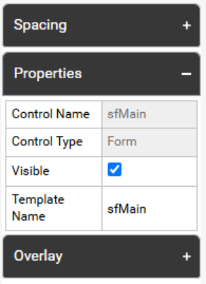
- Template Name: The name of the template for the control.
- Visible: Option to show or hide the control in different views.
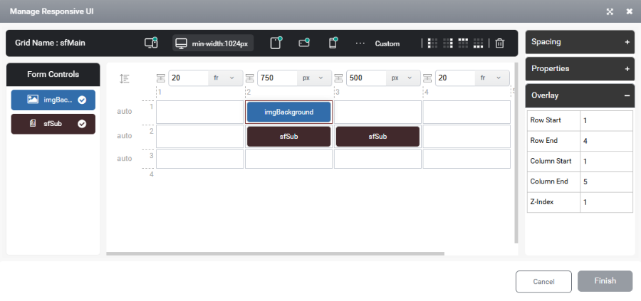
Overlay:
Overlay feature helps to set a control as an overlay on top of another control.
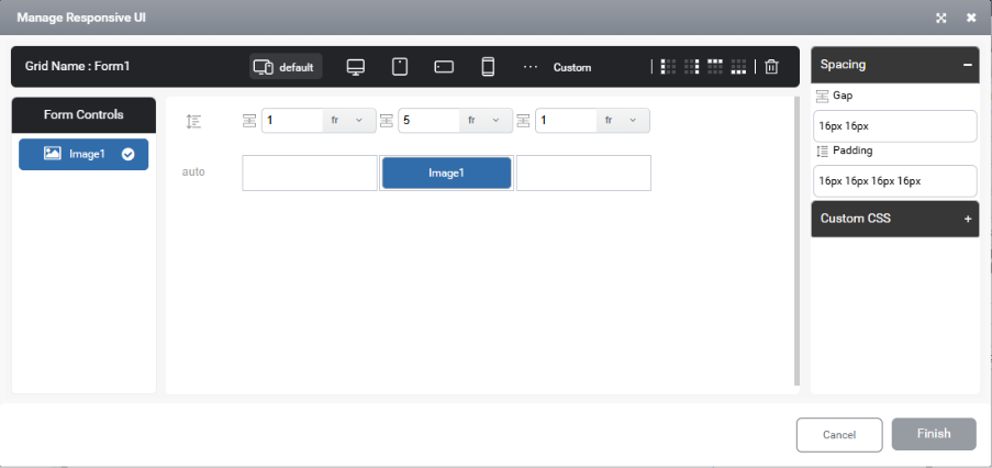
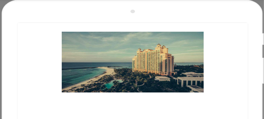
Overlay Example:
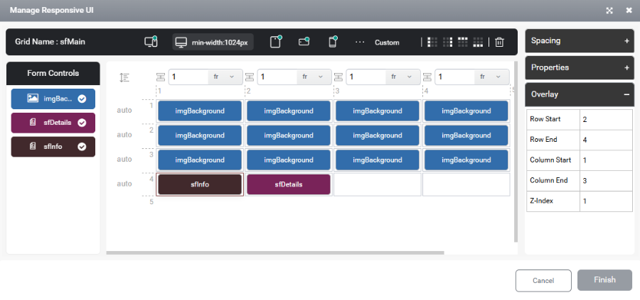
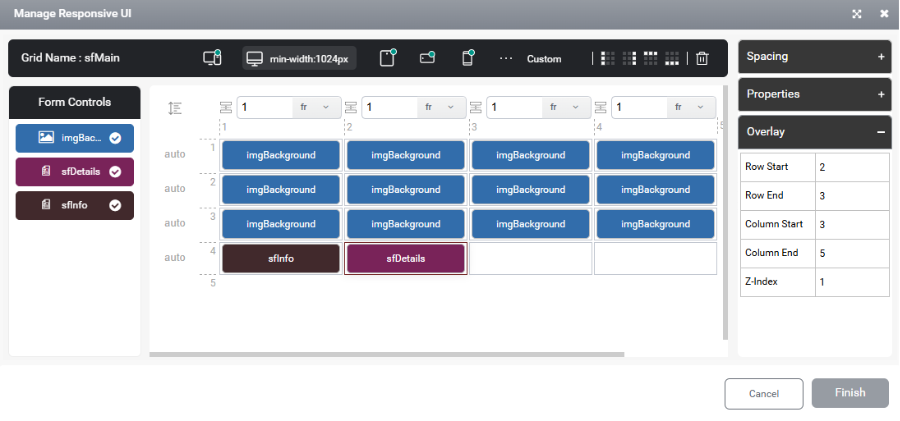
If the user needs to place a label on top of an image control, which is commonly used in projects, then configure both the image and required controls within the subform.
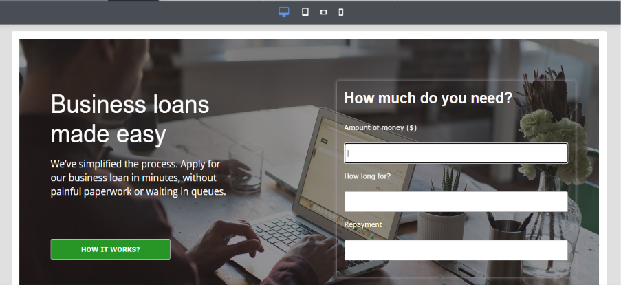
Next, select the Manage Responsive option for the subform where these controls are configured. Position the subform containing all controls below the image and set its Overlay property accordingly. Then, configure the Row Start, Row End, Column Start, Column End and Z-Index properties as needed.
The z-index property in Overlay defines the stacking order of elements on a web page. It determines which elements appear in front of or behind others when they overlap. An element with a higher z-index value will be displayed above elements with a lower z-index value.
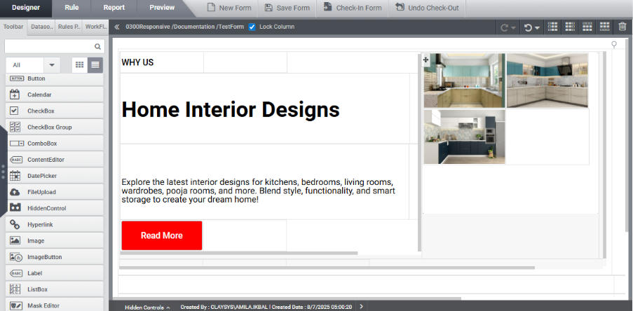
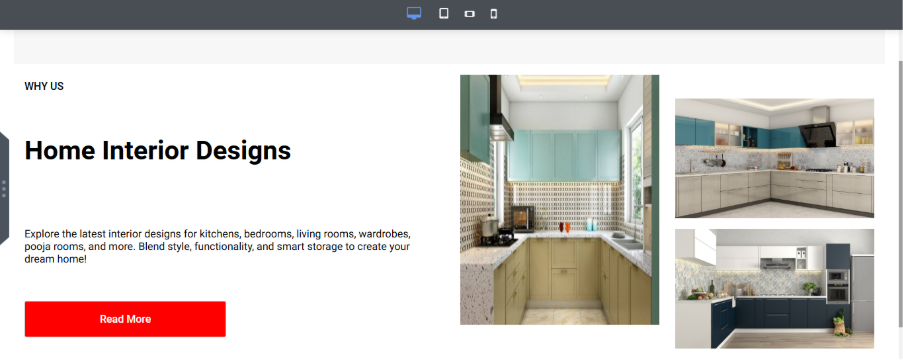
To achieve the above UI, group the controls into two sub-forms: place the controls on the left side inside sfInfo, and those on the right side inside sfDetails.
The configured view can be seen as:

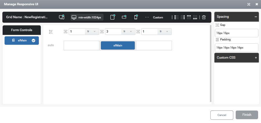
SubForm Responsive option
Form controls need to be added inside a subform container. Once this is done, the Responsive Options section in the subform’s properties can be used for responsive configuration. This configuration process is similar to the main form settings. However, while the main form configuration manages subform controls, the subform configuration specifically manages the controls placed inside it.
- Template Name: The name of the template for the control.
- Template: Configure the responsive UI for each control by adjusting its settings.
- Auto Align: Enable or disable auto alignment
- Alignment: Choose the control’s alignment—horizontal or vertical.
- Gap: This property controls the spacing between items.

- Enable Trigger: Enable or disable the control trigger. The sub form will appear in the trigger section only after enabling this option.
Control Responsive option
The Responsive Options under control property are available for all controls.
- Template Name:
The name assigned to the control’s template, used to reference the control in the Responsive Configuration window.
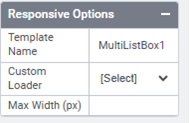
- Custom Loader:
Custom loaders are unique loading symbols that can be applied to Collection Controls, TableView, and Dynamic Grid. These loaders must be added in the Tenant Settings and can then be configured for any required control.
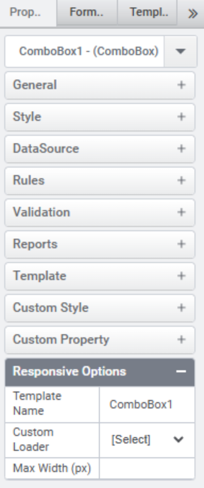
- Max Width (px):
Specifies the maximum width of the control in pixels. This option is available only for CheckBox, CheckBoxGroup, Combobox, Image, Image Button, Button, MultiListBox, RadioButtonGroup, and TextBox.
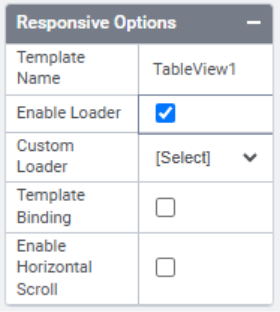
The Responsive Options available for TableView are different from those of other controls.
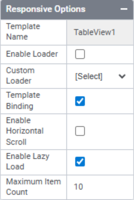
- Template Name:
The name assigned to the control’s template.
- Enable Loader:
This option is enabled when a loader needs to be displayed from the form load until the data is fully loaded upon executing the FillData function.
- Custom Loader:
Selects a custom loader for the control.
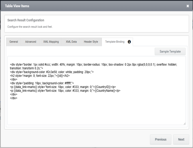
- Template Binding:
Enables the Template Binding option in the Data Source Configuration. In TableView, template binding can be used to bind the table data in a certain HTML format to improve the UI of the control.
- Enable Horizontal Scroll:
Enabling this property allows the horizontal scroll within the Tableview control.
- Enable Lazy Load:
Enabling this option enables incremental data loading in the TableView, where data is fetched progressively as the user scrolls, instead of loading the entire dataset upfront. This approach optimizes performance, particularly when handling large volumes of data.
- Maximum Item Count
This feature is accessible only when the ‘Enable Lazy Load’ setting is enabled. Users can define the item count for the initial load as well as for each incremental load during scrolling.
Template Binding Example:
Template binding can be used to bind table data in a specific HTML format to enhance the control’s UI.
A sample template is available in the Template Binding Configuration window and can be used for reference. Based on user requirements, custom styles and HTML formatting can be applied to the template. For specific styles and HTML configurations, the AppForms support team can assist the designer.
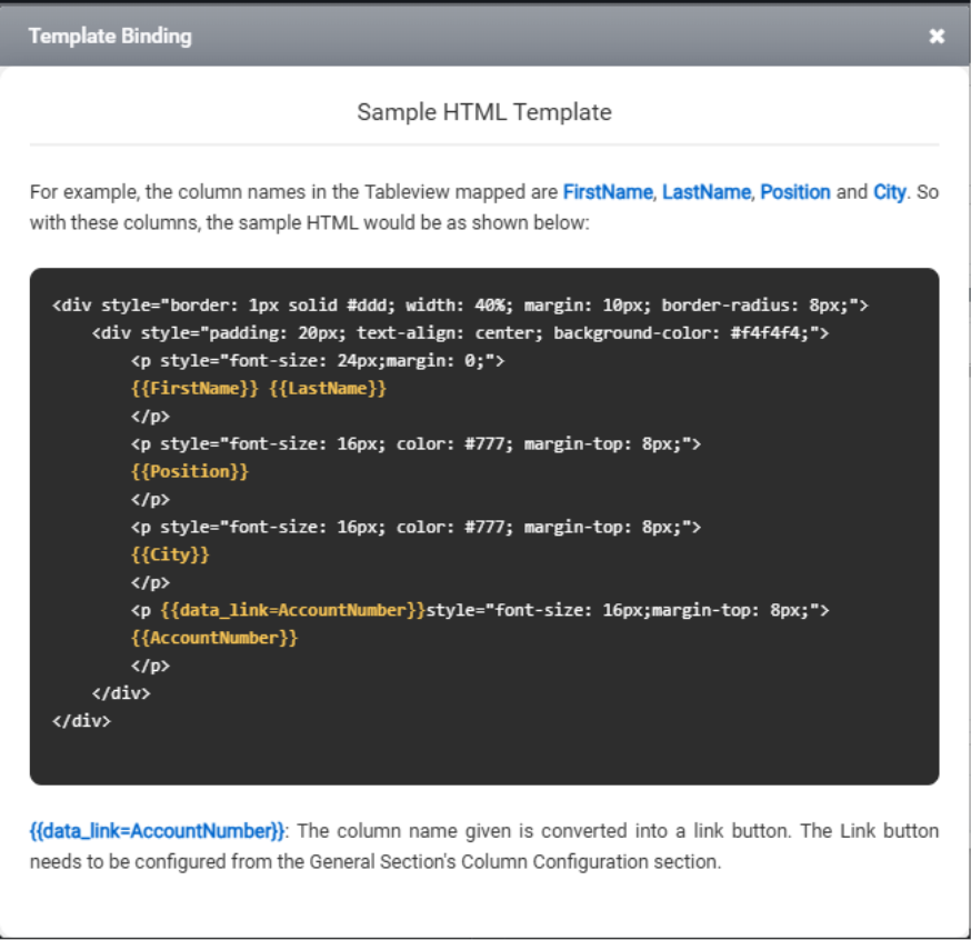
Example:
- The Html snippet that can be used in template binding for a reference:
Example1:
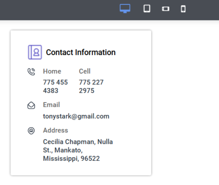
Then the Tableview can be viewed as above when we use the below HTML.
<div class="db-CU-CI-card">

<div class="db-CU-CI-two secn">

<div class="db-CU-CI-left">

  <div><img src="/AppSite/ClientFiles/Member/Leftpanel/Phone.svg"></div>

  <div><h4 class="db-CU-CI-hd">Home</h4><p class="db-CU-CI-value">{{Home}}</p></div>

</div>

  <div class="db-CU-CI-right">

     <h4 class="db-CU-CI-hd">Cell</h4><p class="db-CU-CI-value">{{Cell}}</p>

</div>

</div>

<div class="db-CU-CI-left">

  <div><img src="/AppSite/ClientFiles/Member/Leftpanel/Email.svg"></div>

  <div><h4 class="db-CU-CI-hd">Email</h4><p class="db-CU-CI-value">{{Email}}</p></div>

</div>

<div class="db-CU-CI-left">

  <div><img src="/AppSite/ClientFiles/Member/Leftpanel/Location.svg"></div>

  <div><h4 class="db-CU-CI-hd">Address</h4><p class="db-CU-CI-value">{{Address}}</p></div>

</div>

</div>


Example 2:

<div style="border: 1px solid #ccc; width: 40%; margin: 10px; border-radius: 10px; box-shadow: 0 2px 8px rgba(0,0,0,0.1); overflow: hidden; transition: transform 0.2s;">

<div style="background-color: #2c3e50; color: white; padding: 20px;">

<h2 style="margin: 0; font-size: 22px;">{{id}}</h2>

</div>

<div style="padding: 16px; background-color: #ffffff;">

<p {{data_link=marks}} style="font-size: 18px; color: #333; margin: 0;">{{CountryID}}</p>

<p {{data_link=marks}} style="font-size: 18px; color: #333; margin: 0;">{{CountryName}}</p>

</div>

</div>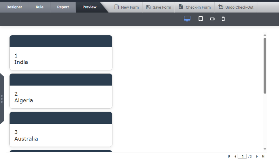
Subform Template Copy-Paste Functionality
If users need to reuse the same template configuration across different forms, they can take advantage of the “Copy Template” and “Paste Template” features.
These options allow users to easily duplicate a responsive template from one subform to another within the designer. This copy-paste functionality is supported across different forms, not limited to the same form.
To do this, right-click the source subform—the “Copy Template” option will appear in the context menu only if IsResponsive is enabled.
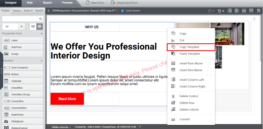
Then, right-click the target subform and select “Paste Template” to apply the copied layout.
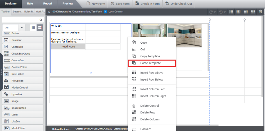
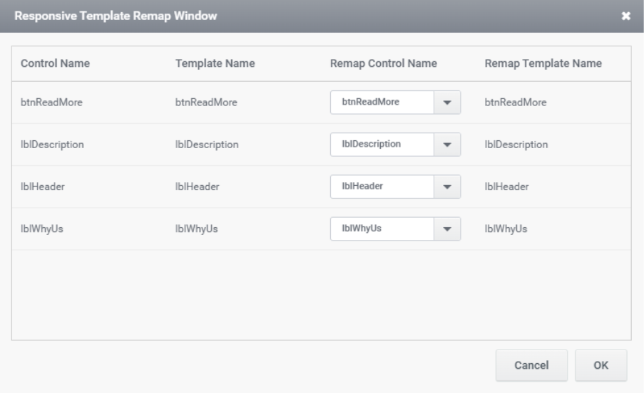
During the paste operation, controls from the source subform are automatically mapped to their corresponding control types in the target subform using the default configuration of the Responsive Template Remap Window.
Users have the flexibility to review and customize these mappings as required to ensure proper alignment with the target layout.
When a template is copied, the custom class and styles of the selected subform, as well as those of its immediate child controls, are retained and applied during the paste operation.
When rendered, it is displayed as:
Custom Loaders
This feature allows designers to add custom loading symbols for individual controls or the entire tenant.
- In Tenant Settings, there is an option to configure custom loaders.
- Users can add a custom HTML loader and set it as either a Global Loader or a Local Loader.
Global Loader: Acts as the default loader for the entire page and appears while the page is loading.
Local Loader: Applied to individual controls and appears only when the specific control is loading.
Note: If no custom loader is specified for a control, the system will use the default loader.
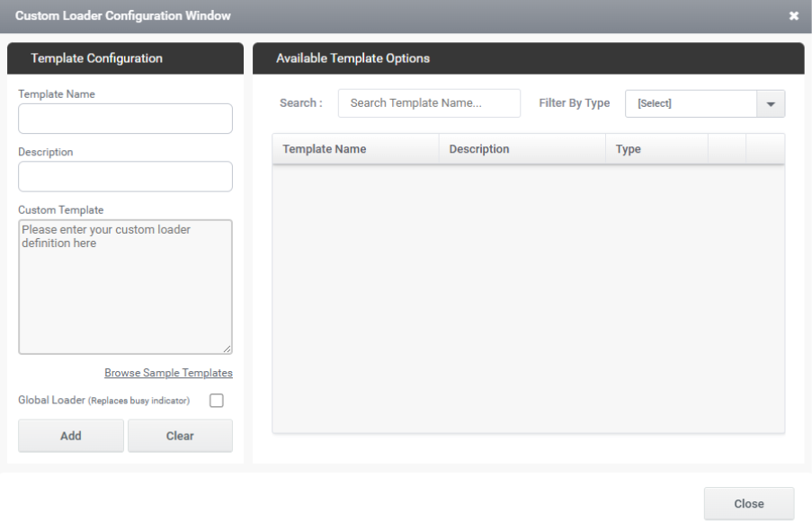
Users can browse sample templates by clicking the ‘Browse Sample Templates’ option. This opens a Custom Loader templates popup where users can select and use sample template HTML. Both global loaders and control-specific loader samples are available, making it easier to add any type of loader to a form.
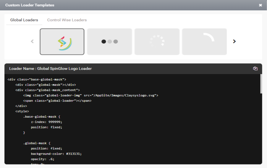
The custom loader can be displayed as shown in the image below.
When the responsive option is enabled for a form, a new property called Custom Loader will be available in the responsive section for the following controls:
- AutoCompleteTextBox
- CheckBoxGroup
- MultiListBox
- ComboBox
- ListBox
- RadioButtonGroup
- ExternalForm
- TableView
This Custom Loader property allows users to set a custom loader for these controls in the responsive layout, ensuring a more personalized and efficient loading experience for each control.
Select the custom loader from the dropdown and save the form.
For Tableview there is an option “Enable Loader”. This option is enabled when a loader needs to be displayed from the form load until the data is fully loaded upon executing the FillData function. Select the custom loader from the dropdown and save the form.
How to configure large controls
Large controls should be placed across adjacent cells to ensure proper UI rendering. If they are confined to a single cell, it can lead to layout issues.
Therefore, the table view should be configured to span more than one cell to ensure the UI renders correctly across all device views.
This ensures the table view is displayed with a proper and visually consistent UI.
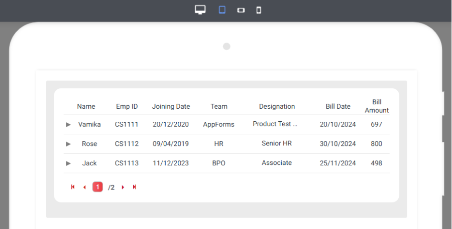
Please ensure the same styling rule is applied to the chart control as well.
How to make control/image to center to a container
The control can be centred within a container by placing it inside a cell and adding extra cells to the left and right of it.
By configuring the control as shown in the figure above, it appears centred with equal spacing on both sides.
How to center align a form
The UI of the form is determined by how the subform is configured in the responsive settings of the main form. The appearance of the form can vary depending on how the subform is set up.
If the user wants to center-align the form with equal spacing on both sides, it should be configured accordingly—so that it appears centrally aligned with balanced space on both sides:
This ensures that the form appears center-aligned with equal spacing on both sides.
If the user needs to left-align the form, it should be configured as described on page 39.
How to restrict max-width for a site
The max-width of a site can be restricted by following these steps:
- Add a custom breakpoint
- Define a breakpoint with a specific minimum width to control layout behavior on larger screens.
- Place the main subform inside a cell
- Insert the main subform into a central cell within the ‘Responsive Manage UI’ option in the main form.
- Set the cell’s width in pixels
- Configure this central cell with a fixed pixel width to maintain consistent sizing.
- Add cells to the left and right
- Insert additional empty cells on both sides of the central cell to create balanced spacing.
This configuration ensures that the site maintains a consistent width and remains centred, regardless of screen size.
In rendering it can be viewed as
Custom CSS
The Custom CSS option in the ‘Manage Responsive UI’ panel allows heading and button controls to apply different styles for desktop, tablet, and mobile views.
Since the Custom CSS option is available in all views, users can apply specific CSS rules tailored to each view individually.
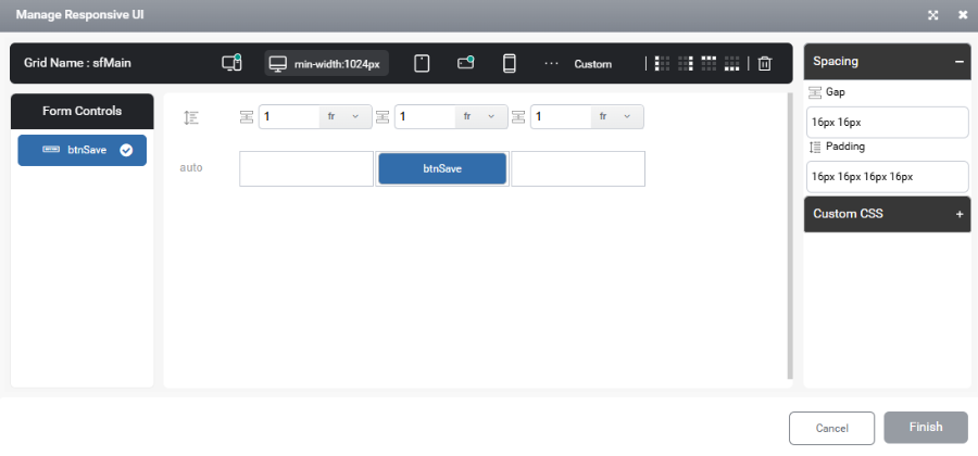
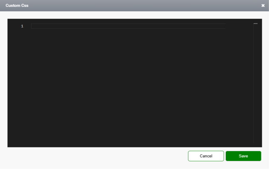
By clicking the gear icon, the user is taken to the Custom CSS editor window, where different styles can be defined for each view—desktop, tablet, and mobile.
The corresponding CSS class name should then be assigned to the control’s ‘Custom Style’ field.
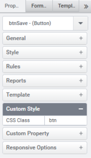
Example:
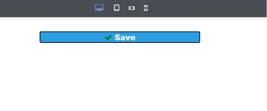
The CSS given in desktop view is:
.btn button {
font-size: 20px !important;
font-weight: bold !important;
color: white !important;
}
And it can be viewed as:
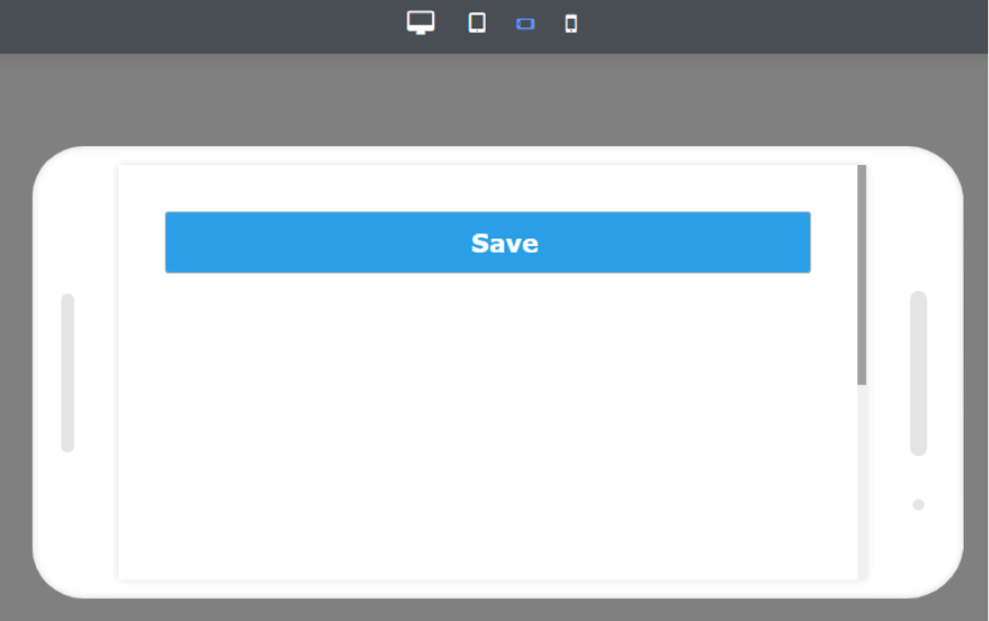
The CSS given in mobile landscape view is:
.btn i {
visibility: hidden !important;
}
.btn button {
font-size: 20px !important;
height: 50px !important;
font-weight: bolder !important;
color: white !important;
}
It can be viewed as:
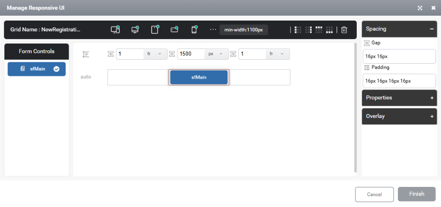
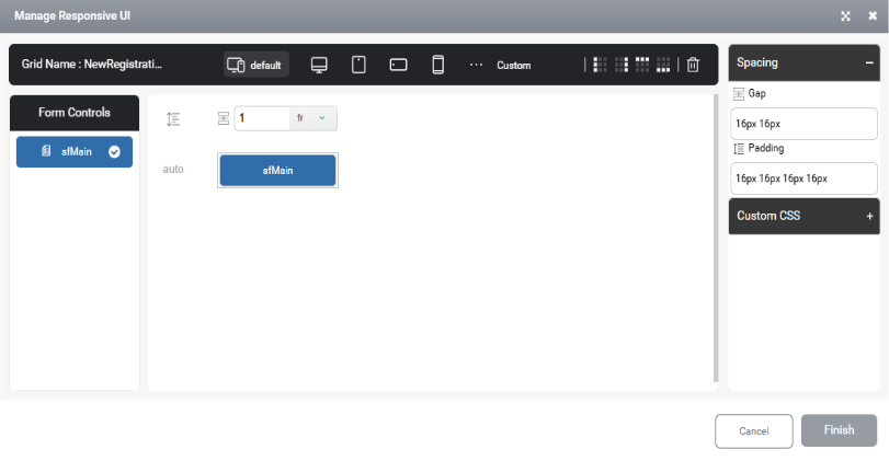
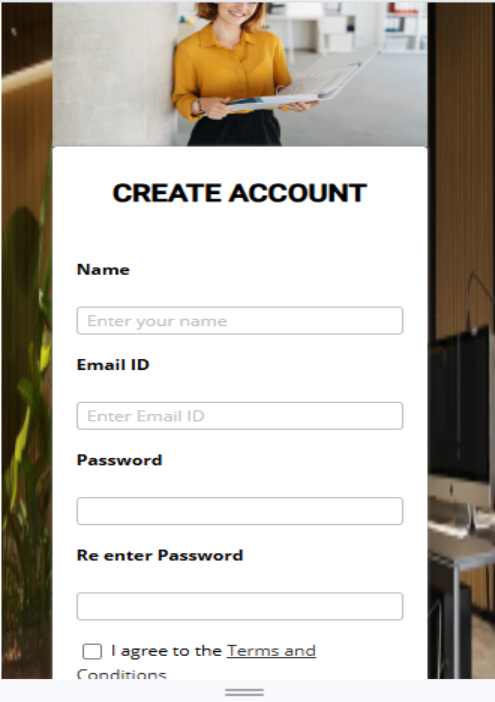
How to design a registration form in responsive
- Create a Form with the Responsive Option Enabled:
- Begin by creating a form and ensuring that the Is Responsive option is enabled.
- Add a Subform:
- Drag and drop a Subform onto the main form.
- Configure the Subform in Mainform Template for Different Views:
- Once the subform is added, configure the template in the main form’s responsive options to define how the subform should be rendered across different views. Since the same UI is applied across different views, only the default view needs to be configured. This configuration will automatically apply to all views. However, if the user requires different layouts for each view, then each view must be configured individually.
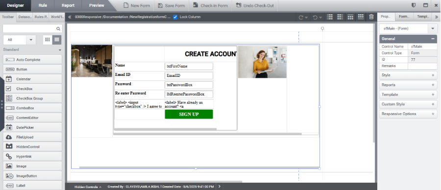
- Place the Required Controls Inside the Subform:
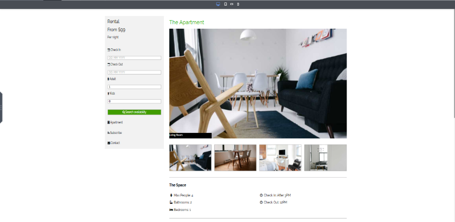
- Within the main subform, add additional subforms as needed. In the second subform, include images and insert another nested subform containing the required controls, such as text boxes, buttons, or other form elements.
- When the responsive feature is enabled, the attached labels of the controls will not be available. Therefore, additional labels must be added to denote each control. The styles and general properties of controls can be modified in the property panel, except for the width. The width of each control can be configured using the responsive UI feature.
- Configure the Controls in the Subform’s Responsive Template:
- Select the subform and navigate to the Responsive option in the Property Panel.
- Configure the controls under the responsive template to adjust according to different screen sizes, ensuring they display correctly across various devices.
- When the Responsive option is selected, only the default view will be available. For each view, the user must define it either by selecting the Generate Default View option or by using the Configured Views option.
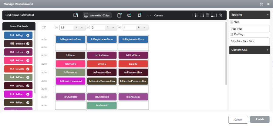
If a control requires additional width, it can be configured to span across multiple columns. In the example below, certain controls are extended over several columns to increase their width. However, controls can only be configured within adjacent cells of the same row or column, non-contiguous placement is not supported.
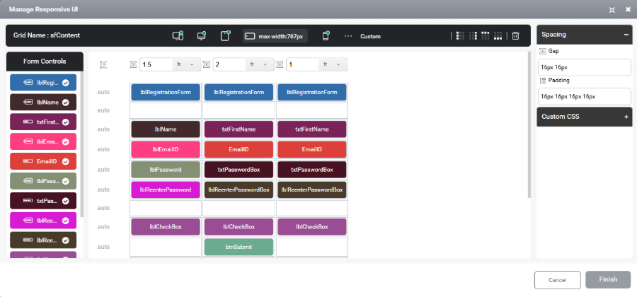
The controls within the nested subforms can be adjusted for each view, as demonstrated in the image below.
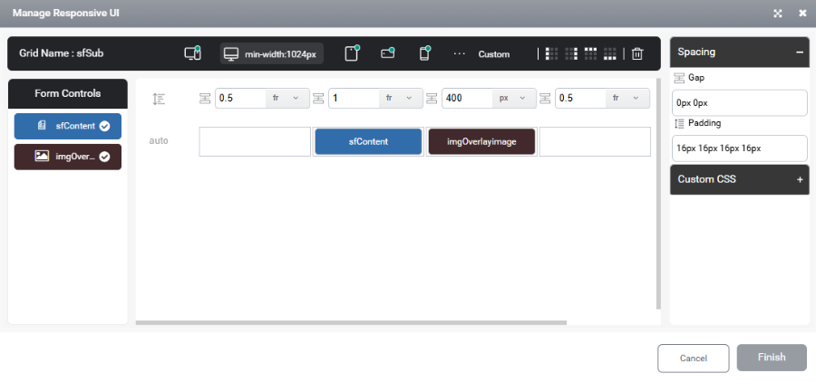
Desktop View

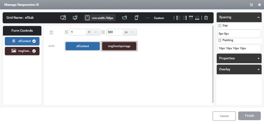
Tablet View
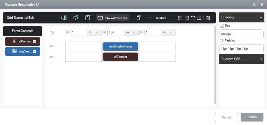
Mobile Landscape View
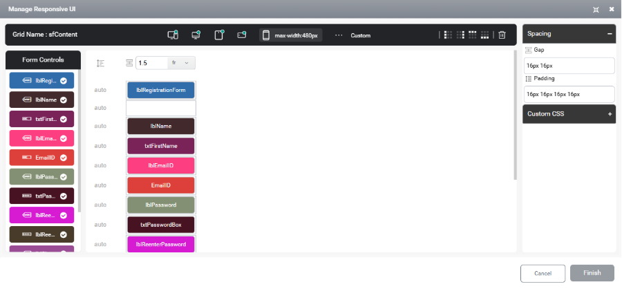
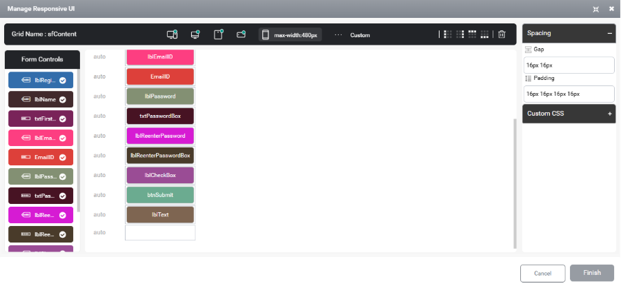
Mobile Portrait View
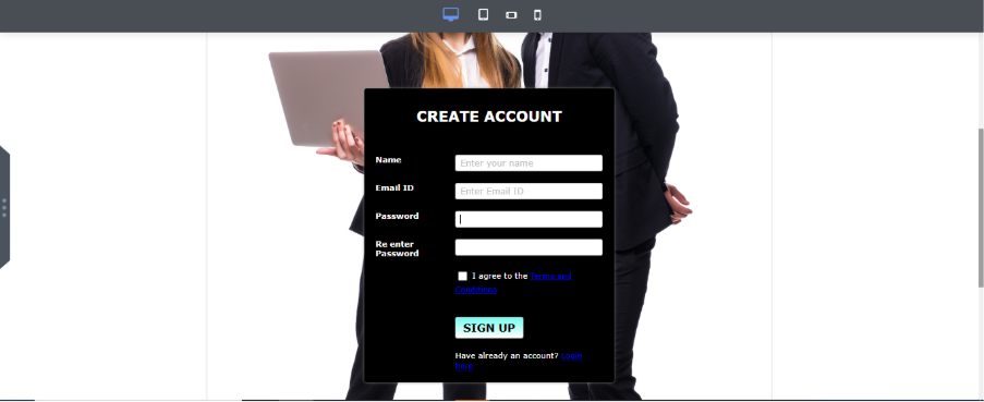
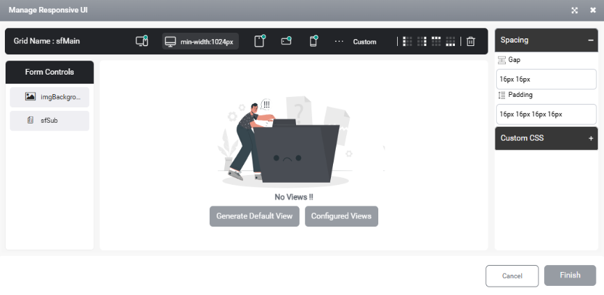
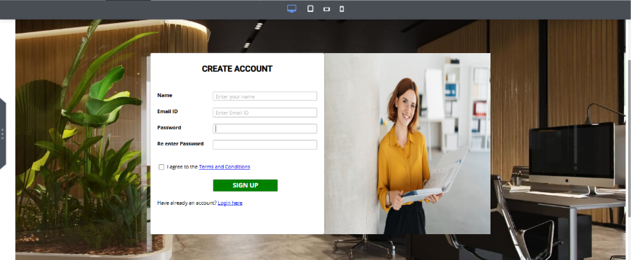
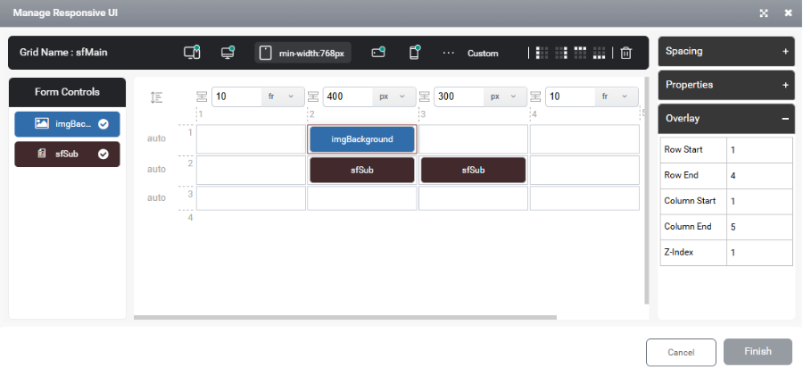
Configure the responsive settings of the main subform as demonstrated below. An overlay effect is applied to enhance the visual appeal and give the form a more professional appearance.
Desktop View
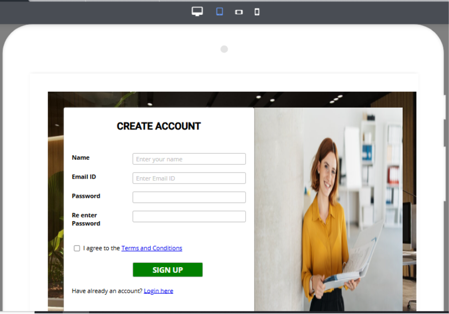
In rendering it can be viewed as
Tablet View
In rendering it can be viewed as

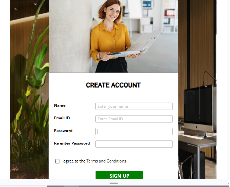
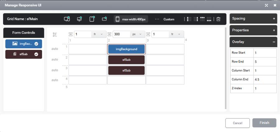
Mobile Landscape View
In rendering it can be viewed as
Mobile Portrait View
In rendering it can be viewed as
Conclusion
The introduction of the responsive feature significantly simplifies form design by enabling a unified configuration approach across all device views. By simply enabling the “Is Responsive” option, designers can ensure consistent, adaptive layouts without repetitive manual adjustments. This enhancement boosts efficiency, saves time, and delivers a seamless user experience across desktop, tablet, and mobile devices.