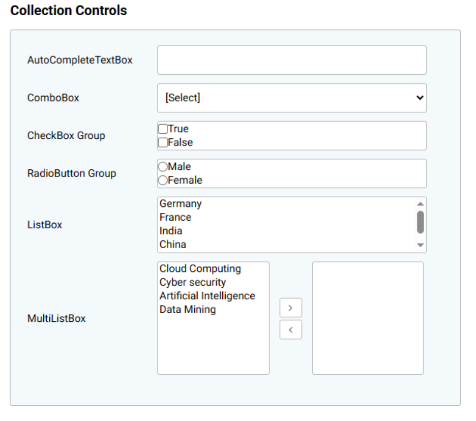
Collection Controls
In AppForms, controls such as ComboBox, ListBox, CheckBox Group, RadioButton Group, AutoComplete Textbox, and MultiListBox are referred to as collection controls. This term is used because these controls present a collection of values from which users can select one or more options.
The sample collection controls are illustrated in the image below.
All collection controls follow the same process for configuring them to display values from any data source.
Generic DataSource Configuration – Collection Control
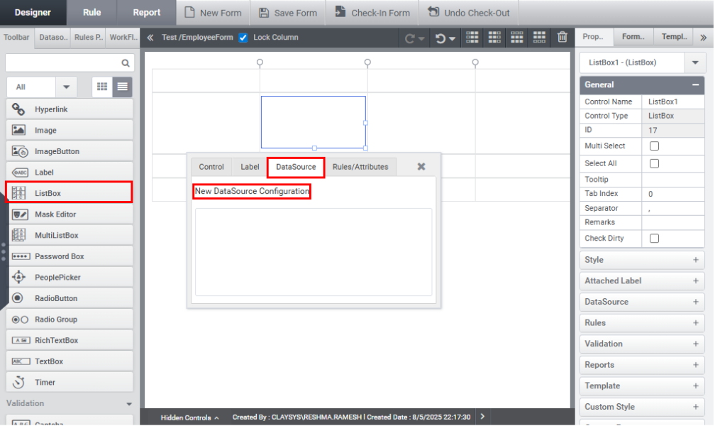
Drag and drop a ListBox control from the toolbox.
The datasource can be configured in two methods:
1. Datasource Configuration using Quick Menu
Click on the control to open the Quick Menu. From there, select the Datasource tab and click on the New Datasource Configuration option, as shown in the image below.
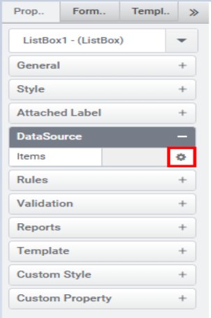
2. Datasource Configuration using Property Panel
Click on the control, then navigate to the Datasource tab and click the gear icon, as shown in the image below.
The Datasource Wizard is displayed, as illustrated in the image below.
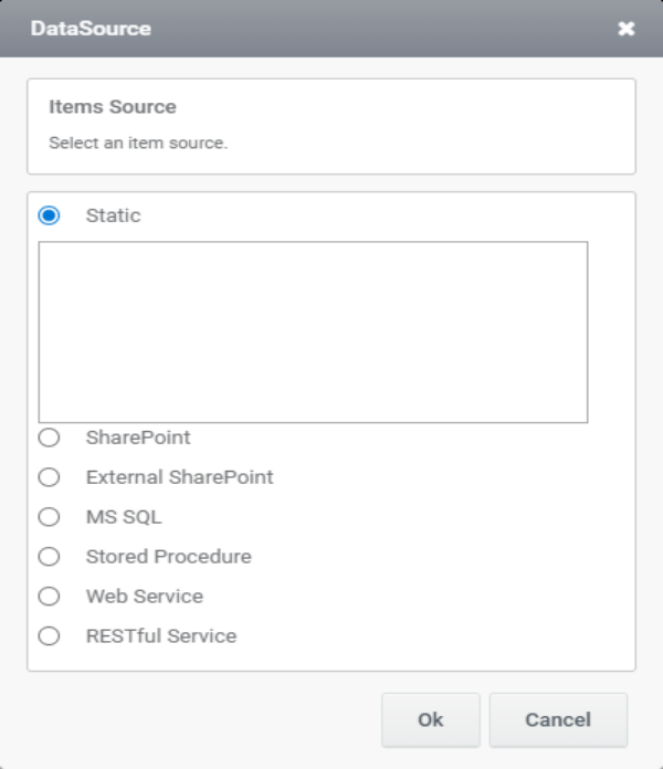
The available data sources are listed below.
- Static Data
- SharePoint List/Library
- External SharePoint List/Library
- MS SQL
- MS SQL Stored Procedure
- RESTful Service
- Webservice
Note:
- Sharepoint and External Sharepoint are available only in sharepoint.
- After configuring the datasource, the rule will be generated automatically.
- The collection control can be filled with FillDataSync,FillData and FillDataAsync.which is explained under Topic Functions.