Line Chart
A line chart is a visual tool used to represent data as a sequence of points connected by straight lines. It is typically used to illustrate the relationship between two variables and how they vary over a continuous period.
There are three types of Line charts:
- Basic Line chart
- Stepped Chart
- Point Chart
1. Basic Line Chart
A basic line chart is a simple visualization that connects a series of data points with straight lines. It’s often used to show trends or changes in data over time or across different categories.
Let’s walk through the steps to configure a basic line chart.
Steps to configure Basic Line Chart:
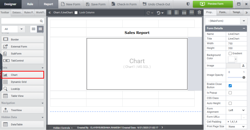
Step 1: Drag and drop the Chart Control and apply formatting to the form to enhance UI presentation.
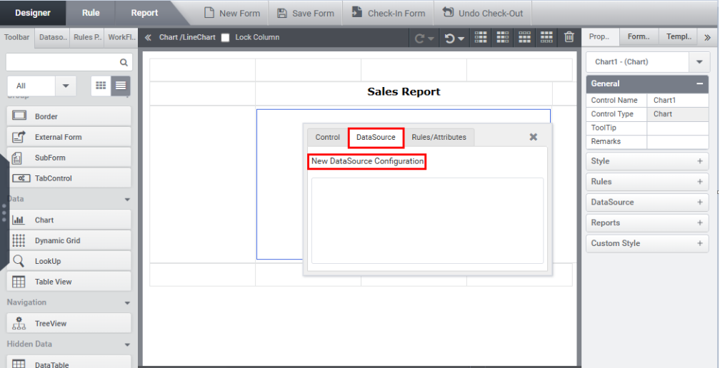
Step 2: Click the New Datasource Configuration link under the Datasource tab in the Quick Menu.
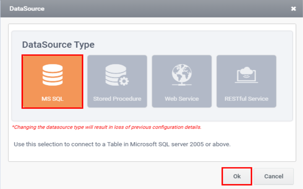
Step 3: Datasource Wizard appears, select the datasource type as SQL and click Ok.
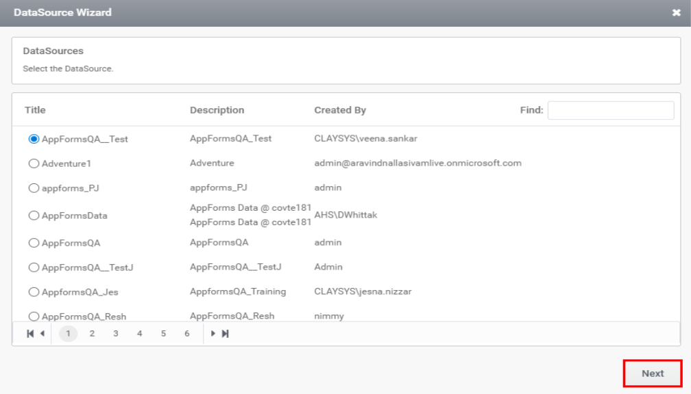
Step 4: Choose the desired data source from the list of available data sources and click Next.
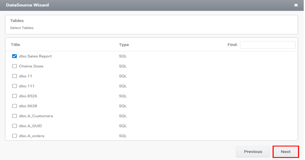
Step 5: Select the required table from the list of Tables and click Next.
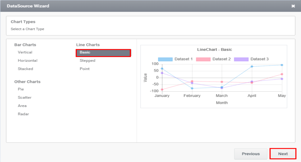
Step 6: Select the type of chart as Basic and click Next button.
Step 7: The next page redirects you to the section for entering chart details. Enter the required fields and click Next.
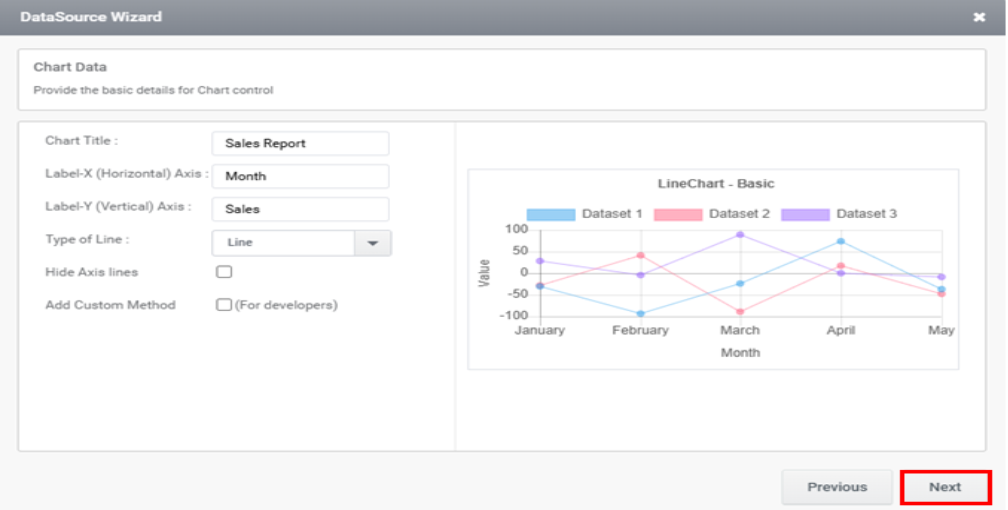
The wizard contains the following fields:
Chart Title: It appears at the top of the chart and helps the viewer understand the purpose or context of the chart at a glance.
Label-X (Horizontal) Axis: The horizontal axis represents the independent variable or the categories being measured. It provides a description of what is being measured in the Horizontal Axis
Label-Y (Vertical) Axis: The vertical axis that represents the numerical values or measurements being plotted or compared. It provides a description of what is being measured in Vertical Axis
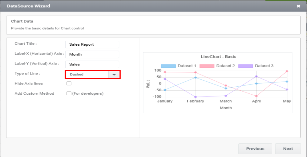
Type of Line: There are two types of lines available. Line and dashed Type.
Hide Axis lines: Hiding axis lines refers to the act of removing or hiding the lines that represent the axes in a chart.
Add Custom Method: Add Custom Method is for developers. When you select Add Custom Method, you will be prompted to enter a method name.
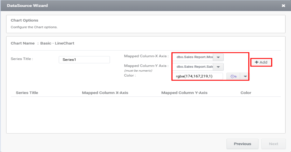
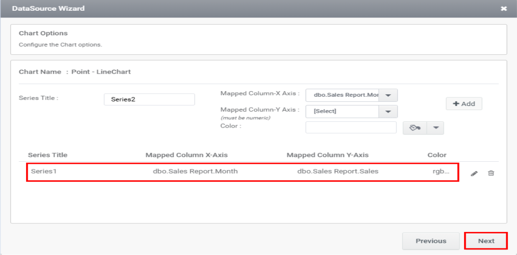
Step 8: The next page allows you to add a series by mapping columns to the respective axes. After completing the mapping, click the ‘Add’ button.
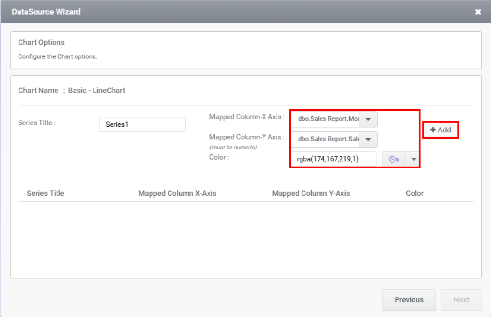
Step 9: Upon clicking the ‘Add’ button, the series will appear in the section below. Then, click ‘Next’ as illustrated in the image below.
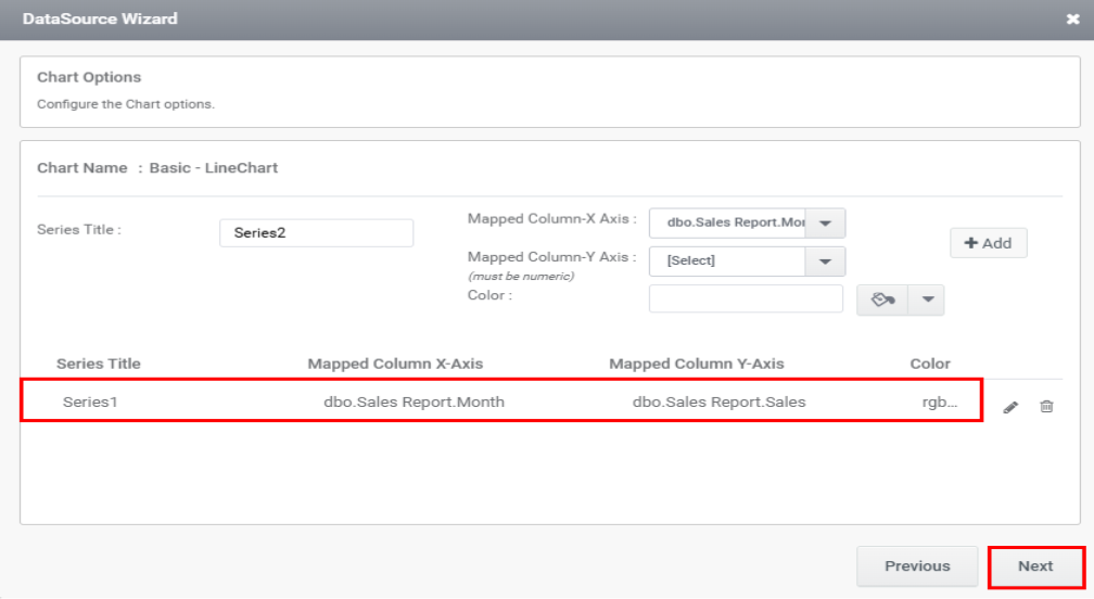
You can edit or delete a series by clicking the corresponding icon, as needed.
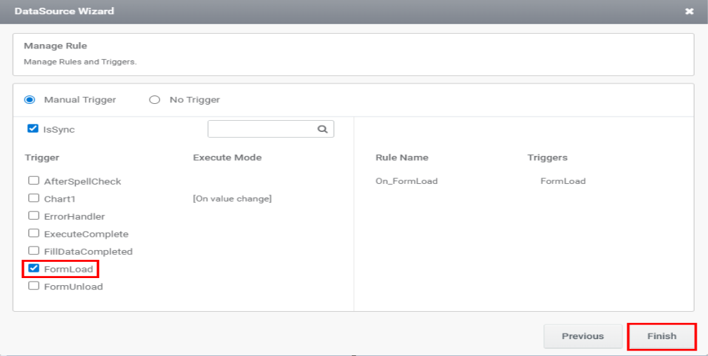
Step 10: Once you select the trigger, the rule will be generated automatically. Proceed by clicking ‘Finish’.
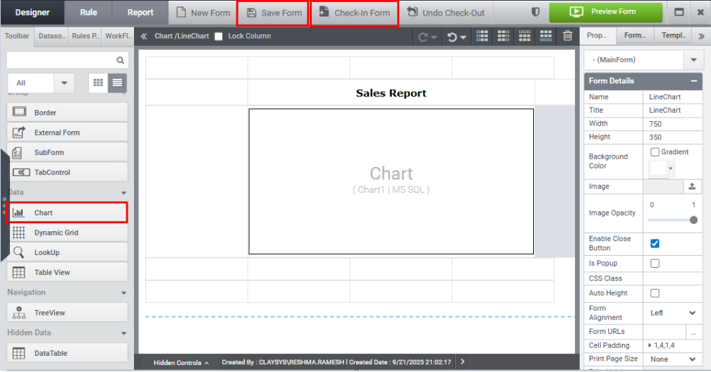
Step 11: Click on the Save Form and Check In form button.
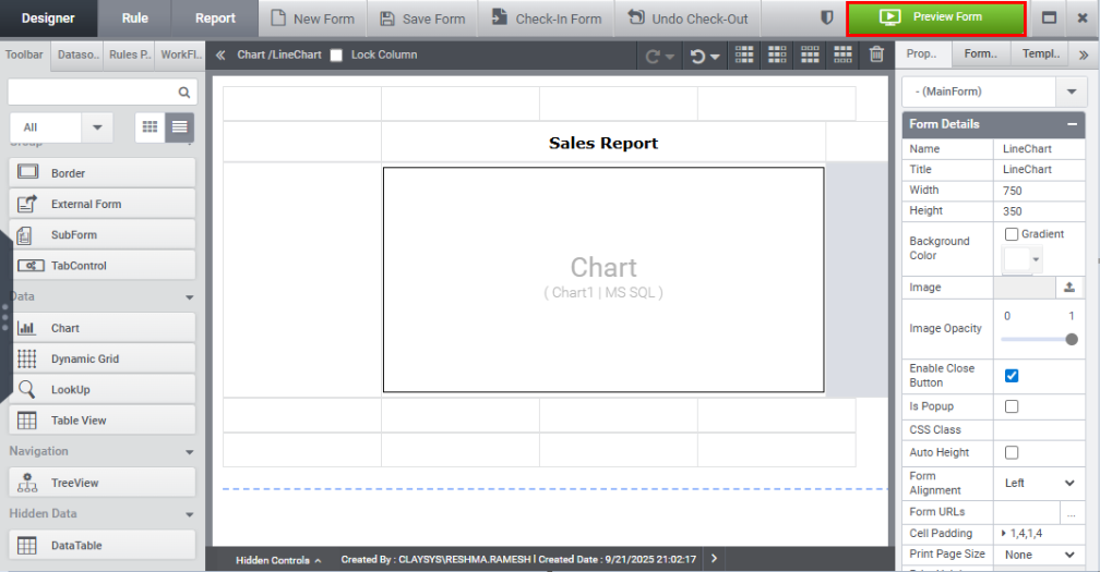
Step 12: Click the Preview button to preview the form.
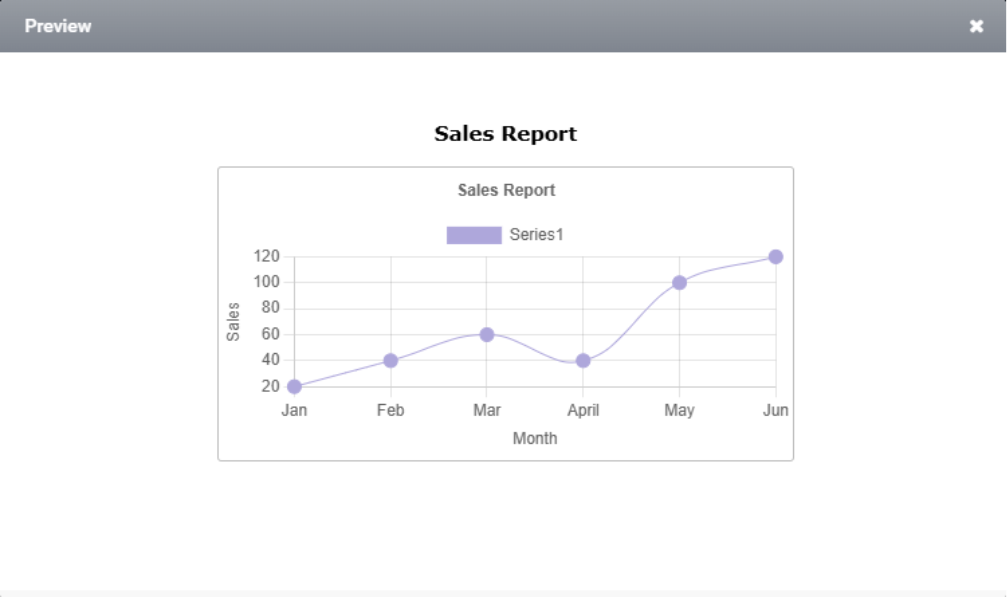
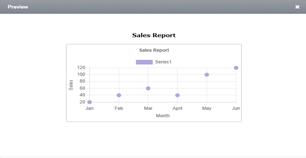
Step 13: The preview of the Basic line chart is shown in the image below.
Dashed line chart:
Another available line style is dashed. To use it, change the line type to ‘dashed’ in the DataSource Wizard as illustrated in the image.
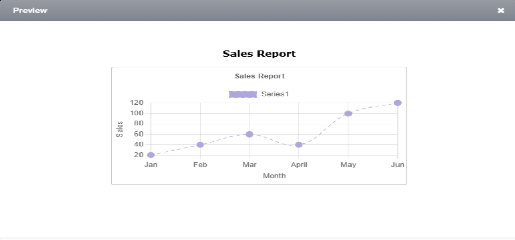
Step 1: Add the series and trigger as shown before and click Preview.
The preview of the dashed line chart is demonstrated in the image below.
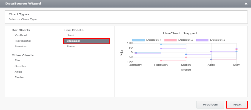
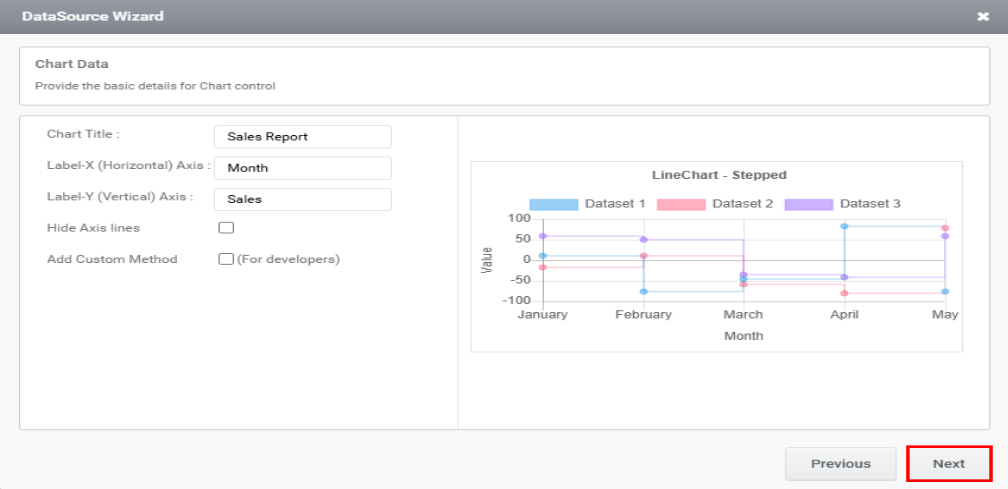
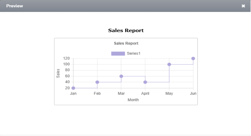
2. Stepped Chart
A stepped line chart is a type of line chart where data points are connected using horizontal and vertical segments, creating a staircase-like appearance.
Steps to configure Stepped chart:
Step 1: Select a Chart Type as Stepped and click the ‘Next’ button.
Step 2: The following page opens the chart details section. Click on “Next,” as depicted in the image below.
Step 3: The next page allows you to add a series by mapping columns to the respective axes. After completing the mapping, click the ‘Add’ button.

Step 4: Upon clicking the ‘Add’ button, the series will appear in the section below. Then, click ‘Next’.

You can edit or delete a series by clicking the corresponding icon, as needed.
Step 5: Select the required trigger from the next wizard and click Finish.
Step 6: Click Preview. The preview of the stacked chart is demonstrated in the image below.
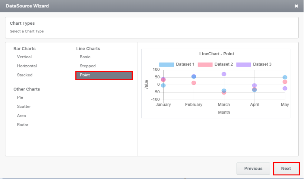
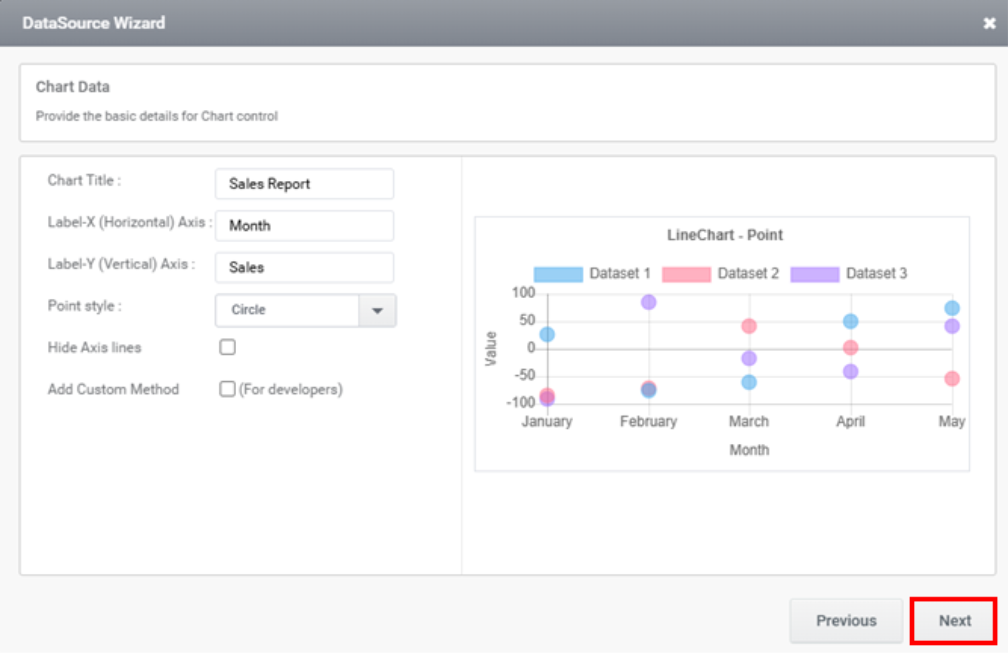
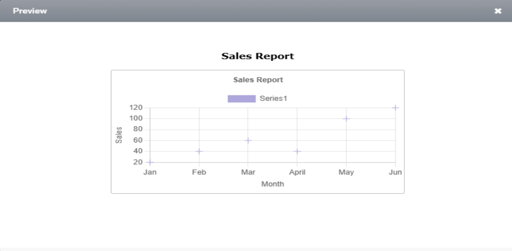
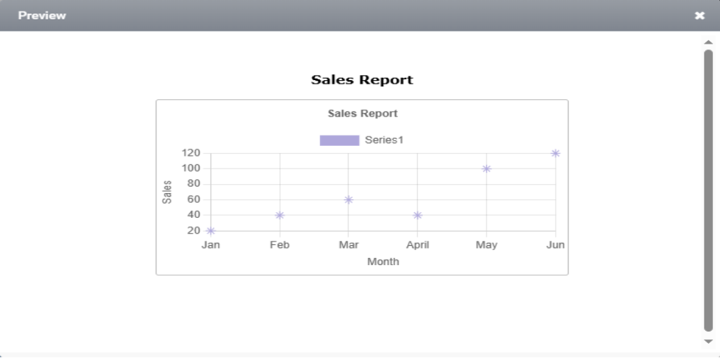
3. Point Line Charts
A point-line chart is a type of data visualization used to illustrate the relationship between two numerical variables. It features individual data points, typically represented by dots or markers, to highlight trends or patterns within the data.
Steps to configure Point Line Charts:
Step 1: Select a Chart Type as Point and click the ‘Next’ button.
Step 2: The next page redirects you to the section for entering chart details and click Next.
Step 3: The next page allows you to add a series by mapping columns to the respective axes. After completing the mapping, click the ‘Add’ button as illustrated in the image below.
Step 4: Upon clicking the ‘Add’ button, the series will appear in the section below. Then, click ‘Next’.
You can edit or delete a series by clicking the corresponding icon, as needed.
Step 5: Select the required trigger from the next wizard and click Finish.
Step 6: Click Preview.
Types of Point Style:
Charts can be configured in 10-point styles which can be selected from the point style field in basic details wizard as shown in the image below.
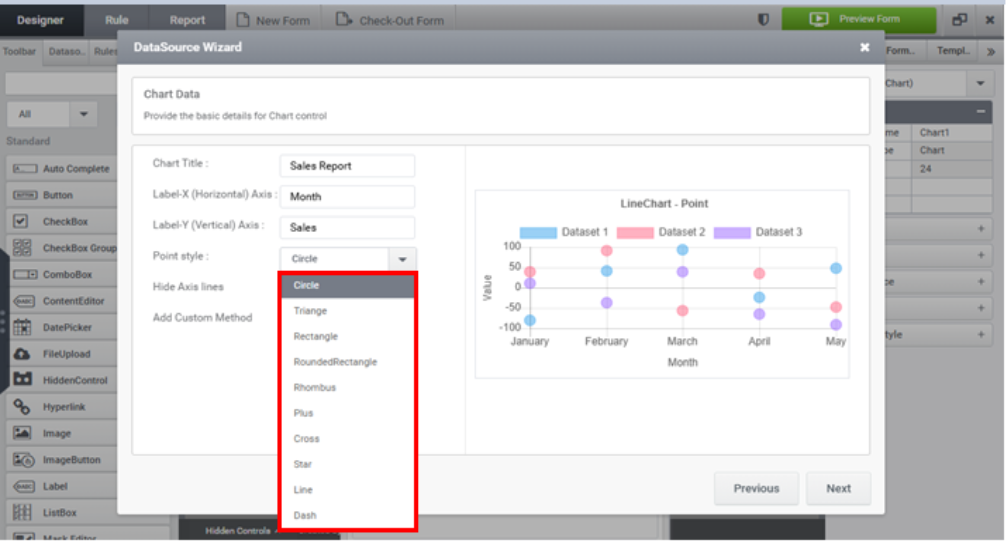
Let’s explore the preview of all styles as demonstrated in the image below.
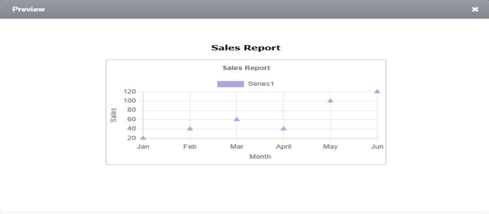
a) Triangle Point Style:
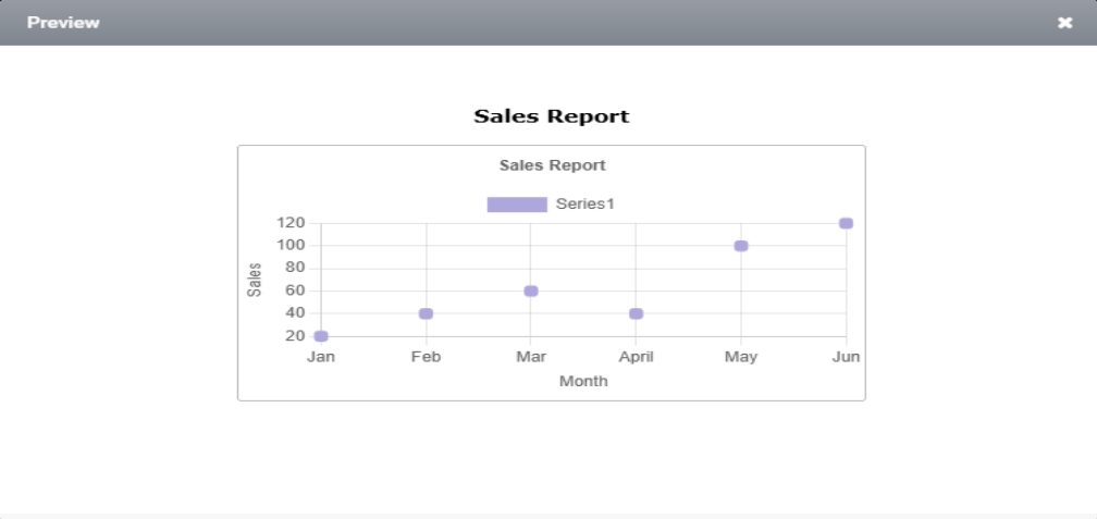
b) Rectangle Point Style:
c) Rounded Rectangle Point Style:
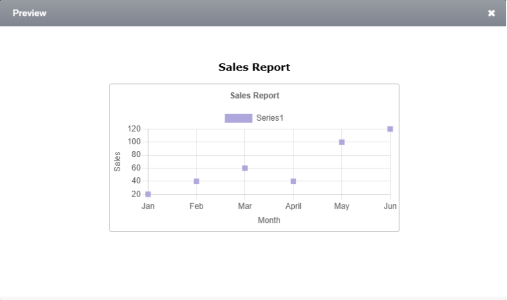
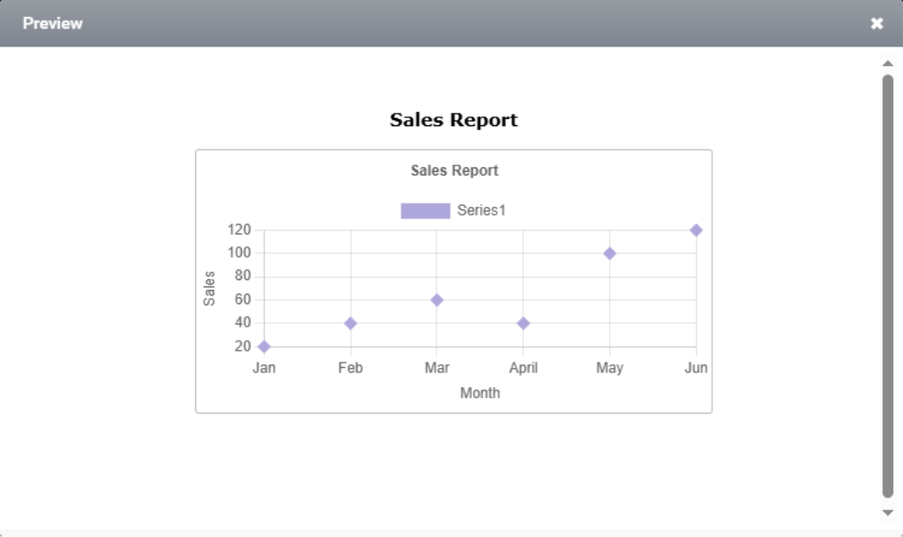
d) Rhombus Point Style:
e) Plus Point Style:
f) Cross Point Style:

g) Star Point Style:
h) Line Point Style:

i)Dash Point Style:
