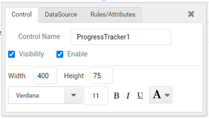
Progress Tracker
Progress Tracker is used to display progress through a sequence by numbered steps. The main advantage of progress tracker is, it provides an overview of the entire process and allows you to track progress at different stages.
Working
- Create a form as shown in Figure 1, by dragging a ‘ Progress Tracker ‘ control from the standard controls section in Toolbox.
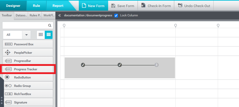
Figure 1
- Select the datasource for Progress Tracker control either through ‘Quick Menu’ or ‘Properties’ window.
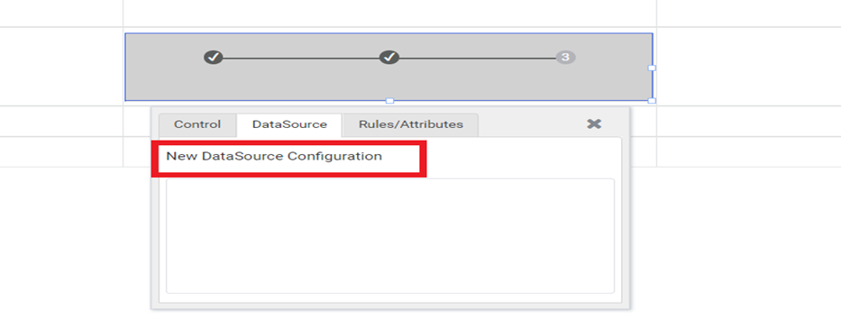
Figure 2
- Select the type of datasource you would like to configure.
- Static
- MS SQL
- Stored Procedure
- RESTful Service
For configuring the progress tracker, here are examples using both Static and MS SQL data sources.
- Configuring a Progress Tracker with ‘Static’ data
Step-1: Select the datasource type as ‘Static’ and click on ‘OK’ button.
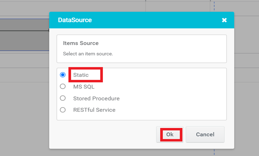
Figure 3
Step-2: Set Value, Title and Description in the Progress Tracker- Static DataSource configuration pop-up window.
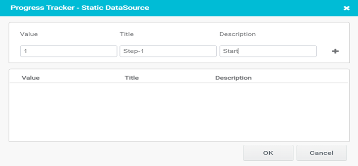
Figure 4
Step-3: You can add required number of steps by clicking the add button. After that click on OK button.
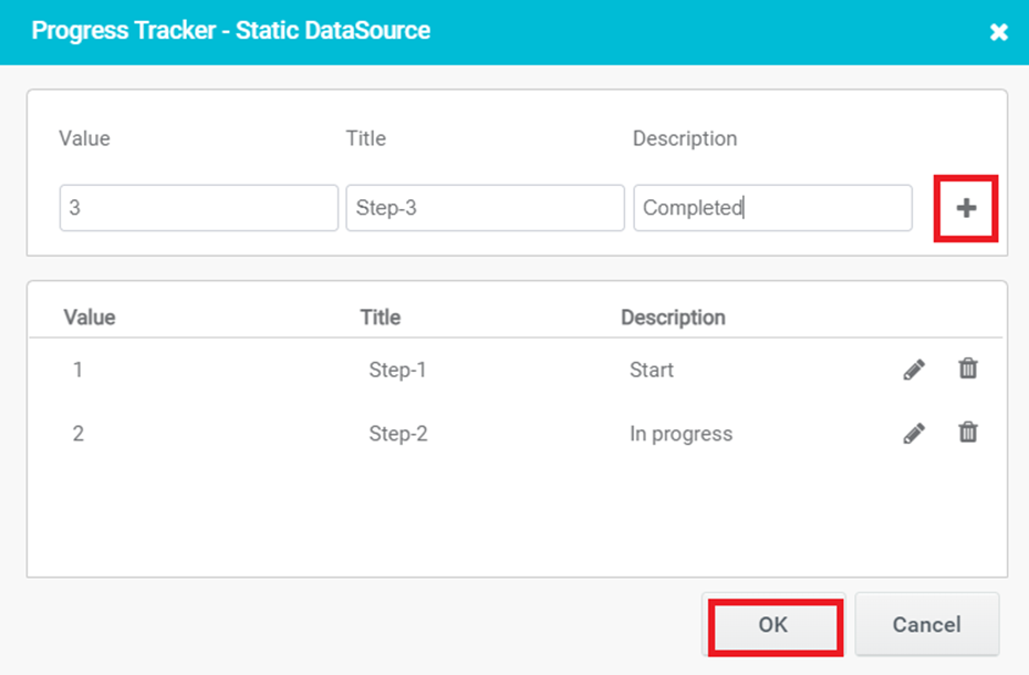
Figure 5
Step-4: In Preview, the static value already configured gets populated in the control.
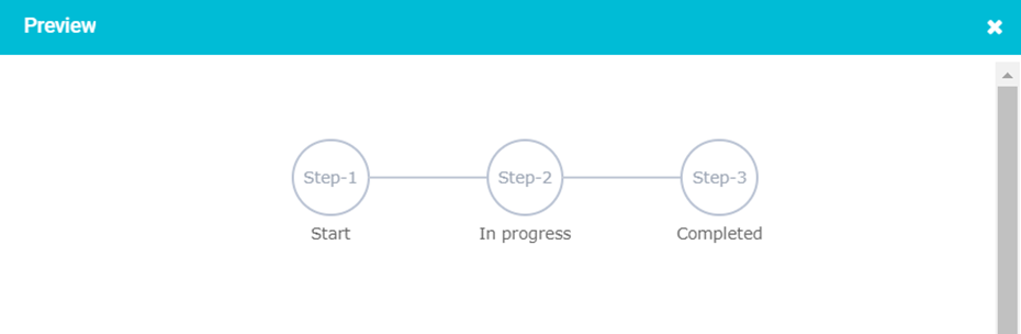
Figure 6
- Configuring a Progress Tracker with ‘MS SQL’
Step-1: Select the datasource type as ‘MS SQL’ and click on ‘OK’ button
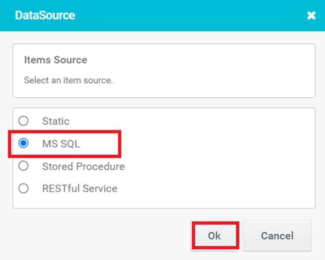
Figure 7
Step-2: Select any of the SQL datasource and click on ‘Next’ button to proceed with the wizard.
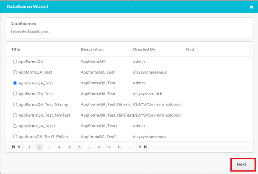
Figure 8
Step-3: Select the table name and click on ‘Next’ button to continue with the wizard. More than one table can be selected here.
- The user can also make use of ‘Filter’ option to search a particular Table from the tables listed in the window.
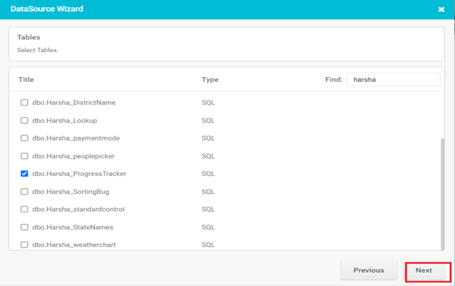
Figure 9
Step-4: This wizard is mandatory only when multiple tables are selected. Now click on ‘Next’ button to continue with the wizard.
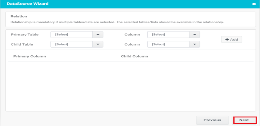
Figure 10
Step-5: A ‘Values wizard’ will pop up.
- Set the columns in the table as Value, Title or Description
- Click on the ‘Next’ button to proceed with the wizard.
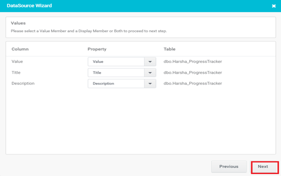
Figure 11
Step-6: A ‘Miscellaneous window’ will pop up. It is used to sort the results.
- Click on ‘Next’ button.
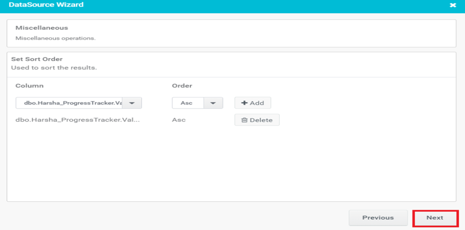
Figure 12
Step-7: In the final wizard, choose the trigger and click on the Finish button.
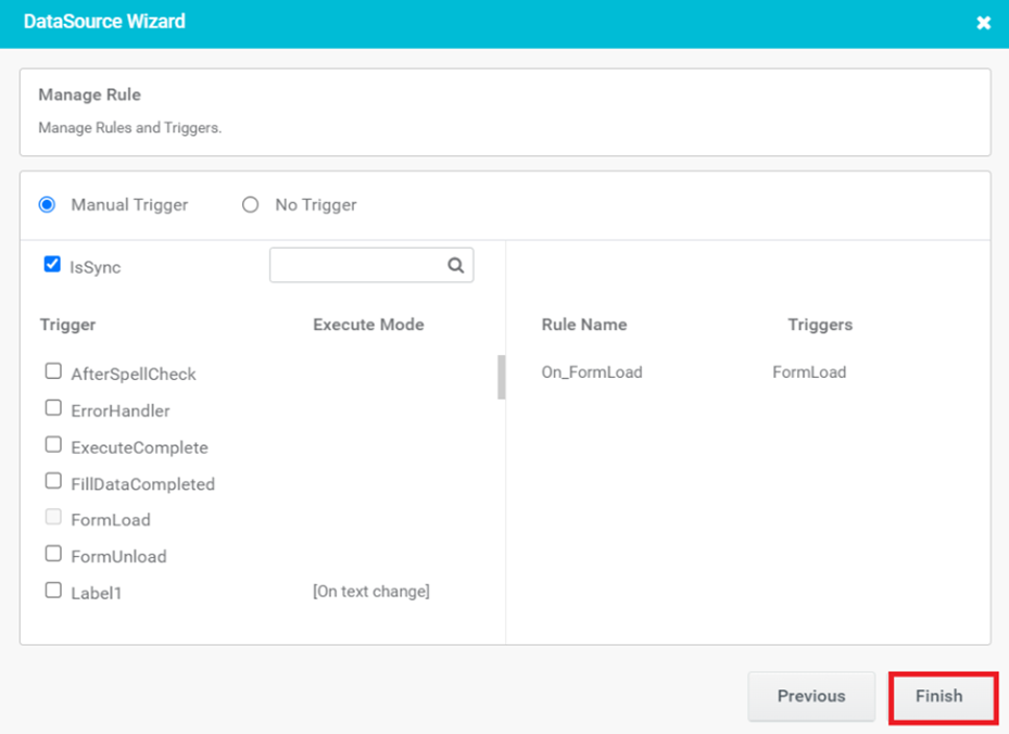
Figure 13
Step-8: In Preview, the sql value configured gets populated in the control.
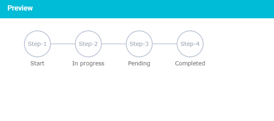
Figure 14
NOTE– Similarly, we can configure it with Stored Procedure and RESTful Service as well.
Progress Tracker Properties
Here’s the basic list of properties which can be used from rules.
ProgressTracker1.Style.Visibility:
- This property allows you to control the visibility of the progress tracker control. You can set it to either show or hide the progress tracker based on your application’s requirements.
ProgressTracker1.Style.Enable:
- This property determines whether the progress tracker control is enabled or disabled. When enabled, users can interact with the progress tracker, such as clicking on steps to navigate between them. When disabled, the progress tracker is non-interactive, and users cannot interact with it.
ProgressTracker1.ActiveStep:
- This property indicates the current active step in the progress tracker. You can use this property to pro-grammatically set or retrieve the active step. For example, when a user completes a step, you can update this property to reflect the next step in the process.
ProgressTracker1.EnableStep:
- This property allows you to enable or activate specific steps in the progress tracker. By setting this property, you can control which steps are clickable or accessible to the user. This is useful when you want to guide users through a sequential process and only allow them to proceed to the next step after completing the current one.
ProgressTracker1.DisableStep:
- Conversely, this property enables you to disable or deactivate specific steps in the progress tracker. When a step is disabled, it is typically greyed out or visually distinguished to indicate that it cannot be selected or interacted with. This is useful when certain steps are temporarily unavailable or should be skipped based on certain conditions.
Designer Properties
- Here’s the list of available properties (for Progress Tracker) from designer
| S.no | Property name | Data type | Description |
| General | |||
| 1 | TabIndex | Integer | Sets the Tab order for the control within its container. |
| 2 | Remarks | String | To make a comment or observation about the control for reference. |
| 3 | Auto Height | Boolean | Set the content can flow naturally within its container without overflowing or being cut off. |
| 4 | Navigation | On clicking Browse button, Progress Tracker Navigation Form window will open and select required form from it. Sets navigation on click. | |
| Style | |||
| 5 | Width | String | Sets the suggested width or thickness of the control. |
| 6 | Height | String | Sets the suggested height of the control. |
| 7 | Text Alignment | String | Specifies whether the text to be left-aligned, Center aligned or right-aligned |
| 8 | Margin | String | Sets the edge or outer margin to the control. |
| 9 | Padding | String | Sets the padding of the control(left,Top,Right,Bottom) |
| 10 | Font | String | Sets the font face\style. |
| 11 | Font Size | String | Set the font size. |
| 12 | Font Color | String | Sets a brush that describes the Text color of the control. |
| 13 | Background Color | String | Sets a brush that describes the Background color of the control. |
| 14 | Visible | Boolean | Sets the visibility of the control while rendering. |
| 15 | Bold | Boolean | To make the control text Bold. |
| 16 | Italic | Boolean | Italicize the control text. |
| 17 | Underline | Boolean | Set the option to underline the text |
| 18 | Column Span | String | To merge the number of columns specified. |
| 19 | Template | String | Can Customize the template of the control. |
| 20 | Step-Size | String | Sets the suggested height and width of the steps |
| 21 | Enable | Boolean | To Enable/Disable the control |
| Active Style | |||
| 22 | Title Font Color | The font color of the title for the active state in the Progress Tracker can be customized using the Title Font Color setting. | |
| 23 | Description Font Color | The font color of the description for the active state in the Progress Tracker can be customized using this option. | |
| 24 | Background Color | The background color for the active state in the Progress Tracker can be customized using this option. | |
| 25 | Border Color | The border color for the active state in the Progress Tracker can be customized using this option. | |
| InActive Style | |||
| 26 | Title Font Color | The font color of the title for the Inactive state in the Progress Tracker can be customized using the Title Font Color setting. | |
| 27 | Description Font Color | The font color of the description for the Inactive state in the Progress Tracker can be customized using this option | |
| 28 | Background Color | The background color for the Inactive state in the Progress Tracker can be customized using this option. | |
| 29 | Border Color | The border color for the Inactive state in the Progress Tracker can be customized using this option. | |
| Data Source | |||
| 30 | Items | On clicking Browse button of the items will open a datasource window. | |
| Reports | |||
| 31 | Control Report | Control Report will redirect to Reports tab that will display all the configurations, rules and datasources details associated to the selected control. | |
| Rules | |||
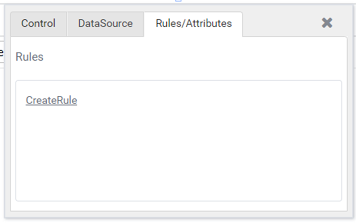
| 32 | Rules | After selecting the control, If user clicks Rules tab it will be expanded and displays a Rules property. Create Rule can be selected from a drop-down list. On clicking the Create Rule link button will navigate the user to the Rules Engine. The same control will be added as a trigger by default to execute the Rule. | |
| Custom Property | |||
| 33 | HTML Attribute | Allows users to add HTML tags. | |
| Template | |||
| 34 | Inherit Template | Boolean | Enable this property to inherit control style from applied template |
| Custom Style | |||
| 35 | CSS Style | String | Allows you to add CSS class to your control to change the default formatting for any of our themes |
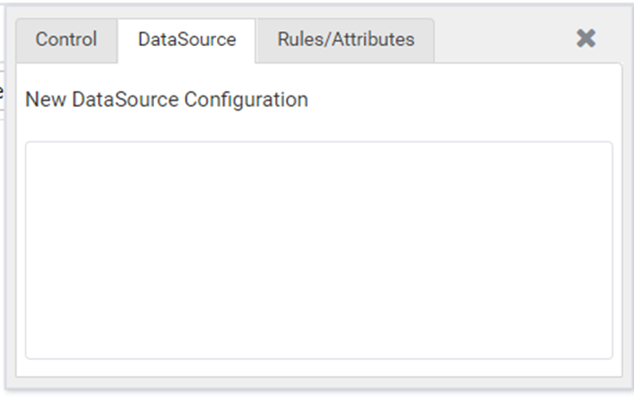
Quick Action Menu
Progress Tracker will contain three Quick action menus (Control, Data Source, Rules/ Attributes).