Mask Editor
Group: Standard
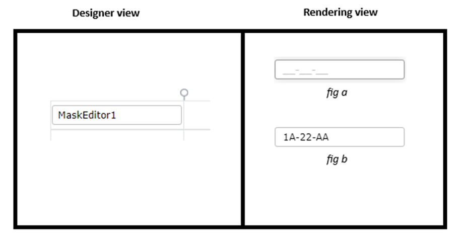
| S.no | Property name | Data type | Description |
| General | |||
| 1 | Text | String | Sets the text associated with the control |
| 2 | Tooltip | String | The text that needs to be displayed when the user hovers the mouse pointer over the control, without clicking it. |
| 3 | Tab Index | Integer | Sets the Tab order for the control within its container. |
| 4 | Remarks | String | To make a comment or observation about the control for reference. |
| 5 | Mask Format | String | Sets the format of the mask to be applied, # – numbers, a – alphabets, * – both. |
| 6 | Check Dirty | Boolean | To determine if the control value has changed, enable this property. After doing so, the controlname.IsDirty rule will provide the current status of the checkdirty property. |
| Attached Label | |||
| 7 | Show Label | Boolean | To display the attached label along with the control. |
| 8 | Label Text | String | Sets the text content of the label attached to the control. |
| 9 | Label Position | String | To place the label attached in various positions around the control. |
| 10 | Label Width | String | Sets the suggested width or thickness of the label attached to the control. |
| 11 | Label Height | String | Sets the suggested height of the label attached to the control. |
| 12 | Text Alignment | String | To align the texts inside the label attached to different positions (Left, Center, Right) within the control. |
| 13 | V-Text Alignment | String | Sets the vertical alignment of the contents in the attached label to the top, center, or bottom. |
| 14 | Margin | String | Sets the edge or outer margin to the control. |
| 15 | Padding | String | Sets the padding of the attached label of the control(left, Top, Right, Bottom) |
| 16 | Box Shadow | String | Set the box shadow of the control by giving horizontal and vertical shadow values, the needed blur distance, and the appropriate color. |
| 17 | Font | String | Sets the font face\style. |
| 18 | Font Size | String | Sets the size of the text in the attached label. |
| 19 | Bold | Boolean | To make the attached label text Bold. |
| 20 | Italic | Boolean | Italicize the attached label text. |
| 22 | Underline | Boolean | Underline the attached label text. |
| 23 | Font Color | String | Sets a brush that describes the Font color in the attached label. |
| 24 | Background Color | String | Sets a brush that describes the Background color to the attached label. |
| Style | |||
| 26 | Width | String | Sets the suggested width or thickness of the control. |
| 27 | Height | String | Sets the suggested height of the control. |
| 28 | Margin | String | Sets the edge or outer margin to the control. |
| 29 | Padding | String | Sets the padding of the control(left,Top,Right,Bottom) |
| 30 | Box Shadow | String | Set the box shadow of the control by giving horizontal and vertical shadow values, the needed blur distance, and the appropriate color. |
| 31 | Enable Custom Font | Boolean | Set a custom font by enabling “Enable Custom Font” and typing the font family needed. It helps to apply “font families,” which are not available in the property box. |
| 32 | Font | String | Sets the font face\style. |
| 33 | Font Size | String | Sets the font size. |
| 34 | Font Color | String | Sets a brush that describes the Text color of the control. |
| 35 | Background Color | String | Sets a brush that describes the Background color of the control. |
| 36 | Visible | Boolean | Sets the visibility of the control while rendering. |
| 37 | Enable | Boolean | Sets the accessibility of the control during rendering. |
| 38 | Bold | Boolean | To make the control text Bold. |
| 49 | Italic | Boolean | Italicize the control text. |
| 50 | Column Span | String | To merge the number of column specified. |
| Rules | |||
| 51 | Rules | After selecting the control, If the user clicks the Rules tab it will be expanded and display a Rules property. Create Rule can be selected from a drop-down list. On clicking the Create Rule link button will navigate the user to the Rules Engine. The same control will be added as a trigger by default to execute the Rule. | |
| Validation | |||
| 52 | Is Required | Boolean | Helps to check whether the user has to give input in the control or not. If this property is enabled, this will not allow the user to save a form without giving the input. |
| 53 | Required Message | String | If the Is Required property was enabled and input was given in this property, the validation message will be displayed to the next right of the control when the user trying to save a form without entering a value in the control. |
| 54 | Message Position | String | Sets the position of the validation message, whether it can be left, right, bottom, or top. |
| Reports | |||
| 55 | Control Report | Control Report will redirect to the Reports tab that will display all the configurations, rules, and datasources details associated with the selected control. | |
| Template | |||
| 56 | Inherit Template | Boolean | Enable this property to inherit the control style from the applied template |
| Custom Style | |||
| 57 | CSS Style | String | Allows you to add CSS class to your control to change the default formatting for any of our themes |
| Custom Property | |||
| 58 | Html Attribute | String | Helps to adjust the behavior or display of a control by adding custom HTML attributes |