show / hide menu

Sub Activity – Mouse

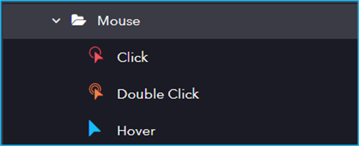
The Mouse activity has the following sub activities:

  1. Click: Click activity helps the user to click the specified UI element.
  2. Double Click: This activity will help the user to double click a particular UI Element.
  3. Hover: The cursor will move and hover over the indicated UI element.

Activity NameCommonElementOptions
ClickLabel – A classifying string applied to an activity which can be renamed by the user. It is the display name.

Disable – The user can enable or disable the activity.

ContinueOnError – It specifies the remaining activities to be executed even when one fails. This field supports only Boolean values (True or False). By default, the value is false so execution terminates when an error occurs.

Private – If selected, the log will not be shown in BOT Manager.

TimeOut – Predefined time interval that is passed without the occurrence of a specific event. The default value is 30secs (30000ms).

DelayAfter – The default delay time after executing the activity is 200ms.

DelayBefore – The default delay time before executing the activity is 200ms.
Element – This field accepts only UI element variable returned from by another activity.

Selector – Text property used to find a particular when an activity is executed.

BoundingBox – Bounding rectangle in pixels relative to the UI Element.

Repo Element – Element from the available UI Windows in the current project or library project.
 
Mouse Button – Click action by the mouse button (left or right).

SimulateClick – If selected simulates a mouse click on an element.

CursorPosition – Displacement of the cursor position according to the option selected in the position field.

Post Validation – 
 
Double ClickLabel – A classifying string applied to an activity which can be renamed by the user. It is the display name.

Disable – The user can enable or disable the activity.

ContinueOnError – It specifies the remaining activities to be executed even when one fails. This field supports only Boolean values (True or False). By default, the value is false so execution terminates when an error occurs.

Private – If selected, the log will not be shown in BOT Manager.

TimeOut – Predefined time interval that is passed without the occurrence of a specific event. The default value is 30secs (30000ms).

DelayAfter – The default delay time after executing the activity is 200ms.

DelayBefore – The default delay time before executing the activity is 200ms.
Element – This field accepts only UI element variable returned from by another activity.

Selector – Text property used to find a particular when an activity is executed.

Repository Element – Element from the available UI Windows in the current project or library project.

BoundingBox – Bounding rectangle in pixels relative to the UI Element.
Mouse Button – Click action by the mouse button (left or right).

CursorPosition – Displacement of the cursor position according to the option selected in the position field.


HoverLabel – A classifying string applied to an activity which can be renamed by the user. It is the display name.

Disable – The user can enable or disable the activity.

ContinueOnError – It specifies the remaining activities to be executed even when one fails. This field supports only Boolean values (True or False). By default, the value is false so execution terminates when an error occurs.

Private – If selected, the log will not be shown in BOT Manager.

TimeOut – Predefined time interval that is passed without the occurrence of a specific event. The default value is 30secs (30000ms).

DelayAfter – The default delay time after executing the activity is 200ms.

DelayBefore – The default delay time before executing the activity is 200ms.
Element – This field accepts only UI element variable returned from by another activity.

Selector – Text property used to find a particular when an activity is executed.

Repository Element – Element from the available UI Windows in the current project or library project.

BoundingBox – Bounding rectangle in pixels relative to the UI Element.