Sub Activity – Control
Control includes activities for identifying, selecting, and manipulating UI elements, including focusing on elements, setting attributes, and verifying element states.
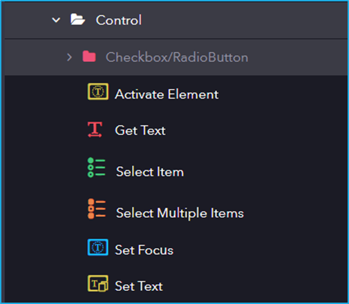
The Control activity has the following sub activities:
Activate Element: This activity makes the specified element the main one in the UI, bringing it into view.
Get Text: This activity extracts the text from the indicated UI elements.
Output Properties:
- Value– String variable extracted from the UI element.
Select Item: This activity is used to Select an item from a dropdown list or a list box.
Input Properties:
- Item– Specifies the item to be selected from the combo box or drop-down list.
Select Multiple Items: This activity allows the user to select multiple items from a combo box or drop-down list box
Input Properties:
- AddToSelection– Specified items will be added along with the already selected item.
- Items– Specifies the items to be selected from the combo box or drop-down list.
Set Focus: This activity sets the keyboard focus to a specified UI Element.
Set Text: This activity allows you to specify a string value to the text attribute of a particular UI Element.
Input Properties:
- Value– Text to be written in the UI element.
Checkbox/RadioButton
It includes activities for interacting with checkbox and radio button UI elements, allowing automation to check, uncheck, select, or deselect options based on the required state. This activity has several sub-activities, each of which is listed below:
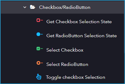
Following are the activities inside the Checkbox/RadioButton sub-activity:
Get Checkbox Selection State: This activity helps to get the current state of a checkbox(checked/unchecked).
Output Properties:
- IsSelected– Returns the corresponding Boolean value depending on the state of the radio button.
Get RadioButton Selection State: This activity is used to return the state of the Radio Button.
Output Properties:
- IsSelected– Returns the corresponding Boolean value depending on the state of the radio button.
Select Checkbox: This activity lets users Select or Unselect a particular checkbox.
Input Properties:
- Value– Checkbox will be checked or unchecked depending on the boolean value.