Overview
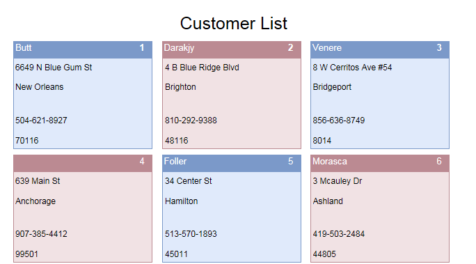
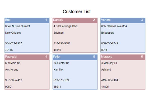
Customer List is used to display the details of the various customers. Customer details include Name, Address, Phone number and Customer id. In the basic form details of 6 customers gets displayed. On increasing the number of customer, more forms will be repeated so as to include details of more customers.
DataStructure in SharePoint
Lists Used
| List Name | Functionality |
| CustomerList | Details of the customer are stored in this list. |
List Details
CustomerList
| Column Name | Data Type |
| CustomID | Single line of text |
| Name | Single line of text |
| FirstAddress | Single line of text |
| SecondAddress | Single line of text |
| Phone | Single line of text |
Creating and Configuring the Forms
List of Forms used
| Form Name | Functionality |
| MasterForm | · MasterForm contains an external form which is used to store the form to be repeated.
· It also contains a search control used to fill all details of the customer with the Customer List. |
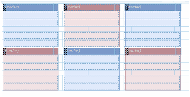
| RepeaterForm | · RepeaterForm contains 6 Border controls.
· Each border control contains 5 labels for displaying 5 fields(Name,Address,City,Phone number,Customer Id) |
The order of creation of forms would be RepeaterForm and then the MasterForm. This is because RepeaterForm is configured in the external form used in MasterForm and this form is made to repeat in the MasterForm as required. The best approach would be to complete the form design of all forms before starting on the rules.
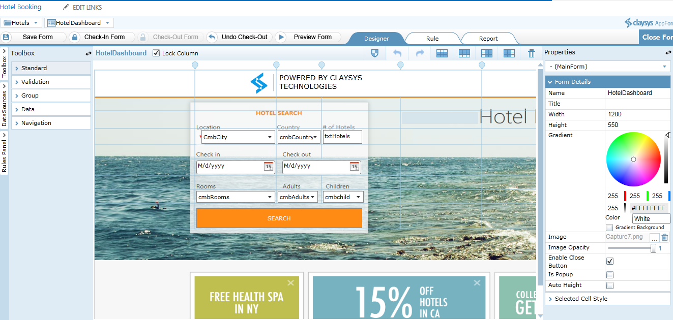
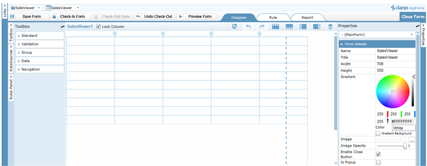
Form Design- MasterForm
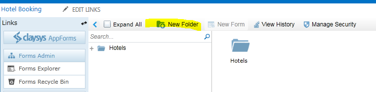
- Create a New Form in the CustomerList Folder and open it for editing.
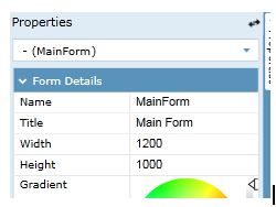
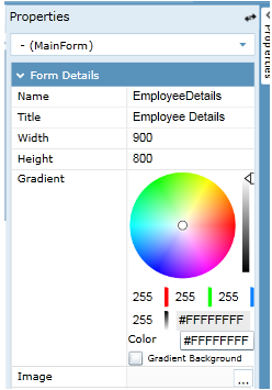
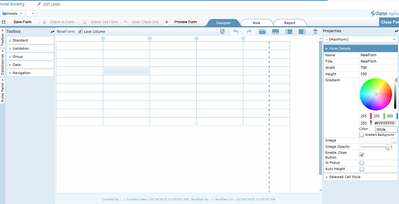
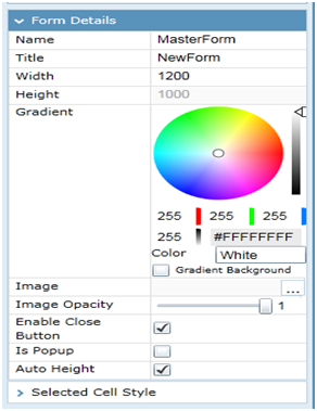
- Click anywhere on the form to get the form properties loaded in the Properties window. Change the Name of the form to MasterForm. Set the Width of the form to 1200 and Height to 1000.Tick Auto Height in order to adjust the height of the form with respect to the controls in the form.
- Drag a label to the center of the form, in first row and name it “CustomerList”
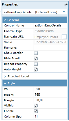
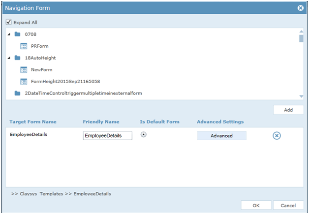
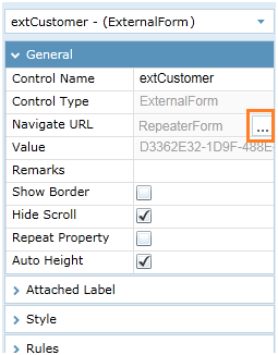
- Drag an External Form in the next row and name it “extCustomer”
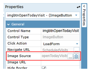
- Click on the external form. In the properties window displayed on the right select the Navigate URL by clicking the button shown below.
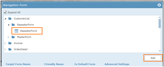
- From the pop screen select the form which has to be loaded in the external form. Here it is Repeater Form.Then click add.
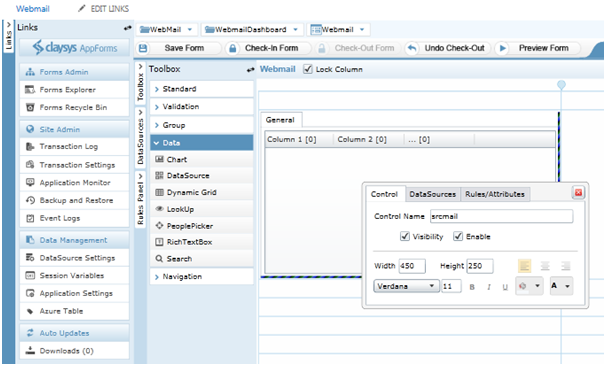
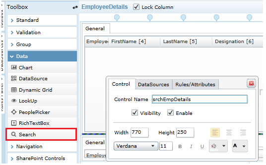
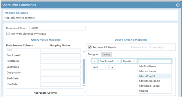
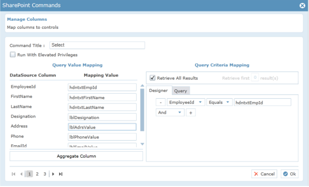
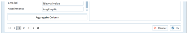
- Drag a search control and name it “SrcMaster”.
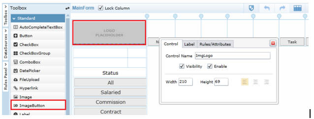
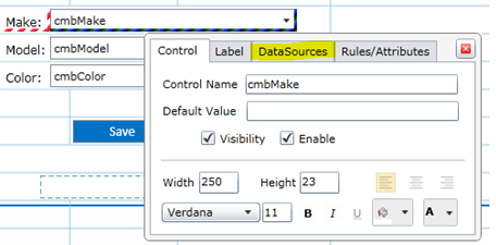
- Name can be given to the controls by clicking on it and editing the “Properties window “displayed on the right side.
Data Source Setting in MasterForm
For the grid:
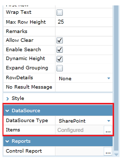
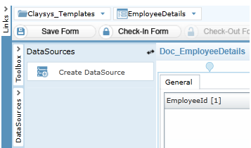
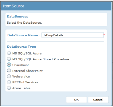
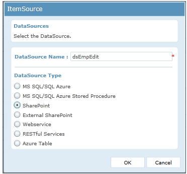
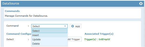
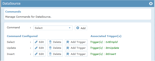
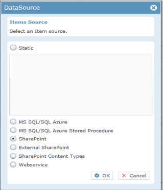
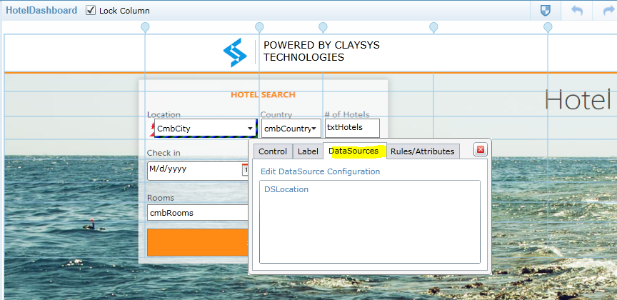
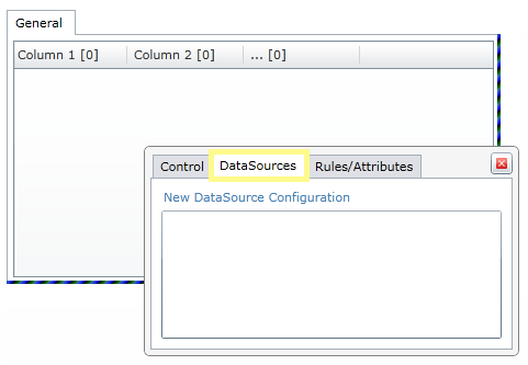
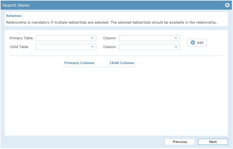
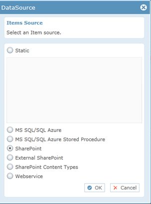
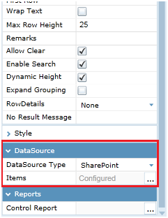
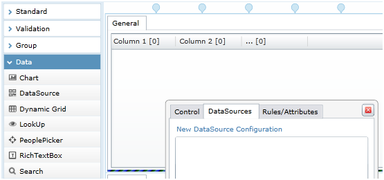
- Click on grid to get the Properties window for the search Grid. In the properties window select SharePoint from the Drop down for DataSource.
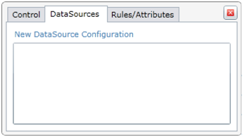
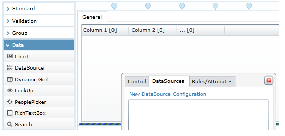
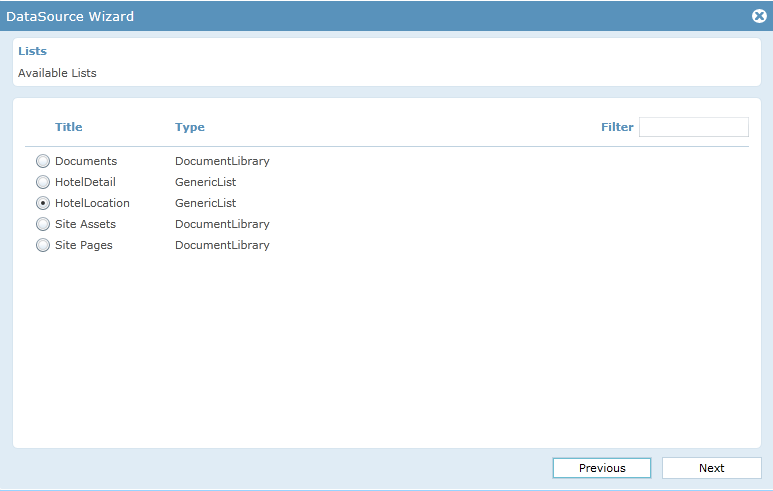
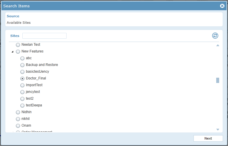
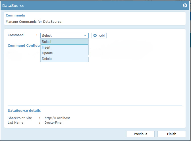
- Click on the grid to get the popup menu, choose DataSource tab and click on New DataSource Configuration.
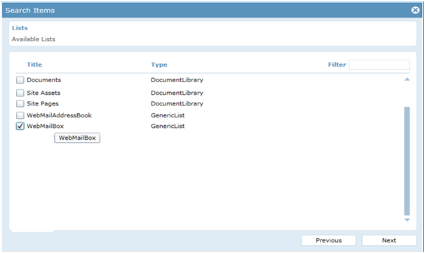
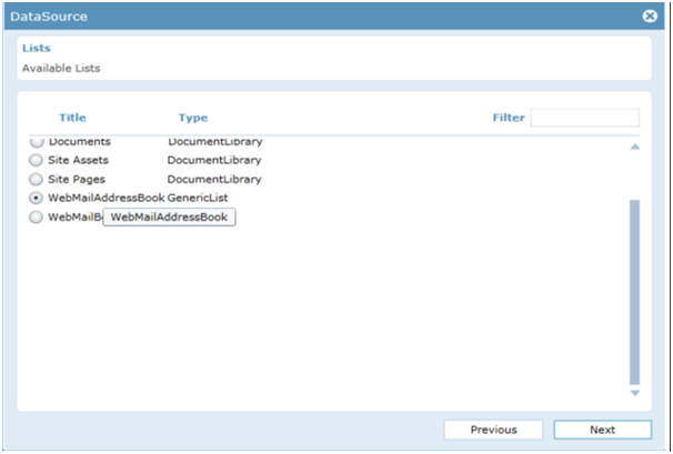
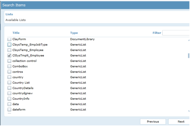
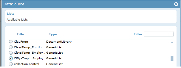
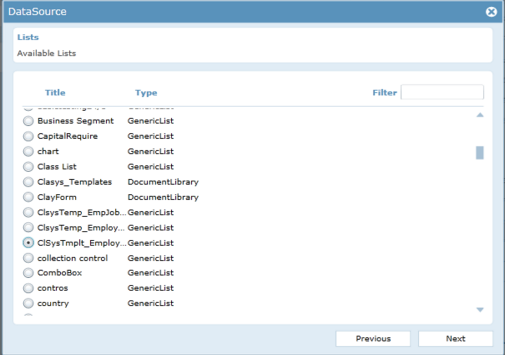
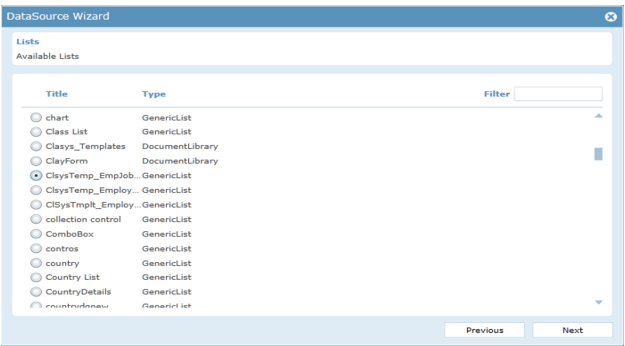
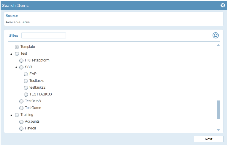
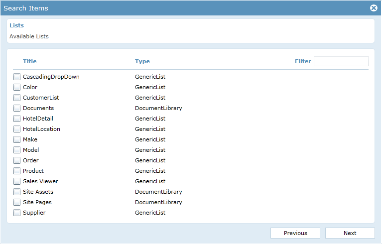
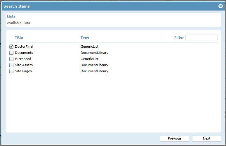
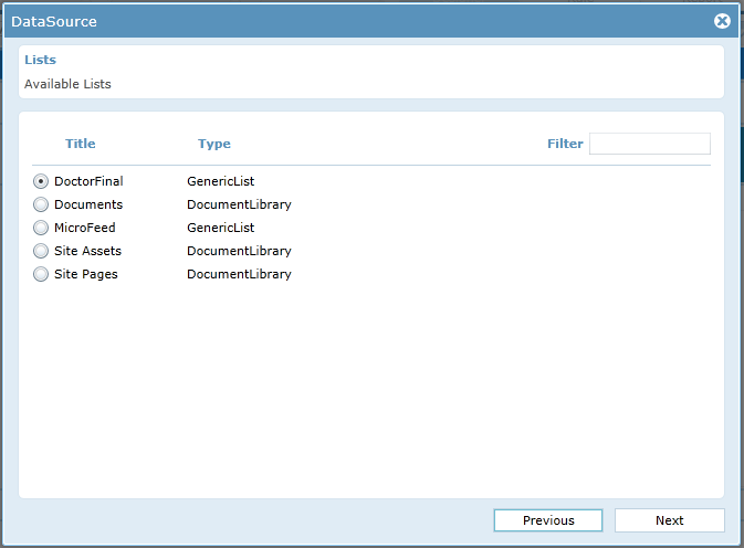
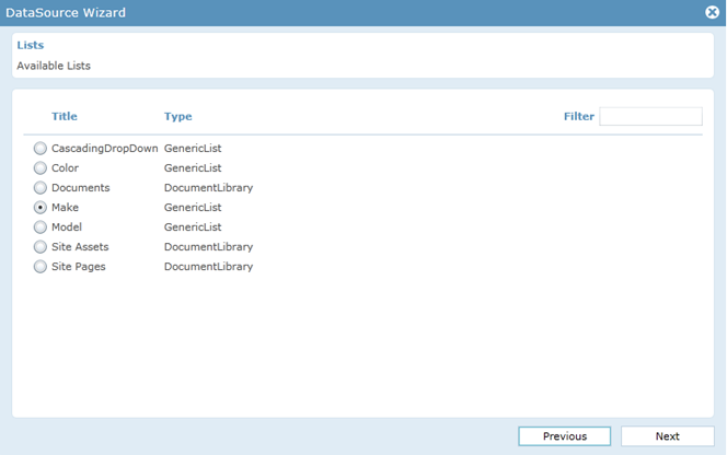
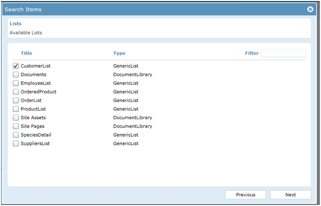
- A New Popup window opens showing the Available lists in SharePoint. Choose CustomerList from the given set of lists and click Next.
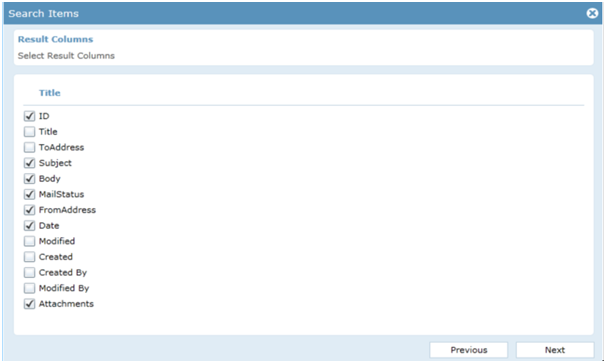
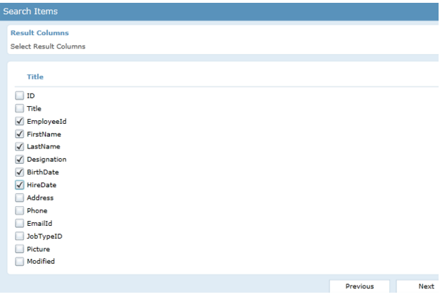
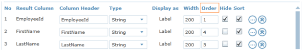
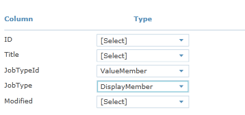
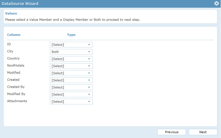
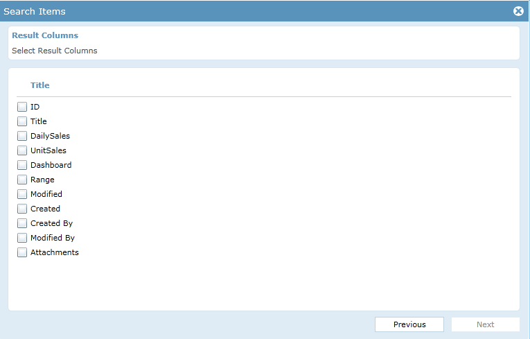
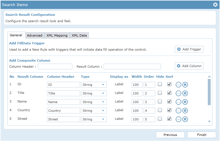
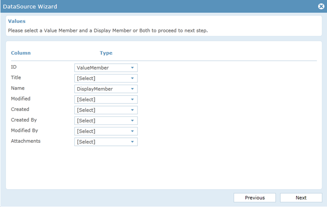
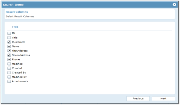
- Select the Result columns that are to be displayed on the grid.Click Next.
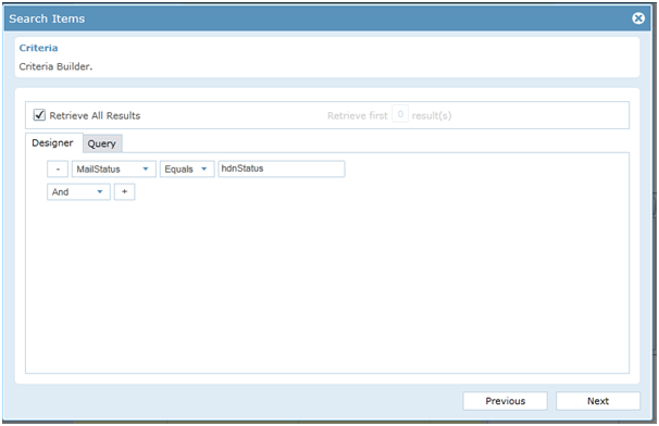
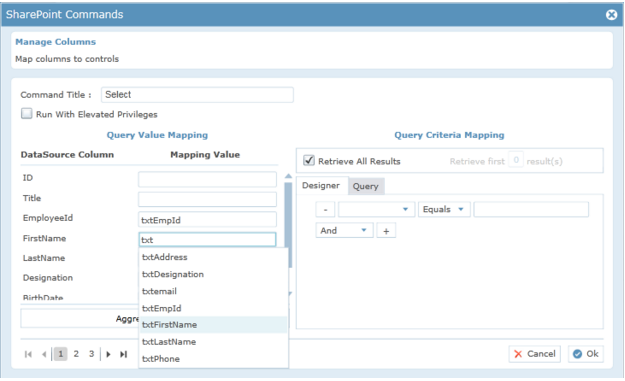
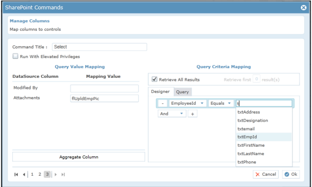
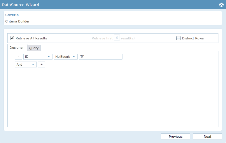
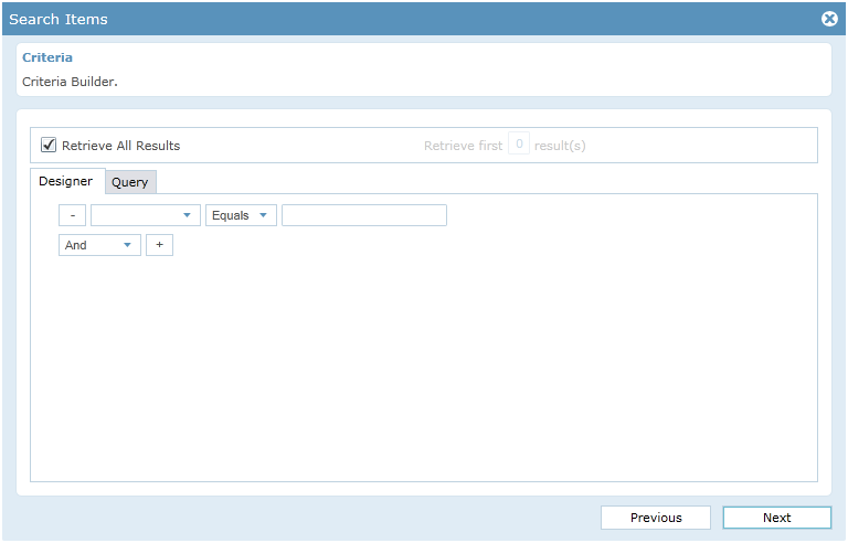
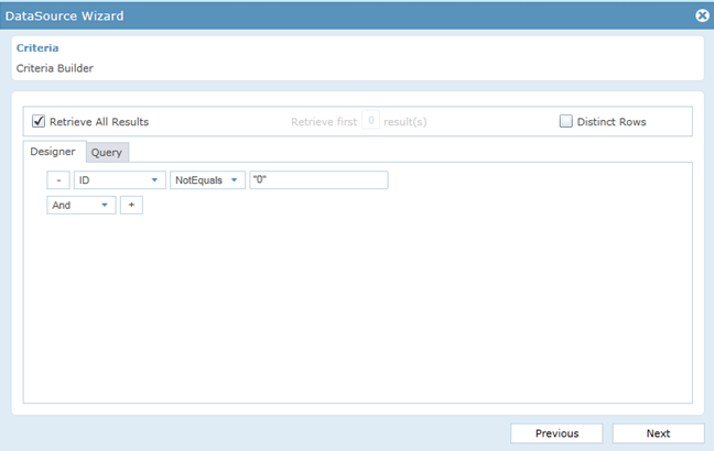
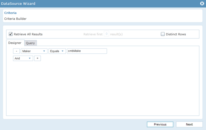
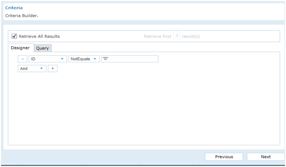
- Enter the selection criteria as shown below.
- ID NotEquals “0”
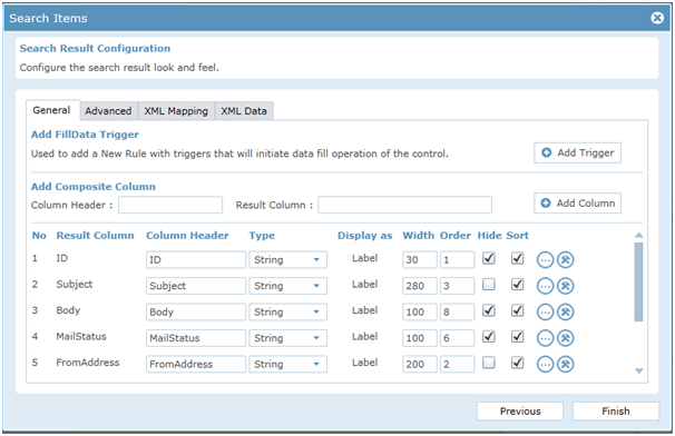
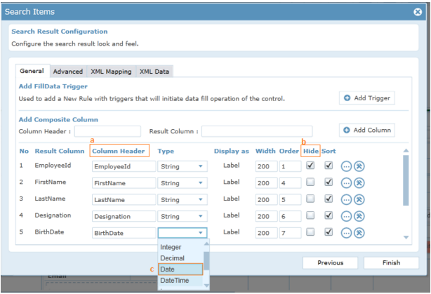
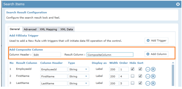
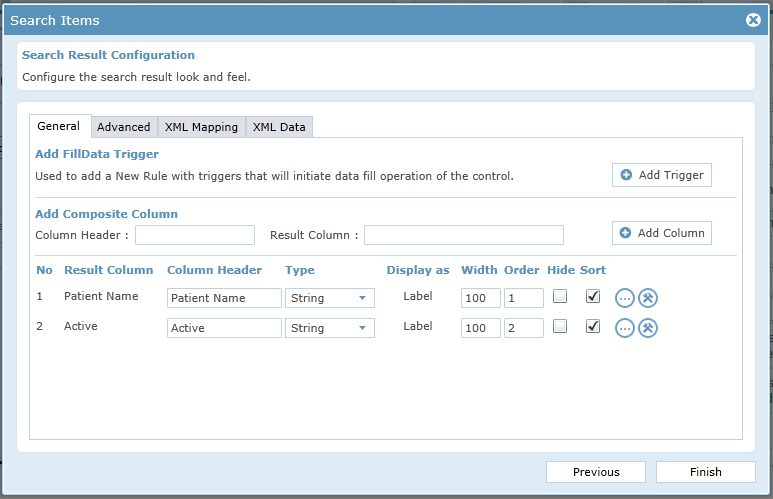
- Click Next until you reach the Search Result Configuration screen. The columns you had chosen would be shown there,
- You can modify the Column Header to give a user friendly name to the column.
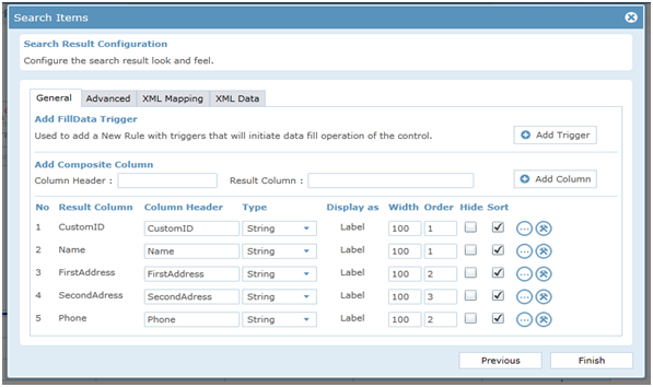
- Click Finish
Form Design-Repeater Form
- Create a New Form in the Customer List Folder and open it for editing.
- Click anywhere on the form to get the form properties loaded in the Properties window.
- Change the Name of the form to RepeaterForm. Set the Width of the form to 1200 and Height to 1000.
- Tick Auto Height in order to adjust the height of the form with respect to the controls in the form.
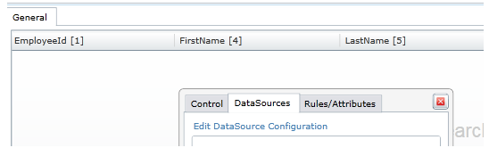
- RepeaterForm contains 6 Border controls. Border and background color for each border can be set in the properties window.
- Set Each border control contains 5 labels for displaying 5 fields(Name,Address,City,Phone number,Customer Id)
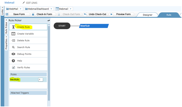
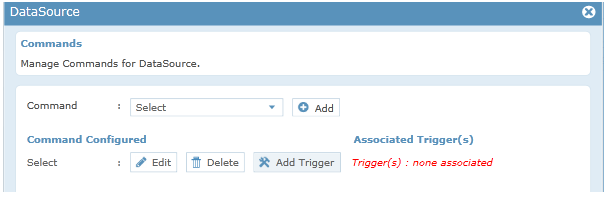
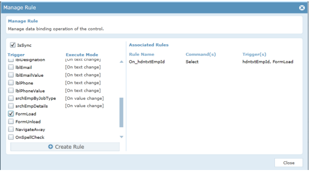
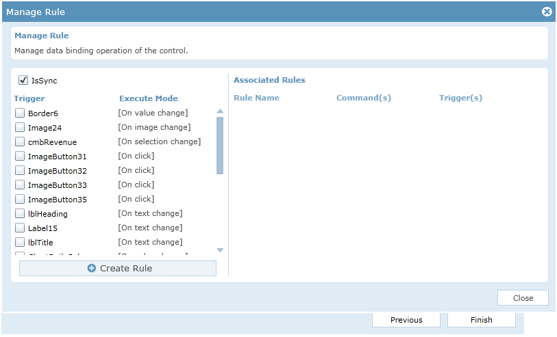
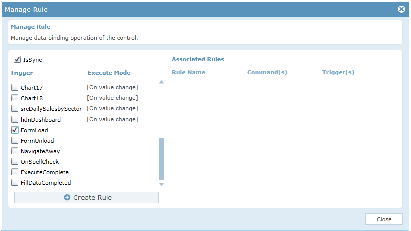
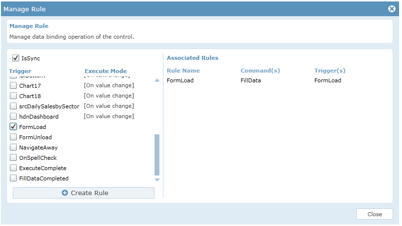
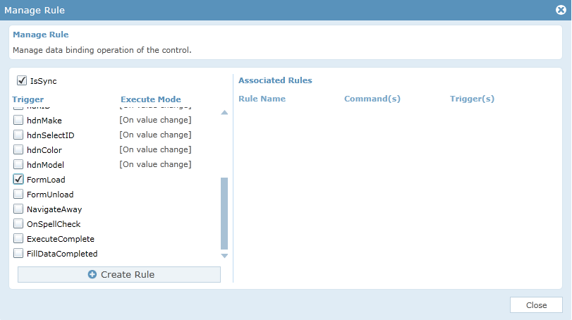
Adding Rules to the form
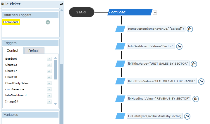
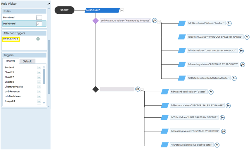
Rules of MasterForm are given below.
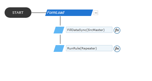
| Sl.no | Rule Name | Trigger | Functionality |
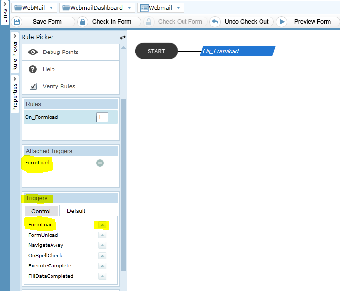
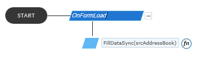
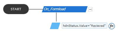
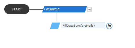
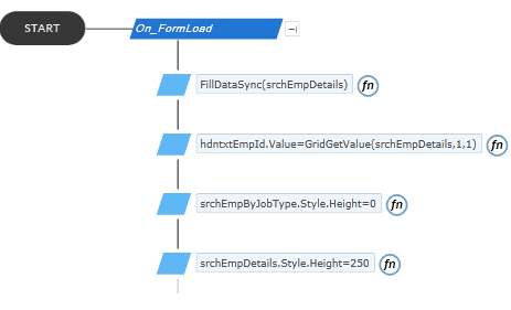
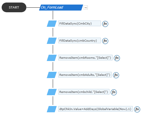
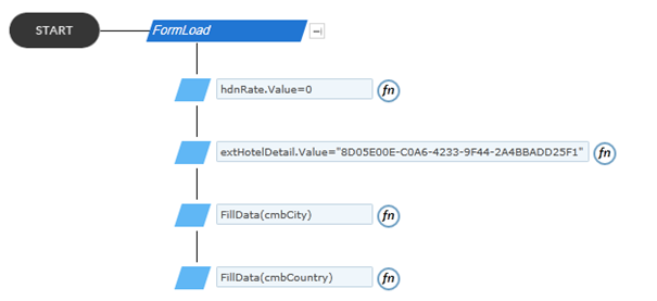
| 1. | FormLoad | FormLoad | Fills the search control with all data from customer list.
Runs the Repeater rule. |
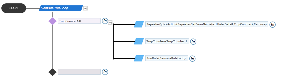
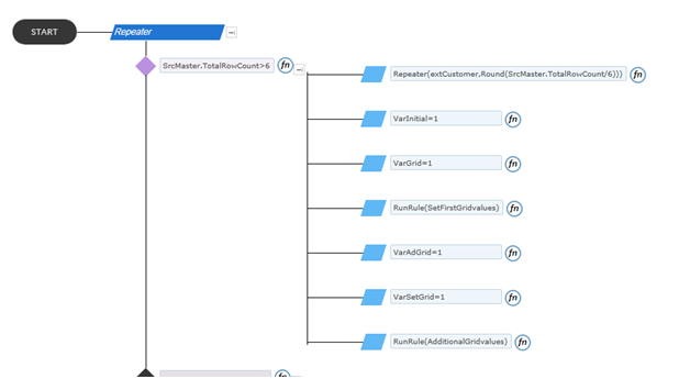
| 2. | Repeater | No Trigger | Checks if the total row count of search is more than 6
If total row count is more than 6, the Repeater form is made to repeat (total row count/6) times. Then the variables VarInitial, VarGrid, VarAdGrid and VarSetGrid are set to value 1. Runs the “SetFirstGridvalues “rule and “AdditionalGridvalues” rule. If total row count is less than 6, Set variable VarInitial and VarGrid value to 1 and Runs“SetFirstGridvalues “rule |
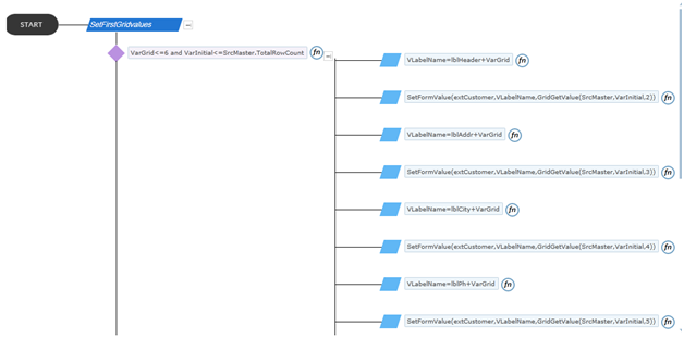
| 3. | SetFirstGridvalues | No Trigger | Checks if the VarGrid value is less than or equal to 6 and VarInitial is less than the total row count of search.
If the condition is true name is set to label controls within the border through (VLabelName=lblHeader+VarGrid) rule. VLabelName is the variable which is used to temporarily store the label control name. Next using SetFormValue rule label controls within the border in Repeater form are assigned values form search control. (Name, address, etc.). Next the value of VarInitial variable and VarGrid variable is incremented by 1. Again run the same “SetFirstGridvalues” rule. This loop runs till all the fields in the basic Repeater form get filled with data from the search. |
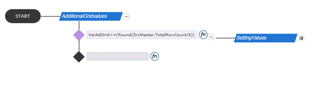
| 4. | AdditionalGridvalues | No Trigger | Initially checks if the VarAdGrid value is less than or equal to (TotalRowCount/6).
VarAdGrid variable is used to get the count of repeater forms. Next if the above condition is satisfied, label controls in the repeater form are given name and the values are assigned just as in the “SetFirstGridvalues” rule. VarSetGrid variable is used to set name for labels. Each time all the controls within the repeater form gets filled VarAdGrid value gets incremented by 1. This rule works as long as the VarAdGrid value is less than or equal to the number of required repeater forms. |
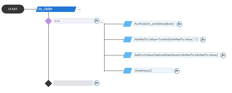
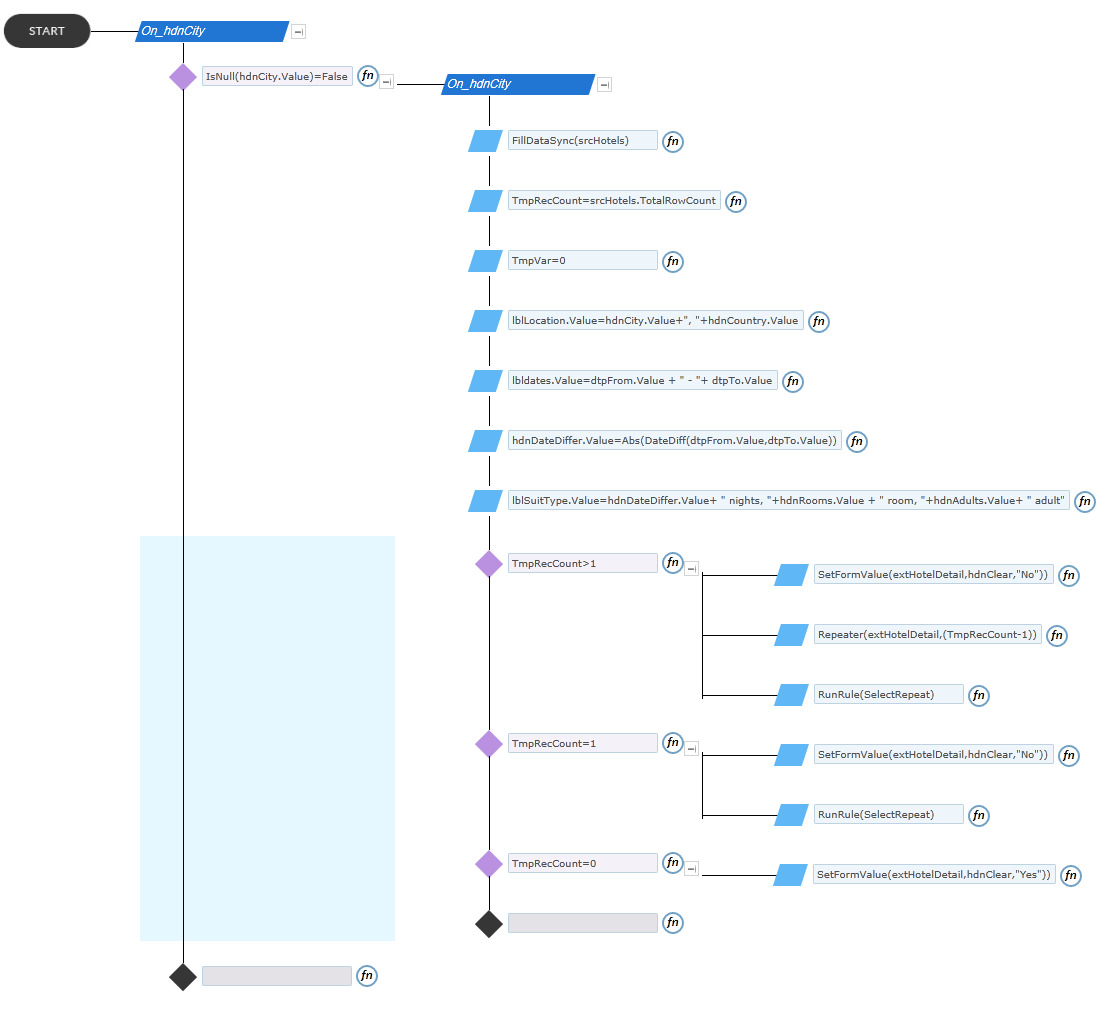
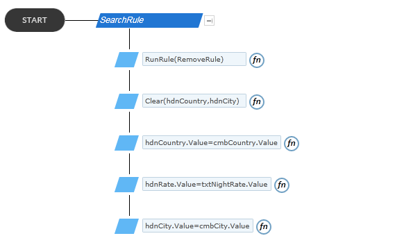
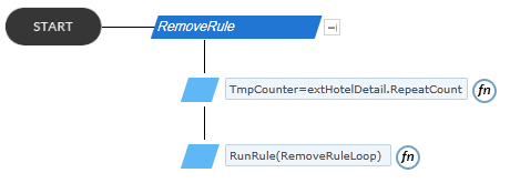
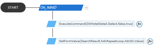
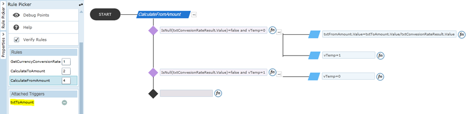
Rule: FormLoad
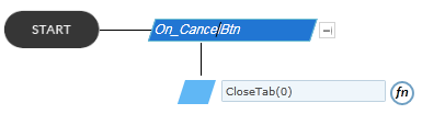
Rule: Repeater
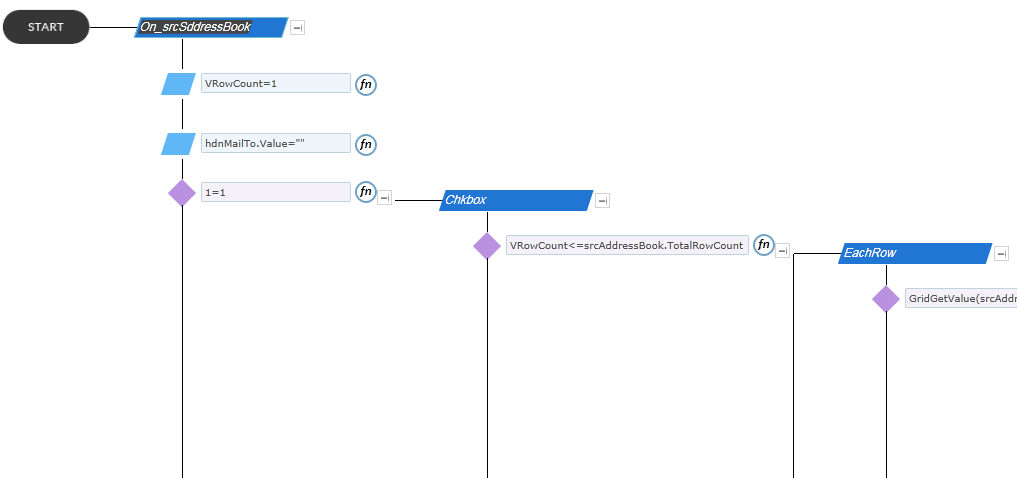
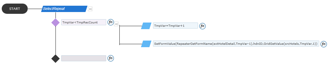
Rule: SetFirstGridvalues
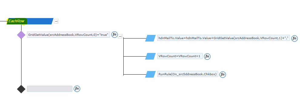
Rule: AdditionalGridvalues
How to use the list template
Uploading List Templates
List templates that were downloaded to a file on the file system can be uploaded to the list template gallery. To perform the following steps, you must have Read permission to the folder or network share that contains the list template file. Before uploading the list template, it should be added to the list template gallery of the root site. Following steps will explain about how to add the list template in to the list template gallery.
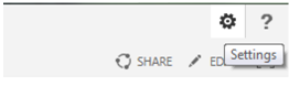
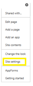
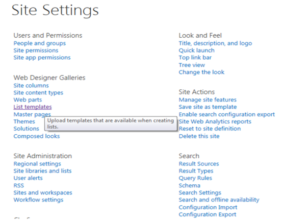
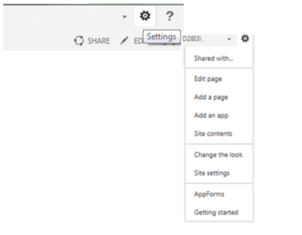
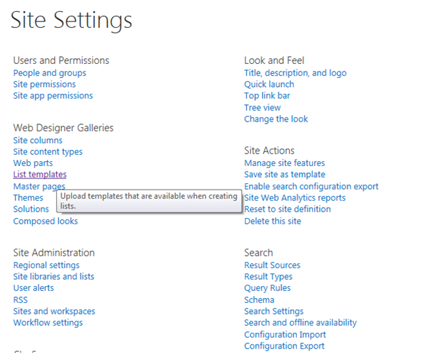
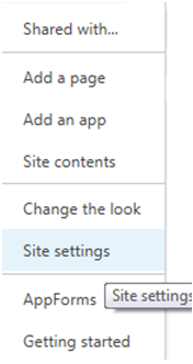
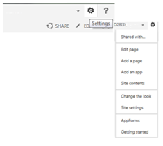
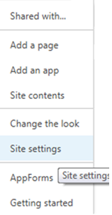
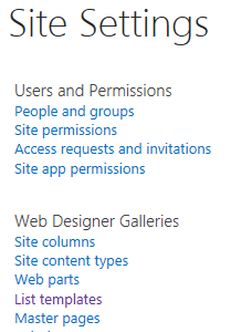
- On the Site Actions menu, click ‘Site Settings’.
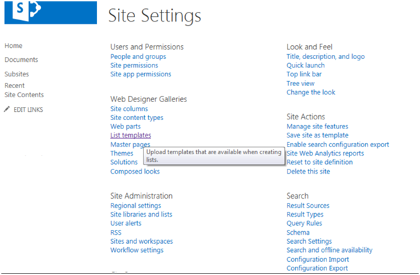
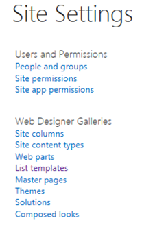
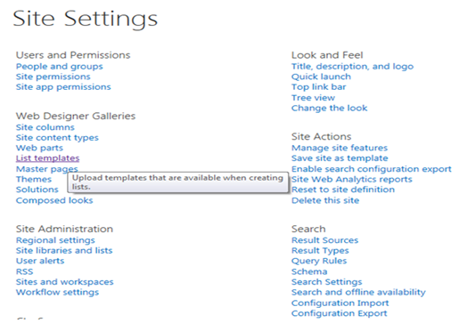
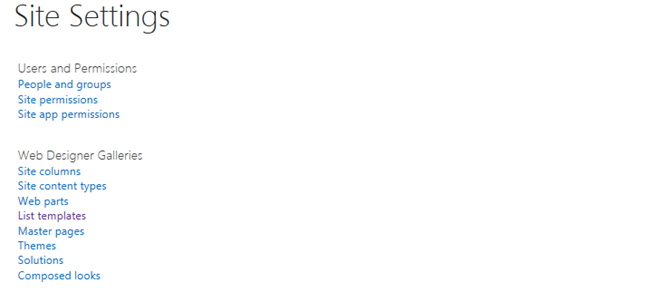
- In the Galleries column, click List templates. This option appears only to users who have the Manage Lists permission. Site owners have this permission by default.
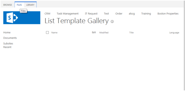
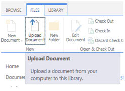
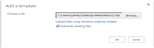
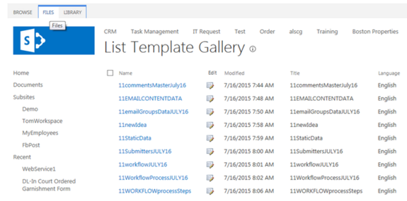
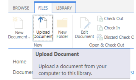
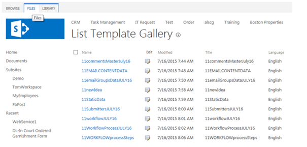
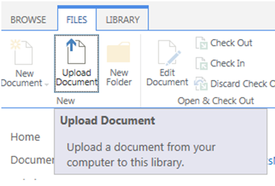
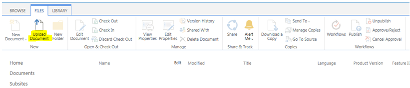
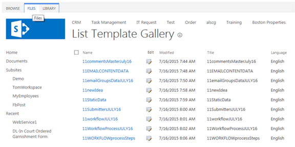
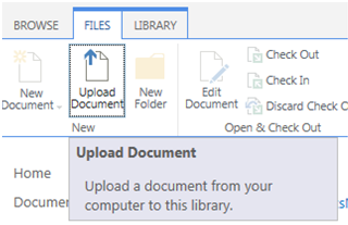
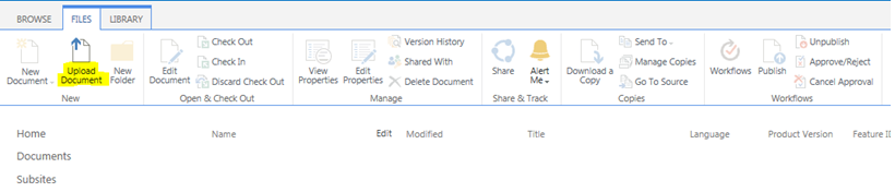
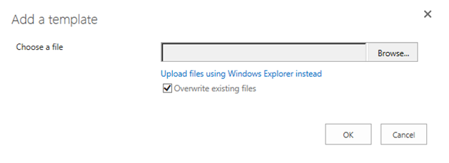
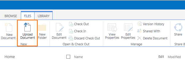
- The List Template Gallery page appears. Select Files and click ‘Upload Document’.
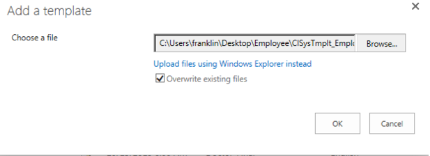
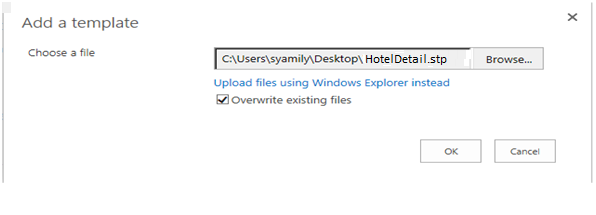
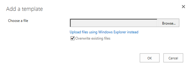
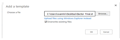
- Either type the path or file name (including the file extension) of the list template that you want to upload, or click ‘Browse’ to select the file. Choose whether to overwrite the existing files. By default, the ‘Overwrite existing files’ check box is selected.
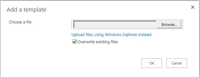
- Click ‘OK’ to choose the file.
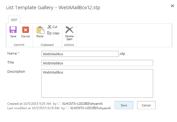
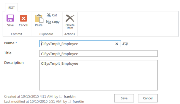
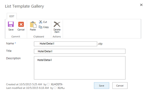
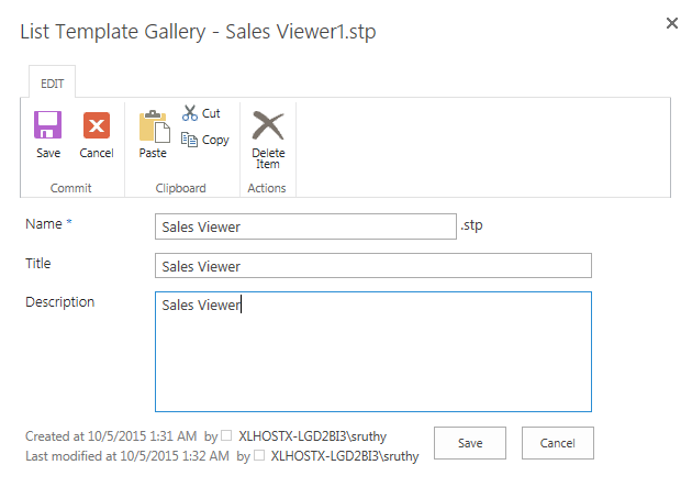
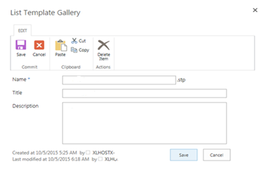
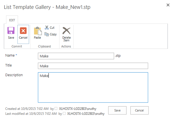
- A pop-up appears to edit the name, title and description of the list template.
- Click ‘Save’ to include the list template into the list template gallery.
- Once the list template is added to the list template gallery, we can create a new list using the list template uploaded. Following steps explains how to create a new list using list template.
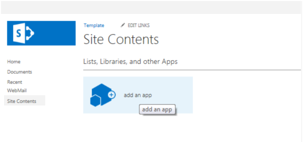
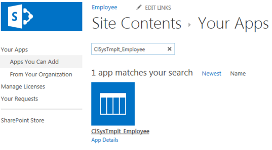
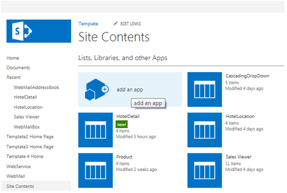
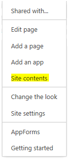
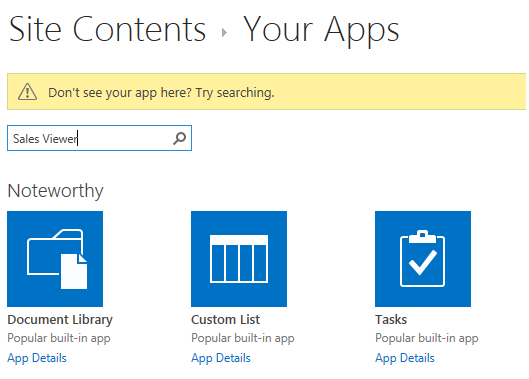
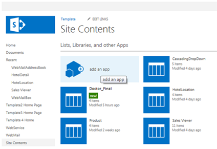
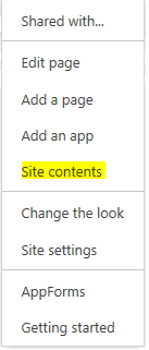
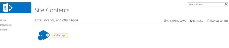
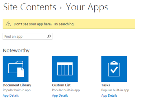
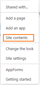
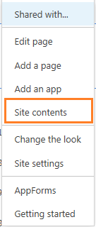
- From the Site Actions drop-down menu in the top right, select ‘Site Contents’ of your site.
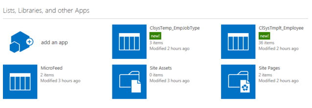
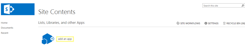
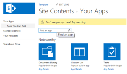
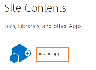
- Click ‘add an app’
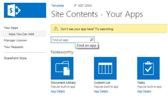
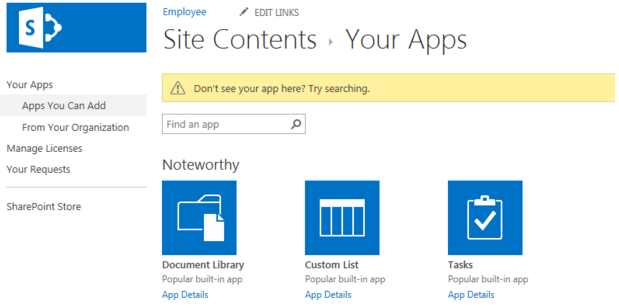
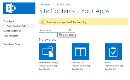
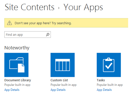
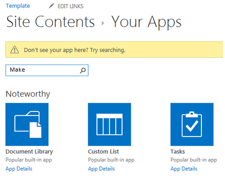
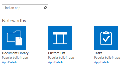
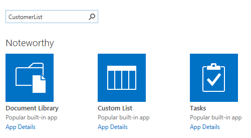
- Find the list template that was uploaded.
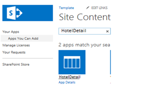
- Click on the list template to use for this site
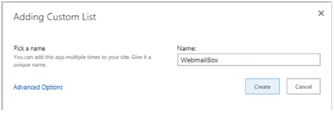
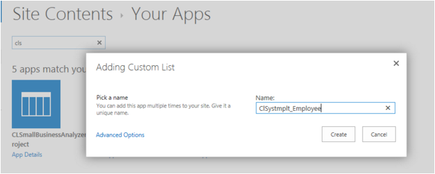
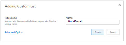
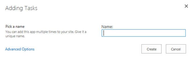
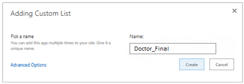
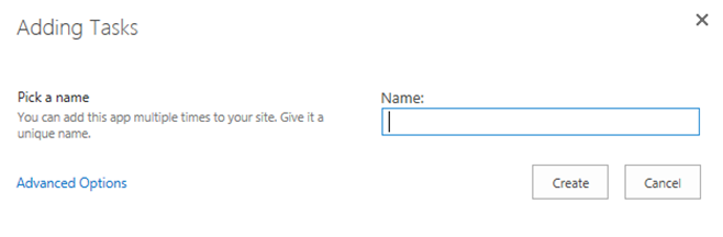
- Pick a name for the new list. We can add this app multiple times with a unique name.
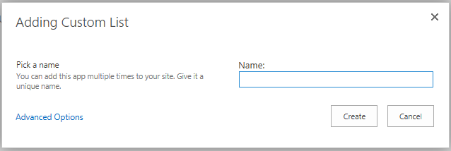
- Click on the ‘Create’ button. A list has now been created using the list template.
- Similarly create all other lists using list template.
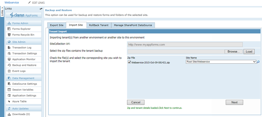
Import Tenant
Following steps will explain about tenant import.
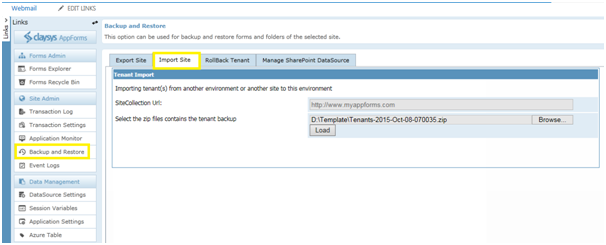
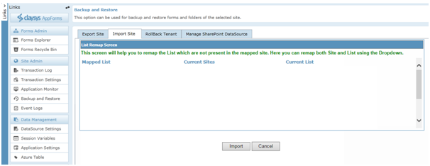
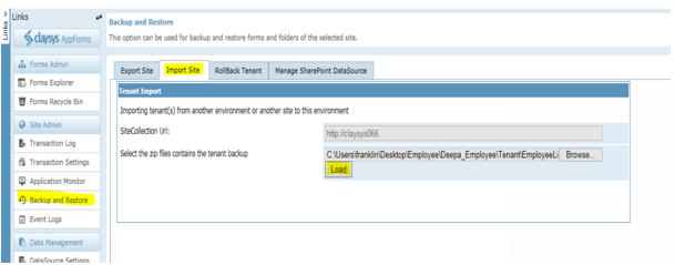
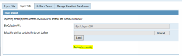
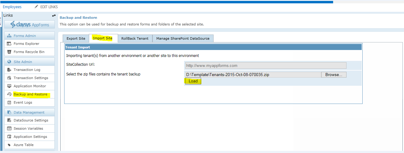
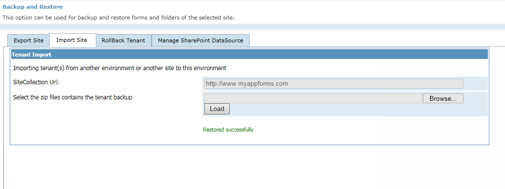
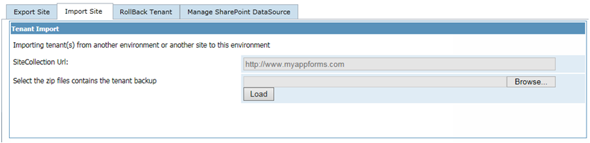
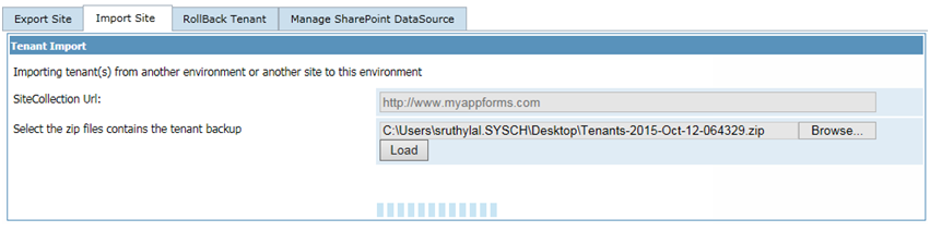
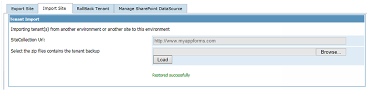
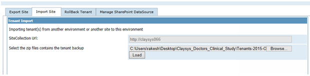
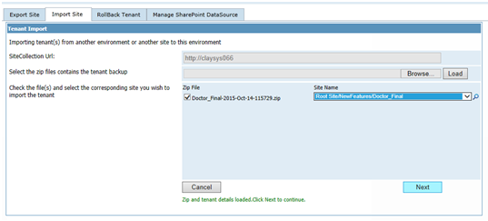
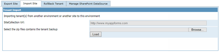
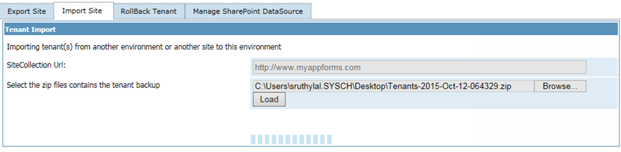
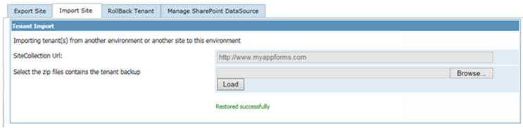
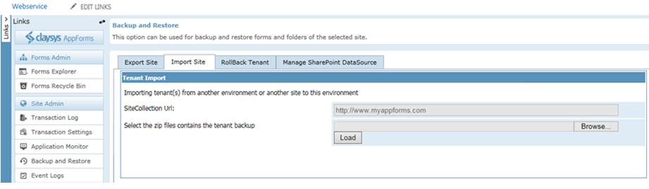
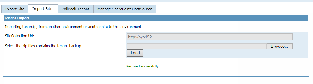
- Open the ‘Backup and Restore’ option in AppForms in the destination site and click on the ‘import site’ tab.
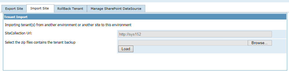
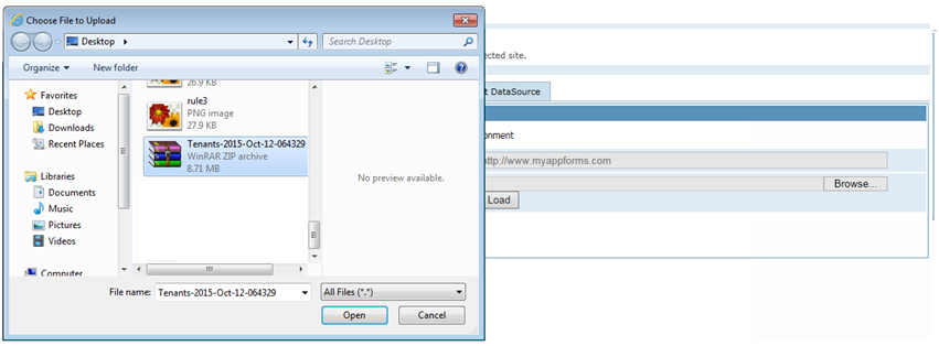
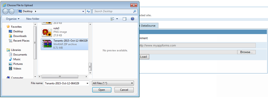
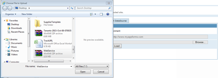
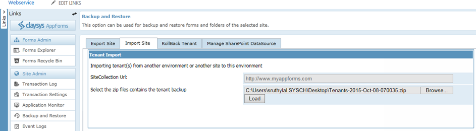
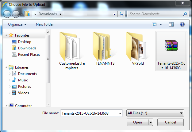
- Select the backup file we had saved from the source site.
- Once the file is selected, click on the load button.
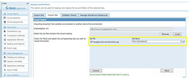
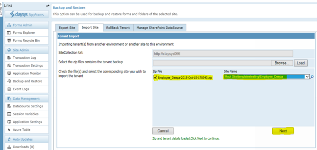
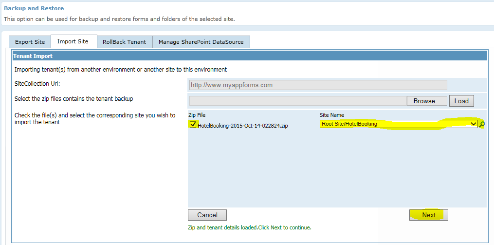
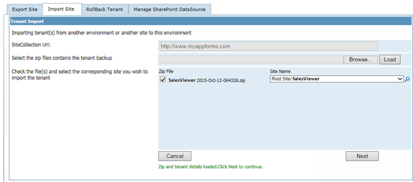
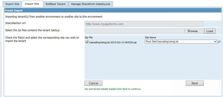
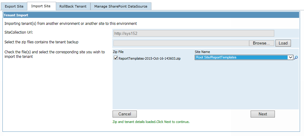
- This will show you the different sites that were exported from the source site. If there are more than one site content saved, then you can map each site in backup file to different sites in the current site. Select the required site content that needs to be restored and select the destination site in the current site as shown below. Once we are done with the backup mapping, click on the next button to proceed with the import.
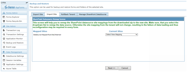
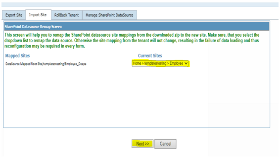
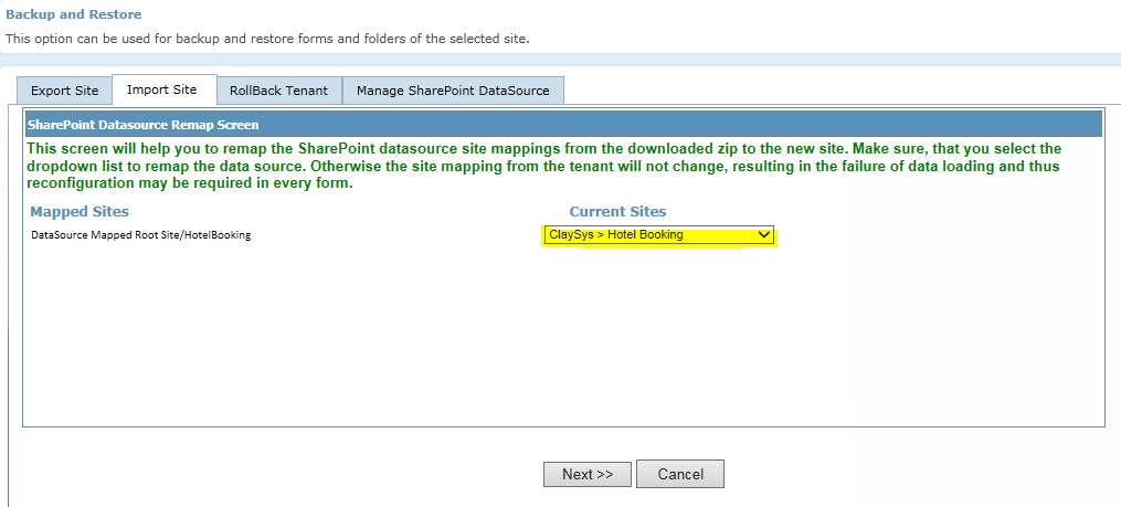
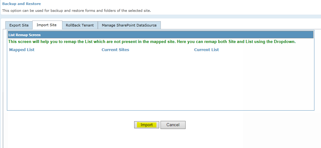
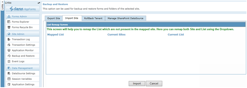
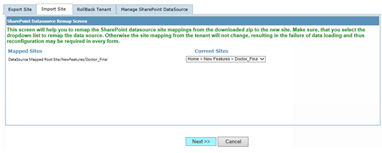
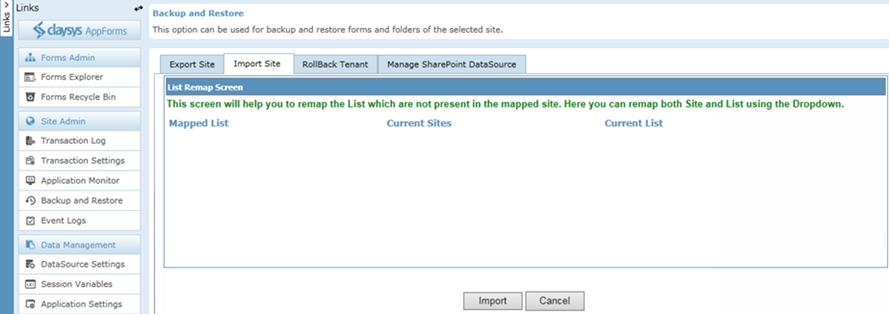
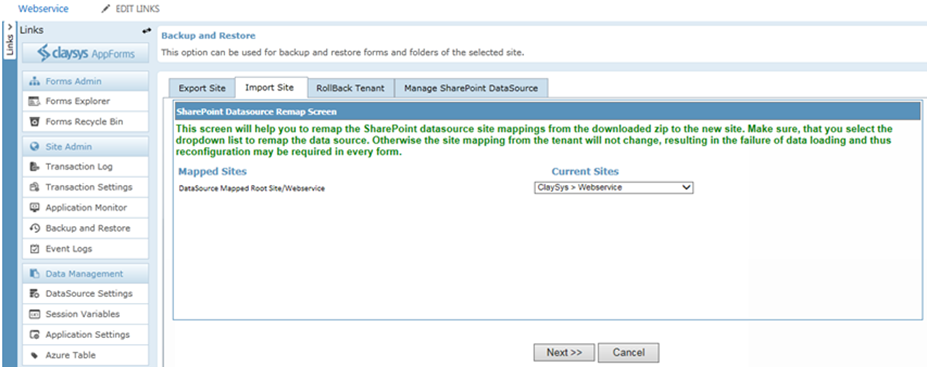
- Now we will have to remap the sites we had used in the source website to the actual site in the target site. The drop down will show you the sites/sub sites to help you with the data source mapping. Click ‘Next’ to continue.
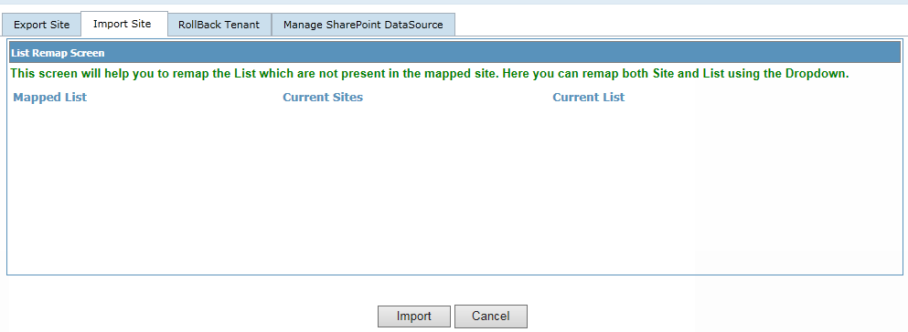
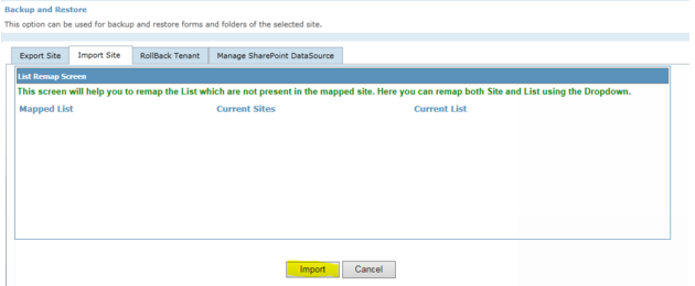
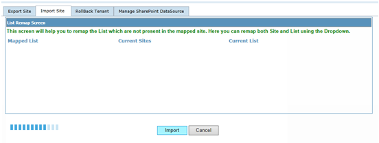
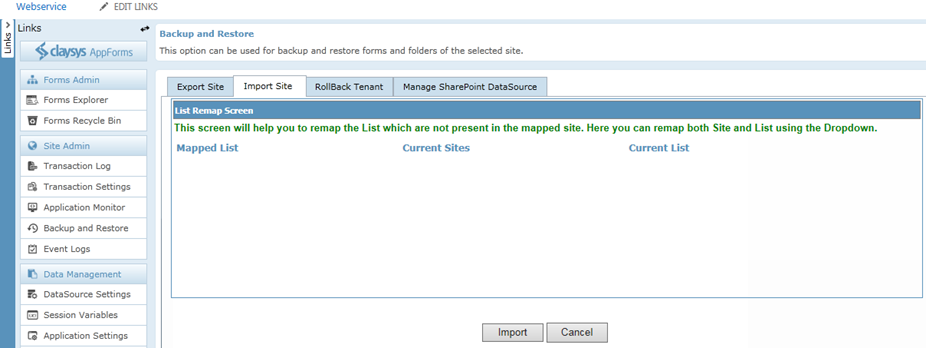
- Click ‘Import’ to continue.
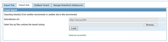
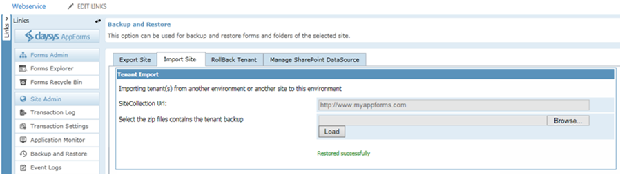
- This will import all the site content we had backed up from the source site and we are ready to work with the forms in the current site.
Create a WebPart Page
Forms can be embedded on any SharePoint page by using the ClaySys AppForms Web Part, to create a webpart page, follow these steps:
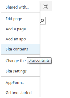
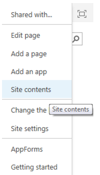
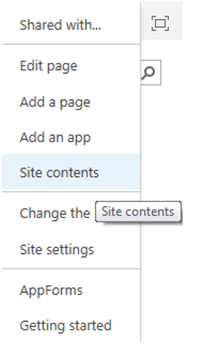
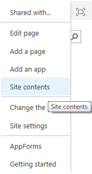
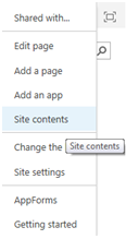
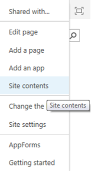
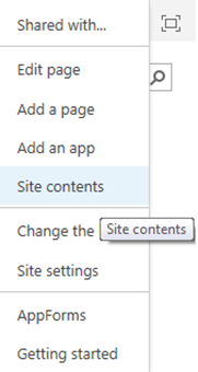
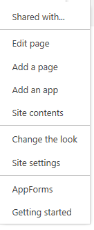
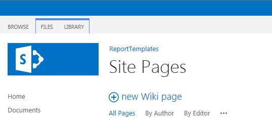
- Click on Site Settings Wheel in the upper right corner of your site and then select “Site Contents Page”.
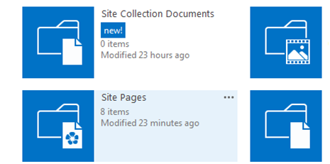
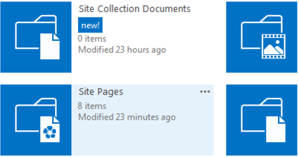
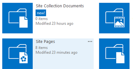
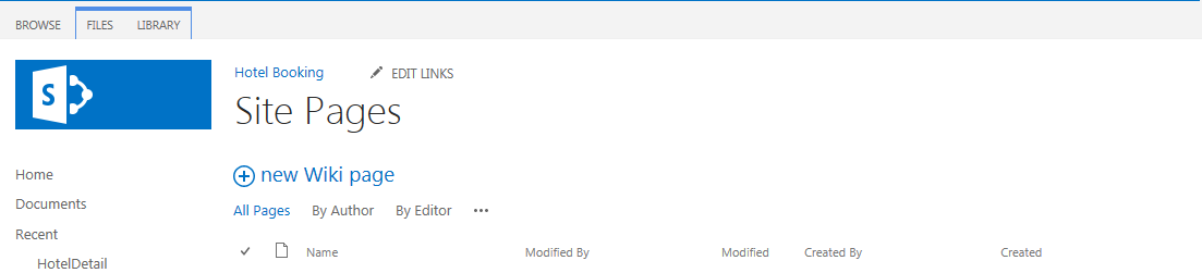
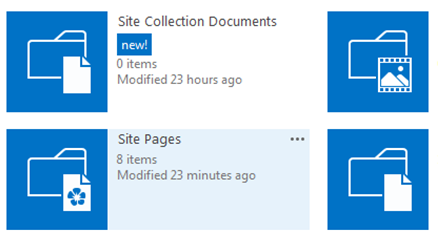
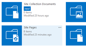
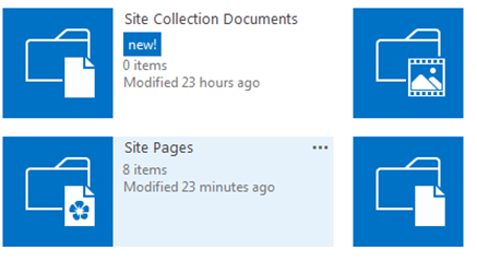
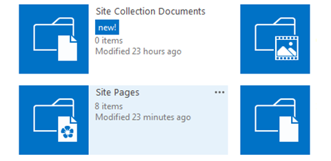
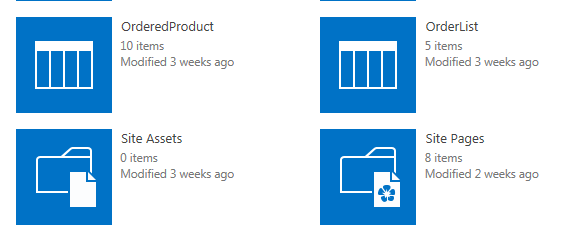
- Select “Site Pages” or simply pages library on Site Contents Page.
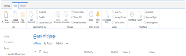
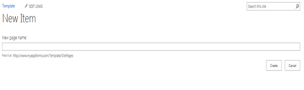
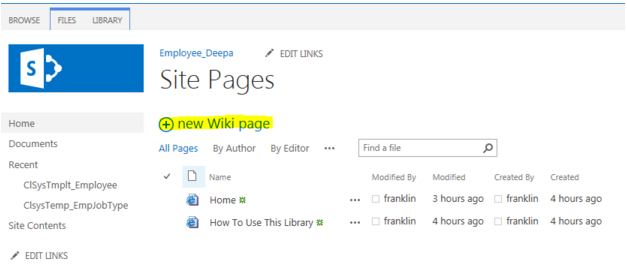
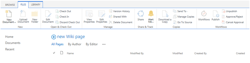
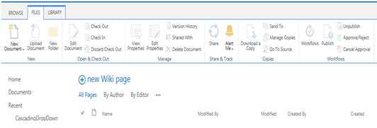
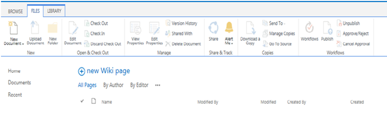
- Click on “New Wiki Page” to add new site page.
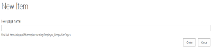
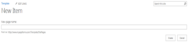
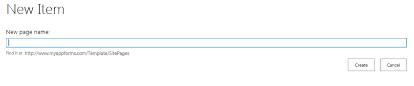
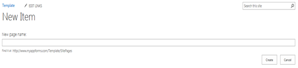
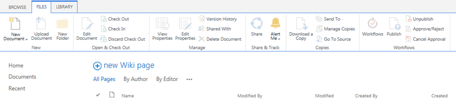
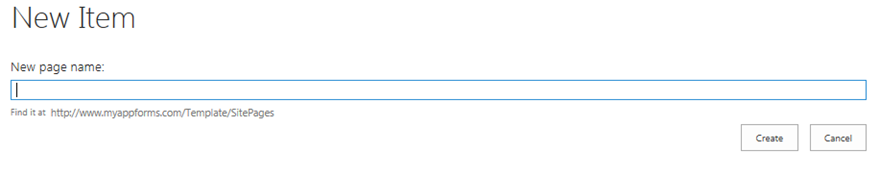
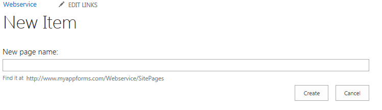
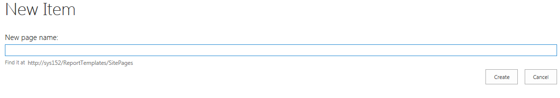
- Give the New page name into the pop-up window and click ‘Create’ to add new page.
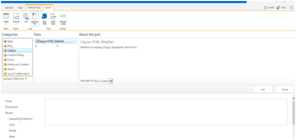
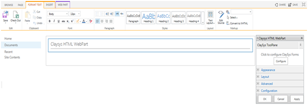
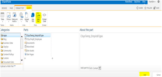
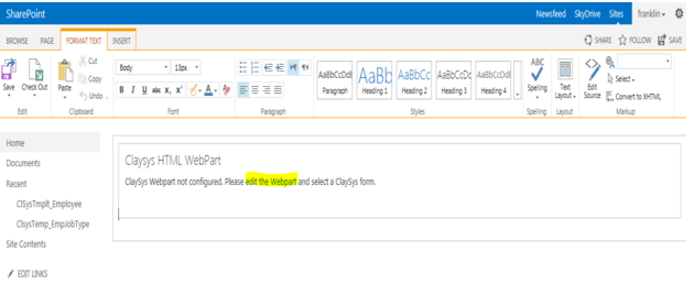
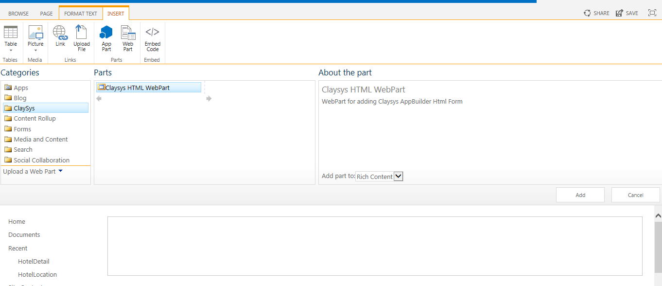
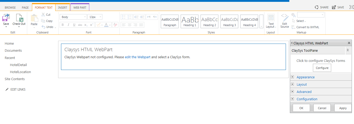
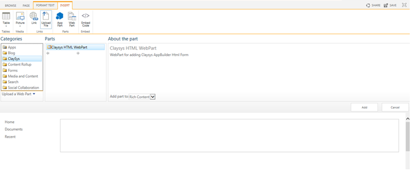
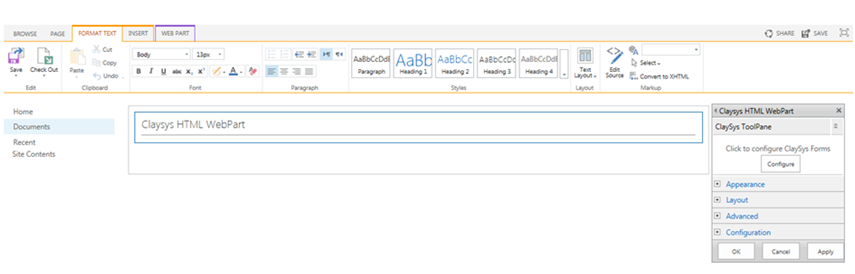
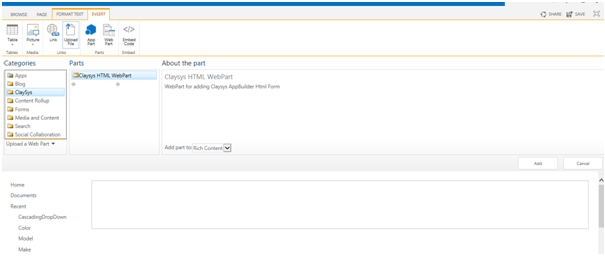
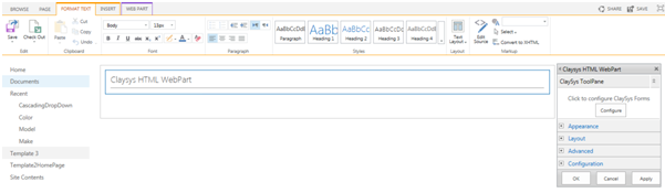
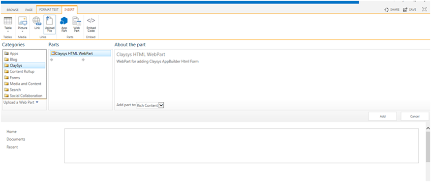
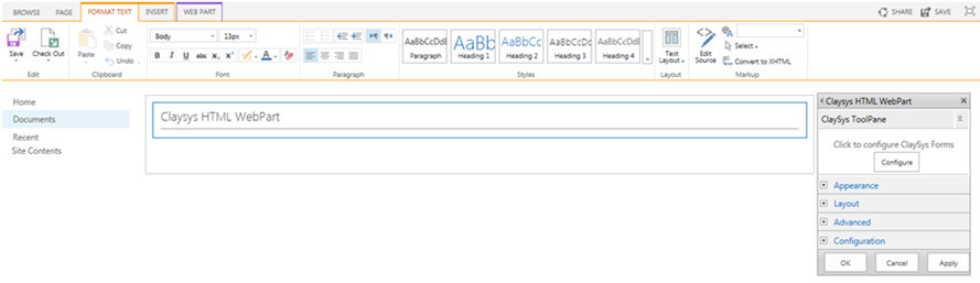
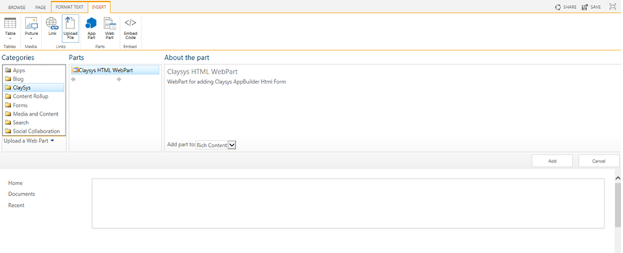
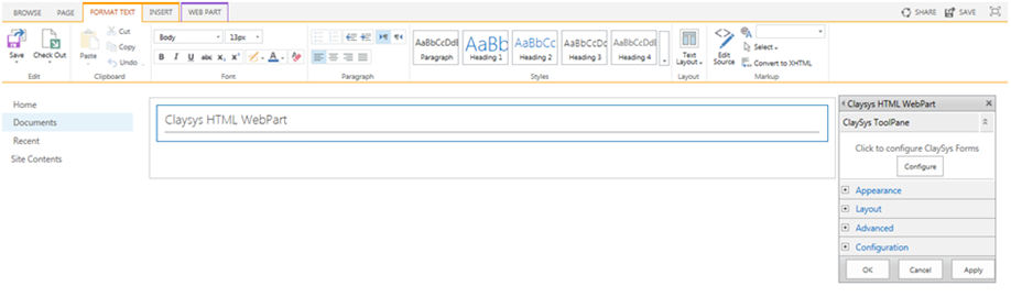
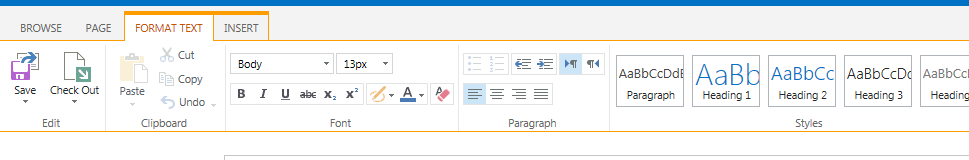
- To add a new web part, click on the ‘Insert’ tab and then click on the ‘WebPart’ button. Then select ClaySys -> ClaySys HTML WebPart.
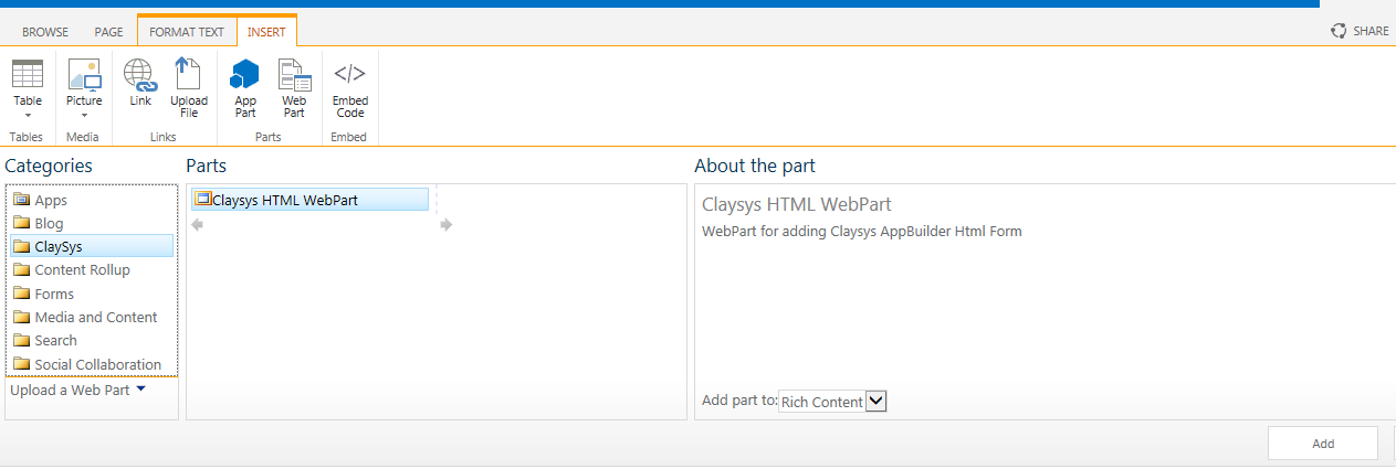
- Click ‘Add’ button to add the WebPart.
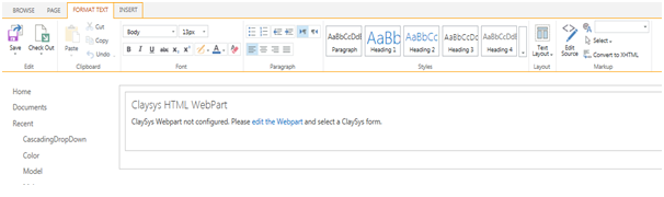
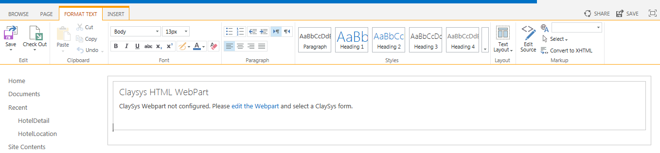
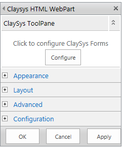
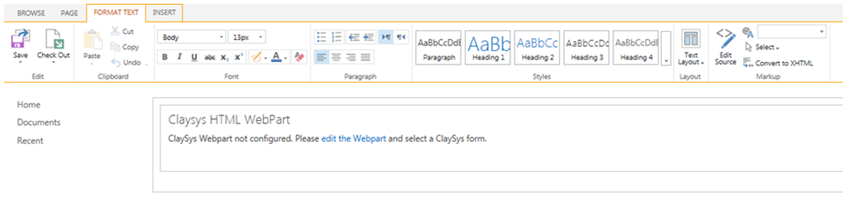
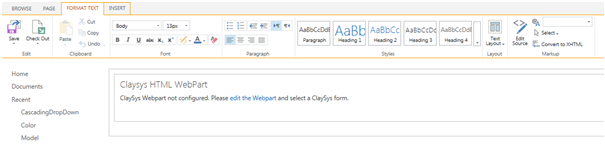
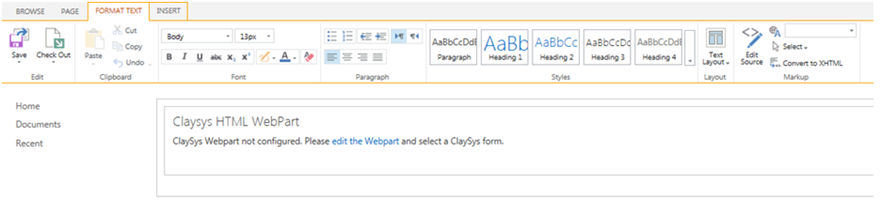
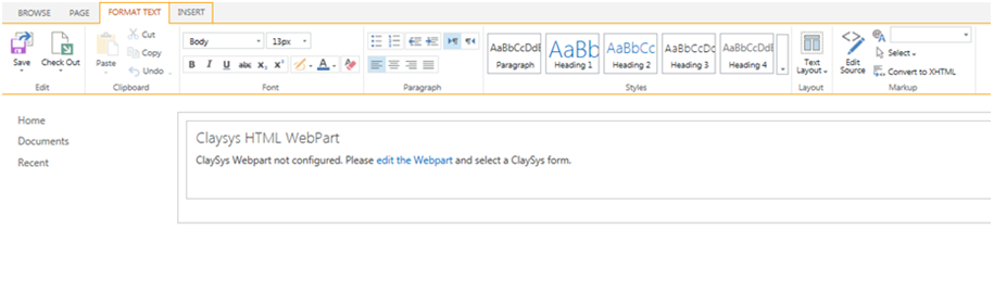
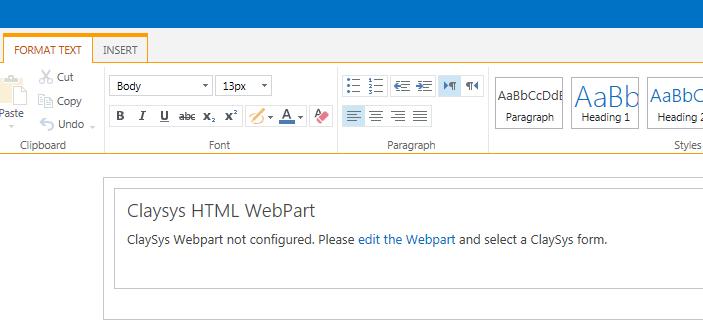
- Click on the ‘edit the Webpart’ link to edit the page.
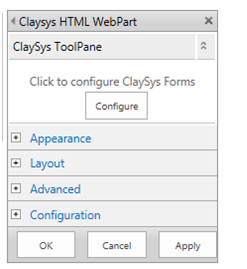
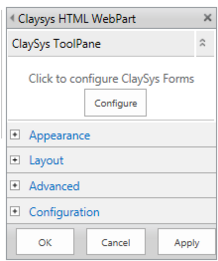
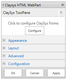
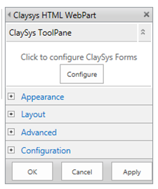
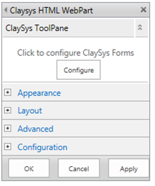
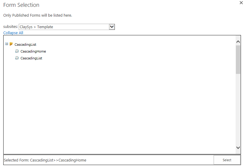
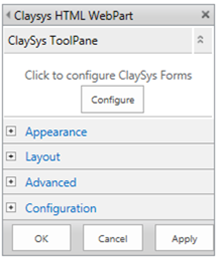
- A new pop-up window appears and here we can configure the ClaySys AppForms by clicking on the ‘Configure’ button.
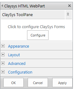
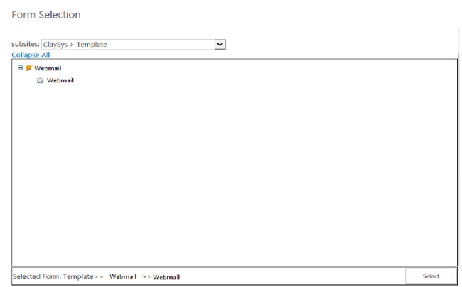
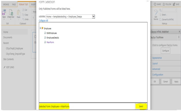
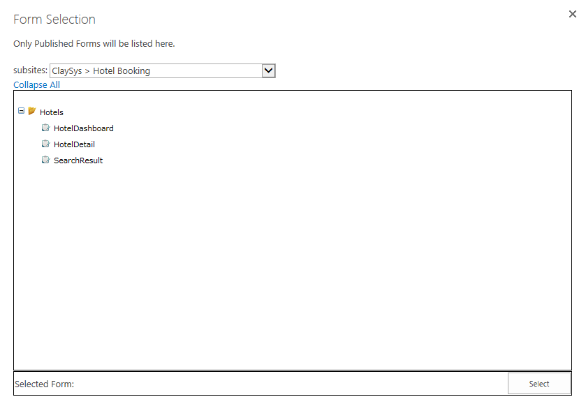
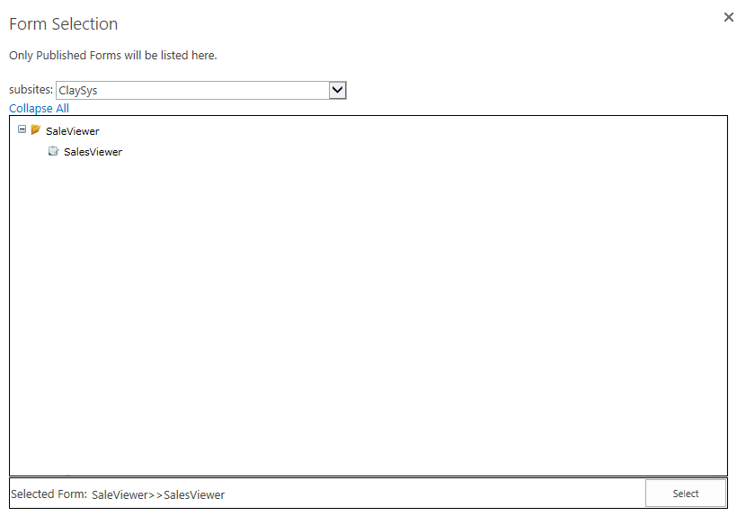
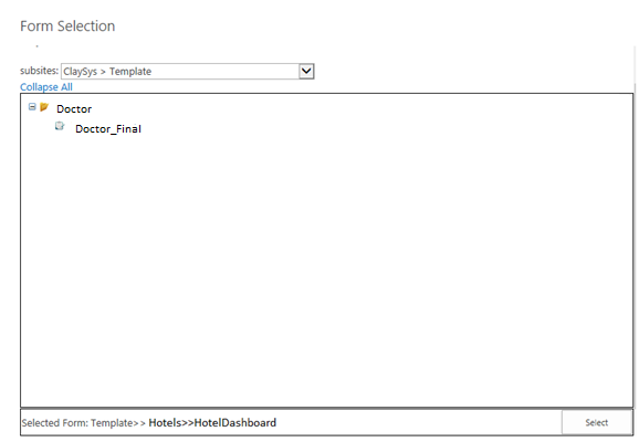
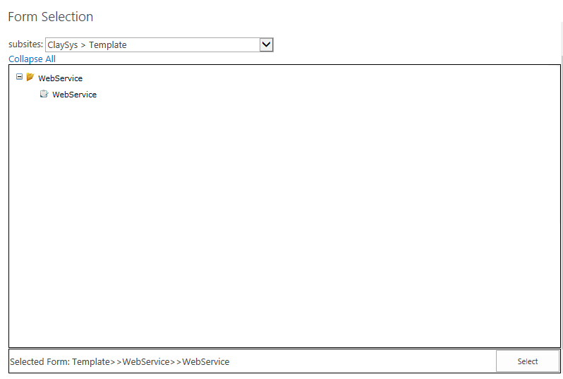
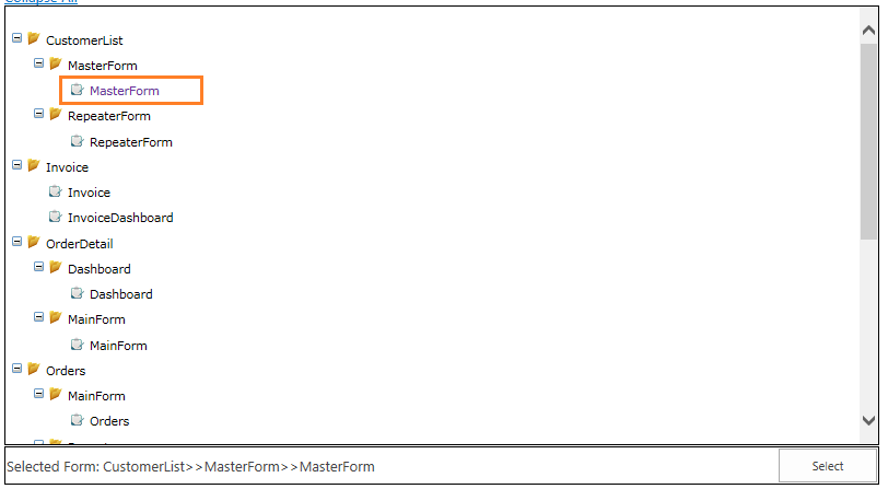
- Pop-up appears with listed published forms. We can select the appropriate form by click on the form and add the form by clicking on the ‘Select’ button.
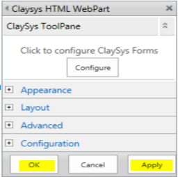
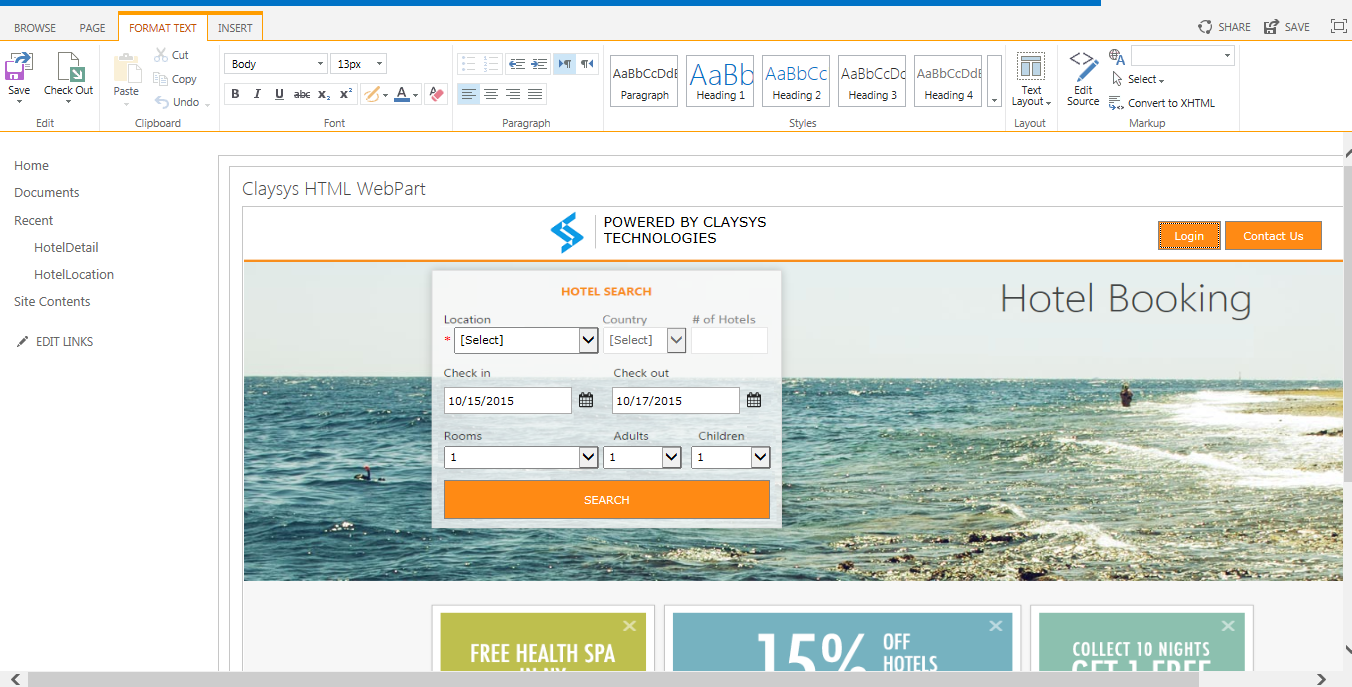
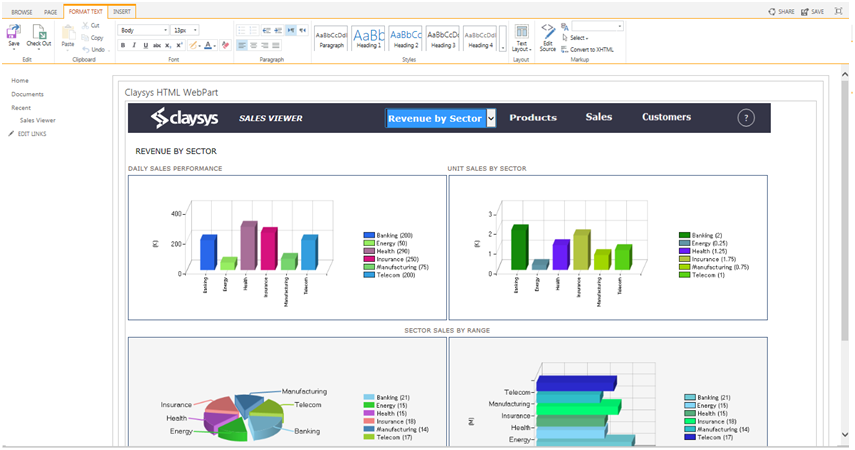
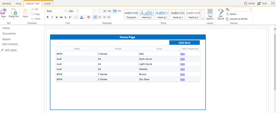
- Once the configuration is finished, click on the ‘Apply’ button to see the changes. Click ‘OK’ to continue.
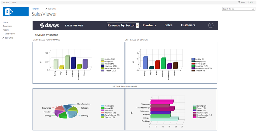
- Click ‘Save’ button to save the changes.
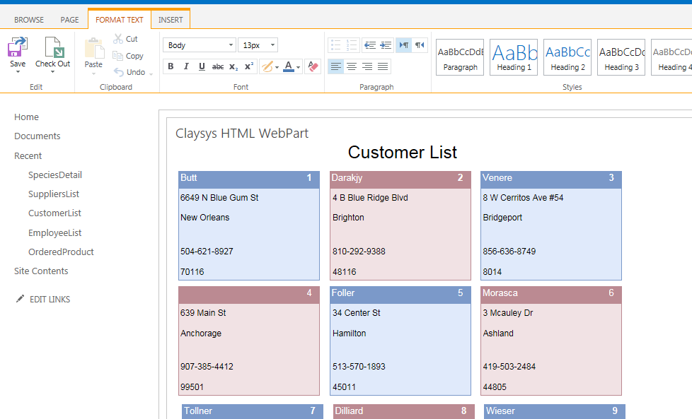
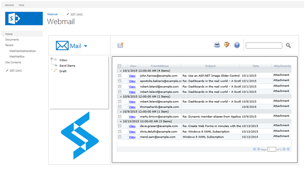
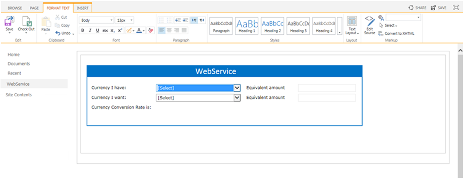
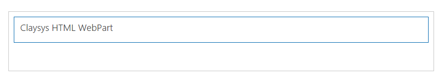
- Below figure shows the form after WebPart configuration.