Sub Activity – Image

The Image category has the following sub activities:

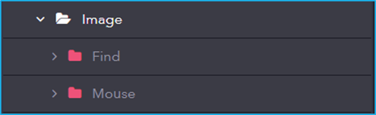
  • Find: Locates images within the user interface for automation purposes.
  • Mouse: Simulates mouse actions (click, hover, etc.) on images found within the user interface.

Sub Activity – Event

Event involves activities that monitor and respond to system or user-triggered events. It enables event-driven automation by detecting actions like mouse clicks, file changes, and system events.

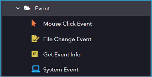
The Event activity has the following sub activities:

Mouse Click Event: This activity is used to monitor each mouse click on a specified UI element.

Element Properties:

  • Selector: String of code that uniquely identifies a specific UI element on a webpage or application.
  • IncludeChildren: Upon selection, the descendants of the specified UI element are also monitored.

Options Properties:

  • RepeatForever: Enables the indefinite repetition of this activity.

File Change Event: This activity monitors the event changes in a directory or a specified file.

Directory Information:

  • FileName: Specifies the File Name (If not provided then it will check for changes in all the files present in the directory).
  • Directory: Specify the directory path.
  • IncludeSubDirectories: Enables to check for changes in subdirectories.

Options Properties:

  • RepeatForever: Enables the indefinite repetition of this activity.
  • ChangeType: Specify the change type that needs to be detected.
  • NotifyFilters: Select the NotifyFilters.

Get Event Info: This activity will return information about the current event that is occurring.

Output Properties:

  • Result: Get event information.

System Event: This activity monitors a specified system-wide key or mouse event.

Options Properties:

  • EventTriggers: Option to select whether a keyboard or mouse event is triggered.

Sub Activity – Mouse

This section in UI Automation allows you to automate interactions with the user interface using mouse actions. It provides functionalities to simulate clicks, double-clicks, and hover events, enabling you to control application elements as if a user were physically interacting with them.

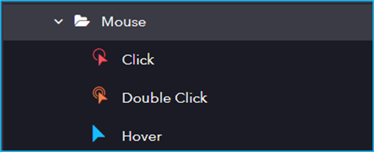
The Mouse activity has the following sub activities:

Click: This activity helps the user to click the specified UI element.

Options Properties:

  • Mouse Button: Click action by the mouse button (left or right).
  • Simulate Click: Stimulates a mouse click on an element.
  • Cursor Position: Displacement of the cursor position according to the option selected from the drop-down (Center, TopLeft, TopRight, BottomLeft, BottomRight).
  • OffsetX: “X” coordinates to shift the action location relative to the CursorPosition.
  • OffsetY: “Y” coordinates to shift the action location relative to the CursorPosition.

Double Click: This activity will help the user to double-click a particular UI Element.

Options Properties:

  • Mouse Button: Click action by the mouse button (left or right).
  • Simulate Click: Stimulates a mouse click on an element.
  • Cursor Position: Displacement of the cursor position according to the option selected from the drop-down (Center, TopLeft, TopRight, BottomLeft, BottomRight).
  • OffsetX: “X” coordinates to shift the action location relative to the CursorPosition.
  • OffsetY: “Y” coordinates to shift the action location relative to the CursorPosition.

Hover: This activity involves hovering the cursor over the indicated UI element.

Sub Activity – Keyboard

The section in UI Automation enables automated interaction with applications by simulating keyboard actions.

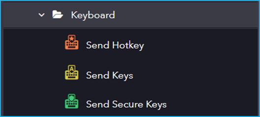
The Keyboard activity has the following sub activities:

Send Hotkey: This activity sends keyboard shortcuts to a specified UI Element.

Input Properties:

  • KeyModifiers: enter a hotkey to perform a specific action or command.

Options Properties:

  • Activate: Enables the specified UI element field.
  • ClearField: Removes existing text from the specified UI element field.
  • ClickBeforeTyping: The specified UI element field is clicked before sending the keystrokes.

Send Keys: This activity allows the users to send keys to a specified UI Element.

Input Properties:

  • Keys: Input text that is to be written in the specified UI element field.

Options Properties:

  • Activate: Enables the specified UI element field.
  • ClearField: Removes existing text from the specified UI element field.
  • ClickBeforeTyping: The specified UI element field is clicked before sending the keystrokes.
  • DelayBetweenKeys: The time interval, in milliseconds, between each keystroke.

Send Secure Keys:  This activity lets users pass keys as a Secured String variable instead of a String variable format.

Input Properties:

  • Keys: Secure string that is to be written in the specified UI element field.

Options Properties:

  • Activate: Enables the specified UI element field.
  • ClearField: Removes existing text from the specified UI element field.
  • ClickBeforeTyping: The specified UI element field is clicked before sending the keystrokes.
  • DelayBetweenKeys: The time interval, in milliseconds, between each keystroke.

RPA Genie Co-Pilot

  • Co-Pilot is the host that executes the automations that are created using the RPA Genie Studio. This application was created mainly to run attended automation, which allows users to interact with the robots. It enables the end users to access, control and execute automation with just a few clicks.
  • Co-Pilot will be able to login to the Bot machine with a user account, and then perform the automation when it is triggered.
  • The RPA Genie Co-Pilot will be accessible from the System Tray.
  • A process can be started, paused and stopped from the Co-Pilot. To initiate a process, the play button can be clicked. While the process is being executed, the user will be able to pause or stop the process. (Refer to the Screenshot provided below)
  • The Co-Pilot is a very user-friendly tool where all the published processes can be viewed in the Co-Pilot dashboard.
  • There is also a feature in Co-pilot to add a title and icon to a process as per the user’s preference. A suitable title can be provided and an image can be uploaded for the process from the Project Settings menu in Studio. Once the title and icon are provided for a process, it can be viewed in the Co-pilot dashboard. This will make it more convenient for the users to select the required process.

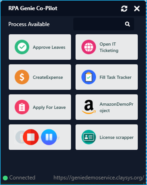
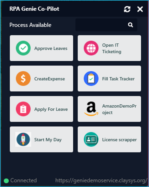
Note: To access the process in the co-pilot, ensure that the project is published and added as a process in the Bot Manager.

RPA Genie Agent

RPA Genie Agent is the host that executes the automations that we have created using the RPA Genie Studio. The agent can run as a standalone bot or with multiple bots connected to a Bot Manager. The RPA Genie agent will be able to login to the Bot machine with a user account, and then perform the automation when it is triggered. If your agent is connected with the BOT Manager, then you can manage the processes from there. The Agent will be accessible from the System Tray. When you right-click on the agent’s icon in the System Tray, you’ll get a menu with options such as Settings, Packages, and to exit.

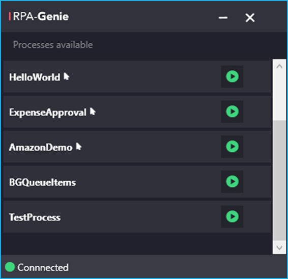
You can start, pause and stop processes from the agent, or you can even schedule a process for a specified time if your agent is connected to the BOT Manager.

With the help of an Agent, you can register a bot. If your agent service supports the auto connect feature and the robot registration has been completed, the Agent will automatically connect to the BOT Manager once you open the Agent.

Sub Activity – Find

It Includes activities for searching and detecting UI elements based on defined properties, allowing automation to dynamically locate elements during execution.

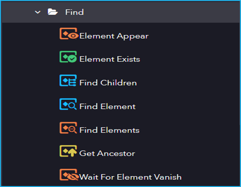
The Find activity has the following sub activities:

Element Appear: This activity waits for a particular UI element to appear then proceeds with the project.

Output Properties:

  • Found Element– Stores the selected UI element.

Element Exists: This activity helps to verify if the UI element exists or not.

Output Properties:

  • Exists– Boolean variable indicating the existence of an element.

Find Children: This activity allows the user to retrieve all the Child elements of a specified UI element. 

Output Properties:

  • Children– Resultant array collection of child elements.

Find Element: The activity waits until the indicated UI element appears on the screen and returns it as UI Element variable.

Find Elements: This activity is used to find all elements that match the provided criteria.

Get Ancestor: This activity is used to retrieve the previous main node of any element that you indicate.

Wait For Element Vanish: This activity waits for specified UI element to disappear from the screen.

Sub Activity – Control

Control includes activities for identifying, selecting, and manipulating UI elements, including focusing on elements, setting attributes, and verifying element states.

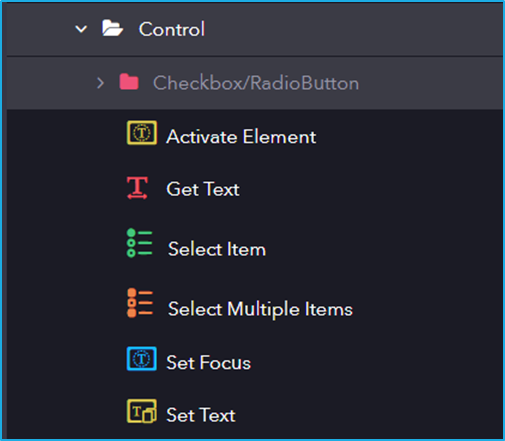
The Control activity has the following sub activities:

Activate Element: This activity makes the specified element the main one in the UI, bringing it into view.

Get Text: This activity extracts the text from the indicated UI elements.

Output Properties:

  • Value– String variable extracted from the UI element.

Select Item: This activity is used to Select an item from a dropdown list or a list box.

Input Properties:

  • Item– Specifies the item to be selected from the combo box or drop-down list.

Select Multiple Items: This activity allows the user to select multiple items from a combo box or drop-down list box

Input Properties:

  • AddToSelection– Specified items will be added along with the already selected item.
  • Items– Specifies the items to be selected from the combo box or drop-down list.

Set Focus: This activity sets the keyboard focus to a specified UI Element.

Set Text:  This activity allows you to specify a string value to the text attribute of a particular UI Element.

Input Properties:

  • Value– Text to be written in the UI element.

Checkbox/RadioButton

It includes activities for interacting with checkbox and radio button UI elements, allowing automation to check, uncheck, select, or deselect options based on the required state. This activity has several sub-activities, each of which is listed below:

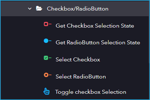
Following are the activities inside the Checkbox/RadioButton sub-activity:

Get Checkbox Selection State: This activity helps to get the current state of a checkbox(checked/unchecked).

Output Properties:

  • IsSelected– Returns the corresponding Boolean value depending on the state of the radio button.

Get RadioButton Selection State: This activity is used to return the state of the Radio Button.

Output Properties:

  • IsSelected– Returns the corresponding Boolean value depending on the state of the radio button.

Select Checkbox: This activity lets users Select or Unselect a particular checkbox.

Input Properties:

  • Value– Checkbox will be checked or unchecked depending on the boolean value.

Select RadioButton: This activity lets users select or unselect a particular radio button.

Toggle Checkbox Selection: This activity helps us change the value of the toggle UI element.

Sub Activity – Element

Element includes activities for identifying and interacting with specific UI elements, such as buttons, text fields, and labels, enabling automation to perform actions like clicking, typing, and extracting information.

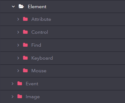
The Element activity has the below sub activities:

  • Attribute
  • Control
  • Find
  • Keyboard
  • Mouse