ClaySys AppForms Demo template document deals with,
- Pre-Requisite
- How to create a main form using different controls
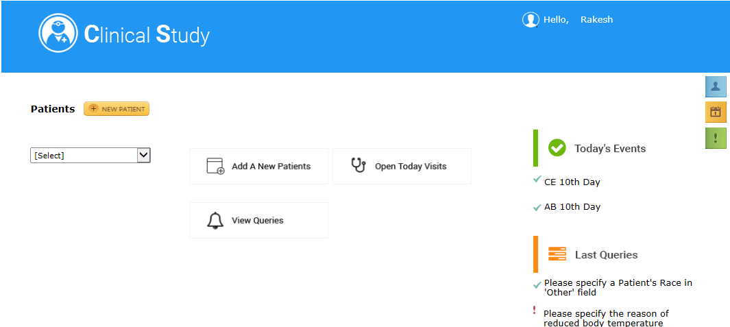
- How to create the home page to display patient details
- How to rename a control
- How to add an image to image control or image button
- How to configure a search control
- Adding a new patient form
- Query page
- View comments page
- To view daily schedule
- How to use this template
- SharePoint 2013
| SharePoint List | |||
|---|---|---|---|
| List Name | Column Name | Data Type | |
| Doctor_Final
This SP list has details of patients. |
Active | Single Line Text | |
| Patient Name | Single Line Text | ||
| List Of Forms Used | ||
|---|---|---|
| Name | Functionality | |
| Main Form Form Design | This is the Home Page | |
| New patient Form Form Design | This form is used to add a new patient | |
| Query Form Form Design | This form is used for entering Queries | |
| View comments page: Form Design Rule Design | This will be a pop up to view the comments by doctor | |
| Schedule Visit Form Design | This Form is used to see | |
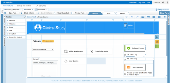
Controls used in the form are Image Control, Image Button, Sub Form, Label, Search Control, Text box as hidden control (visibility is set as false).
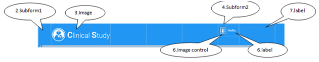
Follow the steps to create the home page to display patient details: Select the first column and by using span option, span it to “n” number of columns, eg: 5. Drag “Sub-Form” from Group to the spanned column. Inside the sub form add columns. In one of the columns add one image control. Add one more Sub-form inside one of the columns of the first inserted Sub-form. Add two columns to the second Sub-form. Drag and drop one image control and label control to the added columns respectively. Add another label control to the 1st Sub-form.
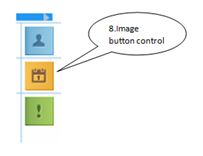
Drag and drop three Image button controls.
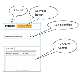
Drag and drop a label control and change the name as Patient. Drag and drop an image button, combo box and the search control.
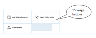
Image button controls are dragged and dropped.
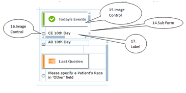
Drag and drop the sub-form, image control and label control.
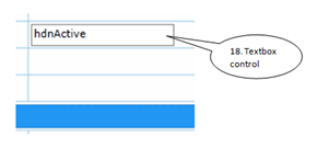
Drag and drop the text box control.
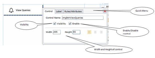
How to rename a control: Click on the control, a quick menu will be displayed. Edit the name of the control in the column name field. We can make the control visible/ invisible by selecting the check box respectively. The control can be enabled / disabled by selecting the check box respectively. We can also set the width and height of the control.

Adding a image to image control or image button: Steps to add a image to image control or image button. Select the image / image button control. In the right side Properties drop down select Image source. Browse and select the image from the stored location. The image will be added to the image source and displayed in the image/image button control.
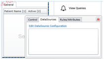
Configuring a search control: Create a list in sharepoint with required field. Click on the search control. Quick menu will be opened. Select the Data Source tab. Click on edit Data Sources Configuration hyperlink.
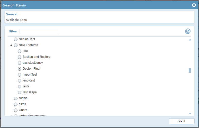
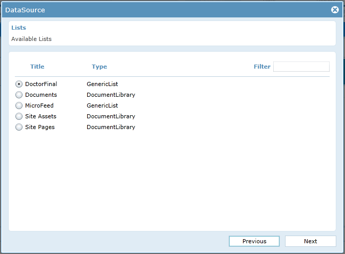
Select the site by clicking the radio button from the pop-up and click on Next button.
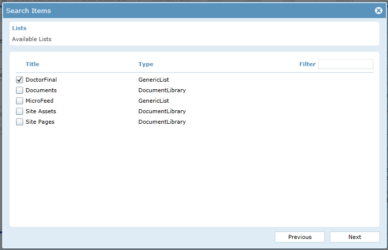
Select the list created in the sharepoint and click on next button.
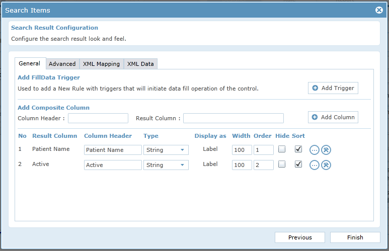
Select the columns in the list which should be displayed in the search control. Select the criteria if necessary / click on next button. Select the Relation, if you need to join 2 or more tables. In search result configuration window, you will be allowed to edit the column header, type and order to display the columns.
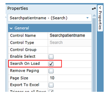
Click on finish button. The search control will be configured. In general properties, select the Search On Load option and the search will be filled when the form is launched. Search can also be filled using various methods.
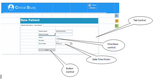
Controls used in the form are Image Control, Image Button, Sub Form, Label, Tab Control, Text box, Check box, Date Time Picker, Button. Steps to create this form: Follow the same steps used in first form to create the header part. Place a label control by spanning columns and change the name as New Patient. Change the header Name of the Tab control to “Patient Information – New Patient”. Properties –> Tab Collection –> Items –> Enter the name in Tab Item Name and click on OK button. The name of the tab control will be changed. Drag and drop controls as shown in the image. The UI design of New Patient Form is completed.
Save Functionality in the Form: Button is dragged and dropped. Create a list in SharePoint. Add a data source to the form and name it. Click On DataSources –> Create DataSource –> Enter Name –> Select the data source as SharePoint –> Click Ok –> Select the list created in the share point –> Click on Next button.
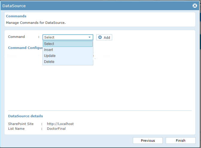
Select Insert option from the drop down and click on add button.
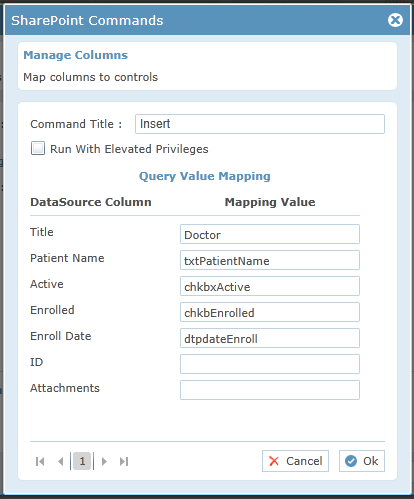
Map the columns of list to the design controls and click on OK button.
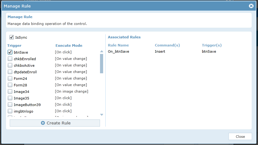
Click on Add Trigger Button.
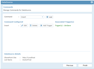
Select btnSave as trigger and click on “Create Rule” button. The rule will be created –> Click on close button. Click on Finish button The data source will be added. By using this form, we will be able to insert the data into the List created in the sharepoint. In this form, new patient details will be added.
Controls used in the form are Image Control, Image Button, Sub Form, Label, Button.
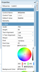
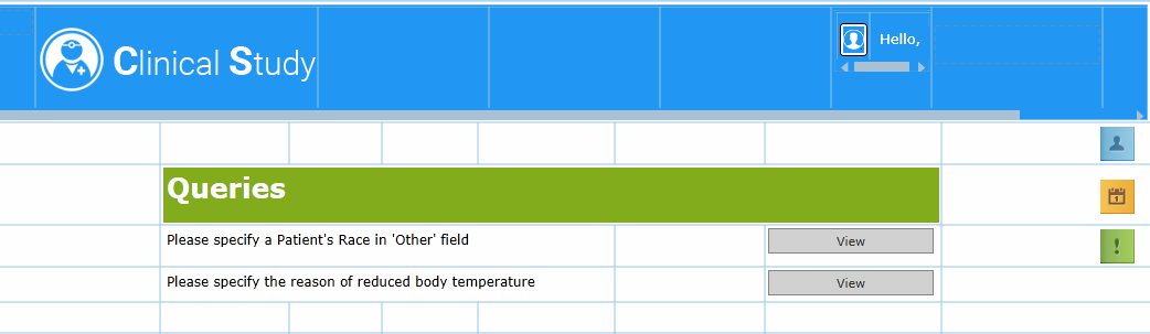
Steps to create this form: Create the header by using the same steps used in the above forms. Span columns and drop a label control. Name the label as “Queries”. Change the back ground color to “eg: Green”. The back ground color option is present in Properties –> Style –> Background color. Complete the design as shown in the image.
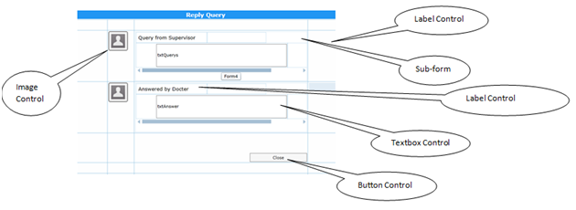
Controls used in the form are Image Control, Sub Form, Label, text box, Button.
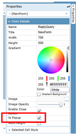
This form should be shown as a pop-up when the “VIEW” button in query Form Is Clicked. So “Is Pop-Up” option should be selected in this form. Click on any part of form –> Properties –> Form Details –> Is Popup=True.
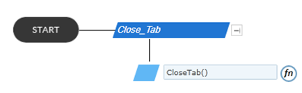
Follow the steps to create the form: Drag and drop all the controls and achieve the Form UI design. For Close button, Click on the button –> Quick menu will be displayed –> Select Rule/Attributes –> Create rule –> Click on start –> Add an action –> Write rule “CloseTab ()”.
Controls used in the form are Image Control, Image Button, Date Time Picker, Label, Search Control.
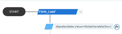
Steps to create the form: Drag and drop all the controls and achieve the Form UI design. In this a label for error message and search control is placed and is Invisible. When the Form is loaded, the date time picker displays the current date. This is achieved using a rule. Rules –> New Rule –> Add Action –> “dtpselectdate.Value = GlobalVariable(Now)” dtpselectdate.Value=GlobalVariable(Now) means dtpselectdate.Value–Value Of date time picker. The name of date time picker is given as ” dtpselectdate” in form design. GlobalVariable(Now) – this selects the current date.
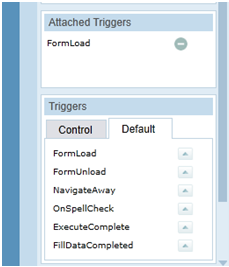
FormLoad is set as trigger. In Default Tab –> form load will be displayed.
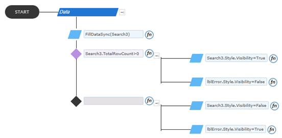
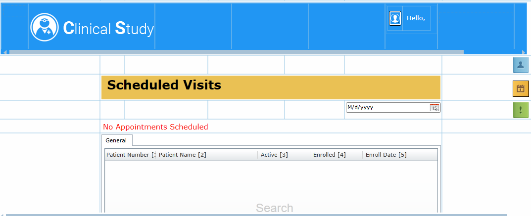
When the Form is loaded, if there is any appointment scheduled for the current date the search control will be displayed with data. If there is no appointment scheduled for the current date, the error message will be displayed. This is achieved using rules. Have Date Time Picker as trigger . Rules: Create a new Rule –> Add a Action Rule – “FillDataSync(Search3) “ Add a decision: If Search3.TotalRowCount>0 -> Search3.Style.Visibility=True -> lblError.Style.Visibility = False Else -> Search3.Style.Visibility = False -> lblError.Style.Visibility = True. The Form Design is complete.