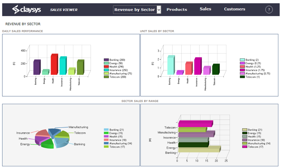
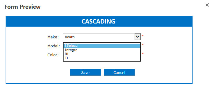
Cascading DropDown enables a common scenario in which the contents of one combobox depends on the selection of another combobox. The Cascading Dropdown Menu allows you to drill down through hierarchical data by using one dropdown menu as a filter into the next. The purpose of this template is to be a reference for any person wishing to implement or any person interested in the architecture of the cascading dropdown for the ClaySys AppForms or how to configure the combo boxes in AppForms with cascading dropdown effect.
- SharePoint 2013
| SharePoint List | |||
|---|---|---|---|
| List Name | Column Name | Data Type | |
| Color
‘Color’ list is used to populate the color combo box. |
Color | Single line of text | |
| MakeID | Number | ||
| ModelName | Single line of text | ||
| SharePoint List | |||
|---|---|---|---|
| List Name | Column Name | Data Type | |
| Cascading DropDown
‘Cascading DropDown’ list is used to fill saved data in cascading home page. |
Make | Single line of text | |
| Color | Single line of text | ||
| Model | Single line of text | ||
| SharePoint List | |||
|---|---|---|---|
| List Name | Column Name | Data Type | |
| Model
‘Model’ list displays model of automobile with respect to make. |
Maker | Single line of text | |
| Name | Single line of text | ||
| SharePoint List | |||
|---|---|---|---|
| List Name | Column Name | Data Type | |
| Make
‘Make’ list displays the name of automobile manufactures. |
Name | Single line of text | |
| List Of Forms Used | ||
|---|---|---|
| Name | Functionality | |
| Cascading Form Design Rule Design | Cascading form is used to understand the cascading combination of dropdowns. | |
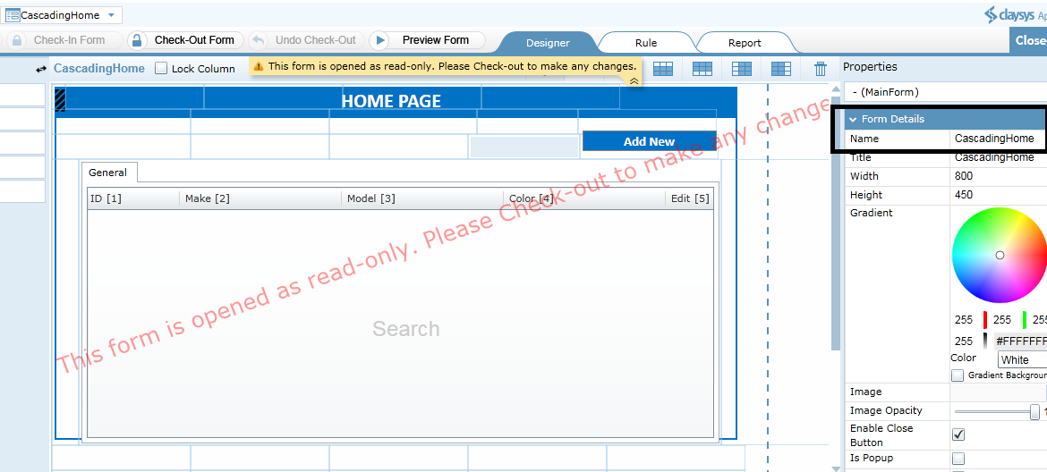
| CascadingHome Form Design Rule Design | CascadingHome contains all the datas saved in the list via cascading form. User can modify these details from CascadingHome. | |

Folders are used to store and organize forms that have a logical association or relationship. To create a new form, click ‘New Folder’ button on the toolbar of the designer. On clicking the New Folder option, it will create a new folder and the name will be in the edit mode. You can type a new name for the folder.
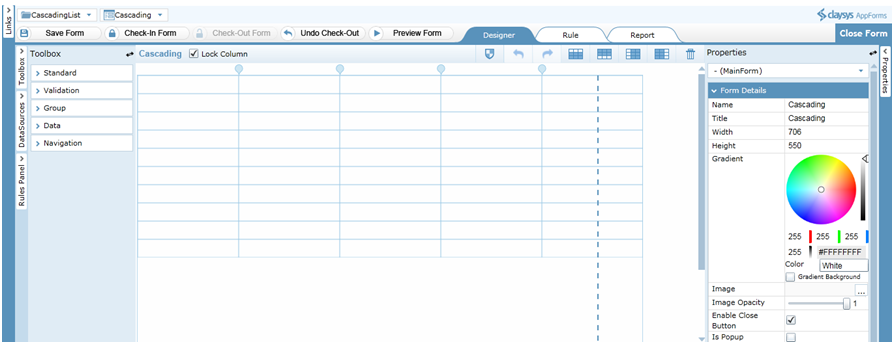
Then click on the ‘New Form’ link on the toolbar. Give an appropriate name for the form. Click ‘Save’ to save the form.
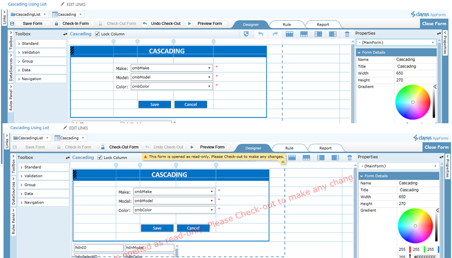
You can drag and drop controls format the styles easily. ‘Check-In Form’ to save the changes and publish to get the completed form for the end user to use. A form must be checked-out to make modifications while all aspects of the form can be examined while checked-in.
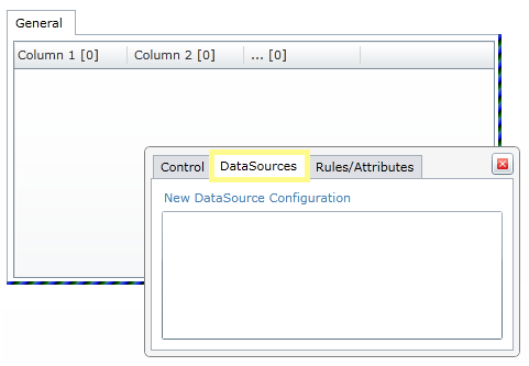
Following steps will explain about the DataSource configuration of ComboBox control. Click on the ‘Make’ ComboBox and select the DataSources tab to edit the DataSource.
A pop-up window appears to select the item source. Select the appropriate Item source and click ‘OK’ to continue. Here, we select the Item Source as ‘SharePoint’.
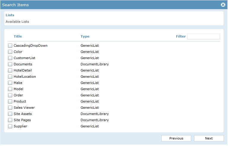
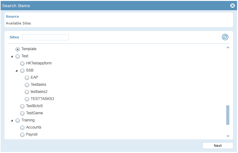
Select the SharePoint List in the next window. Click ‘Next’ to continue.
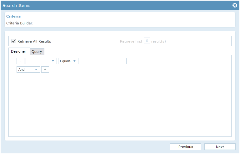
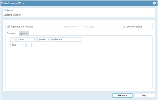
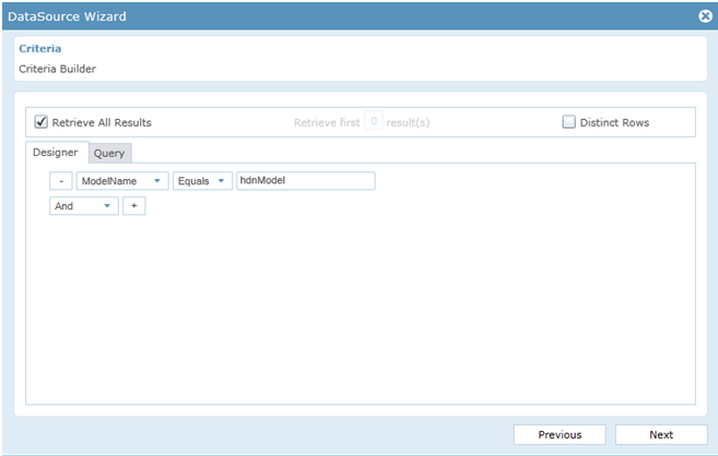
Click “Add” button in the criteria window to Write the appropriate criteria for filling the ‘Make’ ComboBox in the Criteria Builder. Click ‘Next’ to continue.
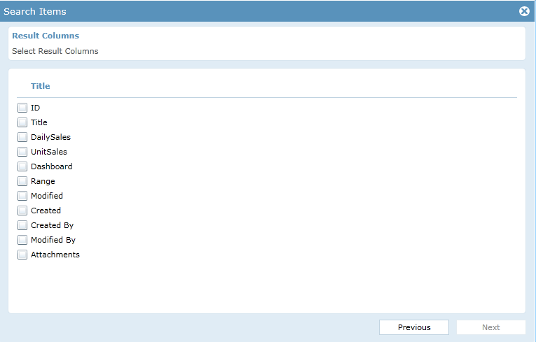
Select the value member and display member from DataSource wizard. Click ‘Next’ to continue.
When the user selects ‘Acura’ from Make, Model names should be populated in the ‘Model’ combo box. To configure the ‘Model’ ComboBox follow the steps for configuring the ‘Make’ ComboBox upto the list selection. Give the criteria for filling the ‘Model’ combo box as given below.
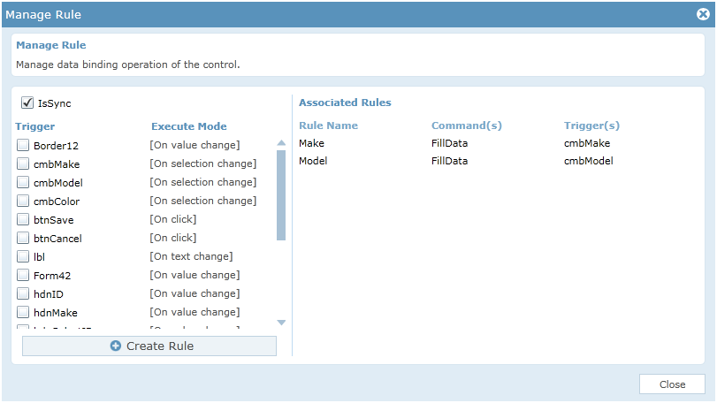
Click “Next” to continue. Follow the configuration steps of ‘Make’ combo box to add the trigger for ‘Model’ combobox. Add trigger as ‘Make’ and complete the configuration. When you select the value from the combobox ‘Make’, the ‘Model’ will populate the Names of corresponding Maker. Click “Preview”. You can see that Model names are populating in combo box.
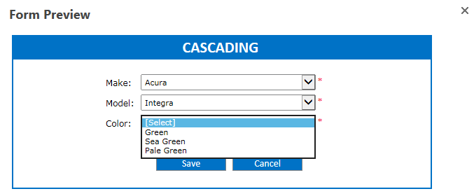
Click ‘Color’ and follow above steps that you followed for ‘Make’ and ‘Model’ upto selecting the List. Give the criteria for filling the combo box ‘Color’.
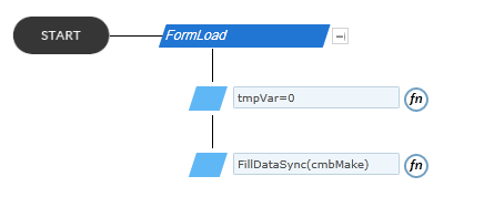
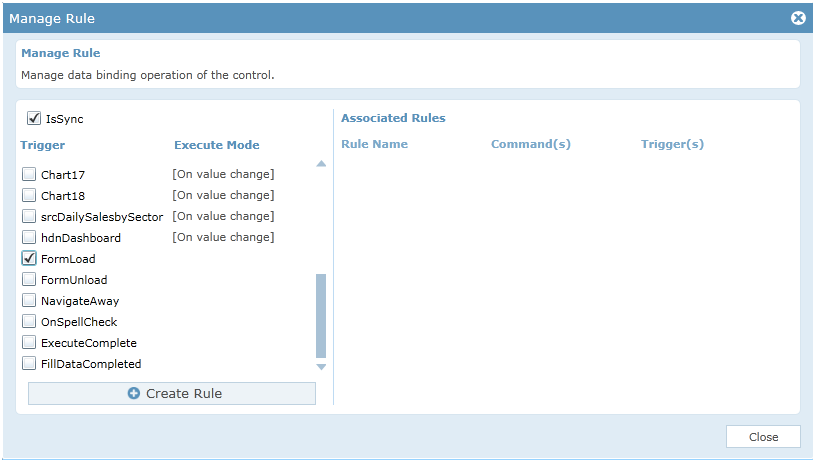
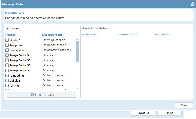
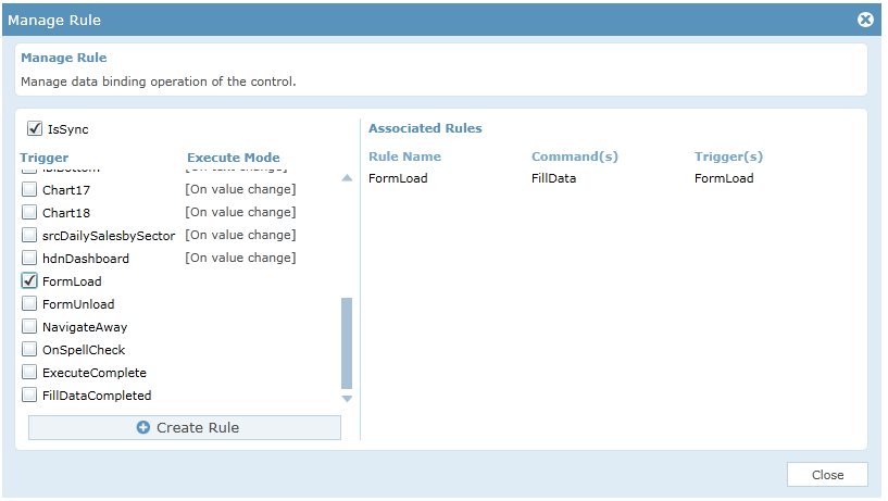
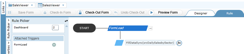
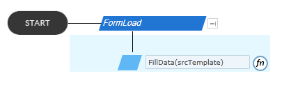
In FormLoad, temporary variable ‘tmpVar’ set to zero and fills the combobox control ‘cmbMake’.
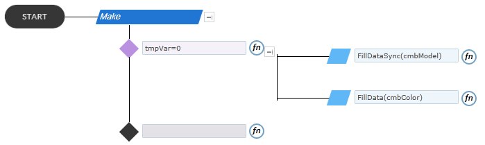
Fill the combobox control named ‘cmbModel’ and ‘cmbColor’ if the value of temporary variable ‘tmpVar’ is zero.
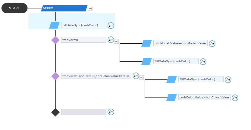
If the value of ‘tmpVar’ is zero, then selected value of ‘cmbModel’ control is passed to the hidden control ‘hdnModel’ and fills the combobox ‘cmbColor’. If the value of ‘tmpVar’ is one and the ‘hdnColor’ contains value, then fills the ‘cmbColor’ and pass the value of ‘hdnColor’ to ‘cmbColor’.
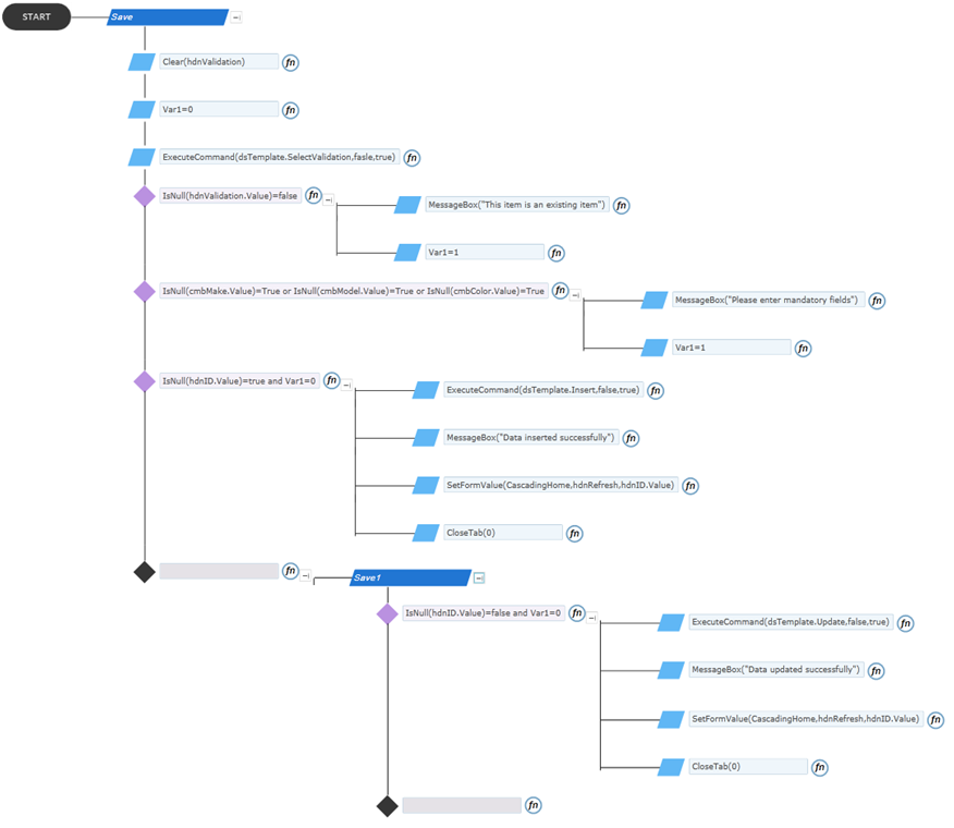
Check the validation. The rule for executing the Insert and Update command on the basis of the value in the hidden control ‘hdnID’ and pass the value of ‘hdnID’ to ‘hdnRefresh’ in the form ‘CascadingHome’ to refresh the dashboard.
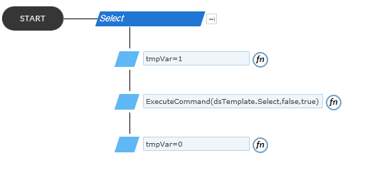
The rule is for setting the value of temporary variable ‘tmpVar’ to one and executing select command. After executing the ‘Select’ command, the value of ‘tmpVar’ set to zero.
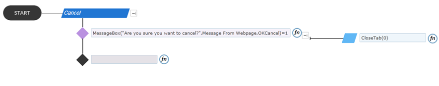
On clicking the Cancel button the popup form is closed.
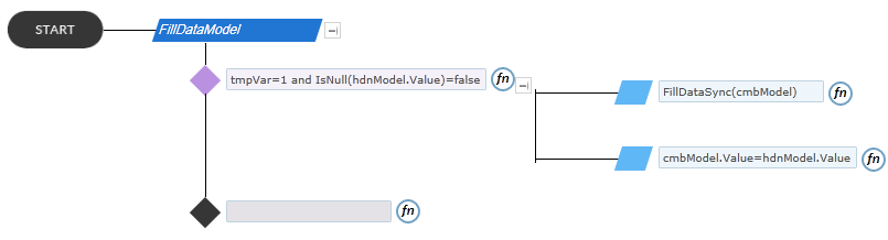
If the value of the temporary variable ‘tmpVar’ is one and hidden control ‘hdnModel’ contains any value then the combobox control named ‘cmbModel’ will be filled and set the value of ‘hdnModel’ to ‘cmbModel’.
Folders are used to store and organize forms that have a logical association or relationship. To create a new form click ‘New Folder’ button on the toolbar of the designer. On clicking the New Folder option, it will create a new folder and the name will be in the edit mode. You can type a new name for the folder.
Then click on the ‘New Form’ link on the toolbar. Give an appropriate name for the form. Click ‘Save’ to save the form.
You can drag and drop controls format the styles easily. ‘Check-In Form’ to save the changes and publish to get the completed form for the end user to use. A form must be checked-out to make modifications while all aspects of the form can be examined while checked-in.
To fill the search control named ‘srcTemplate’.
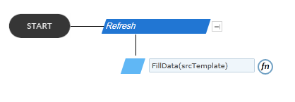
‘hdnRefresh’ gets the value from the ‘Cascading’ form and fills the search control ‘srcTemplate’ on its trigger.
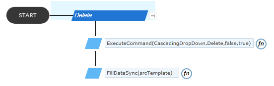
Executing delete command for delete the item form list and refresh the dashboard search control ‘srcTemplate’.