Captcha Control
Captcha
Captcha(Completely Automated Public Turing test to tell Computers and Humans apart) control is a type of challenge response test used in computing to determine whether or not the user is human. It is a validation tool which displays some random string which the user has to type to submit the form. Captcha is like a testing input to ensure you are dealing with a human and not a robot.
Working with a Captcha control
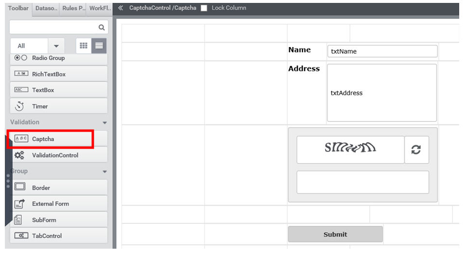
- Create a form as shown in Figure 1, by dragging a ‘Captcha’ control.
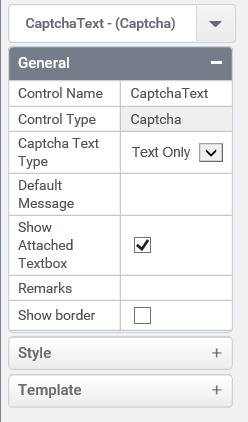
- In the properties tab of Captcha control user can set various properties like type of captcha text and can set border of control (Figure 2). Captcha control is a case sensitive validation tool.
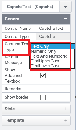
- The Captcha text type feature in Captcha control Property tab allows the user to select the type of text which should appear in Captcha image (Figure 3).
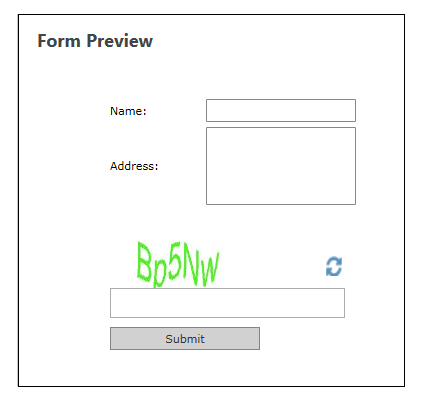
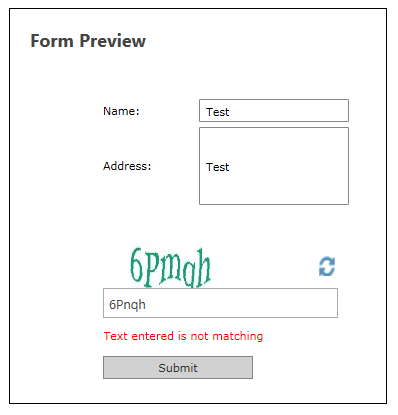
- Preview of a form containing captcha control is shown in Figure 4.
- In order to validate a form using captcha control user should write the following rule (Figure 5). ValidateCaptcha() is used to validate the text in captcha image and returns true value if it is matching. All the actions that are to be performed after validation are written under the condition true.
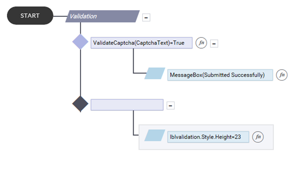
- And if it is not matching user can set a validation message as an indication to user that they went wrong with the captcha image (Figure 6).
Control Name: Captcha
Group: Validation Control
| General | |||
| S.no | Property Name | Data Type | Description |
| 1 | Captcha Text Type | String | Set the type of captcha text. |
| 2 | Default message | String | Sets the message that is to be displayed in captcha textbox by default. |
| 3 | Show Attached Textbox | Boolean | To display the attached textbox along with the control. |
| 4 | Remarks | String | To make a comment or observation about the control for reference. |
| 5 | Show Border | Boolean | To set the border for the control. |
| Style | |||
| S.no | Property Name | Data Type | Description |
| 6 | Width | String | Sets the suggested width or thickness to the control. |
| 7 | Height | String | Sets the suggested height to the control. |
| 8 | Margin | String | Sets the edge or outer margin to the control. |
| 9 | Background Color | String | Sets a brush that describes the Background color of the control. |
| 10 | Visible | Boolean | Sets the visibility of the control while rendering. |
| 11 | Enable | Boolean | Sets the accessibility of the control during rendering. |
| 12 | Column Span | String | To merge the number of column specified. |